
Framer Website Designer & Developer


Framer Website Designer & Developer


Creative Designer | Webflow & Framer Developer


Creative Designer | Webflow & Framer Developer

View more →

Website and product design for B2B AI & SaaS startups.
Website and product design for B2B AI & SaaS startups.


Premium UI/UX & Web Design Services ✨
- $1k+
- Earned
- 3x
- Hired
- 5.0
- Rating
- 14
- Followers
Premium UI/UX & Web Design Services ✨


Hi, I’m Caden.
I design modern high end brands & websites
- 5.0
- Rating
- 7
- Followers
Hi, I’m Caden.
I design modern high end brands & websites
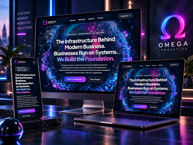
Omega Innovation — Premium Website Design & Development
Corporate Website Design | UI/UX Design | Web Development | Digital Brand Experience
Project Overview
A bold digital presence built for modern business.
Omega Innovation is a digital solutions company specializing in brand systems, corporate websites, web applications, and business infrastructure.
The goal of this website project was to create a visually striking, modern, and professional digital experience that communicates innovation, technical expertise, and forward-thinking business solutions.
The Design Approach
The visual direction combines a futuristic aesthetic with refined UI/UX principles, bringing together immersive visuals and a clean, structured interface.
Key Design Highlights:
Premium Visual Identity: Deep navy backgrounds, electric blue and magenta gradients, and dynamic digital-inspired imagery.
Modern UI/UX Design: Bold typography, intuitive navigation, clear visual hierarchy, and strategically placed calls to action.
Immersive Website Experience: High-impact hero section, vibrant visual elements, and contemporary interface styling.
Responsive Design Direction: A cohesive digital experience presented across desktop, laptop, and mobile mockups.
Conversion-Focused Layout: Clear service positioning and prominent calls to action designed to encourage visitors to explore and connect.
The Outcome
A distinctive corporate website experience that brings together brand identity, modern web design, and digital innovation.
The result is a confident, technology-driven visual presence designed to strengthen brand recognition, communicate services clearly, and create a memorable first impression.
A modern digital experience where strategy, technology, and design come together.
Project Expertise
Website Design · Website Development · UI/UX Design · Corporate Website · Responsive Web Design · Digital Branding · Visual Design · Web Design
2
246
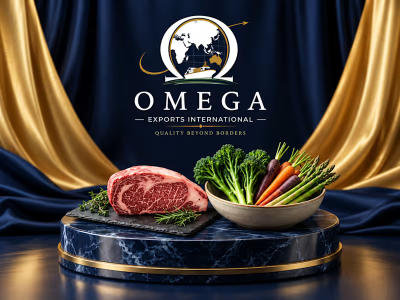
Omega Exports International – Corporate Brand Identity
The Overview
In the high-stakes logistics and international trade sector, trust is a company's most valuable currency. Omega Exports International needed a visual identity that instantly communicated global scale, reliability, and established corporate authority. The goal was to build a brand that commands respect in international boardrooms and stands out in the competitive export market.
The Strategic Design
I developed a comprehensive, authoritative emblem that seamlessly integrates the structural strength of the Omega symbol with maritime logistics and global reach.
Visual Iconography: The design anchors the globe within the Omega letterform, while a sweeping gold arrow introduces dynamic, forward momentum perfectly visualizing their tagline, "Quality Beyond Borders." The detailed cargo ship roots the brand in its core industry without feeling generic.
Color Palette: To position Omega as a premium corporate entity, I utilized a classic deep navy and refined gold color system. This specific combination is psychologically linked to security, wealth, and unwavering reliability.
Typography: A sophisticated, tailored serif wordmark was chosen to give the brand a timeless, established feel. It is structured to hold its weight beautifully, whether it is printed on premium corporate letterheads or scaled up on the side of a shipping container.
The Result
A commanding corporate identity that elevates Omega from a standard logistics service to a trusted global authority. It proves that B2B and industrial branding can still be highly sophisticated and visually striking.
Services Provided:
Brand Strategy & Positioning
Primary & Secondary Logo Design
Color Palette & Typography Curation
Corporate Brand Guidelines
Corporate high end website design / development & deployment - https://omegaexportsinternational.com.au
4
673
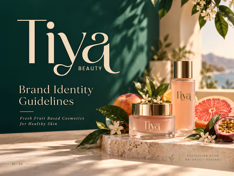
Tiya Beauty — Premium Brand Identity for Fresh, Fruit-Powered Skincare
A vibrant, elevated brand identity created for Tiya Beauty, an Australian skincare brand focused on fresh fruit-based cosmetics for healthy, naturally radiant skin.
The objective was to build a visual world that feels fresh, premium, feminine, modern, and naturally luxurious—while communicating the energy of fruit-powered skincare and the quality expected from a contemporary beauty brand.
Creative Direction
The identity combines deep emerald green, soft cream, peach, grapefruit, warm sand, and botanical tones to create a distinctive balance between nature and sophistication.
The existing Tiya Beauty logo became the foundation for a broader visual system built around fresh ingredients, healthy skin, Australian lifestyle, and modern beauty culture.
Elegant editorial typography, sunlit product photography, botanical details, fruit-inspired color accents, and refined packaging create a brand experience that feels premium without losing its natural freshness.
Brand Concept
Fresh ingredients. Radiant skin.
Tiya Beauty is positioned as more than a cosmetics brand. The identity communicates a lifestyle centered around healthy skin, natural ingredients, freshness, self-care, and effortless beauty.
The visual system was designed to feel aspirational enough for premium skincare while remaining bright, approachable, and relevant to modern beauty consumers.
2
1
383
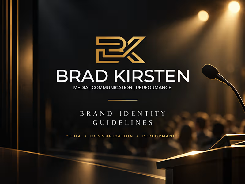
Brad Kirsten — Premium Brand Identity for Media, Communication & Executive Performance
A bold, high-end brand identity created for Brad Kirsten, a specialist in media training, executive communication, presentation coaching, public speaking, corporate facilitation, and live Q&A moderation.
The challenge was to build a visual system that immediately communicates authority, confidence, clarity, professionalism, and performance—while still feeling premium enough for senior executives, leadership teams, and corporate organizations.
The Creative Direction
The identity is built around a sophisticated black, gold, white, and graphite palette, creating a strong executive presence with a polished, high-value feel.
The existing Brad Kirsten logo was retained as the foundation of the brand and developed into a complete visual system. Strong typography, cinematic lighting, structured layouts, premium presentation environments, and modern corporate imagery give the brand a confident personality designed for high-level communication.
The overall direction reflects the core promise of the brand:
Confident people. Clear messages. Greater impact.
1
328

Transforming ideas into vibrant designs

They came to me with nothing but a logo.
No content. No copy. No images. No brief. Just a logo, a business name, and 32 years of electrical expertise that nobody could find online.
Integrated Wiring Solutions is a family-owned commercial electrical contractor based in East Windsor, Connecticut. Jeff Kegel has been in the trade for over three decades — building a reputation entirely through word of mouth. But without a website, new clients had no way to find him.
That's where I came in.
Before touching a single page I sent a 21-question discovery questionnaire. That document gave me everything I needed — the brand direction, the audience, the messaging, and the tone. From there I refined the color palette, wrote every word of copy from scratch, and built a full 5-page premium website directly in Squarespace.
Halfway through the project the client shifted direction. They wanted the site to feel less like a project portfolio and more like a reliable service business. I pivoted the messaging, restructured the homepage, and updated every CTA — without redoing the design.
They loved it on the first draft.
4 weeks. 5 pages. A business that went from invisible to professional overnight.
Platform: Squarespace
Timeline: 4 Weeks
Live site: integratedwiringct.com (http://integratedwiringct.com)
#SquarespaceDesigner #SquarespaceWebsite #WebsiteDesign #CustomWebsite #ContractorMarketing #SmallBusinessWebsite #LocalBusiness #TradesBusiness
0
73

Built a brand and website from scratch for a civil construction company in Western Australia.
The problem
Jackson Civil Construction had no logo, no website, no online presence. Just good work and word of mouth. That works for a while until a homeowner Searches "earthworks Busselton", and you don't appear. Or a mate recommends you, they look you up, and find nothing. No site, no proof you even exist. So they call the next guy who looks legit online.
Why this wasn't a typical web design job
I'm a former civil engineer by training. So when I sat down to build this site, I wasn't guessing what matters. I already knew how people look for contractors and what makes them pick one over another.
A homeowner about to spend thousands on a driveway, a septic system, or a retaining wall isn't browsing for fun. They're nervous. They want to know you've done this before, you've got the gear, and other people trust you. That's it.
What I built
Logo and brand identity — clean and industrial. Something that holds up on a truck door, a hi-vis shirt, and a website header. Construction brands don't need to be clever. They need to look solid.
Full Squarespace website, structured around one goal: turn a visitor into an enquiry. Here's how the page flows:
→ Hero section with a clear service area and direct call to action
→ Services breakdown — earthworks, drainage, septic systems, land clearing, limestone walls, car parks. Written the way this industry talks, not in vague marketing language
→ Trusted-by logo bar — City of Busselton, Water Corporation, Catholic Education WA. When a homeowner sees local government and major organisations hire this company, the trust question is answered instantly
→ Real project photos — excavators in the ground, actual drainage work. Not stock images of blokes in hard hats shaking hands
→ Full capabilities section — 14-tonne excavator, posi track loader, semi tipper, plate compactors, the lot. Most homeowners don't know what half of that means, but seeing it tells them this isn't a one-ute operation
Why it works
This is what happens when the person building your website actually understands your industry. You don't waste time explaining what a soakwell is or why a machinery list matters. The site just makes sense from day one.
The whole thing runs on Squarespace, so the client can update it themselves. New project photos, updated services, changed contact details, no developer needed.
0
92
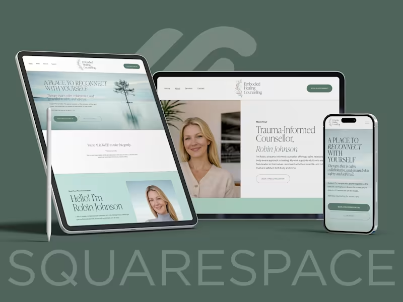
Embodied Healing Counselling needed a cohesive brand and website that reflected trauma-informed, body-aware therapy while maintaining professionalism and warmth. I led a full rebrand, redesigning the logo, refining the visual identity, and rebuilding the website on Squarespace.
The focus was to create a calm, grounded presence that builds trust from the first scroll. Soft typography, nature-inspired tones, and structured layout were used to balance emotional safety with clarity.
The result is a cohesive brand and digital experience that supports connection, credibility, and client inquiries.
0
117
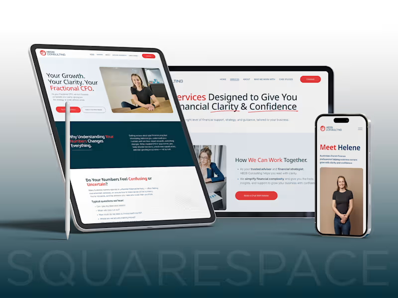
I designed and developed a modern, high-trust Squarespace website for HB2B Consulting, a Fractional CFO and financial advisory business based in Australia.
The goal was to create a clean, professional website that builds credibility, clearly communicates services, and converts visitors into qualified leads. The project included UX strategy, content structuring, responsive design, and performance-focused layout decisions.
Key sections included Services, About, Who We Work With, and conversion-driven CTAs — all fully optimized for mobile and desktop.
0
108

Top Framer Expert Developer & Website Designer ✨
- 1x
- Hired
- 5.0
- Rating
- 28
- Followers
Top Framer Expert Developer & Website Designer ✨
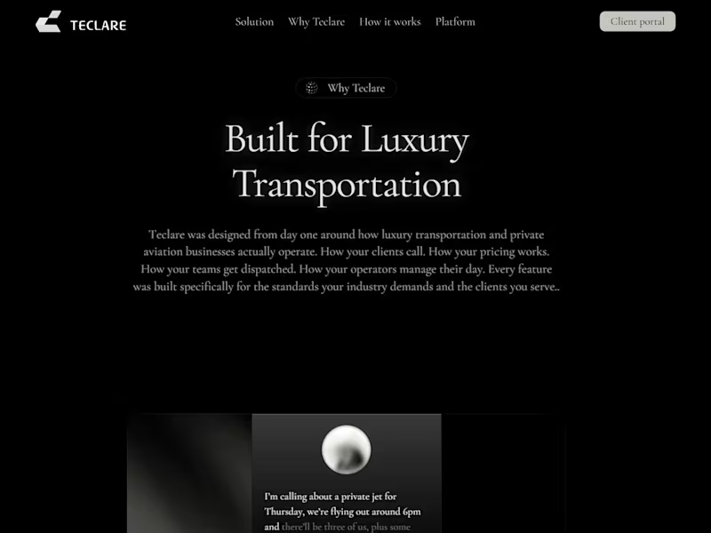
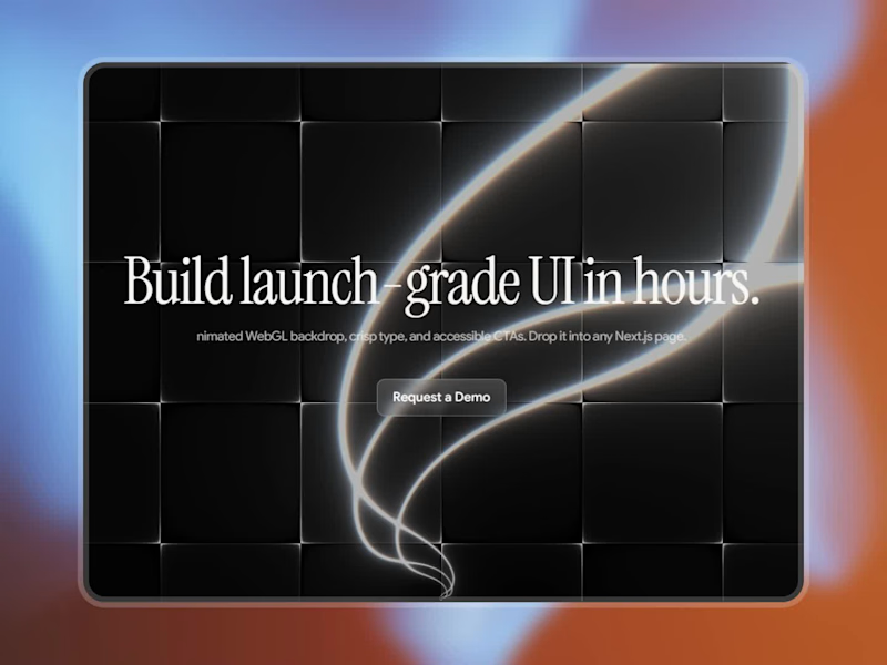
I've been experimenting with WebGL shaders inside Framer and ended up turning it into a free code component - an animated shader background you can drop behind any hero section.
Controls exposed:
Speed – how fast the pattern animates
Scale – spacing/density of the lines
Glow – intensity of the center streaks
Tint – an RGB multiplier so you can shift the palette without touching code
Max DPR – a performance cap for high density screens
Clear Color – the base background color
Check it out (https://www.framer.com/community/marketplace/components/shaderbg/)
3
5
452
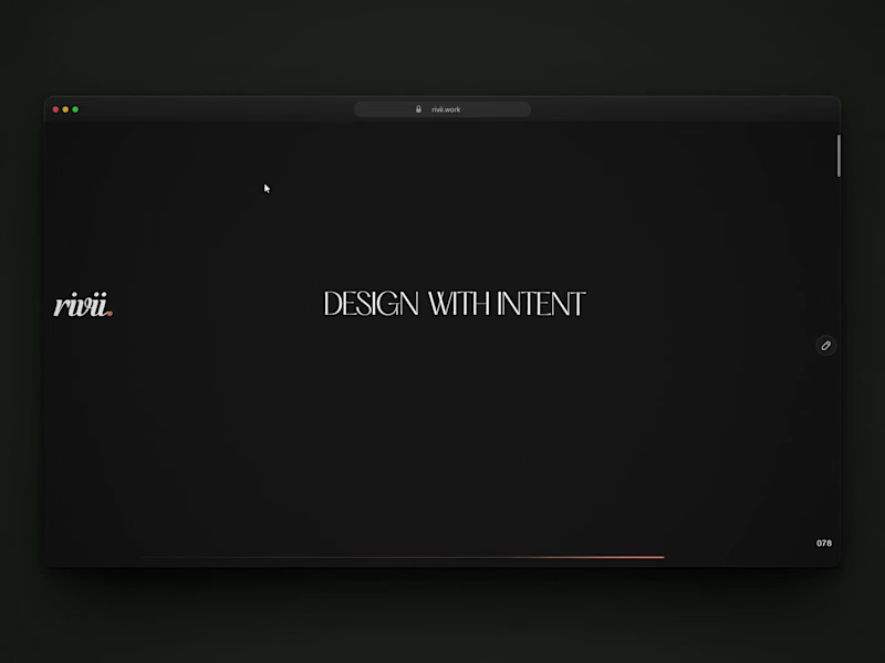
My portfolio just got a new look.
Fresh design with motion and a lot of small details you only find when you start playing with it.
See it live: https://rivii.work
(https://rivii.work)Building something? If you want a site that looks as good as the thing you’ve built, my inbox is open.
8
9
980
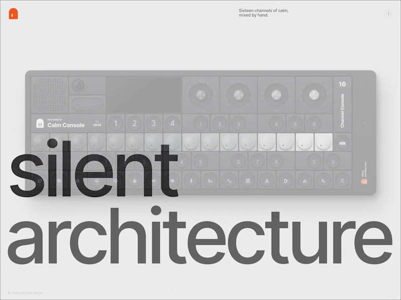
This is Figma design + motion.🔥
I’ve been wanting to make something like this for so long, and it’s finally done.
I wanted a screen that feels like you could actually reach out and touch it. Knobs, buttons, a tiny display, real weight and personality.
Here’s the fun part: none of it is real. It’s all pixels, designed in Figma.
Then I animated the whole 15s piece in Figma Motion too. Like actually, no other tool. I genuinely couldn’t stop smiling when it started moving.
Meet Silent Architecture. Sixteen channels of calm, mixed by hand. Inspired by @1042studio.
and I think this might be my favorite thing I’ve ever made?
#FigmaDesign #FigmaMotion #ProductDesign
1
183

Webflow Developer | Webflow Migration Specialist


