
Teclare: An AI voice platform for luxury transportation
Role: Sole designer and developer (motion, UI/UX, full Framer build)
Timeline: 4 weeks
Tools: Figma, Framer
Live: teclare.com
Overview
Teclare is an AI voice platform for luxury transportation and private aviation operators. It answers every inbound call, quotes from the operator's own rates, confirms the booking by SMS and dispatches the driver.
It started when the founder spotted the gap while working in corporate. I designed and built the marketing website that introduces it to the operators it was made for.
The challenge
Teclare is a voice product, so there is no interface to point at. The challenge was making it feel real to an operator deciding in a few seconds whether it's for them.
Two things made that harder:
1. It could easily read as generic AI software.
Plenty of tools say they answer calls. Very few quote from a rate table, handle vehicle classes and airport transfers, and dispatch the driver afterwards. That industry specificity was the real differentiator, and it needed to lead.
2. The audience expects luxury.
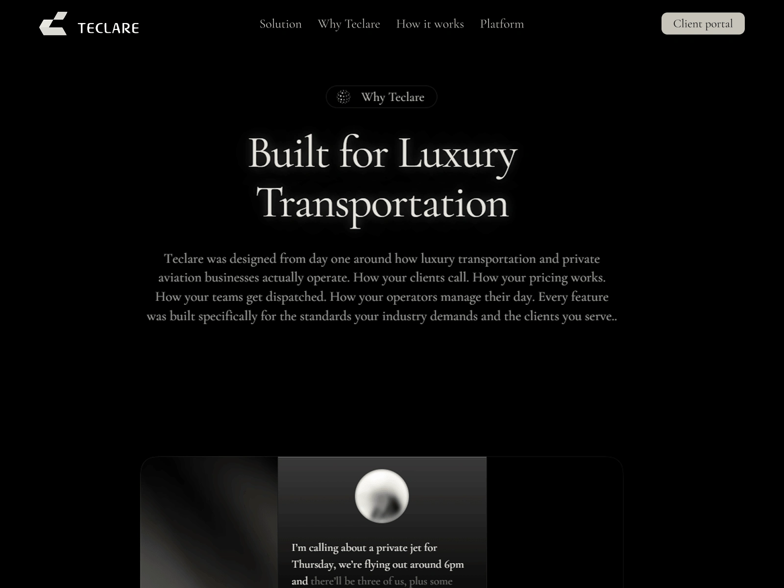
These operators sell black cars and private flights. A standard startup look would feel like it was made for someone else. The visual reference for the project was a black Escalade next to a private jet on a tarmac.
Process
The first direction used navy tones and colorful gradients. It had energy, but it felt closer to a software dashboard than to the world these operators work in. The client's feedback pointed to a refinement, not a rethink, so I focused on four things.
1. A tighter palette.
Black backgrounds, pearl white text and one subtle brand gradient. Cormorant Garamond carries the headlines and Inter Display handles everything else.
2. A cleaner hero.
I tested several 3D options in Spline for the hero. Nothing worked, so I replaced it with a cleaner version.
3. Less on the page.
My first idea for "how it works" was a diagonal chart. It looked interesting but slowed the reading down, so I replaced it with a numbered list from 01 to 05. For the eight-capability grid, I explored a longer scroll-reveal layout, but it added too much scrolling before visitors reached the product. I kept the grid and refined the animation instead.
4. Quieter cards.
The platform cards started with richer backgrounds that pulled attention from the product UI inside them. I moved to near-black with a subtle brand-colored ombre. The footer got the same treatment as well.
The solution
1. A hero that says who it's for.
"AI that runs your Inbound Operations" opens the page, followed by the industry it serves and one primary action: Request a Demo.
2. Eight capabilities at a glance.
An "Intelligent Front End" grid covers the product in short lines, from 24/7 call handling and accurate pricing to missed call recovery and driver dispatch.
3. Product demos inside the page.
Instead of describing the platform, I built three custom animated cards in Framer code:
A voice AI listening to a live booking call.
A booking that fills in field by field while the revenue counter rises.
An operator dashboard where a trip is approved or declined.
The animations show the product doing the work, so the copy doesn't have to.
4. Numbers instead of paragraphs.
Three figures carry the value: 10 seconds to recover a missed call, 60 seconds to confirm a booking, and 24 hours a day of coverage.
5. A call to action that fits a voice product.
"Hear Teclare Live" invites operators to request a demo, and the platform calls their own number. For a product that lives on the phone, hearing it is the most convincing demo.
6. The pages around it.
A demo request form connected to the founder's inbox, legal pages managed in the CMS, a custom 404 page and a floating navigation with a Client Portal button. The site is responsive across desktop, tablet and phone, with SEO and accessibility basics in place.
Because I designed and built it, nothing got lost between mockup and launch. I could also adjust the animation timing in the browser as I went, and I kept the motion restrained so nothing competes with the product demos.
Outcome
The site launched at teclare.com. It takes an operator from a missed call to a confirmed booking in eight sections, and it asks for one thing: a demo.
Client Recommendation after project handoff
I had an amazing experience working with Rivi. He is extremely talented and truly puts his heart in anything he does. Rivi is also very creative and brought ideas that made a real difference in the overall result. I recommend Rivi a 1000%!!
Aman Salman, Founder, Teclare
1 like · 2 views · Nov 7, 2026
Designed and built a site that shows a voice-only AI product at work for luxury transport operators.

