Freelancers in Cimahi
Sign Up
Post a job
Sign Up
Log In
Filters
1
Projects
People
Pratama Hasriyan
pro
Bandung, Indonesia
Web/UI Designer & Framer Specialist
$25k+
Earned
24x
Hired
5.0
Rating
64
Followers
expert
Club
Follow
Message
Web/UI Designer & Framer Specialist
1
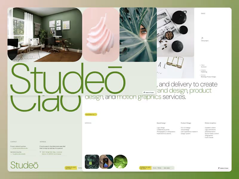
Studeo – Framer Portfolio Template
1
406
2
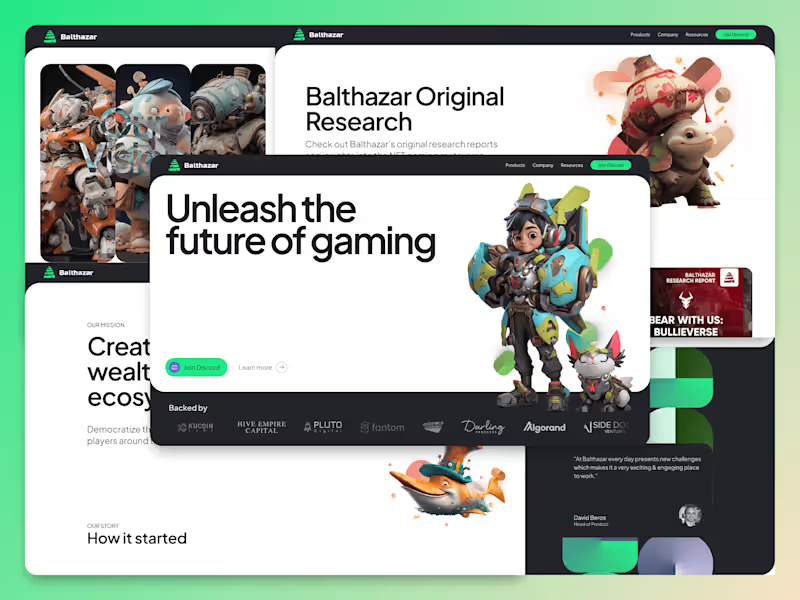
Framer Website Design for Balthazar
2
71
0
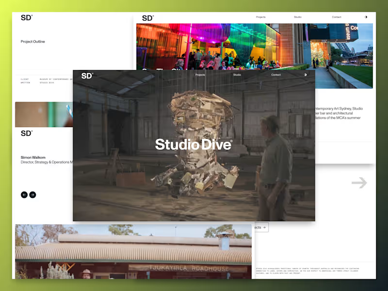
Studio Dive Website Framer Dev
0
25
0
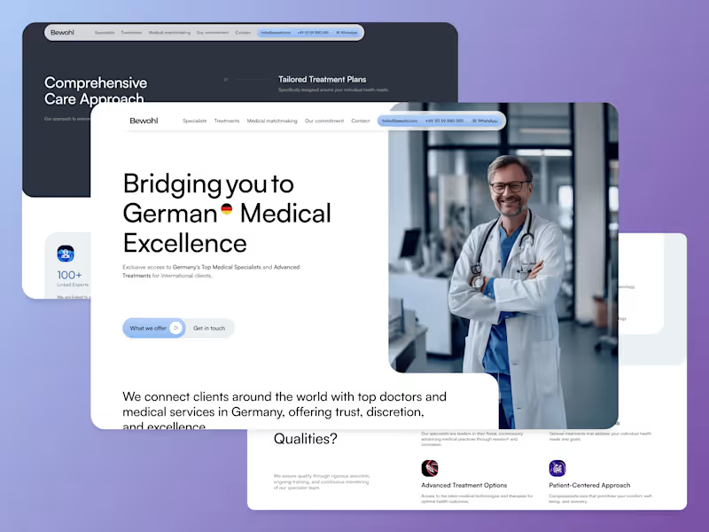
Bewohl Medical Website Design and Framer Development
0
40
Follow
Message
Alvin A
pro
Bandung, Indonesia
Certified Framer Expert | UI/UX Designer | Figma to Framer
1x
Hired
5.0
Rating
21
Followers
expert
Follow
Message
Certified Framer Expert | UI/UX Designer | Figma to Framer
1
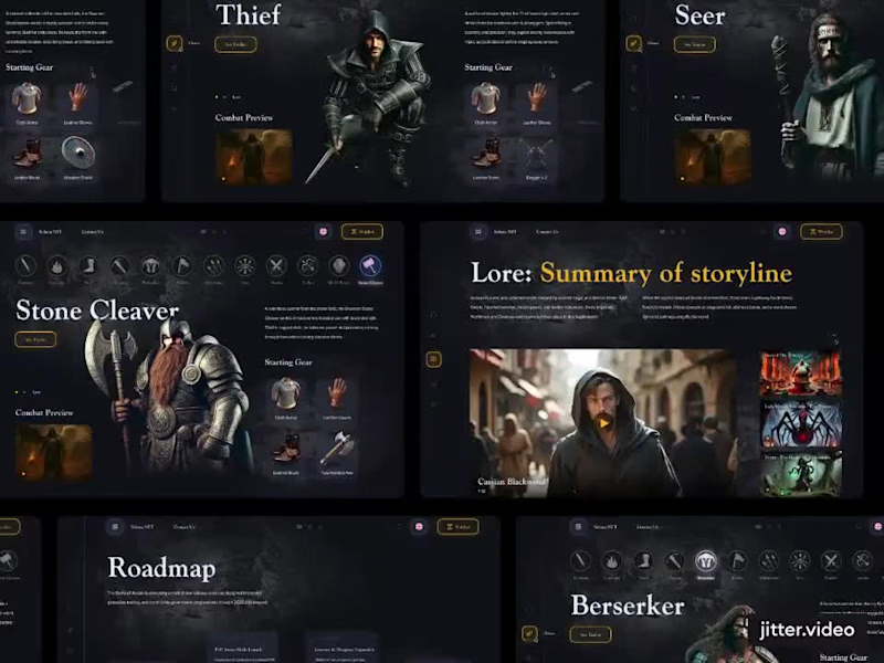
Gaming Website — Custom Design & Framer Build
1
13
0
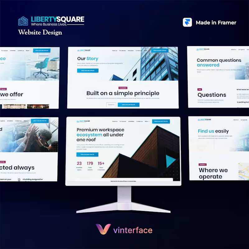
Liberty Square Brand & Website Development
0
11
0
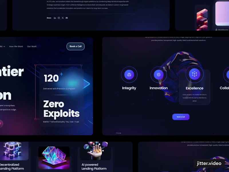
VTS Labs – Tech Agency Site Designed in Figma & Framer
0
10
0
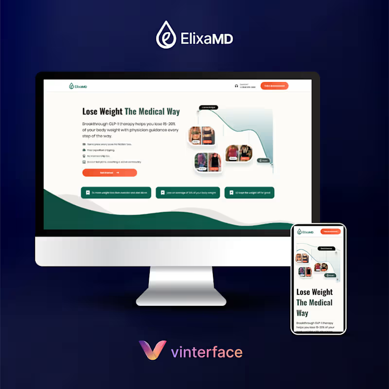
Elixa MD — CRO Marketing Landing Page Design (GLP-1 Brand)
0
12
Follow
Message
Imam Abullaisi
pro
Bandung, Indonesia
UX/UI Designer & Developer ✦ AI, SaaS, Web3, Motion, System
$1k+
Earned
2x
Hired
5.0
Rating
43
Followers
expert
expert
Follow
Message
UX/UI Designer & Developer ✦ AI, SaaS, Web3, Motion, System

0
A cinematic video for EveryX content, built scene by scene in FLORA.
0
212
1
X @PaceTerminal V2 Launch Motion Design Commercial
1
455
0
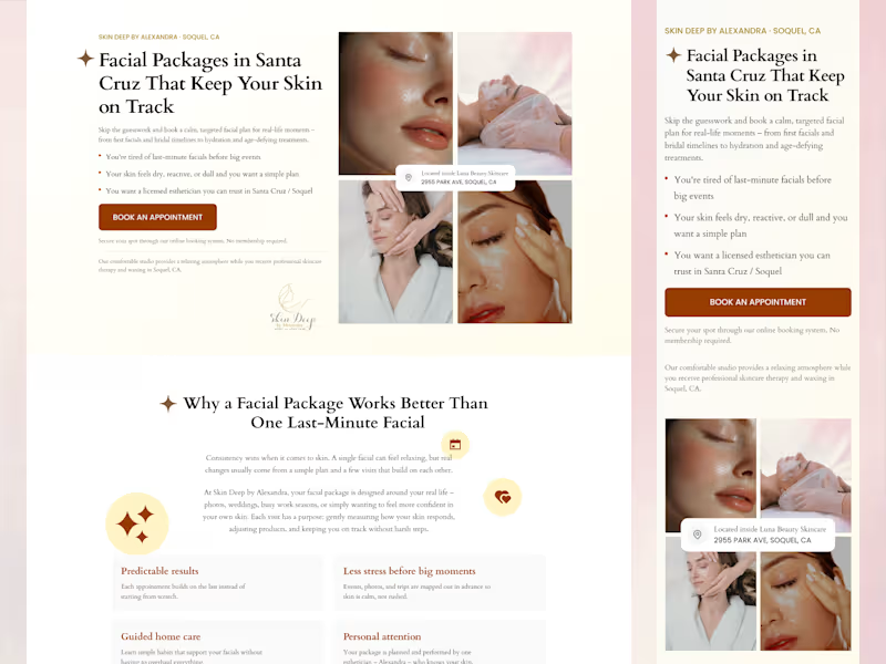
Skin Deep - Conversion-focused Framer Landing Page Design
0
9
1
A visual concept exploring the relationship between political figures and market psychology during crypto Fear & Greed crashes. Created using Flora AI. Achieved ~2.5k organic views and engagement on X: https://x.com/abullaisi/status/1988185494778507497
1
444
Follow
Message
Musmuliady Jahi
pro
Bandung, Indonesia
UI/UX Designer | Framer Expert
8
Followers
expert
Follow
Message
UI/UX Designer | Framer Expert
0
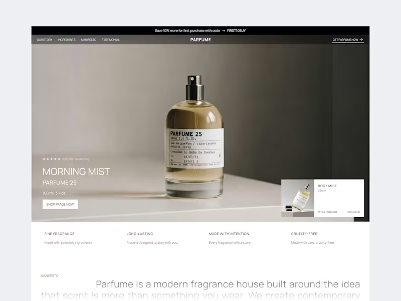
Parfume Fragrance — Hero Section
0
18
0
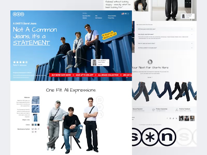
S*N - Denim Fashion Ecommerce Landing Page
0
28
3
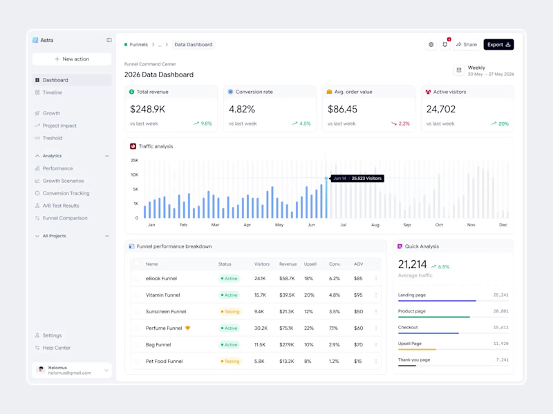
Astra - Funnel Dashboard
2
3
160
1
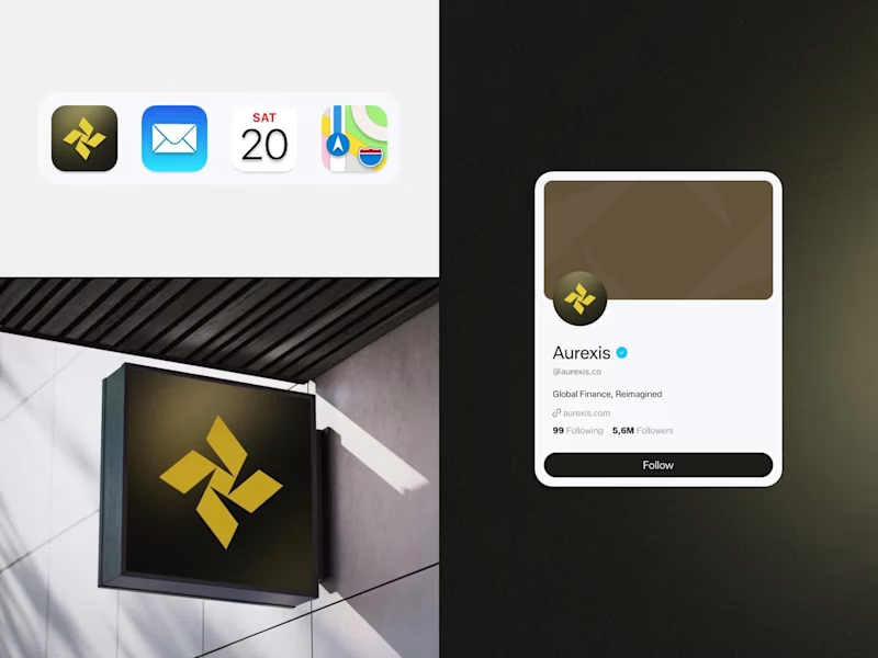
Aurexis - Finance Branding
1
1
120
Follow
Message
Rifky Ardiansyah
Bandung, Indonesia
Versatile designer uniting identity and interaction.
Follow
Message
Versatile designer uniting identity and interaction.
1
Here is how I create visual identity with expansive with Envato. Almost used everything in Envato site. Check on my Instagram too! https://www.instagram.com/reel/DbSWtx1xwPT/?igsh=b2l4NWx2cHdkcXlz
1
145
0
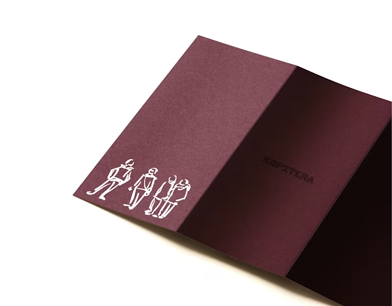
Rebranding works for Kopitera with Studio Dure, exciting project when i had to explore a simple brush illustration style. Located in the heart of Bandung, Indonesia, Kopitera appears as a warm and familiar classic café. Since 2017, Kopitera has offered a soft and comfortable space where coffee and everyday life meet in quiet harmony. #rebranding:
0
72
0
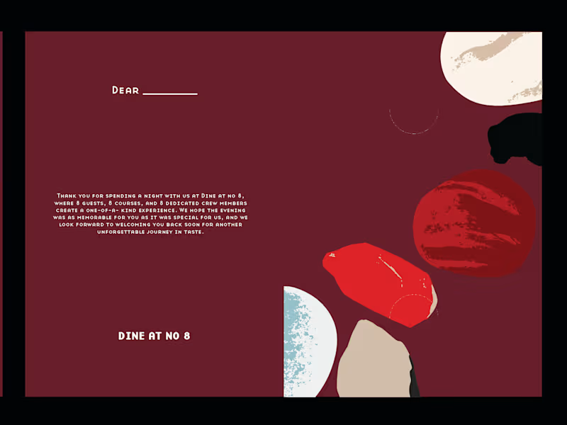
Crafting an exclusive keepsake collection for Dine at No. 8 , where fine dining meets thoughtful design. Each guest receives a custom keychain and a mini memory photo card, subtle details that turn every dining experience into something personal and memorable. ✨🍽️ Excited to connect with brands and founders worldwide who value thoughtful design and creative collaboration. Check it out here 👇 https://rifkyardiansyah.site Always open to new opportunities through Contra 💼
0
127
0
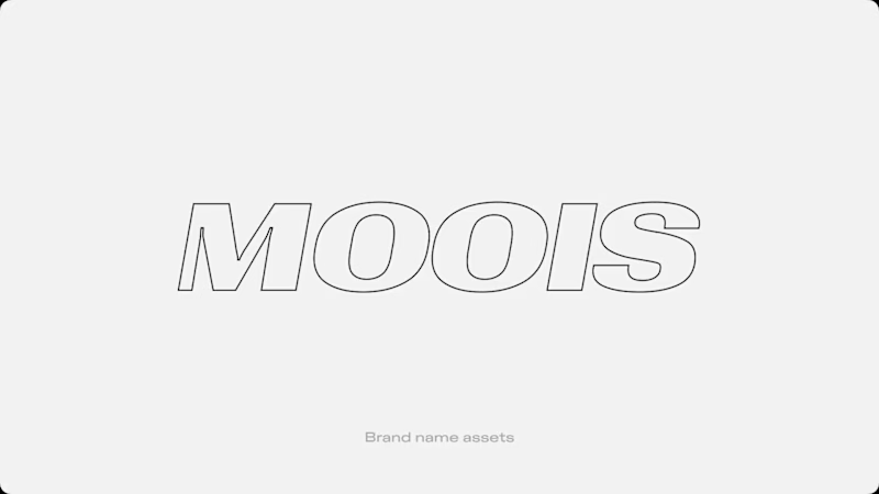
Rebranding Moois All‑Terrain, bringing a refreshed identity to life through a new logo and wordmark, crafting a customized typeface, dynamic packaging design, and social direction spanning photo, video, and digital presence. Excited to connect with brands and founders worldwide who value thoughtful design and creative collaboration. Check it out here 👇 https://rifkyardiansyah.site Always open to new opportunities through Contra 💼
0
140
Follow
Message
Calvin Yuda Tama
pro
Bandung, Indonesia
Shopify Development & CRO Design That Actually Converts
5.0
Rating
4
Followers
Follow
Message
Shopify Development & CRO Design That Actually Converts
4
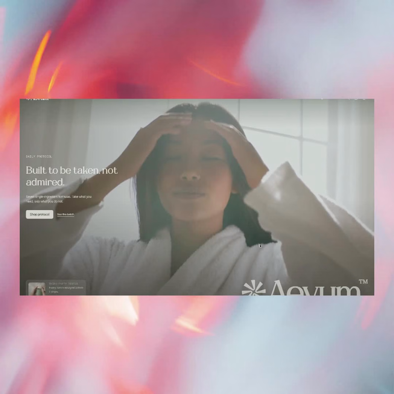
A Shopify theme I designed and built end to end, with conversion as the brief rather than something added at the end. Every section is hand-written Liquid with real schema settings, and that matters more than it sounds. When the merchant can change hierarchy, copy, and layout themselves, they can actually run tests. Hardcode it and every experiment needs a developer, so no experiments happen. No page builder either. That weight lands on LCP, and a slow page loses the buyer before the design gets a say. Aevum. Designed and built by one person. Want something like this for your store? Send me a message, happy to talk it through. Demo brand, real build. Take a look: https://clvn-avenir.myshopify.com/ (https://clvn-avenir.myshopify.com/)Password: aevum
1
4
163
5
Hey. Spent the last stretch building a Shopify theme from scratch. Something I keep running into with stores: people want to A/B test their way to more sales, but the storefront looks like every other Dawn install. There is nothing to test yet. The design is the variable. So this one is mine end to end. Brand, storefront, 62 custom sections. Demo brand, real build. Take a look: https://clvn-avenir.myshopify.com/ (https://clvn-avenir.myshopify.com/)Password: aevum
4
5
263
1
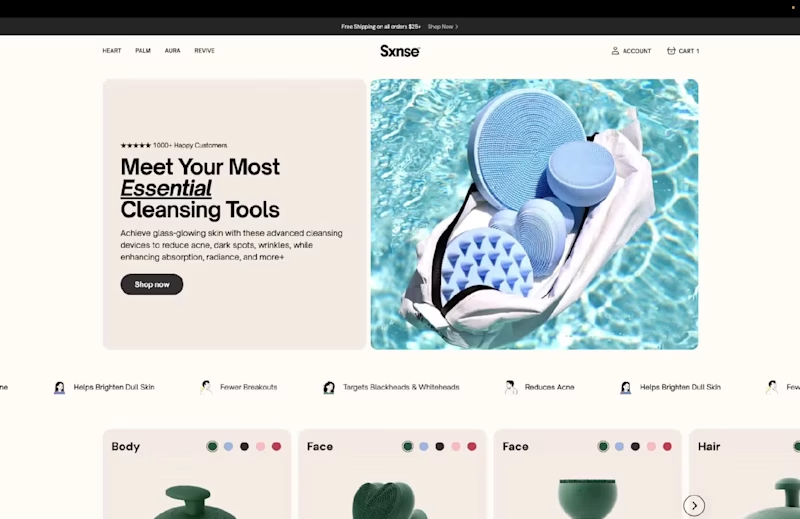
Most Shopify stores fail because they showcase products, not results 🔥 Here's what I built for Sxnse - a premium skincare brand: - Position benefits front and center, not just product specs - Focus on "glass-glowing skin" transformation over device features - Make the product lineup feel like a curated skincare experience - Built with 80% custom Shopify sections because premium brands need premium execution. The result? A conversion-focused store that sells confidence, not cleansers. 🚀
1
329
1
Elegant E-commerce Platform for Marianne Jewellery
1
17
Follow
Message
Ramanda Prabu
Bandung, Indonesia
Web Designer & Frontend Developer
9
Followers
Follow
Message
Web Designer & Frontend Developer
0
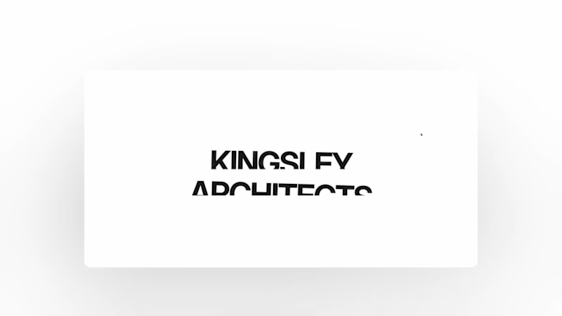
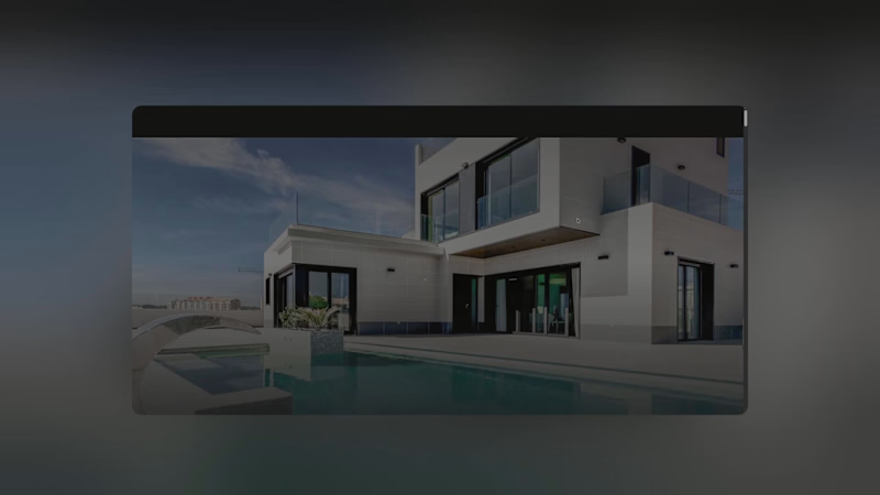
I've been paying attention to how architecture firms present their work online, and one thing I kept coming back to was how much the first few seconds matter. Large project photography, minimal distraction, strong project information, and recognition placed close to the work itself. I kept those ideas in mind while designing Kingsley Architects. The homepage opens with a project slideshow where the imagery, project name, location and recognition change together, so each project gets its own moment rather than feeling like another item in a grid. I approached motion the same way. Using GSAP, I focused on transitions that guide attention, create hierarchy and give the architectural photography enough room to carry the experience. But I also wanted Kingsley to work beyond the initial launch. Architecture practices keep evolving. New projects are completed, photography gets updated, awards are received, and the portfolio grows. So I built a content management system behind the website that allows the studio to add projects, replace imagery and update content without touching the code. That was an important part of the concept for me. A studio website shouldn't only look good when it launches. It should be something the practice can continue building on as its body of work grows. Kingsley is a fictional architecture practice, but the design decisions came from patterns I found while studying real architecture firms and how they present projects, recognition and studio credibility online. I designed and developed the full experience with Next.js, Tailwind CSS, GSAP and CMS, covering visual direction, responsive development, motion, project presentation and content management. 🔗 Live site: https://kingsley-architecture.vercel.app/ For architects and studio teams, how important is it for your team to be able to update your portfolio without relying on a developer?
0
16
0
I wanted VELA to feel less like a conventional portfolio and more like a quiet introduction to a studio’s way of thinking. The starting point was simple: Can a website communicate the character of an architecture practice before someone reads much at all? For VELA, I built the visual language around a restrained palette, oversized imagery, measured typography and generous spacing. Rather than showing everything immediately, the site reveals the studio gradually through projects, interiors, process, materials and smaller editorial moments. The photography does most of the talking. The interface stays intentionally understated so the architecture can remain the focus. I also spent a lot of time on rhythm. Some sections are almost completely visual, while others slow things down with smaller images, text and details about the studio’s approach. Motion follows the same idea. I used GSAP to connect sections and give the page a natural flow, while keeping the interactions subtle enough that they never compete with the work. VELA is a fictional architecture and interiors studio, but the project was shaped by a lot of research into how design-led practices communicate atmosphere, materiality and identity online. I designed and developed the complete experience with Next.js, Tailwind CSS and GSAP, including the visual direction, responsive layouts, motion and project presentation. 🔗 Live site: https://vela-studio-eight.vercel.app/ For architects and interior designers, when someone lands on your website for the first time, what do you want them to understand about your practice before anything else?
0
23
0
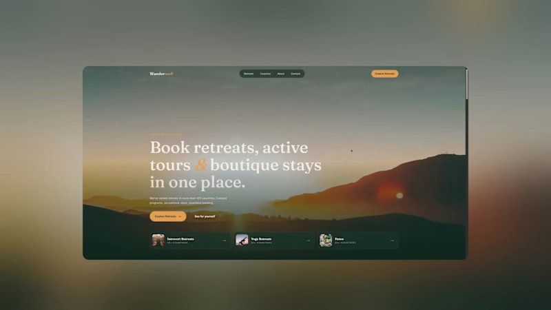
You don't usually decide to travel because a website had a good CTA. You decide because you started imagining yourself there. That's the feeling I wanted to capture with Wanderwell. Instead of treating the experience like a traditional booking platform, I approached it more like an editorial travel experience. Large imagery. Spacious layouts. Curated destinations. Stories before transactions. Then, once the visitor is inspired, the booking journey becomes the natural next step. 🔗 Live website: https://wanderwell-five.vercel.app/ Built with Next.js, Tailwind CSS & GSAP Would you rather book from a website that's optimized for speed or one that makes you want to pack your bags?
0
204
0
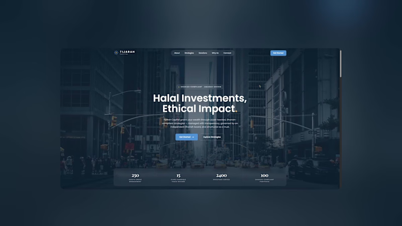
First impressions matter. Especially when money is involved. For this Tijarah Capital concept, I wanted to explore what a financial website could feel like when the priority isn't just "looking premium", but actually communicating trust and clarity. I kept the visual language restrained: • Strong typography • Structured information • Editorial layouts • Subtle motion • Plenty of breathing room Nothing too flashy. Because sometimes the most convincing design is the one that knows when to stop. 🔗 Live website: https://tijarahcapital.vercel.app/ Built with Next.js, Tailwind CSS & GSAP What makes you trust a financial website within the first 10 seconds?
0
188
Follow
Message
Rudy Pratama
Bandung, Indonesia
Designer | Illustrator | Storyteller

97
Followers
Follow
Message
Designer | Illustrator | Storyteller
0
AKAI Professional MPC 3000. Midi Production Center. Skeuomorphic illustration done in Figma.
0
101
0
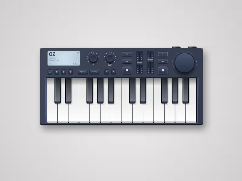
Midi Controller illustration done in Figma. I'm trying to fire up my skeuomorphic illustration skills.
0
101
0
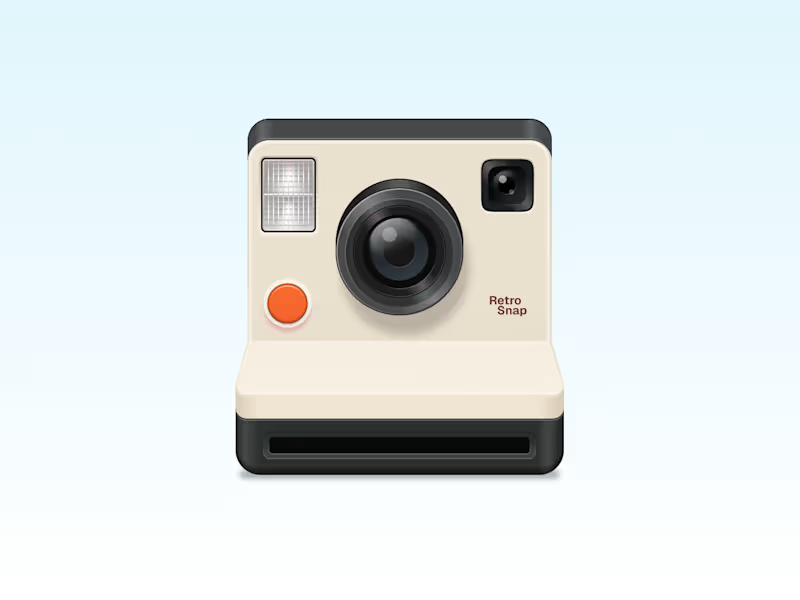
Polaroid camera in a skeuomorphic style. Done in Figma.
0
151
0
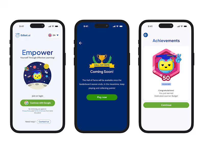
Edbot.ai Design System Overhaul
0
7
Follow
Message
Explore people