
Ramanda Prabu
Web Designer & Frontend Developer


I've been paying attention to how architecture firms present their work online, and one thing I kept coming back to was how much the first few seconds matter.
Large project photography, minimal distraction, strong project information, and recognition placed close to the work itself.
I kept those ideas in mind while designing Kingsley Architects.
The homepage opens with a project slideshow where the imagery, project name, location and recognition change together, so each project gets its own moment rather than feeling like another item in a grid.
I approached motion the same way.
Using GSAP, I focused on transitions that guide attention, create hierarchy and give the architectural photography enough room to carry the experience.
But I also wanted Kingsley to work beyond the initial launch.
Architecture practices keep evolving. New projects are completed, photography gets updated, awards are received, and the portfolio grows.
So I built a content management system behind the website that allows the studio to add projects, replace imagery and update content without touching the code.
That was an important part of the concept for me.
A studio website shouldn't only look good when it launches. It should be something the practice can continue building on as its body of work grows.
Kingsley is a fictional architecture practice, but the design decisions came from patterns I found while studying real architecture firms and how they present projects, recognition and studio credibility online.
I designed and developed the full experience with Next.js, Tailwind CSS, GSAP and CMS, covering visual direction, responsive development, motion, project presentation and content management.
🔗 Live site:
https://kingsley-architecture.vercel.app/
For architects and studio teams, how important is it for your team to be able to update your portfolio without relying on a developer?
0
17
I wanted VELA to feel less like a conventional portfolio and more like a quiet introduction to a studio’s way of thinking.
The starting point was simple:
Can a website communicate the character of an architecture practice before someone reads much at all?
For VELA, I built the visual language around a restrained palette, oversized imagery, measured typography and generous spacing.
Rather than showing everything immediately, the site reveals the studio gradually through projects, interiors, process, materials and smaller editorial moments.
The photography does most of the talking.
The interface stays intentionally understated so the architecture can remain the focus.
I also spent a lot of time on rhythm.
Some sections are almost completely visual, while others slow things down with smaller images, text and details about the studio’s approach.
Motion follows the same idea.
I used GSAP to connect sections and give the page a natural flow, while keeping the interactions subtle enough that they never compete with the work.
VELA is a fictional architecture and interiors studio, but the project was shaped by a lot of research into how design-led practices communicate atmosphere, materiality and identity online.
I designed and developed the complete experience with Next.js, Tailwind CSS and GSAP, including the visual direction, responsive layouts, motion and project presentation.
🔗 Live site:
https://vela-studio-eight.vercel.app/
For architects and interior designers, when someone lands on your website for the first time, what do you want them to understand about your practice before anything else?
0
25
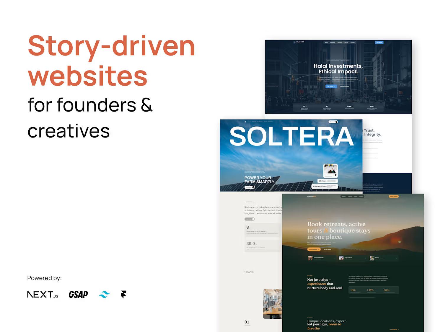
You don't usually decide to travel because a website had a good CTA.
You decide because you started imagining yourself there.
That's the feeling I wanted to capture with Wanderwell.
Instead of treating the experience like a traditional booking platform, I approached it more like an editorial travel experience.
Large imagery.
Spacious layouts.
Curated destinations.
Stories before transactions.
Then, once the visitor is inspired, the booking journey becomes the natural next step.
🔗 Live website:
https://wanderwell-five.vercel.app/
Built with Next.js, Tailwind CSS & GSAP
Would you rather book from a website that's optimized for speed or one that makes you want to pack your bags?
0
205
First impressions matter. Especially when money is involved.
For this Tijarah Capital concept, I wanted to explore what a financial website could feel like when the priority isn't just "looking premium", but actually communicating trust and clarity.
I kept the visual language restrained:
• Strong typography
• Structured information
• Editorial layouts
• Subtle motion
• Plenty of breathing room
Nothing too flashy.
Because sometimes the most convincing design is the one that knows when to stop.
🔗 Live website:
https://tijarahcapital.vercel.app/
Built with Next.js, Tailwind CSS & GSAP
What makes you trust a financial website within the first 10 seconds?
0
188