Brand-focused Art Director building visual systems
Brand-focused Art Director building visual systems

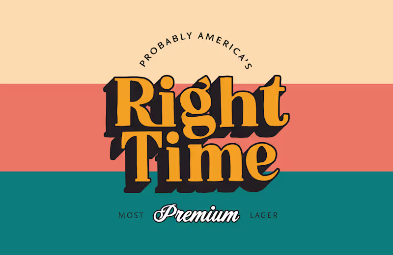
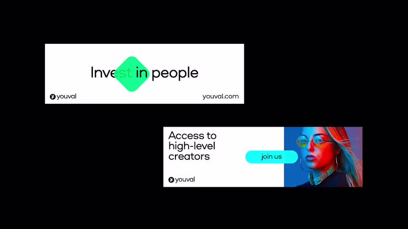
Break-through campaigns, design, motion graphics
Break-through campaigns, design, motion graphics


View more →
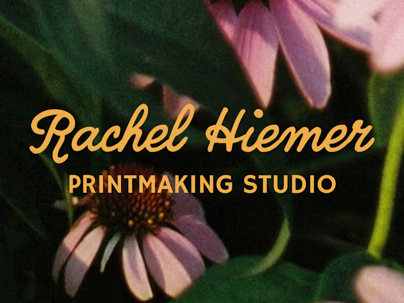
Attention to detail, unique designs
Attention to detail, unique designs

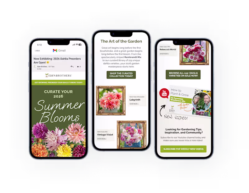
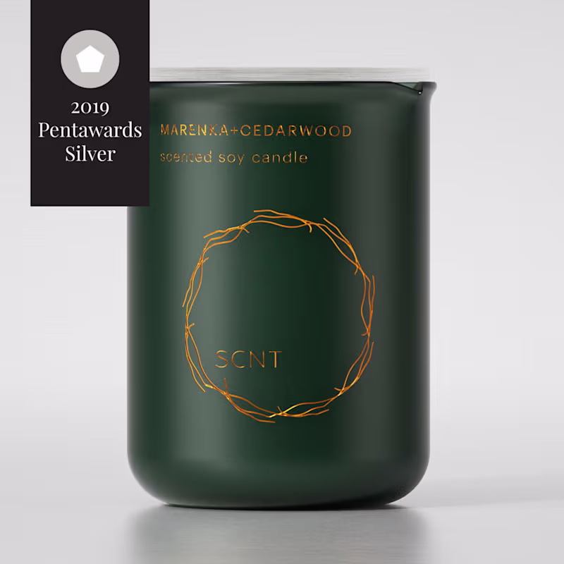
Award-winning Brand Designer
Award-winning Brand Designer

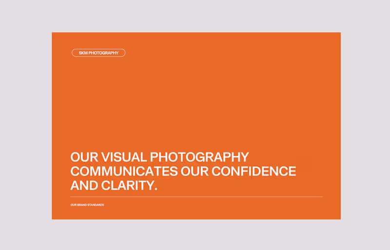
Experienced Brand and Graphic Designer