
SaaS Explainer Videos, AI Videos & Product Demo Specialists
- $1k+
- Earned
- 2x
- Hired
- 5.0
- Rating
- 45
- Followers
SaaS Explainer Videos, AI Videos & Product Demo Specialists
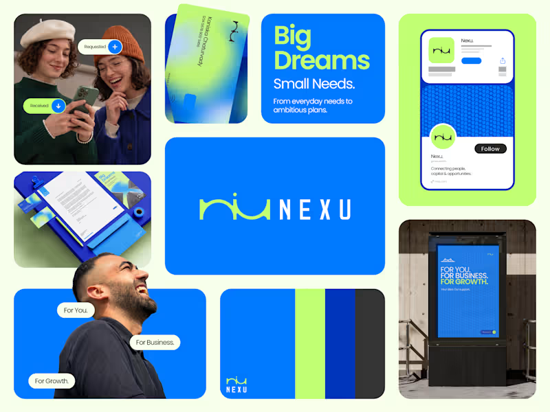
Good branding isn’t just about how a logo looks. It’s about what it represents.
Sharing one of our recent projects: NEXU, a fintech brand identity built around connection, trust, and opportunity.
The idea was to create a visual identity that makes finance feel more human and approachable. The symbol brings together the gesture of reaching out and the strength of a bridge, representing the connection between people, capital, and opportunity.
From the logo concept to the broader visual identity, every detail was designed to communicate confidence, clarity, and progress.
It’s always rewarding to see how a simple visual idea can tell a much bigger story.
Would love to hear what you think!
Check it out (https://contra.com/p/NF3FYbO7-nexu-or-fintech-brand-identity)
#BrandIdentity #LogoDesign #Fintech #BrandDesign #ContraCommunity
6
9
1K
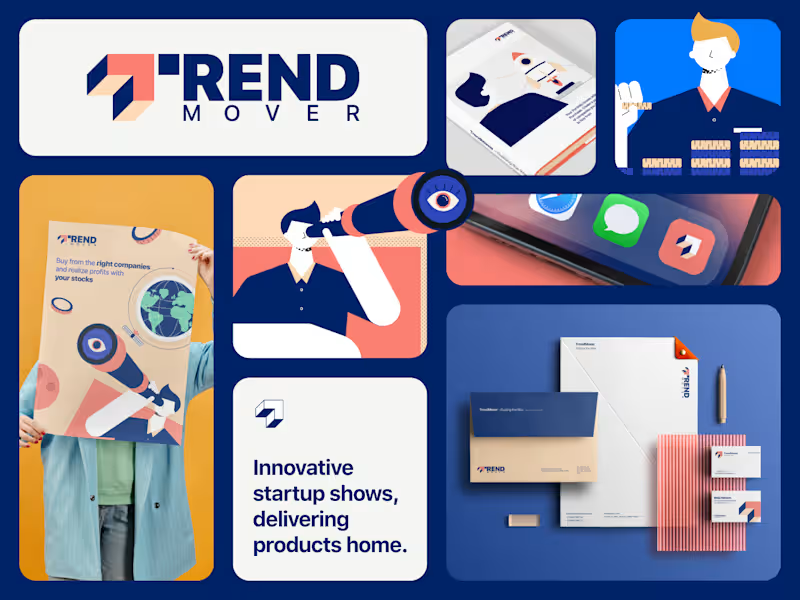
Just dropped on Contra: Full Branding for Trend Mover 🚀
When building an identity for a brand moving fast, safe design doesn't cut it. We built a complete visual system for Trend Mover from the ground up—turning high-energy positioning into a bold, cohesive visual story.
What went into the build:
Brand Strategy & Positioning: Defining the core identity and edge.
Visual Identity System: Custom typography, color architecture, and scalable assets.
Brand Applications: Bringing the system to life across touchpoints.
We don't do cookie-cutter visuals—we build systems that command attention and drive narrative clarity.
Check out the full case study on our profile.
We’d love to hear your thoughts! Drop a comment on what stands out to you.
Check it out (https://contra.com/p/WbeFZcXL-logo-design-for-trend-movers-startup)
0
159

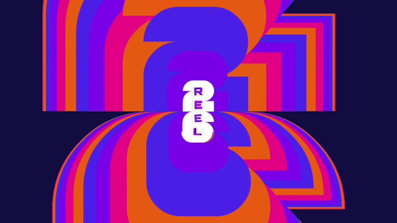
Celebrating 9 years of motion graphics, our 2026 showreel is live.
Nine years ago, AGFX Studio was a small team with one belief: complex ideas deserve to be explained beautifully.
Since then, we've crafted explainer videos, product demos, and 2D/3D animation for SaaS, AI, FinTech, Web3, and healthcare brands around the world. This reel is a look back at the stories we've helped tell, and a promise of what's next.
Every frame in this showreel was designed, animated, and refined by our in-house team. If your product needs a story that converts, we'd love to build it with you.
https://agfx.studio/
(https://agfx.studio/)#MotionGraphics (https://www.linkedin.com/search/results/all/?keywords=%23motiongraphics&origin=HASH_TAG_FROM_FEED) #ExplainerVideo (https://www.linkedin.com/search/results/all/?keywords=%23explainervideo&origin=HASH_TAG_FROM_FEED) #2DAnimation (https://www.linkedin.com/search/results/all/?keywords=%232danimation&origin=HASH_TAG_FROM_FEED) #Showreel (https://www.linkedin.com/search/results/all/?keywords=%23showreel&origin=HASH_TAG_FROM_FEED) #AGFXStudio (https://www.linkedin.com/search/results/all/?keywords=%23agfxstudio&origin=HASH_TAG_FROM_FEED) #BrandStorytelling (https://www.linkedin.com/search/results/all/?keywords=%23brandstorytelling&origin=HASH_TAG_FROM_FEED)
6
11
639


Video Editor & Motion Designer | Brand & AI Creative
- 2x
- Hired
- 4.9
- Rating
- 8
- Followers
Video Editor & Motion Designer | Brand & AI Creative



Senior Product Designer | SaaS | AI | Figma Expert
- 5.0
- Rating
- 10
- Followers
Senior Product Designer | SaaS | AI | Figma Expert
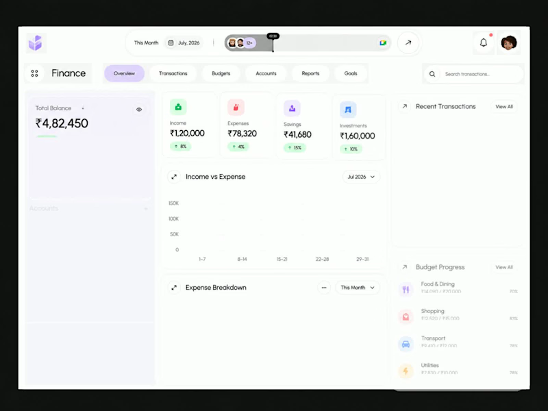
Finora — Personal Finance & Fintech Dashboard Design
A modern fintech dashboard concept crafted to simplify personal financial management through thoughtful UX and clean visual design.
The interface brings essential financial information together in one unified workspace, allowing users to monitor their total balance, income, expenses, savings, investments, transactions, and budget progress at a glance.
1
60
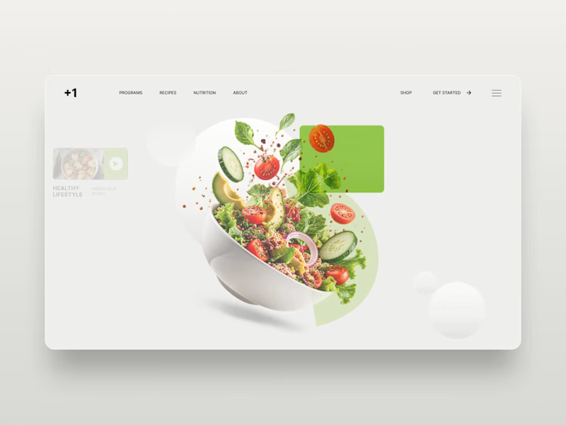
Diet Planner — Nutrition & Healthy Lifestyle Website Design
Diet Planner is a modern website design concept focused on healthy eating, balanced nutrition, and personalized meal planning.
The design features a clean editorial layout, fresh green accents, high-quality food imagery, and bold typography to create an appealing digital experience for health-conscious users.
The hero section showcases a vibrant salad composition alongside clear navigation, nutrition-focused messaging, and a prominent call to action.
1
75
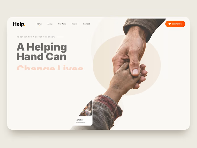
Helping Hand — Charity & Nonprofit Website UI/UX Design
Helping Hand is a charity website landing page concept created to communicate a nonprofit organization's mission and encourage people to contribute to meaningful causes.
The design uses a clean, minimal layout, warm colors, expressive typography, and authentic human imagery to build an emotional connection with visitors. Dedicated sections for education, healthcare, food assistance, and shelter make the organization's initiatives easy to explore.
Key Features:
Modern charity and nonprofit website design
Donation-focused landing page
Clear calls to action
Impact statistics and cause-based cards
Clean navigation and responsive-design direction
Human-centered visual storytelling
0
50
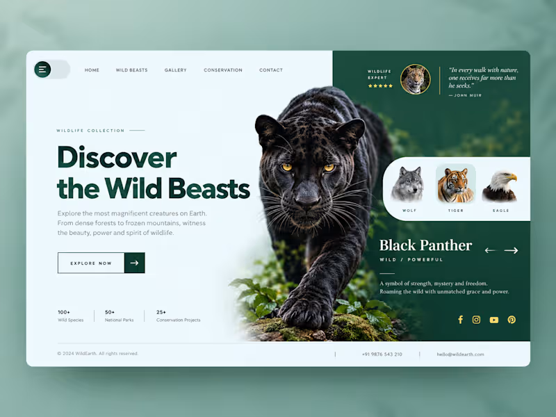
Wild Beasts – Wildlife Website UI/UX Design
A premium wildlife website landing page concept inspired by the beauty, strength, and mystery of wild animals.
The design combines a minimalist layout, immersive black panther imagery, rich forest-green colors, and elegant typography to create a visually engaging digital experience. The animal showcase section highlights different wildlife species while maintaining a clean and intuitive user interface.
9
6
516

Designer & Developer | Figma | Adobe Photoshop | Webflow
- 5.0
- Rating
- 4
- Followers
Designer & Developer | Figma | Adobe Photoshop | Webflow


Brand & Digital Experience Designer
Brand & Digital Experience Designer





Product & Brand Designer blending visual craft with UX logic
- 14
- Followers
Product & Brand Designer blending visual craft with UX logic

Milestone timeline wall I designed. 17 years of growth. 10+ acquisitions across 4 countries. All of that information had to fit on a single wall in their head office corridor, and still be readable from 10 feet away.
The tricky part with timeline designs like this is managing density.
You have 15+ logos, country flags, acquisition labels, and year markers. If you just list them linearly it becomes a spreadsheet on a wall. Nobody reads that.
So I built it around a mountain progression. Each peak represents a growth phase. The timeline flows bottom-to-top instead of left-to-right, which naturally maps to the "climbing higher" narrative. The clouds separate the visual layers so the density doesn't overwhelm.
Designed for large-format print. This sits in their main office corridor.
2
181

Designed this tent card for a hotel chain running 13+ properties. Thousands of guests interact with this card every month.
You've probably seen them in hotel rooms. Placed on your bed, asking you to reuse your sheets. Most of them look like they were made in Word.
I wanted to actually put thought into it.
The globe sitting inside a water droplet was the concept I pushed for. It does the storytelling without making the guest read a wall of text. The botanical elements tie the sustainability message in visually.
The interesting part about designing for physical spaces is that you can't A/B test it like a landing page.
It either works the first time someone picks it up, or it doesn't. So the hierarchy has to be tight. Headline first, visual second, action last.
4
3
195

Every pixel in this composition has a reason.
This is a marketing visual I built. A lot of people might see the final image and assume it's one generated output. It's not. It's manually created with layers, each one placed and blended with a specific visual hierarchy in mind.
➜ The rocket sits on its own layer with independent glow and shadow controls
➜ The cityscape is a separate depth plane with its own color grading
➜ The smoke interaction between the two is hand-masked
➜ The background gradient is tuned to push the focal point exactly where the eye needs to land first
➜ And the blue ring, signature element that defines the brand
None of this is random. You are deciding what the viewer sees first, second, and third.
AI can generate a rocket over a city in 30 seconds.
What it can't do is tell you why the rocket needs to sit 15% above of center, or why the smoke opacity drops at exactly that rate.
That thinking is the craft.
1
158


A Multi-Disciplinary designer helping growth.


UI/UX Designer & Frontend Developer
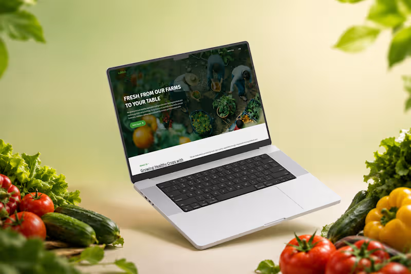
Designed a modern and responsive landing page for an agriculture brand focused on delivering fresh, high-quality vegetables through sustainable farming. The goal was to create a clean digital experience that builds trust while showcasing the company's commitment to quality, innovation, and eco-friendly farming practices.
The interface combines natural green tones, spacious layouts, engaging imagery, and strong typography to reflect freshness and authenticity. Every section is thoughtfully structured—from introducing the brand and highlighting farming practices to showcasing products, encouraging inquiries, and answering customer questions.
The design emphasizes readability, user engagement, and conversion, making it suitable for farms, organic food suppliers, greenhouse businesses, and fresh produce distributors.
0
28
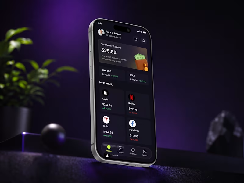
A modern and elegant crypto trading mobile app designed to provide users with a seamless investing experience. The interface combines a dark theme with vibrant accent colors to highlight key actions, market trends, and portfolio insights while maintaining excellent readability.
The design focuses on simplicity, intuitive navigation, and a clean visual hierarchy, allowing users to explore the market, monitor investments, add funds, and manage their portfolios with confidence. Every screen is crafted to create a premium user experience through thoughtful spacing, soft gradients, rounded components, and engaging 3D mockup presentations.
0
30
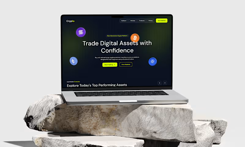
A modern and visually engaging landing page designed for a next-generation cryptocurrency trading platform. The interface combines a premium dark theme with vibrant neon green accents to create a sleek fintech experience that feels both powerful and approachable.
The design is focused on helping users explore digital assets, monitor market performance, manage portfolios, and trade with confidence. Each section is carefully structured to guide users through the platform—from showcasing top-performing cryptocurrencies and key platform benefits to highlighting mobile trading capabilities, security features, and frequently asked questions.
With a clean layout, strong visual hierarchy, modern typography, and carefully crafted UI components, this concept delivers a seamless user experience while maintaining a premium and trustworthy brand identity.
0
25
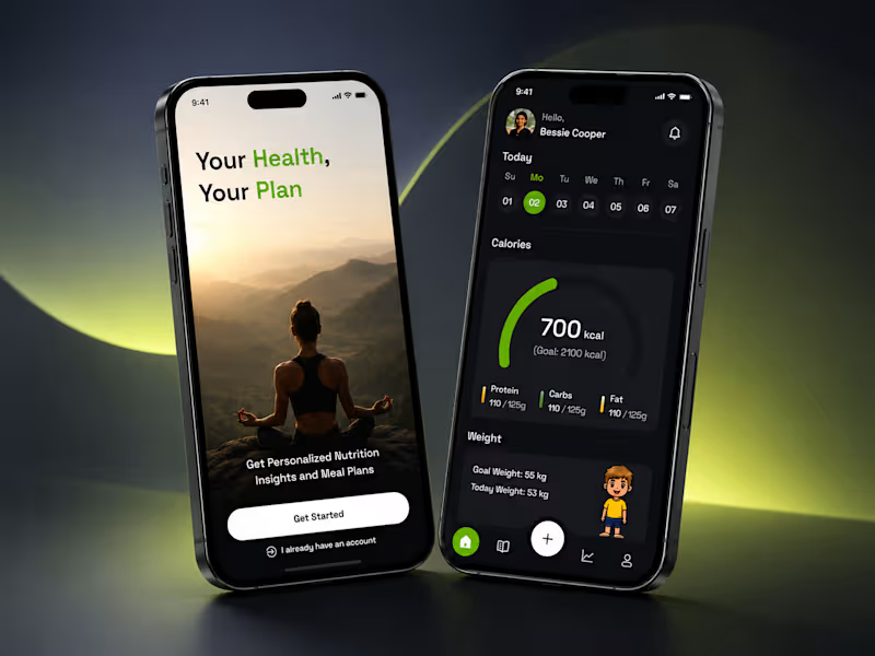
A modern nutrition and wellness app designed to help users build healthier habits through personalized meal planning and daily health tracking. The interface combines a clean dark theme with vibrant green accents to create a premium and engaging user experience.
The onboarding experience introduces the app with a calming visual approach, while the dashboard provides users with quick access to calorie tracking, nutrition goals, progress monitoring, and personalized insights. Every screen is crafted with a strong focus on clarity, accessibility, and intuitive navigation.
0
73