Dozy Oats Landing page Design

Step-by-Step Design Journey
1. Understanding the Brand Essence
Brand Identity: Captured the wholesome and cozy vibe of Dozy Oats, emphasizing natural ingredients and comfort.
Target Audience: Focused on health-conscious individuals seeking nutritious and convenient breakfast options.
2. Strategic Planning & Wireframing
Goal Setting: Aimed to highlight product benefits and drive online sales.
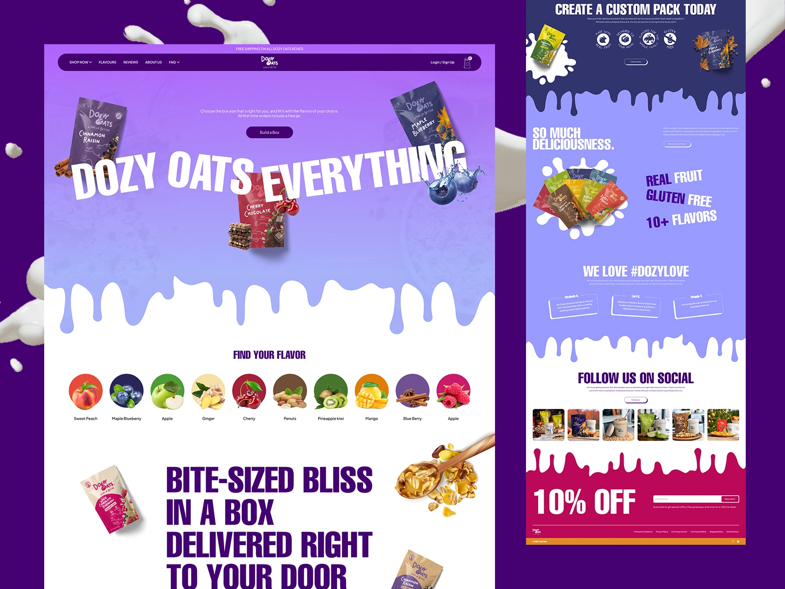
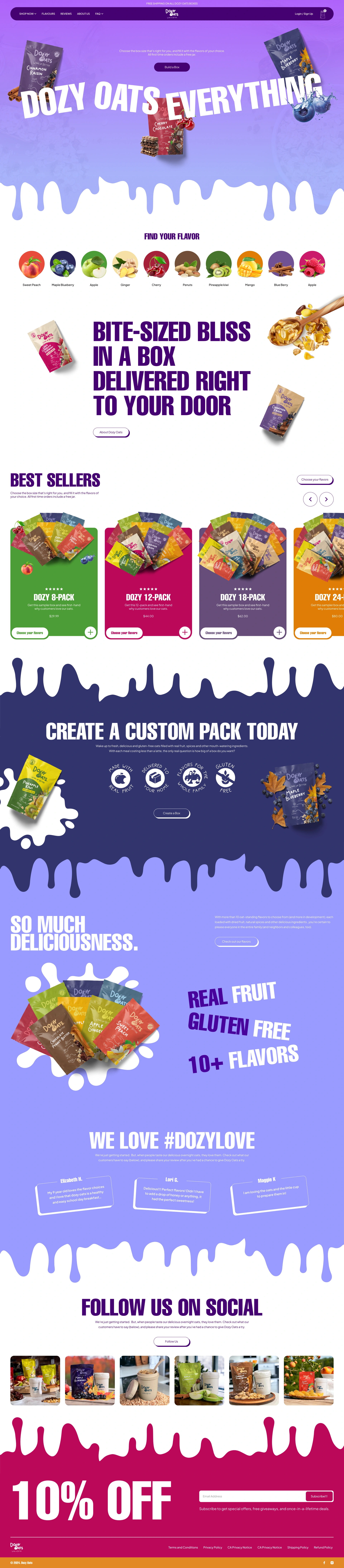
Wireframing: Designed a user-friendly layout with clear navigation, ensuring key information is easily accessible.
3. Visual Design & Aesthetics
Color Palette: Chose warm, earthy tones to reflect the natural ingredients.
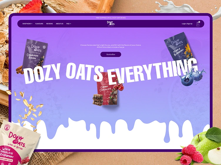
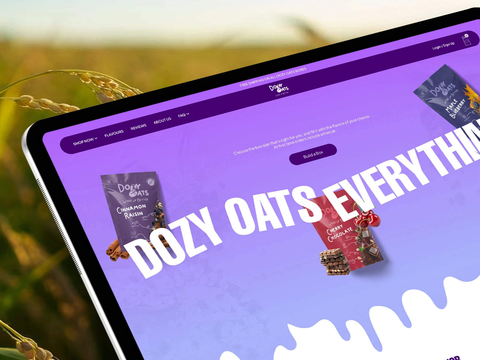
Imagery: Incorporated high-quality images of the oats and ingredients to entice visitors.
Typography: Selected fonts that convey simplicity and healthiness.
4. Development & Responsiveness
Platform: Utilized Webflow for seamless development and responsiveness across devices.
Interactivity: Added subtle animations to enhance user engagement without overwhelming the experience.
5. Testing & Optimization
Performance Testing: Ensured fast load times and smooth functionality.
User Feedback: Gathered insights to refine the design and improve user experience.
0 likes · 11 views · May 28, 2025
Dozy Oats – Your go-to e-commerce destination for wholesome, delicious oats. Landing Page Designed with the help of Figma, and Adobe illustrator.
Timeline
Apr 8, 2025 - May 6, 2025