Creating what matters, for brands with vision.
- $1k+
- Earned
- 1x
- Hired
- 5.0
- Rating
- 93
- Followers
Creating what matters, for brands with vision.
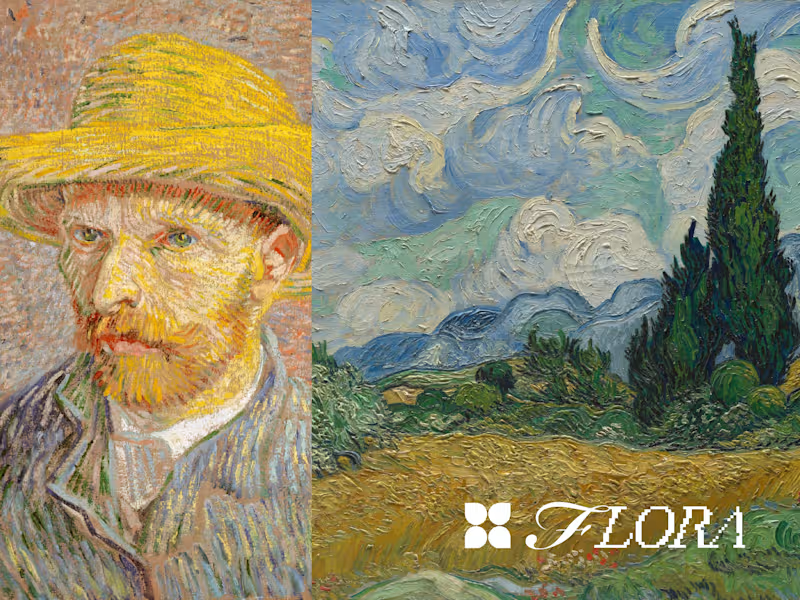
“A splash of life in a summer landscape.”
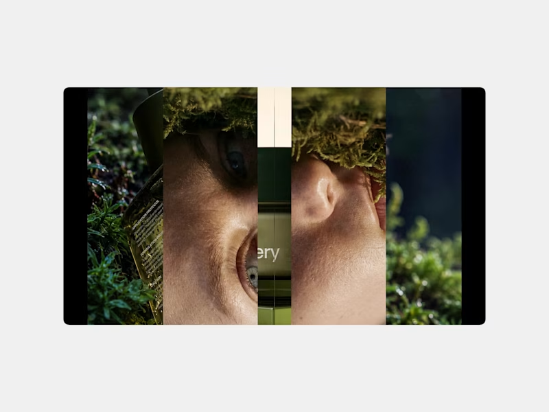
For the #FLORAMuseumChallenge, I brought together two Vincent van Gogh paintings from The Met’s public domain collection: Self-Portrait with a Straw Hat and Wheat Field with Cypresses.
https://www.metmuseum.org/art/collection/search/436535
https://www.metmuseum.org/art/collection/search/436532
I have always wondered what it would feel like for Van Gogh to step inside one of his own paintings. Not simply to visit it, but to finally live within the beauty and peace he created for everyone else.
His self-portrait shows a young artist determined to improve, even when he could not afford a model. Just two years later, he painted Wheat Field with Cypresses, which he considered one of his best summer landscapes. He described its cypresses as “a splash of black in a sunny landscape.”
That line became the emotional center of my piece. It felt like more than a description of the painting. It felt like a reflection of his life, carrying so much darkness while still creating something full of color, movement, and light.
Using Flora AI, I imagined him entering that landscape and slowly becoming part of it. A version of paradise where he is no longer restless or fighting to be understood. A place where he can finally see that his work survived, that it mattered, and that the world eventually saw what he was trying to show us.
He never received that peace or recognition during his lifetime.
This is my small way of giving it to him. 🌾
18
69
3.9K


Brand Identity & Video & Motion
THE FULL PIECE IS HERE.
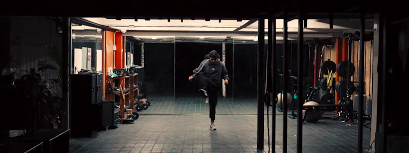
German doesn't talk about climbing the way most people do. For him, it's not a sport you practice — it's a language you learn to speak with your body. That's what we wanted to capture.
The first half is deliberate: static wide shots that hold the space, detail cuts that show the work behind the warmup. Intentional restraint before the release.
Then the fade to black.
What follows is the same athlete — same walls, same hands — but a completely different energy. The low-end of the beat dictates the cut. Movement becomes rhythm.
He ends where he started. Sitting on the wall. The logo closes it.
Shot and edited at his gym, built around his vision of the sport.
Hope you like it !
3
349
BIRRIA.
There's a version of food content that treats the dish as the star and rushes to get there. This isn't that.
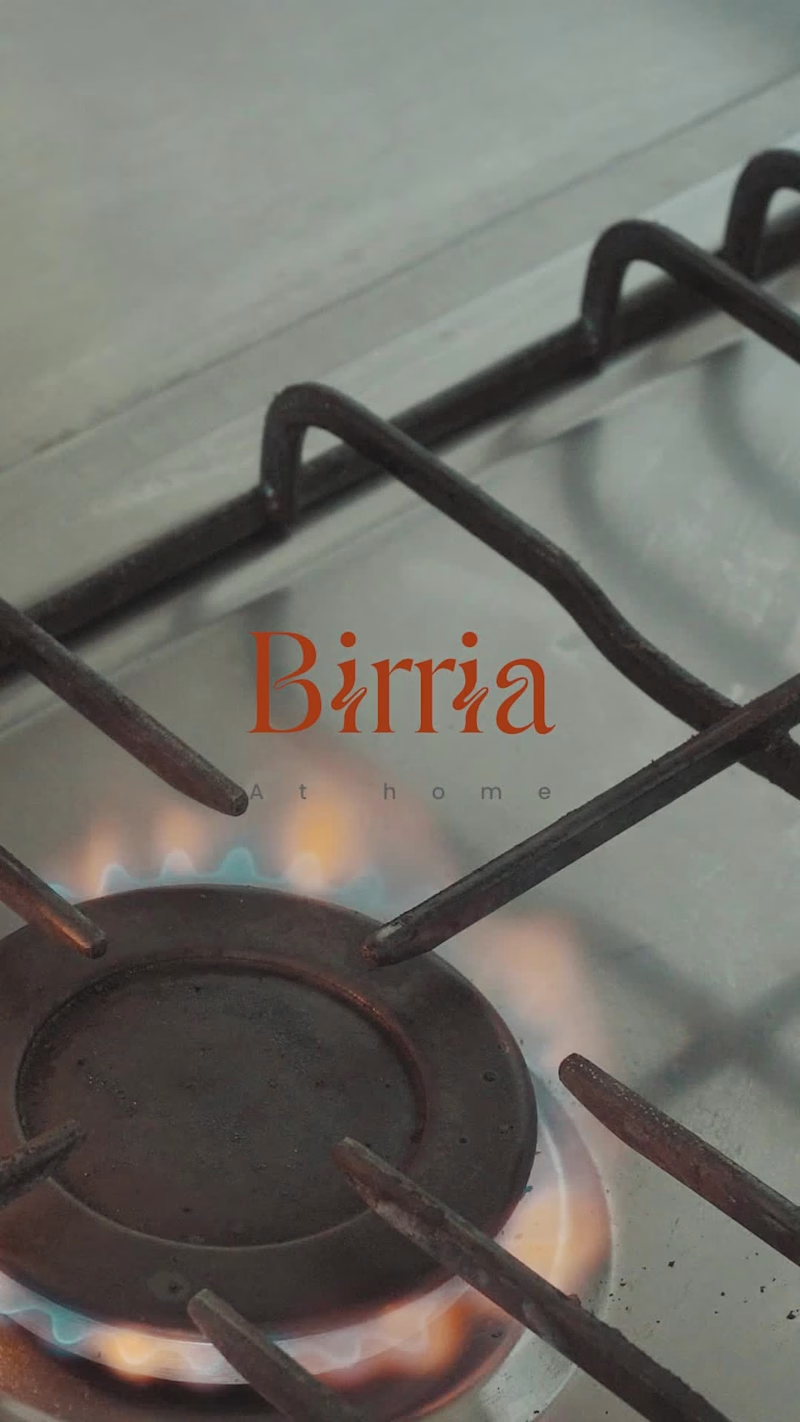
Birria is a slow process — layers of dried chiles, bones, hours of heat. The edit follows that logic. The music is slow, almost pre-Columbian, but the cuts don't drag. They move with the rhythm, not against it. Close on the clay pot. The char on the chiles. Hands working.
The result feels warm. Domestic. Like something your grandmother would recognize even if she'd never seen a camera.
Detail-first food cinematography, edited to feel like the dish tastes.
3
272

Capturing the human element behind major talent requires more than just technical execution; it demands emotional intuition. Alongside my team—Daniela Santamaria and David Salgado—we led the live content creation and event coverage for Universal Music artist Ela Tauber. Designed exclusively for her most dedicated fanbase, our objective was to break away from traditional corporate staging and deliver an authentic, raw, and intimate look at the artist. We focused on capturing her simplicity and natural essence, translating the energy of a live event into passion-driven, high-engagement content.
This project allowed us to explore a deeply human approach to live production, proving that a brand's or artist's strongest asset is their authenticity. Managing real-time asset creation under the high pressure of a live music event further refined our agility and storytelling capabilities. I am eager to connect with innovative creators and brands on Contra to bring this same level of premium, human-centric visual direction to your upcoming projects.
2
366


Senior Video Editor - VFX Artist - Animator - Generative AI
- $•••••
- Earned
- 7x
- Hired
- 5.0
- Rating
- 15
- Followers
Senior Video Editor - VFX Artist - Animator - Generative AI




B2B Meta Ads |Lead Generation |Funnels |Marketing Strategy

B2B Meta Ads |Lead Generation |Funnels |Marketing Strategy
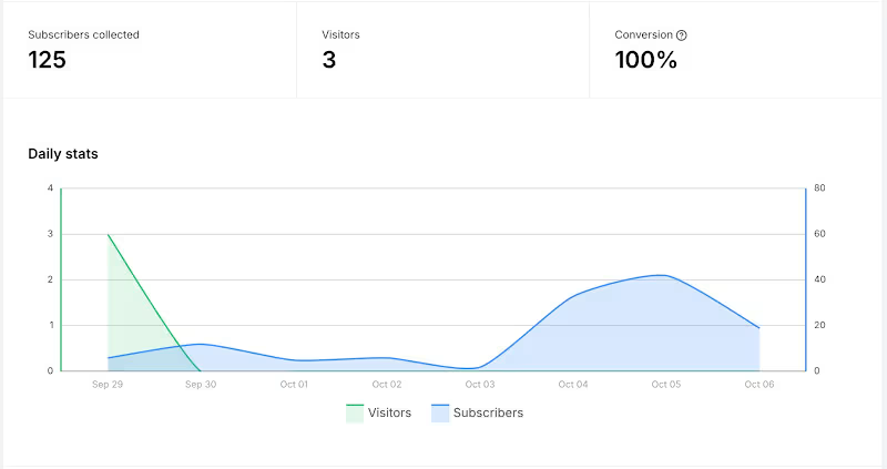
Lead Generation for a Remote-work Coach Masterclass
$36.7 Ad Spend.
90 leads from Meta Ads.
2.5 days campaign running.
Budget $15/d
Latam audience for an 8-week community program.
$0.41 CPL
The IG account is 17.3K followers + 1.2K on YouTube
11
1
368

AI Content Machine | 1 Idea → Multi-Platform Content System
My Role:
AI Content Systems Strategist
Description:
Built an AI-powered content system that turns one long-form idea into multiple assets for LinkedIn, Instagram, YouTube, email, and other channels. I designed the workflow, prompts, content structure, repurposing logic, and automation using tools like Claude, ChatGPT, Make, and APIs. The goal: reduce manual content creation, preserve the founder’s voice, and create a repeatable system for consistent multi-platform distribution.
0
83
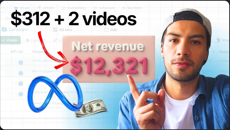


Storyteller crafting result-oriented videos for smart brands
- 25
- Followers
Storyteller crafting result-oriented videos for smart brands
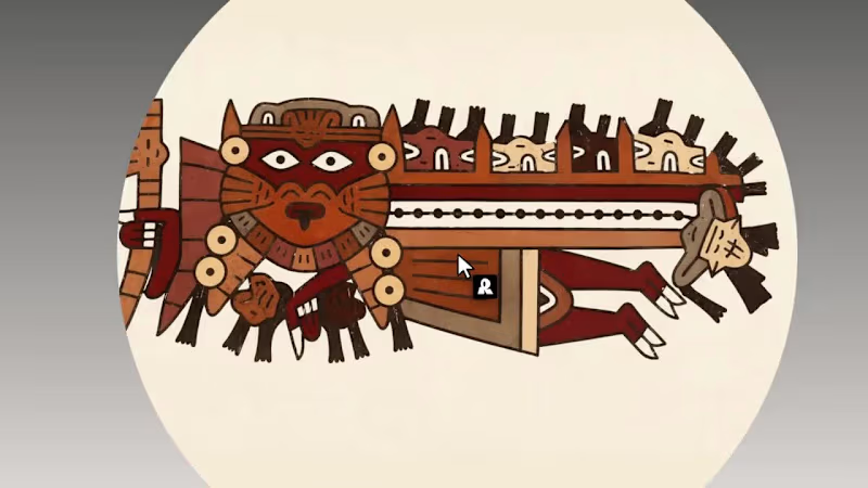
Nazca Terra Pop is a vector style, built from a single Nasca bottle painted on the south coast of Peru 1,500 years ago .
I unwrapped its flying figure, vectorized it, and grew a small world of people, animals and objects around it to train the style, keeping the original earth palette of terracotta, maroon and bone. Then I gave it real jobs: an in-flight safety guide for a made-up airline, a ten-piece collection called Everyday Problems that tells modern annoyances the way the Nasca told their myths, and a microsite (https://andresmesa.com/nazca) where the art becomes a painted tablet again like it would be 1500 years ago.
3
15
875
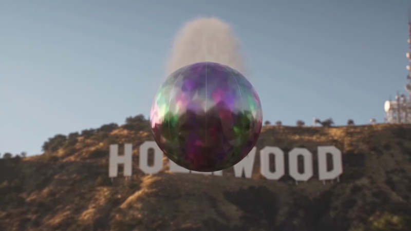
Hello, World. This video is kind of personal. I stopped making videos ten years ago. I was doing countless corporate gigs, and the whole thing started to feel tedious and soulless. I always wanted to tell stories; that's why I studied filmmaking. Discovering generative AI felt like making my first short film, and playing with it since then has opened up a world of possibilities.
So the story references different stages. The macaw is the public that's apprehensive about AI and doesn't want anything to change. The raccoon is that moment of discovery. The sacred chamber of gods is what I feel right now: both awe and fear of what AI can do, or could become. And being propelled to LA, crash-landing in the mecca of filmmaking, is the cherry on top.
Why a mango tree? (https://hollow-jetty-43am.here.now/) We have a macaw at home, and she is so protective of her mango tree. I don't think AI could ever evoke how crazy and loud she screams when an unknown person or animal gets close to it.
Made with CapCut!
#CapCutWorld #CapCutWorldLA #1000WaysToCCW
@CapCut
7
10
1.7K
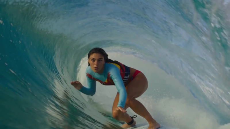
Check out a Scan to Shop transition I made with invideo for a brand I’m building, MARAUL (https://marine-tablet-hsyh.here.now/).
I wanted a promo where you feel you could pause and shop. I asked the invideo Editor agent to freeze her in the wave, lock onto the rash guard and push straight through the print. It took a few tries, but it nailed the transition, then I asked it to use it for the rest of the edits. The agent added the sound effects and the music. Oh, and the raccoon explainer was built through the invideo MCP, just from my voiceover and screencaps.
invideo Editor is amazing, and the MCP connection is one of the best I’ve tried.
invideo Editor is free to try.
Built for Agentic Effects on @Contra · @invideo.io
2
251

Product Designer and No coder


Ecommerce Designer · Digital shelf, Shopify, AI-accelerated
- 5.0
- Rating
- 16
- Followers
Ecommerce Designer · Digital shelf, Shopify, AI-accelerated

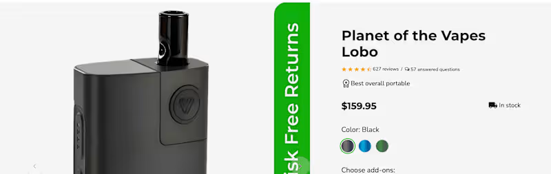
Your reviews are probably in the wrong place.
Most PDPs bury them at the bottom, after specs and shipping info. But shoppers look for proof the moment they hesitate, usually next to the price and the Add to Cart button.
Here's the layout I use on ecommerce PDPs:
Star rating + review count right under the title (tap to jump).
Two or three short snippets near the buy box that answer the top objection (fit, flavor, battery life).
Q&A right after the description, so doubts get answered before they turn into exits.
Full reviews lower down, filterable by use case.
Social proof works best when it shows up at the moment of doubt, not after it.
Where do your reviews live right now?
#Ecommerce #CRO #ProductDesign
3
145