The network for creativity
Join 1.25M professional creatives like you
Connect with clients, get discovered, and run your business 100% commission-free
Creatives on Contra have earned over $150M and we are just getting started
Back to feedPost
Try Verity is an AI-powered interview coaching platform that creates realistic interview simulations based on a candidate's actual resume and target job description.
For this challenge, I used Google Stitch as the center of a real product redesign workflow.
Instead of building a mockup from scratch, I imported screenshots from the existing product, generated redesigned interfaces, and used Stitch to transform those concepts into production-ready UI code.
My workflow:
• Existing Try Verity screens → AI redesign mockups
• Mockups imported into Google Stitch
• Stitch-generated UI and front-end structure
• Implementation and integration using Codex
• Integration into the real application
The goal was not to create a prototype, but to modernize an existing product while preserving functionality, workflows, and business logic.
The redesign covered the landing page, interview workspace, recruiter feedback experience, reporting dashboard, pricing pages, and onboarding flow.
Key improvements:
• Complete landing page redesign
• Interview workspace redesign
• Recruiter-style feedback experience
• Modern SaaS visual language
• Improved information hierarchy
• Better usability and readability
• Enterprise-grade UI patterns
Tools used:
• Google Stitch
• ChatGPT
• Codex
• Next.js
• React
• TypeScript
• Tailwind CSS
Application Web: https://www.tryverity.co/
Video Walkthrough:https://youtu.be/iITu8t9-5pw
Google Stitch became the bridge between visual exploration and implementation, allowing me to iterate much faster than a traditional design-to-development workflow.
Thanks to the Google Stitch team for building tools that make interface iteration dramatically faster.


Looks cool

😃 thanks
Pleasure

Mad props for pulling this off so beautifully.
Thanks you so much!!!

Wow, Christian, using Google Stitch for an actual product redesign workflow rather than just a standalone mockup is such a brilliant way to tackle this challenge!
Fantastic execution! I also just submitted my project for the challenge, STALL, a Swipe-to-Shop App designed to...

on.contra.com
Swipe-to-Shop App Transforming Farmers Market Experience
Connect with next-gen talent and tools to get work underway. Hire more independents. Start more projects. Get more creative.
Thanks Molly, I really wanted to show how Stitch could fit into a real product workflow rather than stopping at the mockup stage.
I'll definitely take a look at STALL. Best of luck in the challenge!

Great

App looking clean 🔥 What did you use to design your UI/UX?
Thanks! 🔥
Most of the UI/UX exploration started with Google Stitch for rapid prototyping and layout ideas. From there, I refined the experience around interview workflows, feedback panels, and candidate guidance to make it feel more like a real interview coach than a traditional...
The network for creativity
Join 1.25M professional creatives like you
Connect with clients, get discovered, and run your business 100% commission-free
Creatives on Contra have earned over $150M and we are just getting started



Related posts

Halden - Landing Page Concepts
Halden sells to grid operators, and there were two good ways to pitch it: tell them what's coming, or show them everything happening now. Rather than pick one on instinct, I designed the landing page as an A/B test so real traffic decides.
The two pages share one 12-column grid, the same section order, type system and components. Each variant changes only its message, its hero visual and its light color, so any difference in demo requests comes from the pitch and not the layout.
The work was building a system flexible enough to carry two different stories without either one feeling like the backup version.
Forecasting (act before demand spikes) vs metering (see and bill every kilowatt)
Primary metric: Demo requests from the hero CTA
4 voted
57%
3 voted
43%
7 votes
Closed

I'd pick Forecasting. "From meter reading to early action" tells a grid operator what they get in one line. Did you write both hero lines before designing the visuals?

A fresh e-commerce redesign focused on making the product experience cleaner, clearer, and easier to shop.
Really happy with how this one came together 🫧
What do you think about this visual direction? Would love to hear your thoughts!

The cleaner product layout really lets the items breathe, Ella. The soft visual direction fits a shop that wants to feel calm and easy to browse.

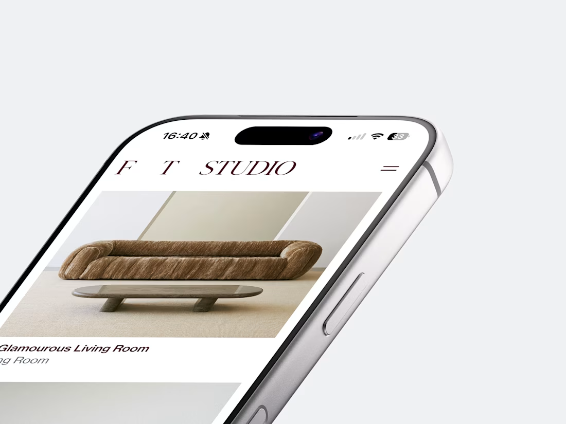
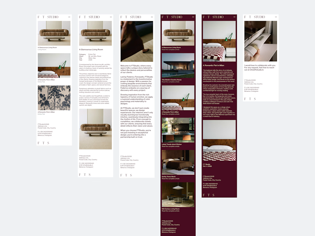
A quick preview of the Website Design created for FT Studio, Interior Design Studio by Federica Tomasello.
As familiar as UI Design may seem to us, today’s technologies are reaching such astonishing levels that they make us believe our work could easily be called into question.
But the fact that UI is subordinate to UX (warnings: human behavior), and that digital products, in turn, adhere to Branding guidelines, leads me to believe that in the coming years, true product designers - the ones made of flesh and blood and nervous breakdowns - will be hired to fix the problems with the digital products being created today.
Am I being silly?
Full case study at this beautiful link!
alessia.