The network for creativity
Join 1.25M professional creatives like you
Connect with clients, get discovered, and run your business 100% commission-free
Creatives on Contra have earned over $150M and we are just getting started
Back to feedPost
A fresh e-commerce redesign focused on making the product experience cleaner, clearer, and easier to shop.
Really happy with how this one came together 🫧
What do you think about this visual direction? Would love to hear your thoughts!

Looks amazing!

Thank you!!

To your question: the water backdrop sells "pure" in one glance, and the yellow Add to Cart pops on the blue. I'd calm the texture behind the price block a bit for readability.

The cleaner product layout really lets the items breathe, Ella. The soft visual direction fits a shop that wants to feel calm and easy to browse.
The network for creativity
Join 1.25M professional creatives like you
Connect with clients, get discovered, and run your business 100% commission-free
Creatives on Contra have earned over $150M and we are just getting started
Related posts

Designed a premium audio e-commerce storefront for VickMix 🎧
From the bold headphone hero section to product listings, audio technology highlights, and a clean product-focused layout, every section is designed to showcase the products and make browsing effortless.
What do you think of this design? Would you keep the minimalist look or make it more colorful? 👇


I'd keep it minimal. The grey palette lets the headphones do the talking.
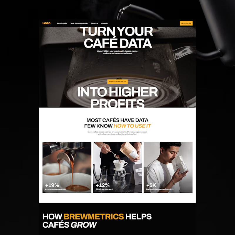
Exploring two color palette directions. Which one are you going for? 👀
13 voted
57%
10 voted
43%

23 votes
Closed

the bold gold of b is a winner by me!

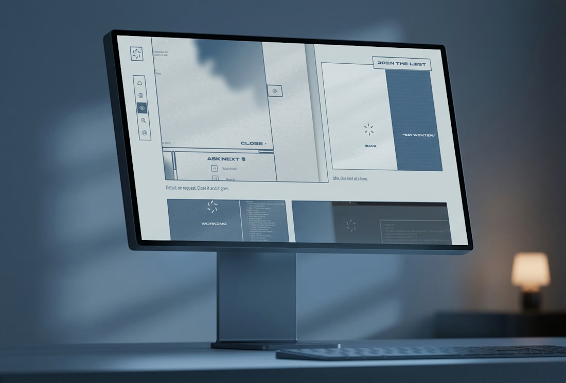
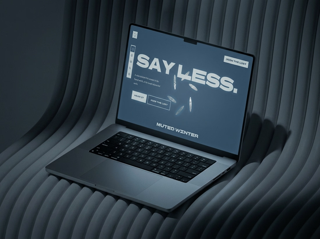
What if a website went quiet as you scrolled?
The Muted Winter site starts on bright snow and ends after midnight. Six petals open like windows, the page dims, and no line runs longer than a breath.
Live here