The network for creativity
Join 1.25M professional creatives like you
Connect with clients, get discovered, and run your business 100% commission-free
Creatives on Contra have earned over $150M and we are just getting started
Back to feedPost

UNTRUE — An interactive chord explorer inspired by Burial's album Untrue (2007).
Using Mobbin, I studied how music apps handle chord exploration and sound interaction. Two apps shaped the direction:
• Demo — for its intuitive chord selection and circular UI patterns
• Endel — for its dark, spatial, monochrome aesthetic
I combined Demo's interaction model with Endel's visual language, themed around the harmonic palette of Burial's Untrue — every chord from every track on the album, playable in your browser.
What you can do:
• Explore chords across 9 album tracks
• Tap to hear each chord with different synth presets
• Build and play your own chord progressions
Process: Mobbin research → Figma → Claude Code → test → back to Figma → rebuild. Each iteration brought it closer to a dark, tactile instrument.
Built with React + Tone.js + Tailwind CSS. Deployed on Vercel.
🔗 Try it: https://untrue.vercel.app/


The network for creativity
Join 1.25M professional creatives like you
Connect with clients, get discovered, and run your business 100% commission-free
Creatives on Contra have earned over $150M and we are just getting started







Related posts

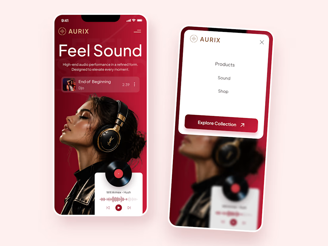
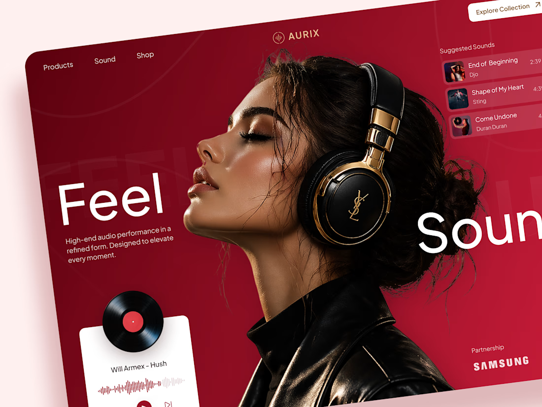
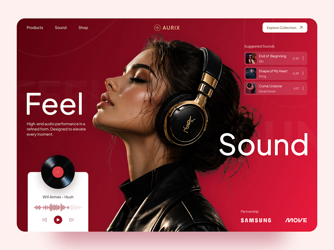
AURIX — Premium Headphones Landing Page 🎧❤️
A bold landing page concept for a premium audio brand, combining luxury headphones, music, and a strong lifestyle aesthetic
The design brings together deep red tones, elegant black and gold details, oversized typography, and immersive lifestyle imagery to create a modern, fashion-inspired experience
Special attention was given to:
• Bold lifestyle-focused hero composition
• Rich red and gold color palette
• Clean, oversized typography
• Music player and suggested tracks
• Premium product presentation
• Responsive mobile experience
• Minimal navigation and clear CTA
The result is a stylish, immersive landing page that connects premium audio with fashion, music, and everyday lifestyle ✨


Love the style!


Check it out
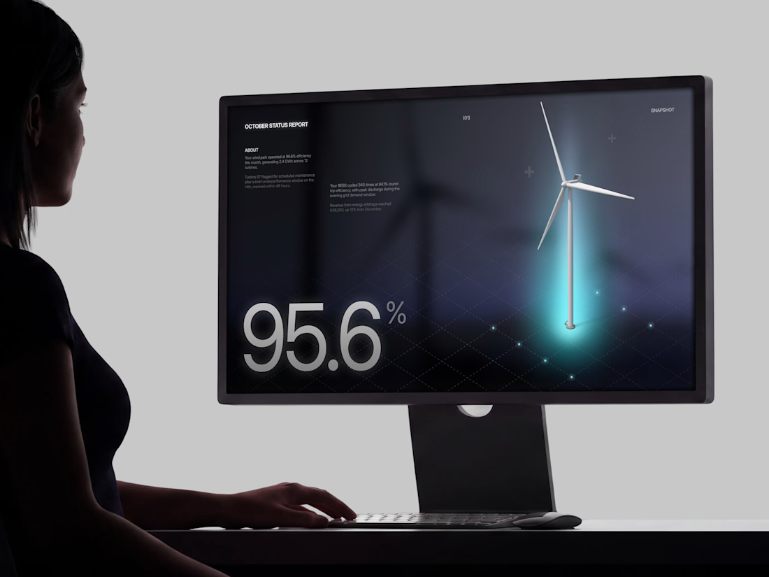
Just published: 0-1 design for an Energy Management System (EMS) ⚡
Designed a desktop platform monitoring wind turbines, PV parks, and battery storage across multiple sites. Keeping the interface mostly white, so green and red status indicators do the talking.
Operators managing critical infrastructure need to assess system health instantly. No visual noise, no cognitive overload. Just unmistakable state communication.


Cool work 👌

NEOL. Making of the Hero
NEOL develops CuGlide™, a copper-based lubricant technology that reduces wear between metal parts.
I recently designed their website. The hero was the hardest part: two gears in contact, with a thin copper film where they meet. That's why I built it in 3D instead of generating it: AI video can't give that level of control and precision.
From the first draft to the live site.


Sleek work!