The network for creativity
Join 1.25M professional creatives like you
Connect with clients, get discovered, and run your business 100% commission-free
Creatives on Contra have earned over $150M and we are just getting started
Back to feedPost
Taste Test

Halloween is the one night a year dark patterns are on theme.
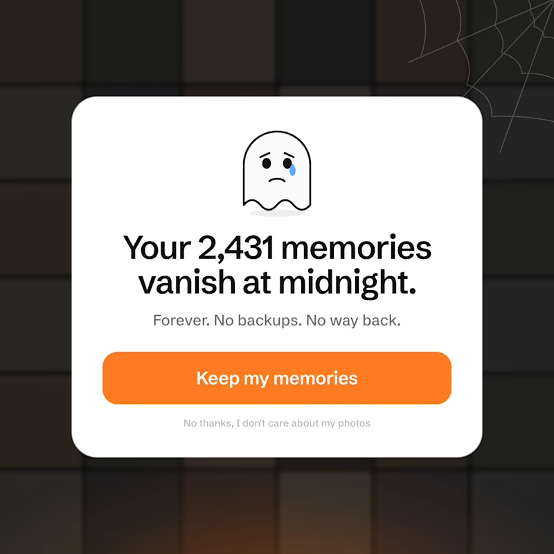
Built two cancel screens for a concept photo app in code with Claude Code. Same plan, same customer about to leave. Which one keeps more of them, A or B?

2 voted
25%

6 voted
75%
8 votes
Closed

the guilt trip

Clean exit, always.

B for retention. The 2,431 memories line hits harder than a plain button. A is the one I'd feel better about as a user though.

A: It’s clean and transparent, letting users download their photos. Simple and straight to the point.
B: Flashy, begging, desperate. Make the cancel action more prominent. By prominent I mean giving its text color the same orange as the surface action.
C: The visuals of B, but with the ability to export the photos, as in A.
The network for creativity
Join 1.25M professional creatives like you
Connect with clients, get discovered, and run your business 100% commission-free
Creatives on Contra have earned over $150M and we are just getting started





Related posts

two brands, one tiny taste test.
would you rather look through an Oriel or answer a Calling?
winner gets the full brand. reply with your pick.
35 voted
85%
6 voted
15%
41 votes
Closed

The biggest misconception about branding is thinking it's just a logo. What actually saves founders time and money later is a compact system a focused 2–3 color palette and clear sub-brand rules so every new deck, social post, or product launch looks cohesive without starting from scratch.

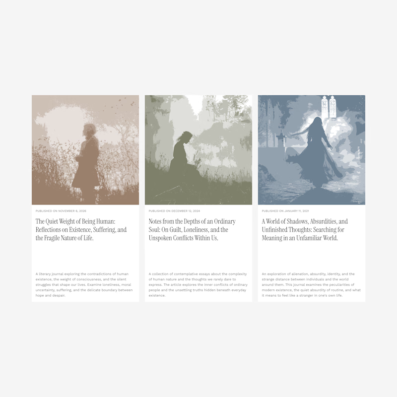
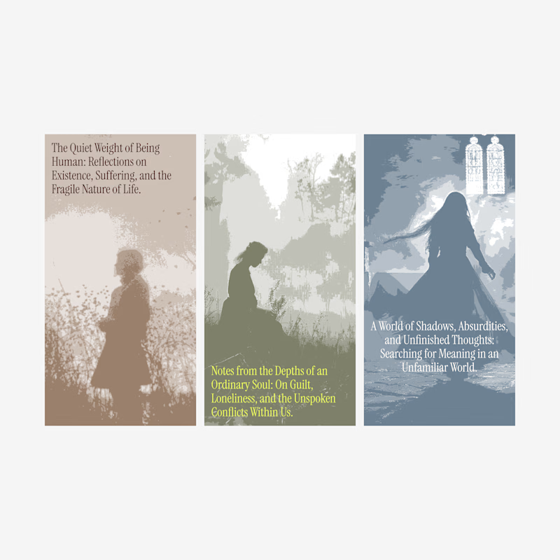
Blog card design.
Which one of these looks better?
1 voted
7%
13 voted
93%
14 votes
Closed

Exploring a few different hero directions for Frame 18.
Which one would you go with, A or B, and why?
Would love to hear your thoughts before I finalize the design!
#webdesign #uiux #framer #websitedesign #designfeedback
9 voted
50%
9 voted
50%
18 votes
Closed
A for me. The portrait grid shows the range of work right away, though B has the stronger first impression.