The network for creativity
Join 1.25M professional creatives like you
Connect with clients, get discovered, and run your business 100% commission-free
Creatives on Contra have earned over $150M and we are just getting started
Back to feedPost

Redesigned my AI interview platform, Try Verity, using Google Stitch as the center of the workflow.
Instead of starting from scratch, I imported existing product screens, generated redesigned interfaces, and used Stitch to transform those concepts into production-ready UI that was later integrated into the real application.
The project included:
• Landing page redesign
• Interview workspace redesign
• Recruiter-style feedback experience
• Improved information hierarchy
• Enterprise SaaS UI patterns
• Modern AI product aesthetics
Built with Google Stitch, Codex, React, Next.js, TypeScript and Tailwind CSS.
#stitchchallenge #googlestitch #uiux #saas #webdesign #frontend #reactjs #nextjs #typescript #ai


The network for creativity
Join 1.25M professional creatives like you
Connect with clients, get discovered, and run your business 100% commission-free
Creatives on Contra have earned over $150M and we are just getting started



Related posts


A bold, modern landing page for a creative agency, built around immersive visuals and strong typography. We’d love to hear your thoughts!


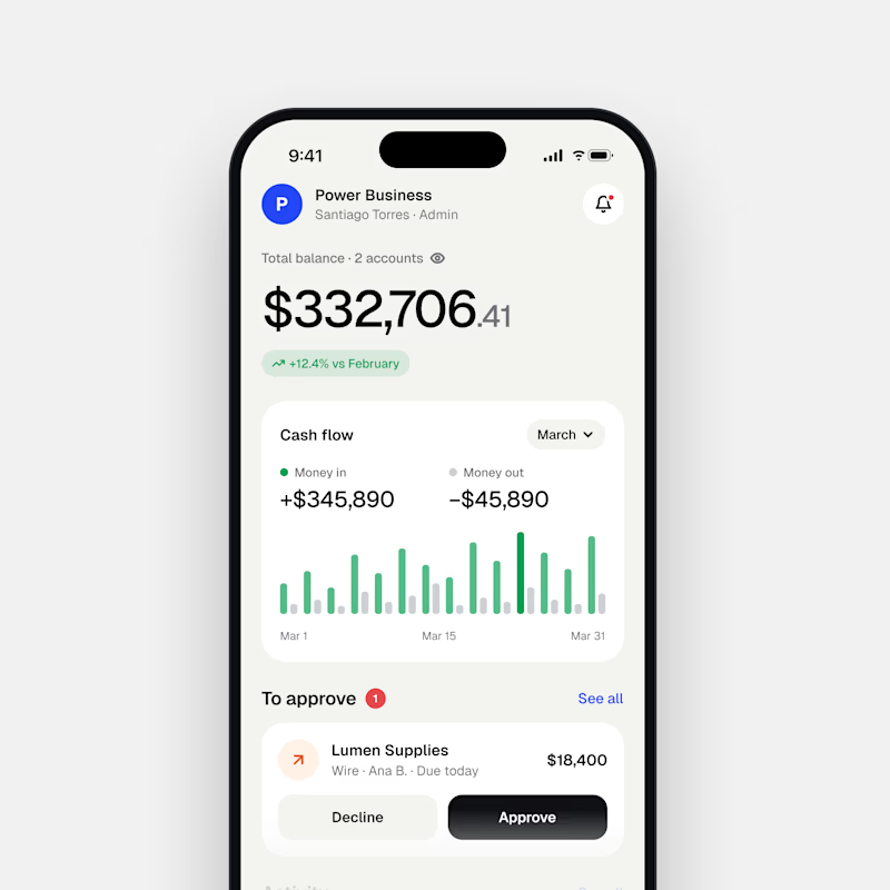
Dark Mode 🖤 or Light Mode 🤍?
Which one matches your vibe? 👀
15 voted
54%
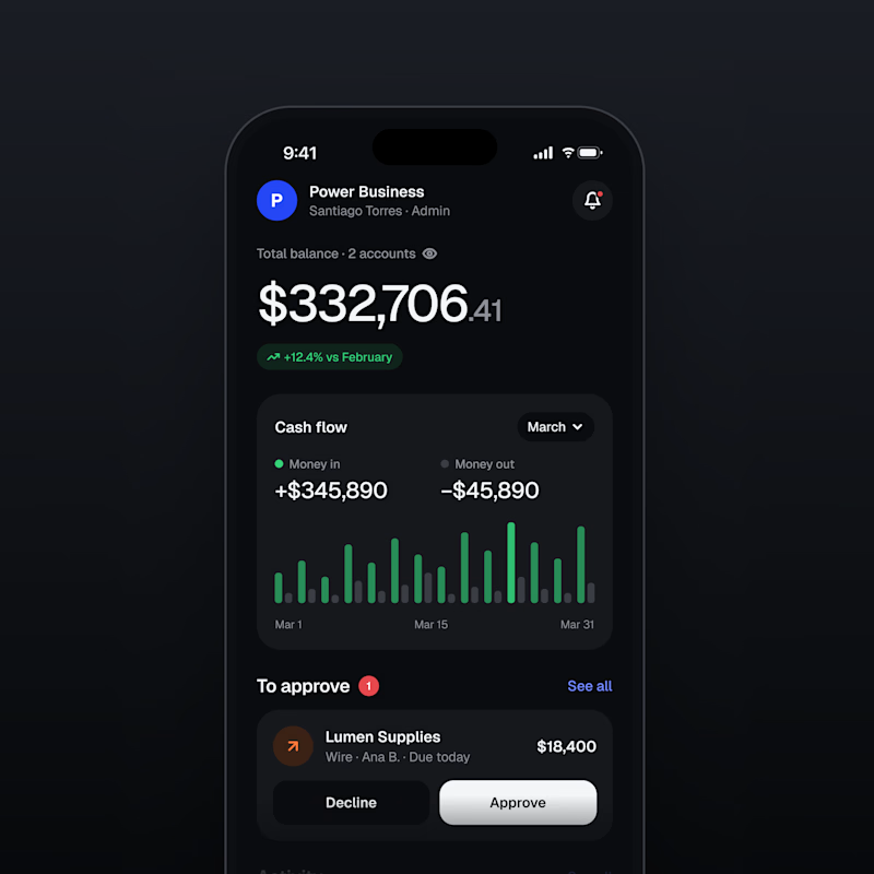
13 voted
46%
28 votes
Closed

Both are nice clean designs...for me,Dark mode!


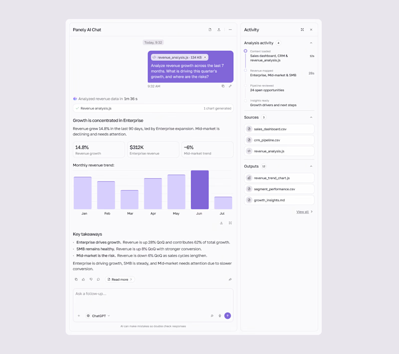
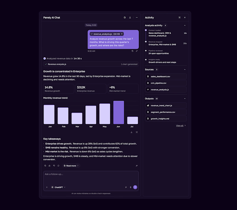

I'd pick Light for an analysis tool, the charts and sources read better on a pale surface and the violet bars still pop. Dark works as the night option. Is the sources panel on the right open by default?


