Web & Product Design Agency for SaaS Companies & White-Label


Web & Product Design Agency for SaaS Companies & White-Label




We bring ideas to life. UX/UI, Branding, and Development
- $5k+
- Earned
- 4x
- Hired
- 5.0
- Rating
- 19
- Followers
We bring ideas to life. UX/UI, Branding, and Development

Visual Branding Designer

The latest visual exploration for Croissant Bakery, I tried using Pop color, Raw style illustration and minimalist layout.
What do you think? Full visual case study on my contra profile 👀
Maybe you have same exploration just drop on reply!
1
2
482


My team and I have recently been conducting visual exploration regarding the contractor brand. The approach taken here is to use bold lines that are synonymous with a contractor's work.
In addition, the use of yellow and black as contrasting colors can make Aro eye-catching and more recognizable outdoors.
What do you think, contractor people? Perhaps you have some input and feedback on what we have done.
6
5
556

Design, build, and elevate your brand
- 1x
- Hired
- 5.0
- Rating
- 16
- Followers
Design, build, and elevate your brand
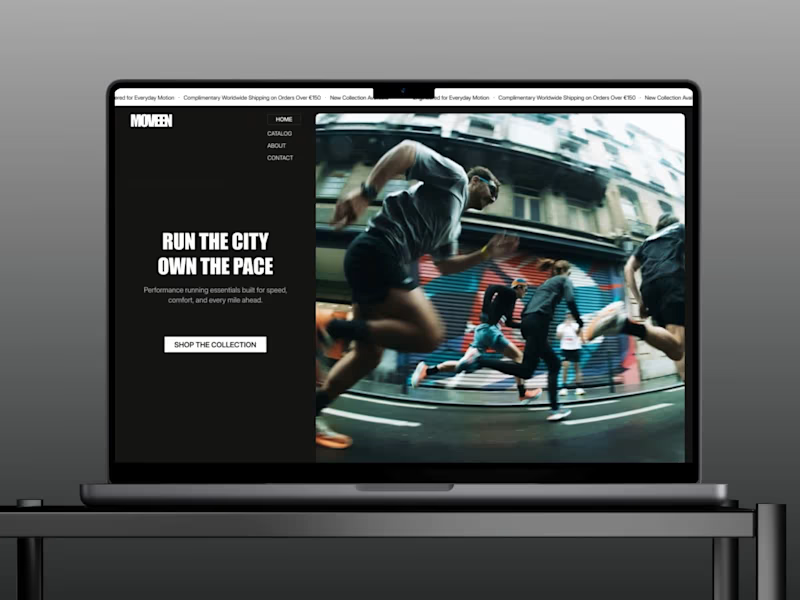


Crafting visuals that make your brand standout
- $1k+
- Earned
- 2x
- Hired
- 18
- Followers
Crafting visuals that make your brand standout


Strategic Creative Partner for Digital Growth
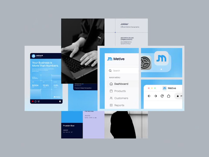



Crafting scalable, conversion-focused design for your brand
- 8
- Followers
Crafting scalable, conversion-focused design for your brand


Most B2B SaaS companies struggle with one major thing: their marketing looks completely disconnected from their actual product.
I wanted to solve that with this conceptual project for Aegis, an AI cybersecurity platform. My goal was to build a seamless bridge between product UI and growth marketing.
First, I designed a dark mode dashboard focused on data clarity and high trust. Then, I pulled those exact UI components into the Meta and LinkedIn ad creatives.
Why? Because technical buyers like IT Directors do not want to see generic stock photos of hackers in hoodies. They want to see exactly how the software solves their problem before they ever book a demo. When your ads look and feel like an extension of a premium product, conversion rates go up.
Swipe through to see the dashboard UI and how it translates into a full social media campaign. Let me know what you think of the dark mode execution in the comments!
#SaaSDesign (https://www.linkedin.com/search/results/all/?keywords=%23saasdesign&origin=HASH_TAG_FROM_FEED) #B2BMarketing (https://www.linkedin.com/search/results/all/?keywords=%23b2bmarketing&origin=HASH_TAG_FROM_FEED) #UIDesign (https://www.linkedin.com/search/results/all/?keywords=%23uidesign&origin=HASH_TAG_FROM_FEED) #GrowthDesign (https://www.linkedin.com/search/results/all/?keywords=%23growthdesign&origin=HASH_TAG_FROM_FEED) #CreativeStrategy (https://www.linkedin.com/search/results/all/?keywords=%23creativestrategy&origin=HASH_TAG_FROM_FEED)
0
196

Aegis is a conceptual B2B cybersecurity brand designed to showcase end to end digital asset creation. The objective was to translate complex AI cybersecurity features such as predictive threat modeling and automated incident response into digestible, high-converting visual assets tailored for enterprise IT directors. I intentionally focused on a clean, minimalist, and professional design aesthetic over a crowded layout, as this streamlined visual language builds the immediate trust and authority required in the high-stakes enterprise tech space.
0
224


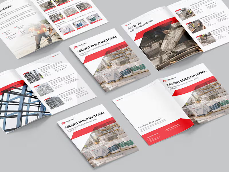
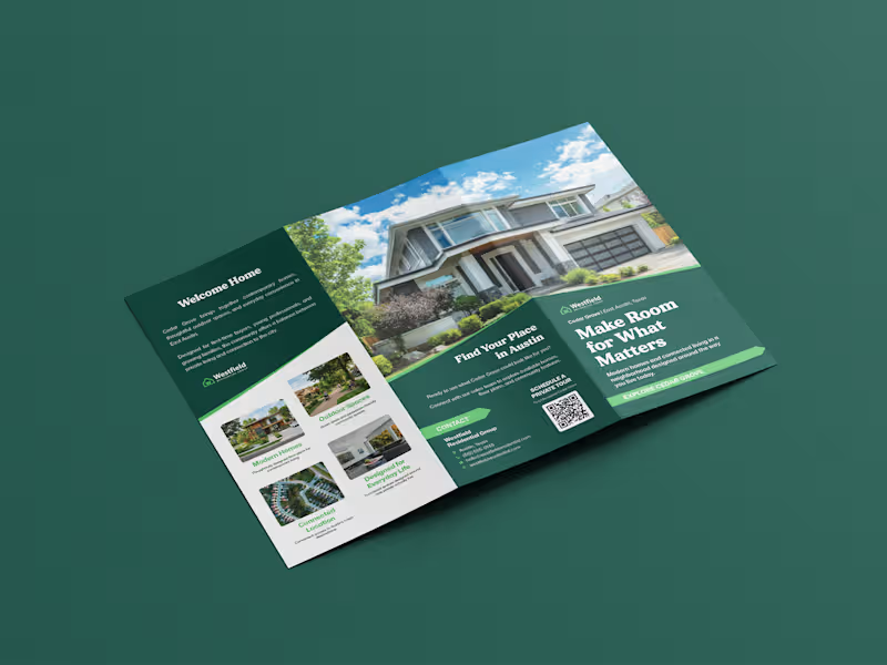
Specializing in brochure, company profile & product catalog
Specializing in brochure, company profile & product catalog
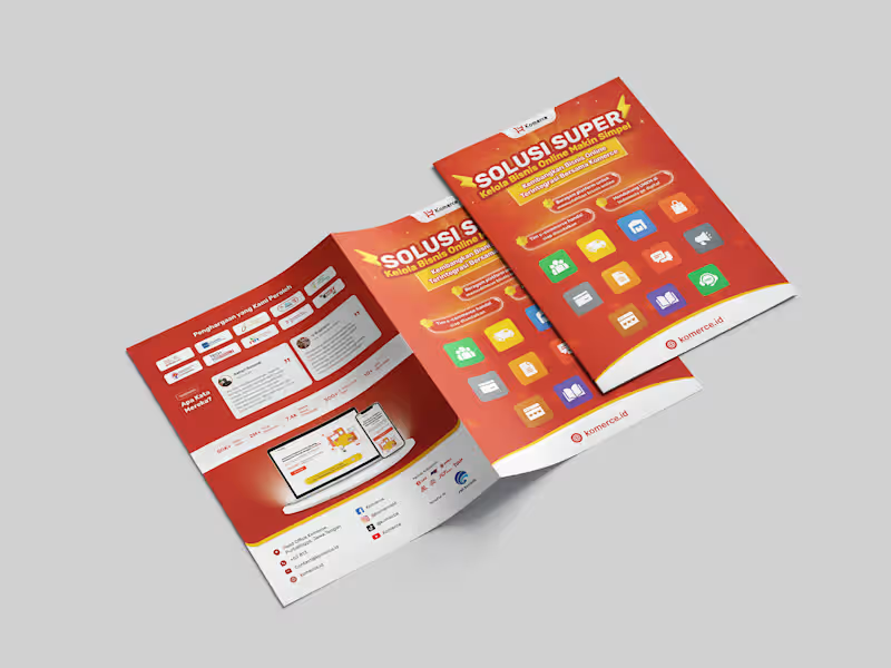
Company Profile Bi-Fold Brochure Design | E-commerce Enabler Business
A modern bi-fold brochure for an e-commerce business solution company to present its products, services, and business value in a professional and engaging format.
The brochure emphasizes clear information hierarchy, clean typography, and strong visual branding to help potential customers quickly understand the company's offerings.
0
31