
Arvela Organic Skincare
Brand Identity, Packaging, Visual System
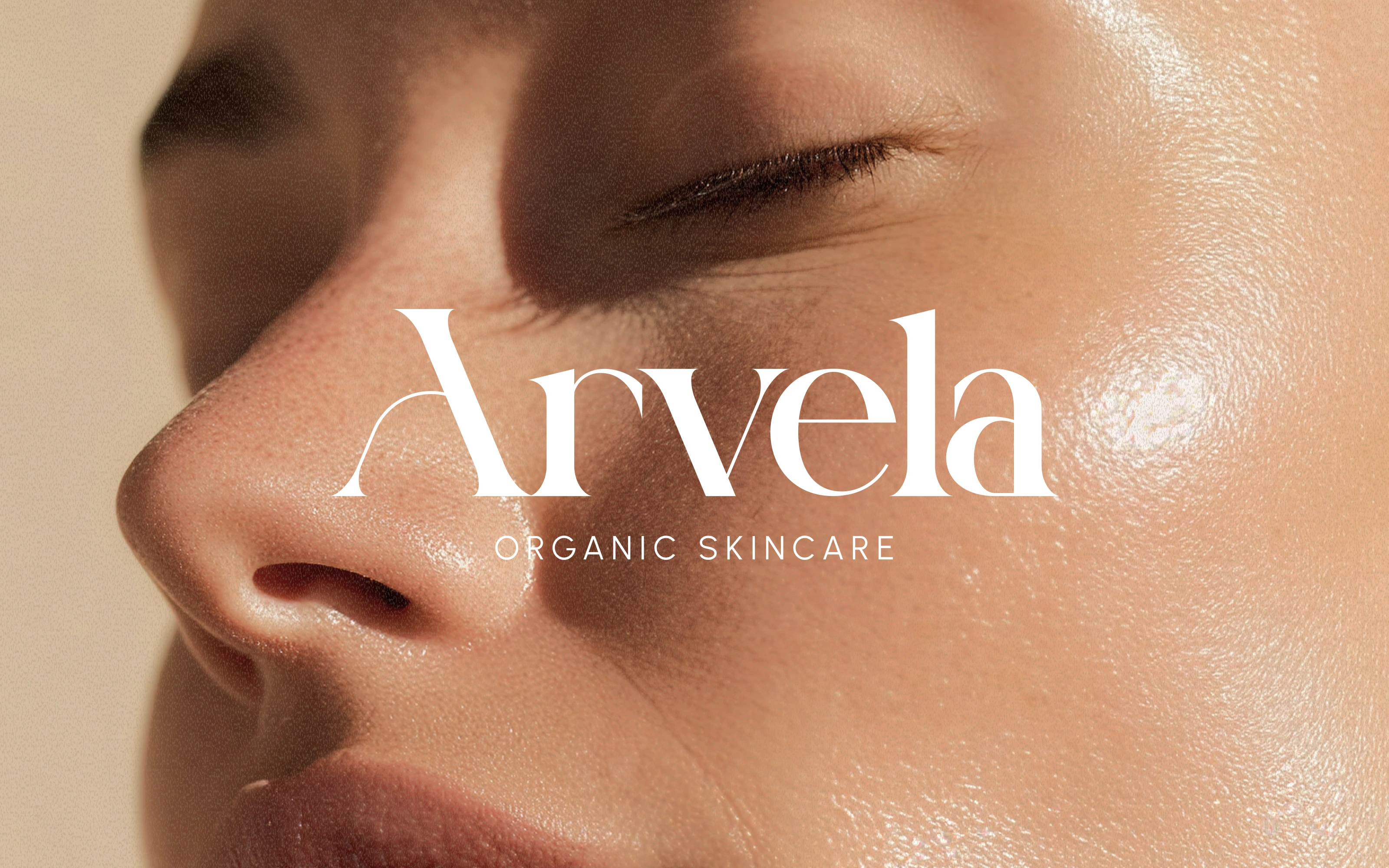
Arvela is an organic skincare brand built around one belief: clean ingredients and elevated experiences are not mutually exclusive. The challenge was standing out in a space where most brands look identical — white backgrounds, green accents, safe sans-serifs. Arvela needed a visual identity that could signal "natural" without looking like every other natural brand on the shelf.
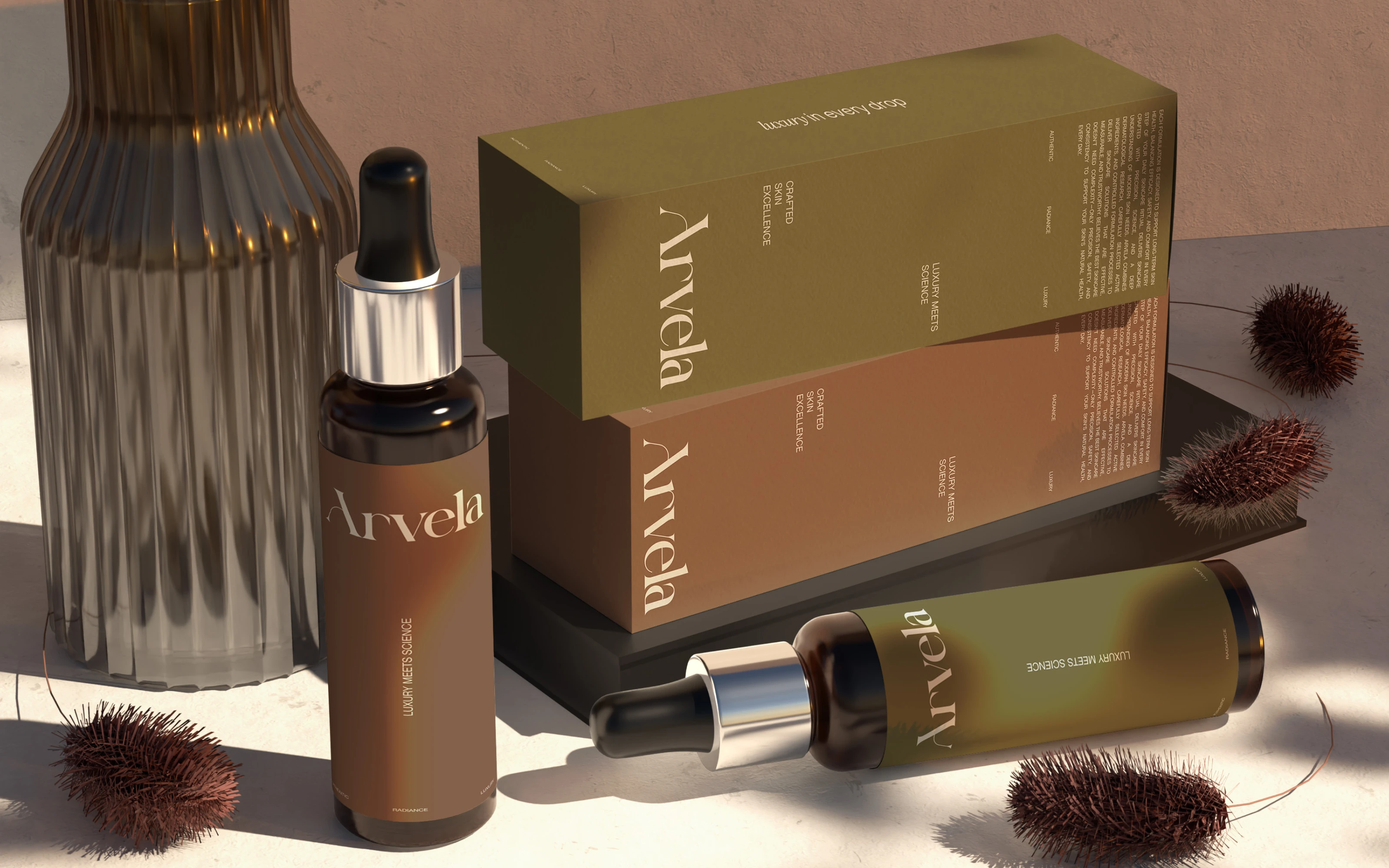
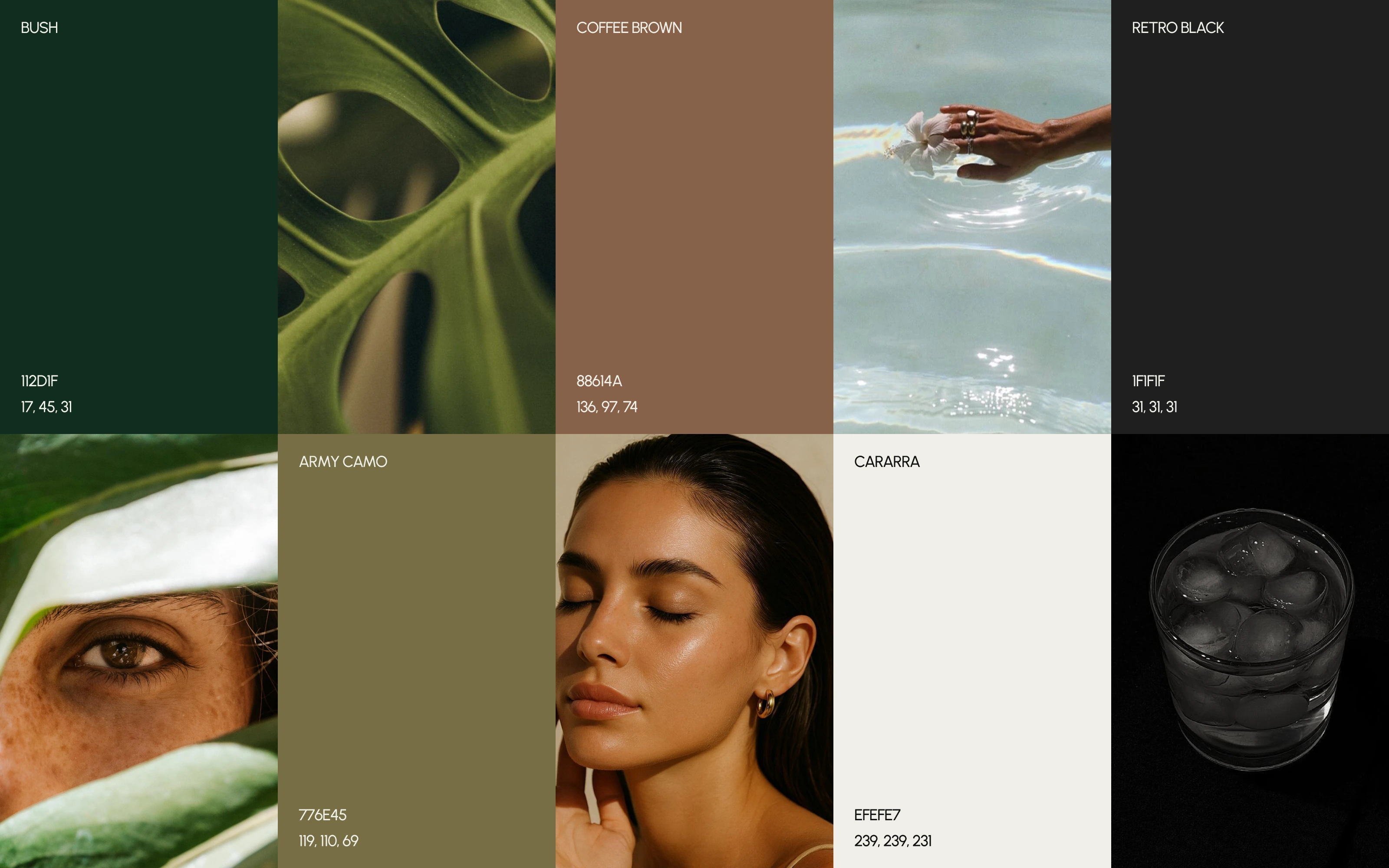
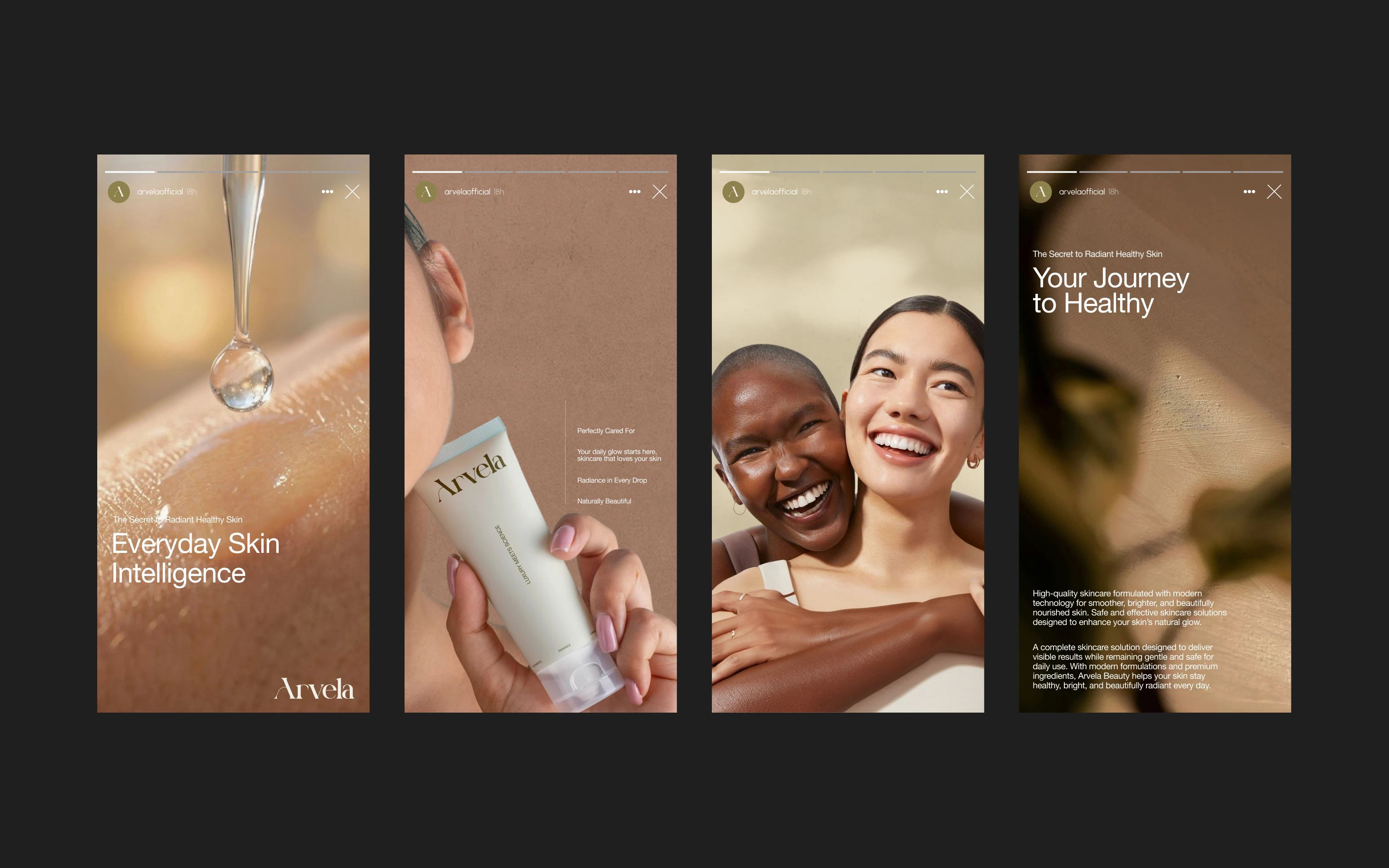
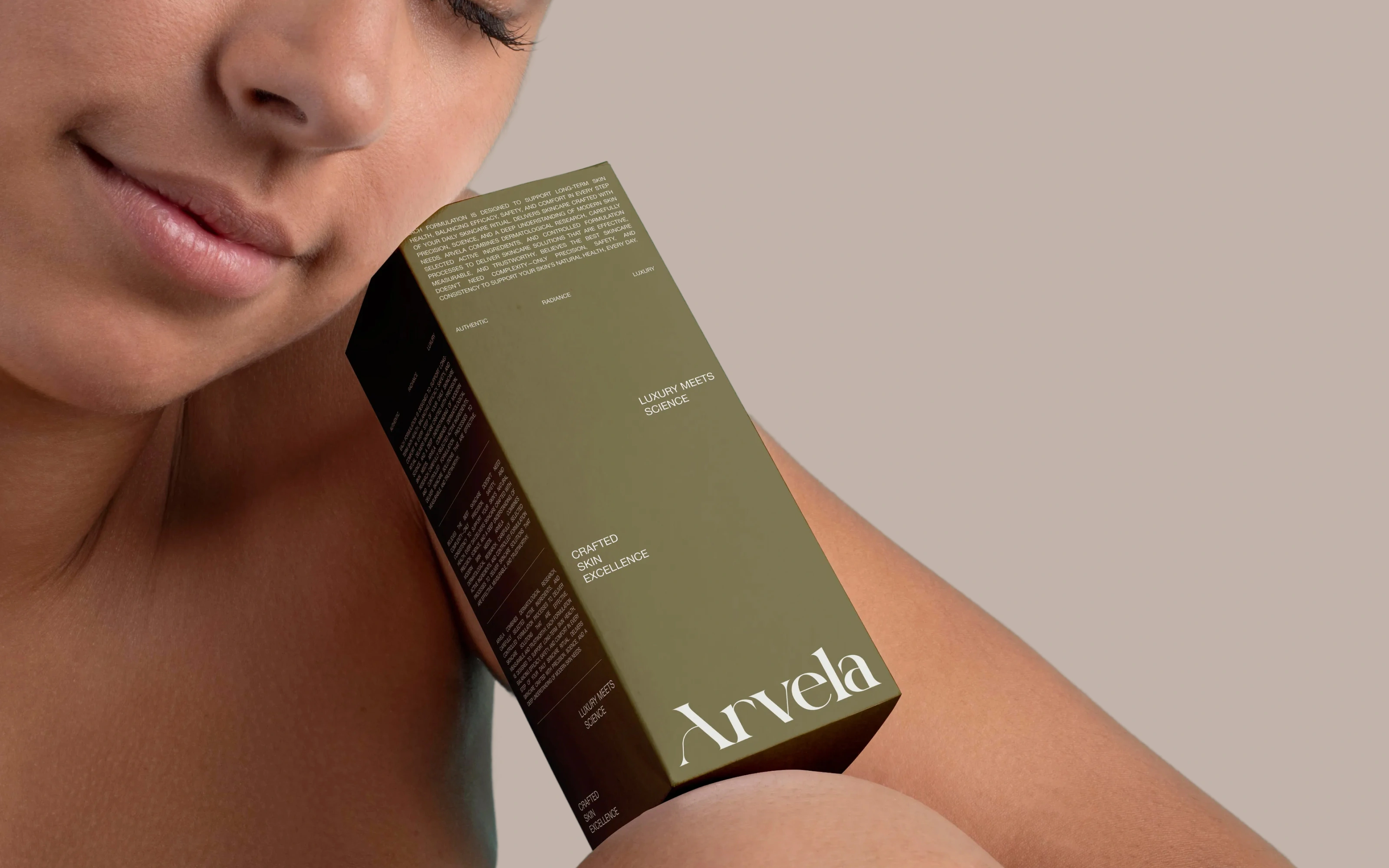
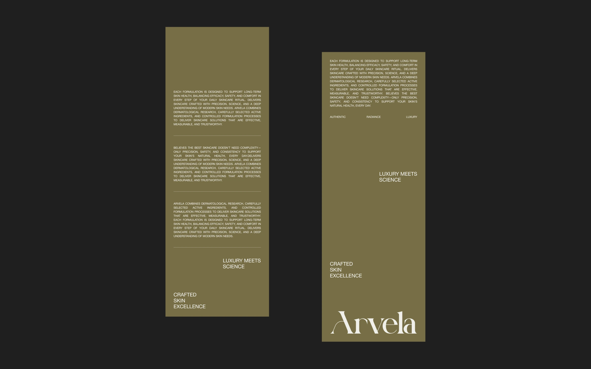
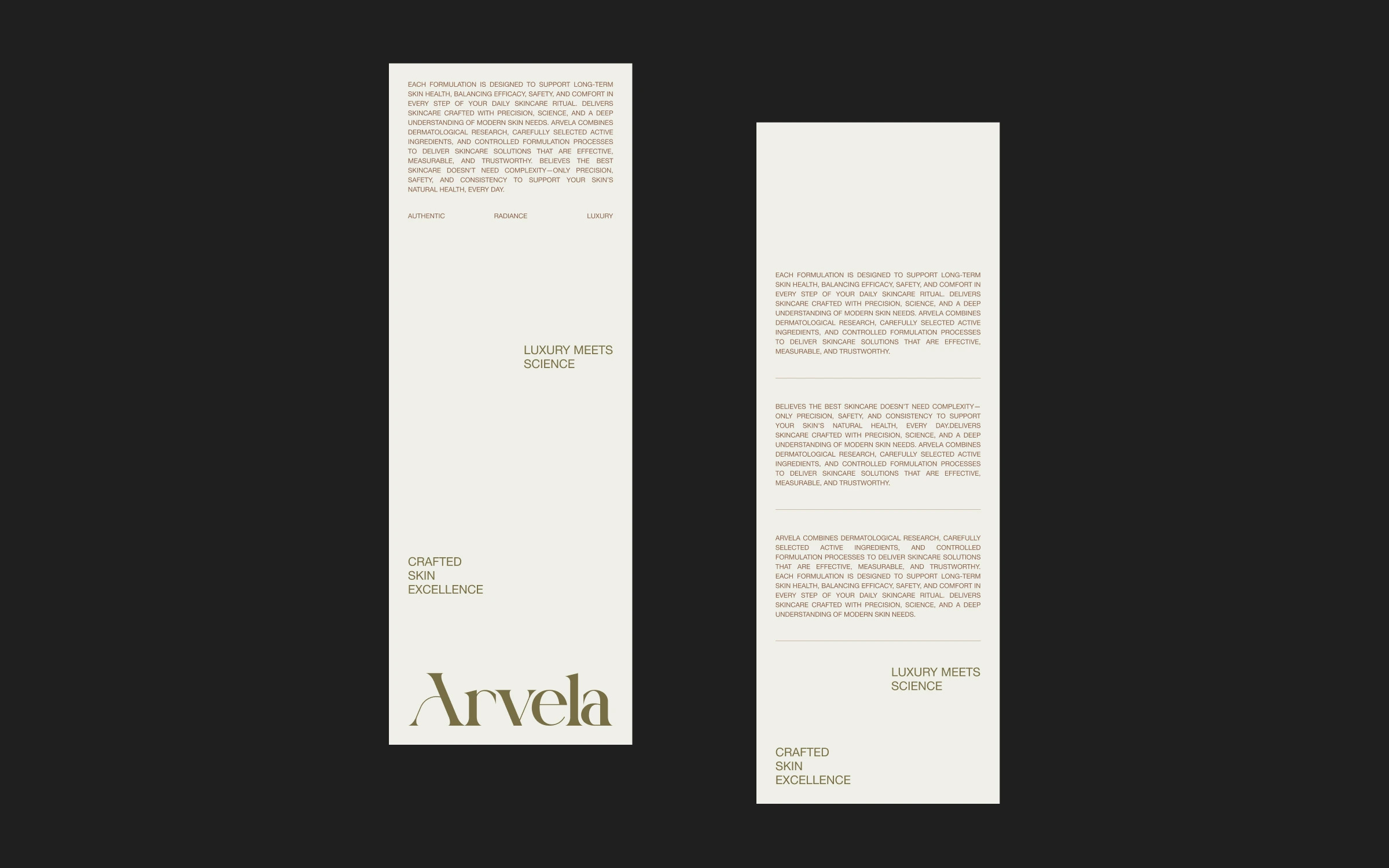
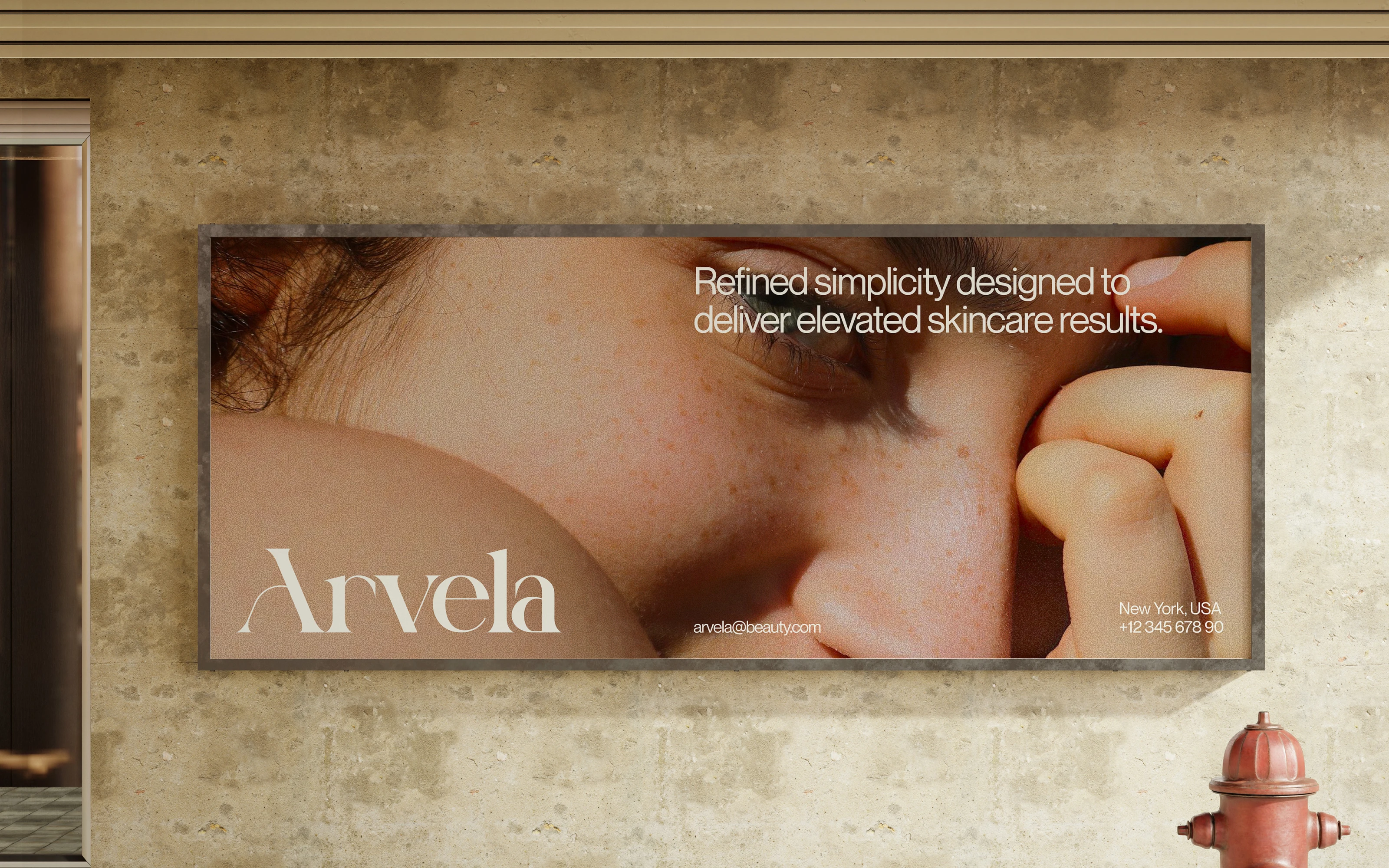
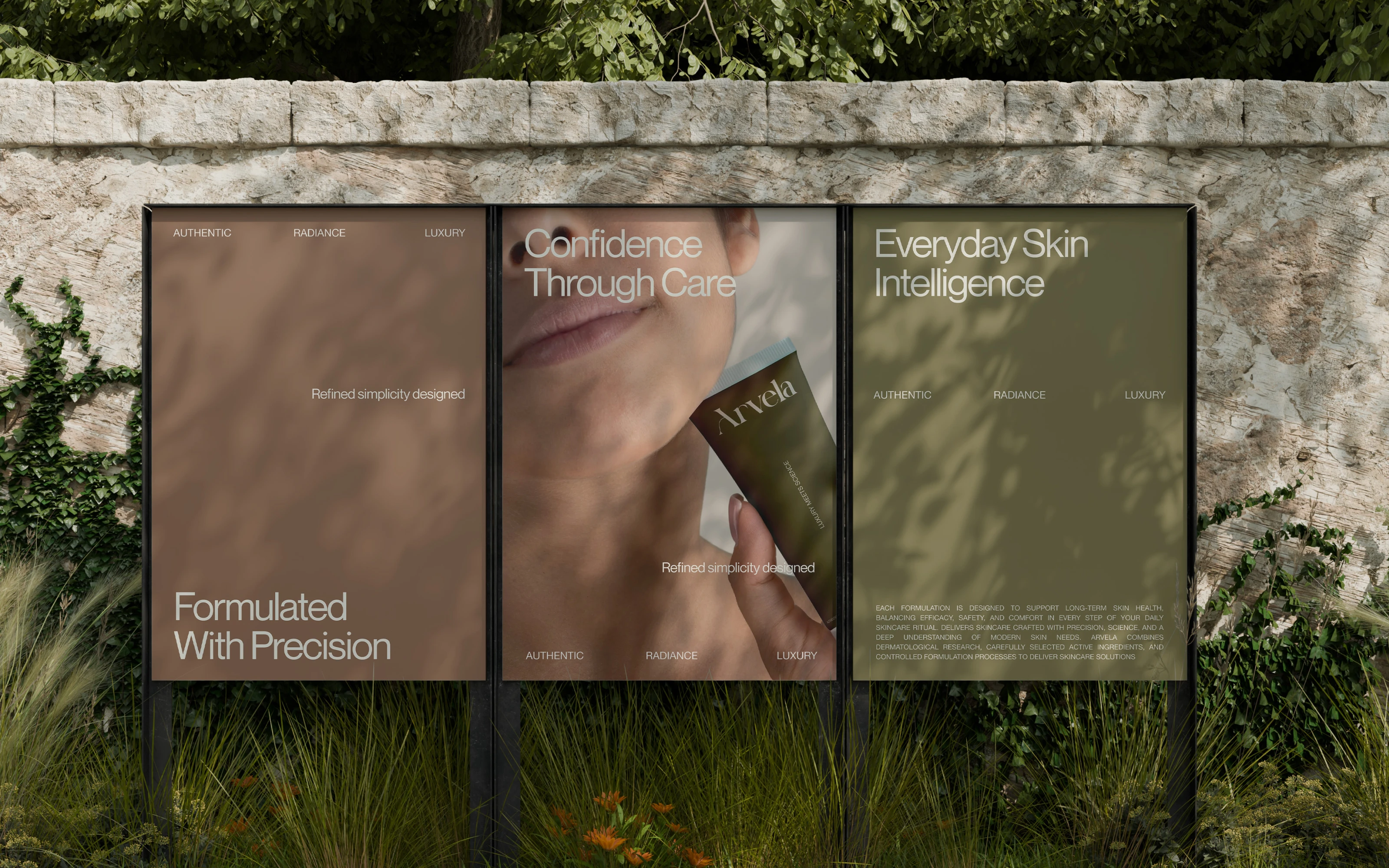
The concept we built around was Refined Nature. Organic does not have to mean rustic. The palette draws from earth without being literal: army green, warm coffee brown, soft cream, near-black. A high-contrast serif wordmark anchors the system, bringing weight and sophistication without overcrowding the layout. Photography direction leaned into texture and honesty, real skin and natural light, because the brand needed to feel trustworthy, not just beautiful.
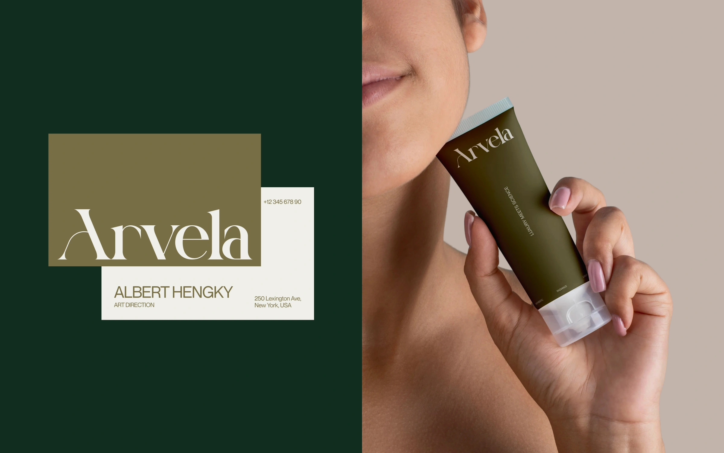
The final system covers brand identity, stationery, product packaging, billboard applications, and social media content. Every element was designed to hold up at scale and up close, from a label on a tube to a full outdoor placement. Arvela came in with a strong product story. We made sure the visuals could tell it.
©2026 - Arvela - Organic Skincare
©Habito Studio
All rights reserved 2026
Creative Director : Faza Dzikrulloh
Art Director : Islahul Khaq
Branding Designer : Zahran Raihan
Visit Our Website | Instagram
1 like · 13 views · Sep 4, 2026
Created a unique brand identity and packaging for Arvela Organic Skincare.

