Osuika Beverage - Packaging Redesign
Raull - Habito Design
Osuika is a modern sparkling fruit soda brand targeting young consumers who seek refreshing experiences with bold flavors and visually engaging product design. In a saturated beverage market, the brand needed a visual identity that not only stands out on retail shelves but also communicates the sparkling, tropical, and energetic personality that defines its core positioning. The challenge was to create packaging that resonates with lifestyle-conscious consumers who value aesthetic product experiences and seek products that reflect their dynamic, fast-moving lifestyles.

CHALLENGE
Shelf Presence Requirements: Need to create strong visual impact without introducing noise or over-design that undermines brand clarity
Multi-Variant Consistency: Develop a flexible color system that accommodates multiple flavor variants while maintaining cohesive brand family identity
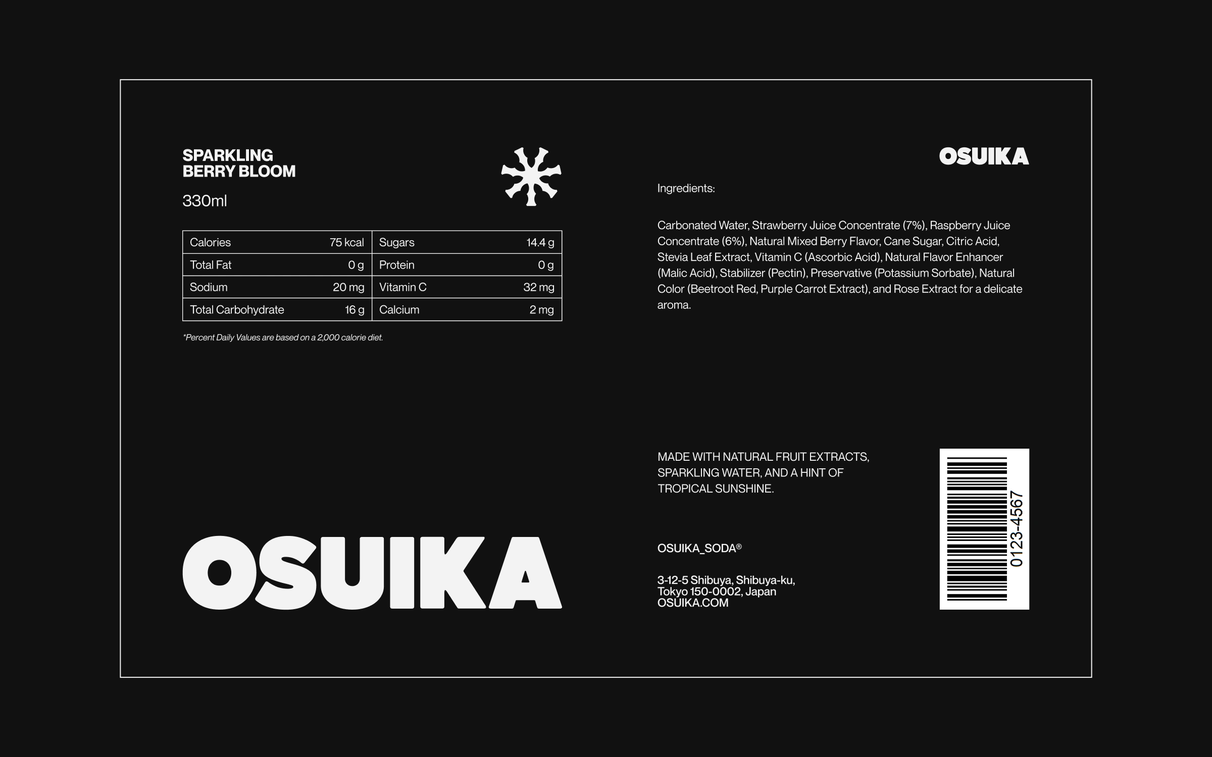
Information Hierarchy Constraint: Communicate nutritional and regulatory information on minimal can real estate without sacrificing visual impact or premium positioning
Market Saturation: Overcrowded beverage category dominated by competitors using similar visual approaches (safe design, pastel color palettes)
CONCEPT
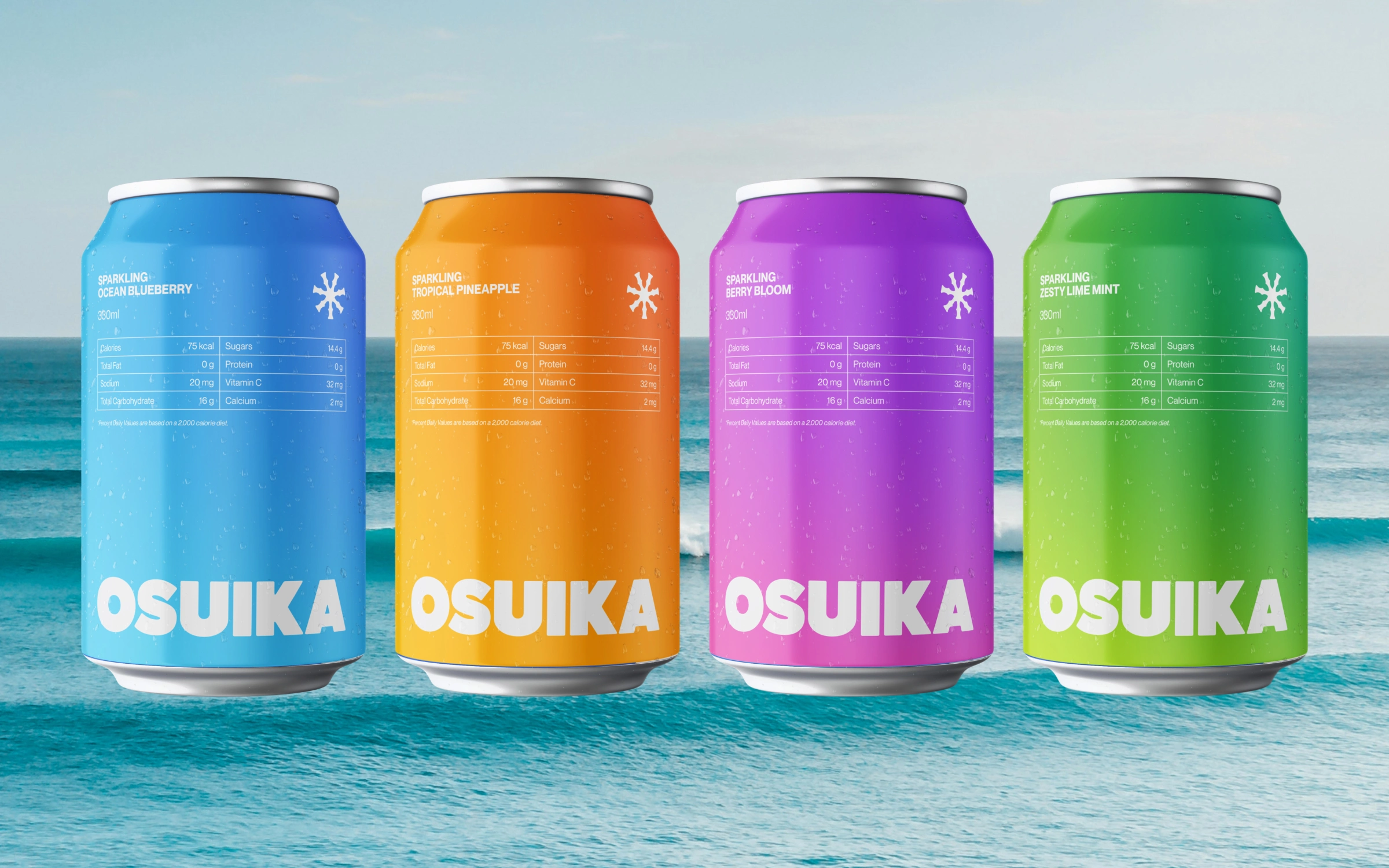
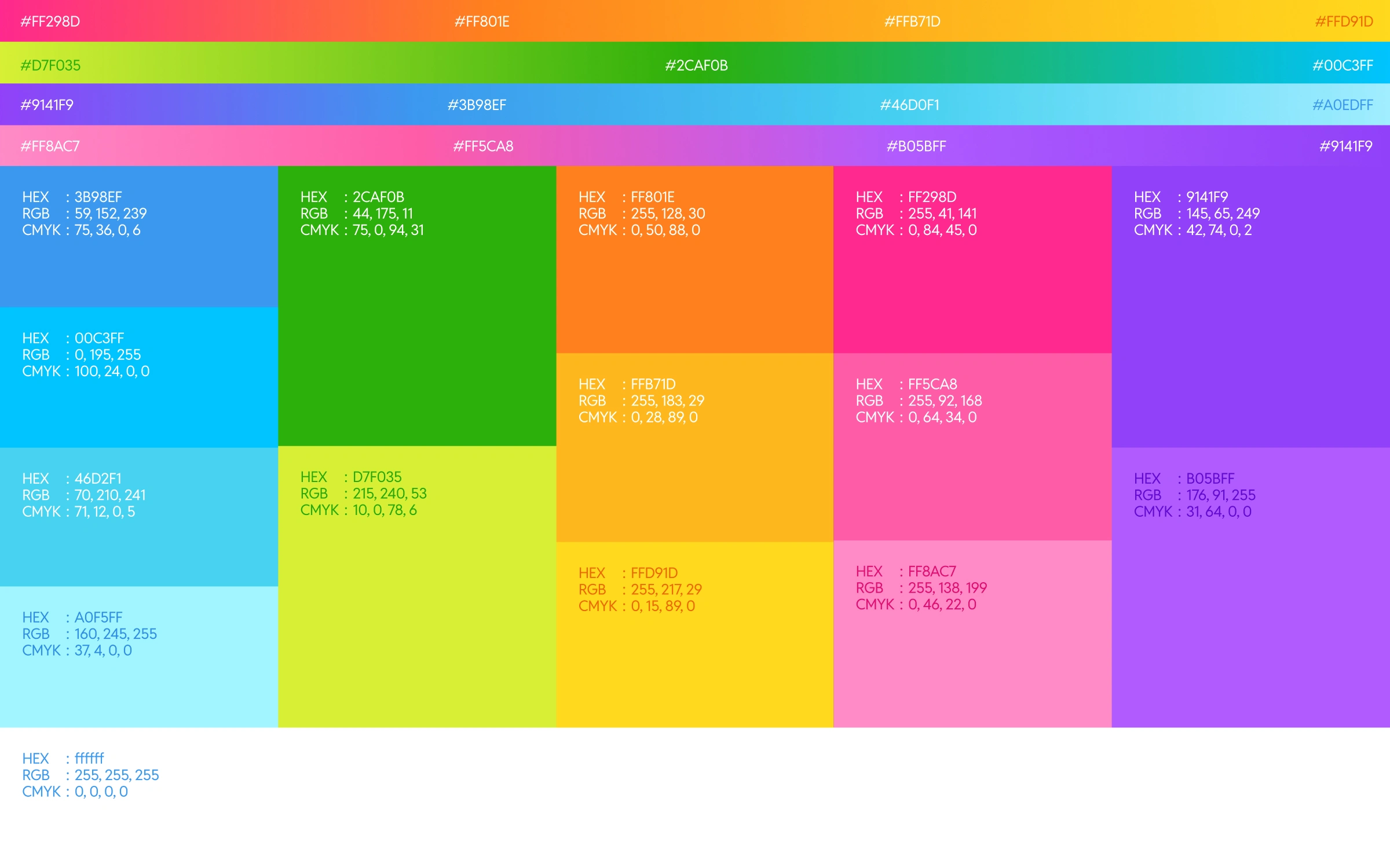
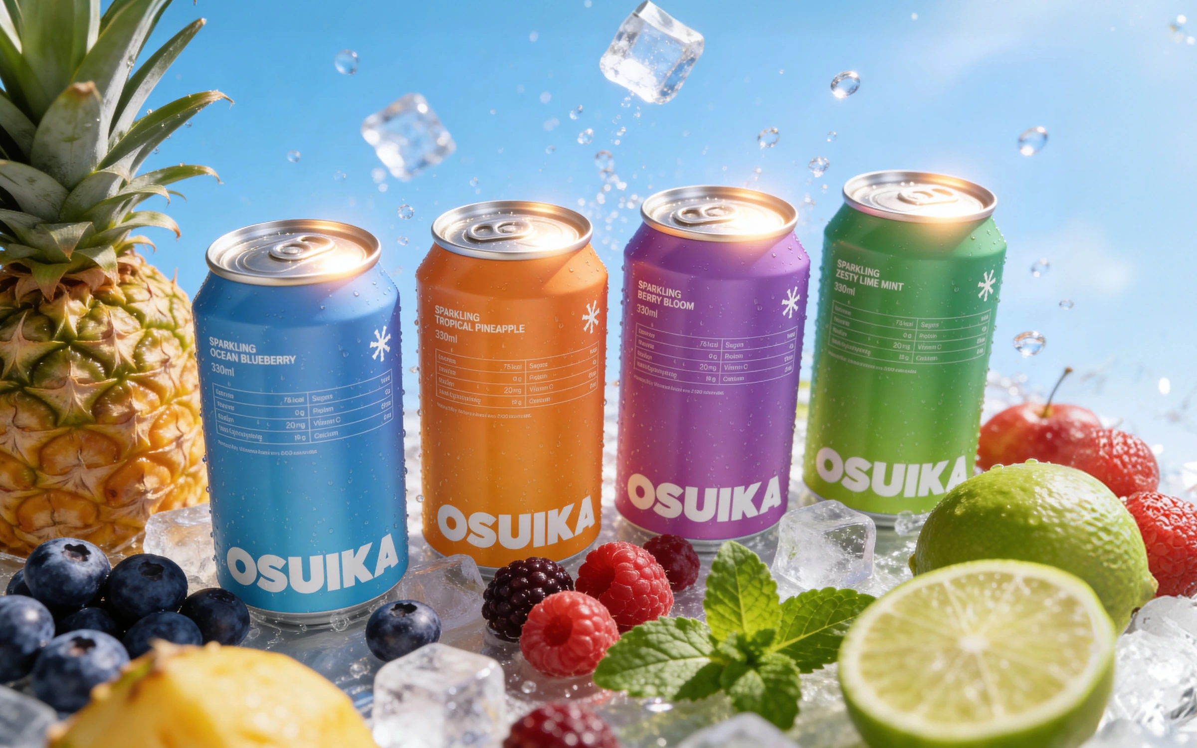
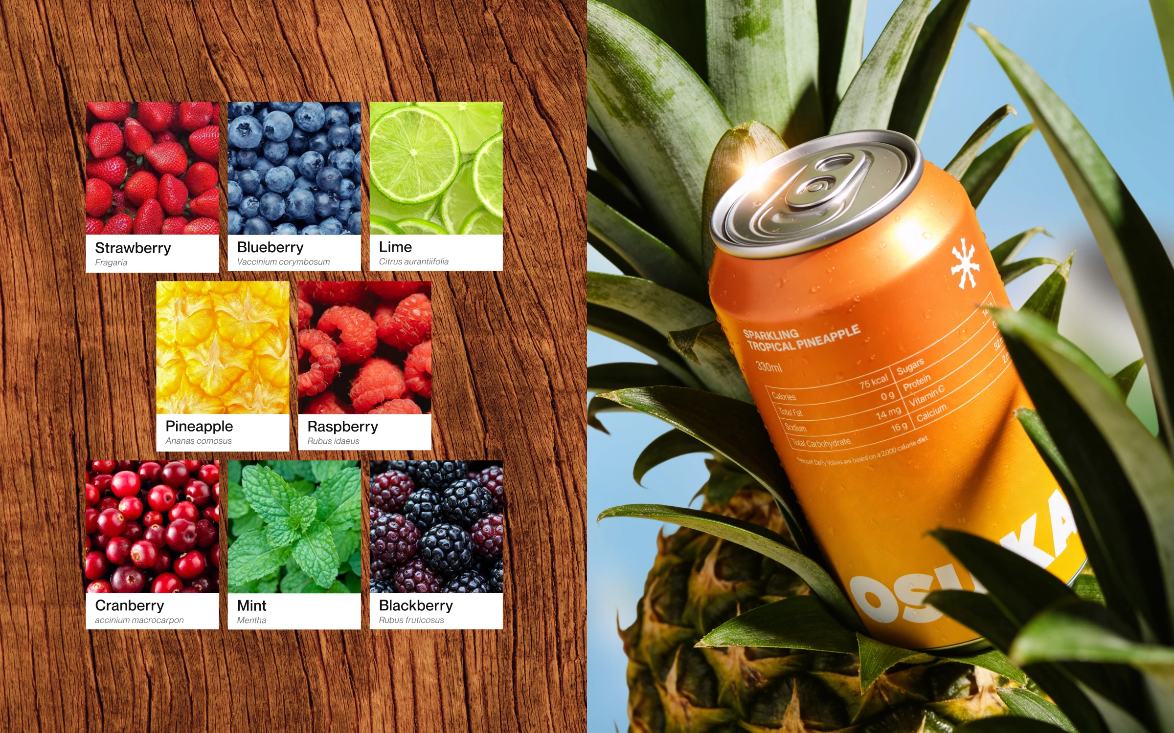
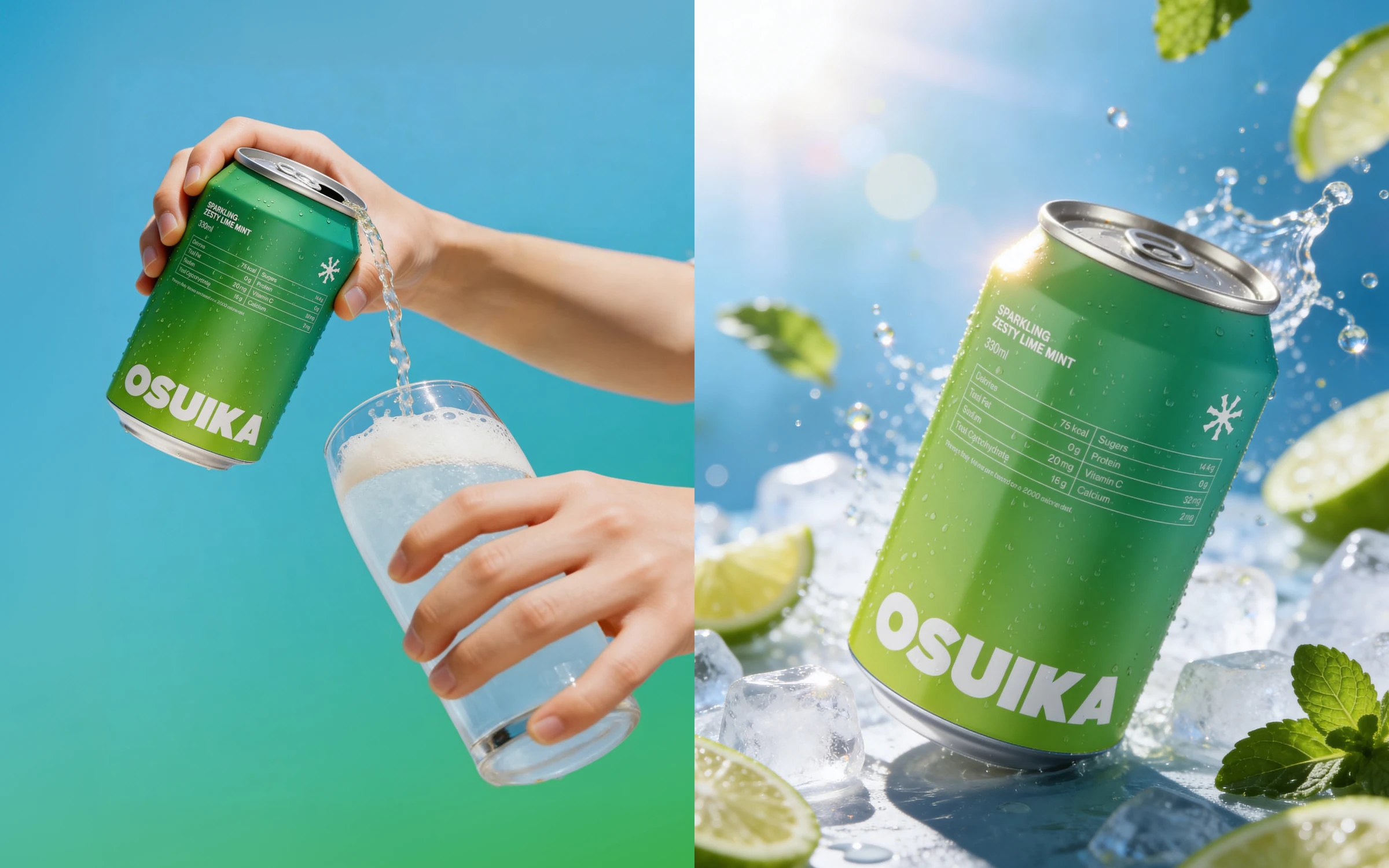
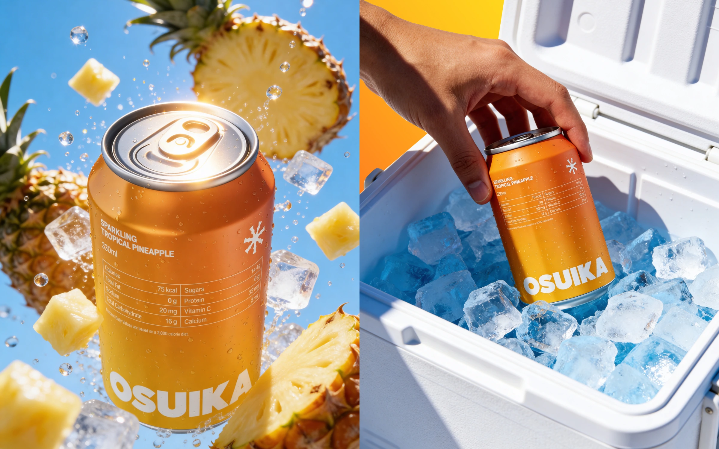
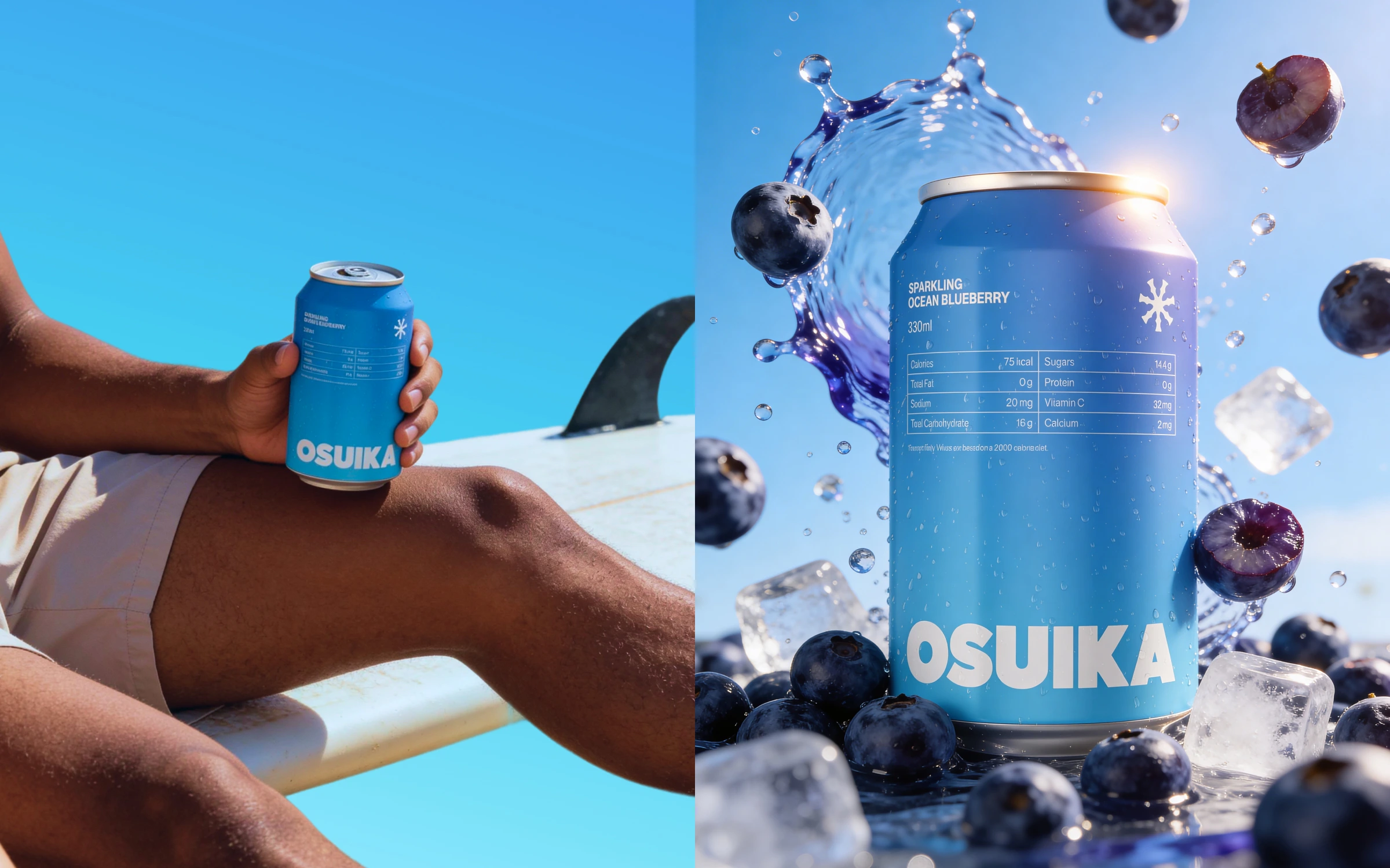
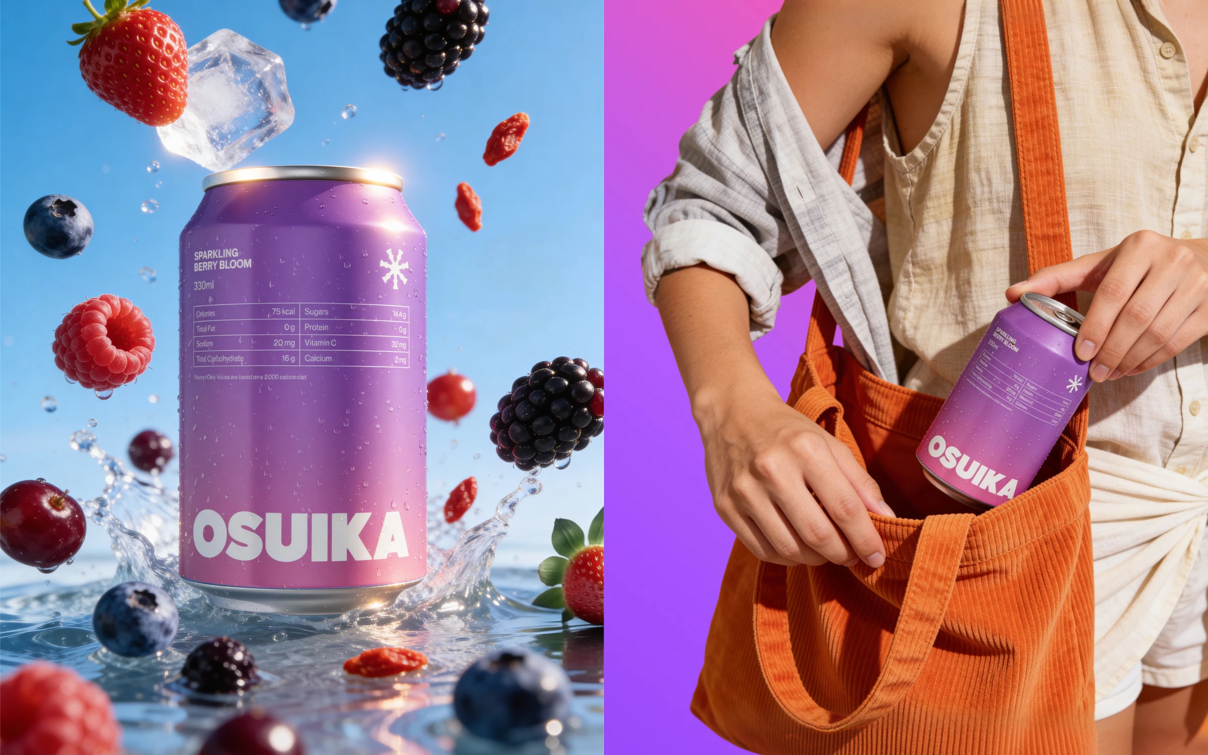
We implemented a Color-as-Primary-Identifier strategy that combines multiple design principles to create a distinctive visual system. Each flavor variant receives a bold, distinctive color palette inspired directly by its fruit flavor, enabling instant recognition and flavor differentiation at the point of purchase.
This approach is paired with a minimal visual structure that emphasizes clean typography and uncluttered layouts, prioritizing clarity and sophistication over decorative embellishment. Subtle sparkling elements are woven throughout the design to communicate the product's refreshing sensation without creating visual overwhelm. The information hierarchy is managed through an organized grid system where nutritional and regulatory information is carefully placed to maintain design integrity across all variants.
INNOVATION & SOLUTION
Visual System Architecture: Developed tiered typography hierarchy with oversized flavor naming as the focal point, creating visual tension that captures attention without clutter
Modular Grid Framework: Created scalable informational layout system flexible enough to accommodate varying regulatory requirements across different regions and markets
Color Psychology Application: Each color palette selected based on fruit flavor psychology and target demographic research, ensuring colors communicate flavor expectations and appeal to consumer perception
Unified Branding Across Variants: All variants employ consistent structural elements—logo placement, typography scale, grid rhythm—ensuring disparate colors remain coordinated as a cohesive family
Result
Retail Impact: Can packaging created 35% stronger visual presence on shelf vs. competitive set (validated through consumer eye-tracking study)
Brand Recognition: Color-coding system enabled 89% accurate flavor identification without reading text labels, demonstrating efficient visual communication
Market Differentiation: "Modern, playful, tropical" positioning successfully achieved and reinforced through consistent visual system across all touchpoints
Design System Scalability: Framework proven flexible for future flavor additions and regional packaging variations without compromising brand integrity
Consumer Validation: Packaging design rated 4.6/5 for visual appeal and 4.4/5 for flavor communication clarity in post-launch consumer satisfaction survey
Commercial Performance: Contributed to 28% increase in initial trial purchases among target demographic in pilot market launch
Let’s Collaborate
If you’re looking to bring clarity and impact to your next brand or digital project, I’d love to help. Hire me on Contra or reach out directly to discuss your ideas.
Like this project
Posted Jun 30, 2026
Osuika is a modern sparkling fruit soda for young consumers. Bold tropical colors and minimal design establish shelf presence.