Omnicon Pitch Deck Design

Cansaas Agency

Overview
Omnicon is a pitch deck built for a marketing analytics startup raising its next round. The goal was simple to state and hard to execute: turn a dense, data-heavy story into something an investor can absorb in a single skim — while still signaling that this is a serious, credible company. Every slide had to earn its place and move the narrative forward, from problem to financials.
The Tension
Pitch decks live in a hard constraint: investors spend an average of a few minutes per deck, yet the content is inherently complex — market sizing, unit economics, go-to-market timelines, five-year projections. Overload the slides and you lose attention; oversimplify and you lose credibility. The entire design challenge was compressing dense information into slides that read fast but still feel rigorous.

Who It's For
The audience isn't a casual reader — it's an investor scanning for signal. That framing drove every decision: bold headline numbers they can catch at a glance, a disciplined structure they can follow without a guide, and a visual tone that says "confident and in control" rather than "trying too hard." The deck had to respect the reader's time while building trust with every slide.
Design Decision
A few specific choices carry the deck:
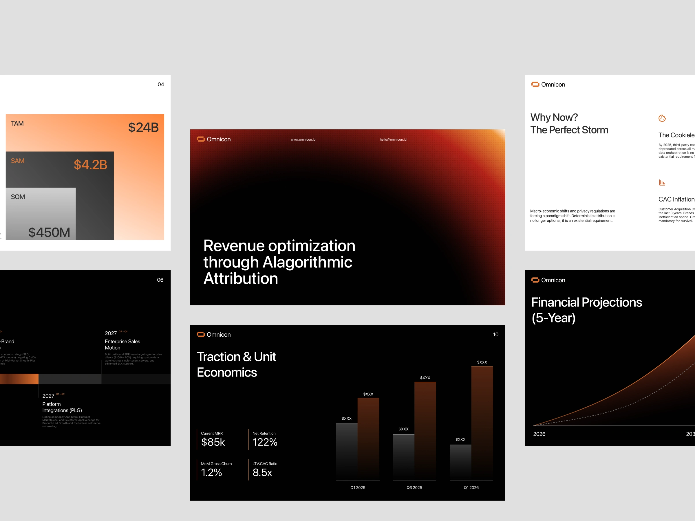
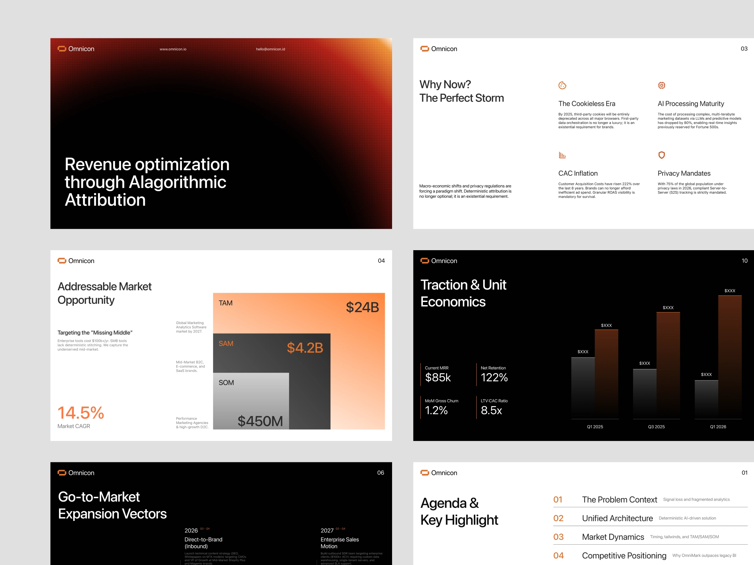
Ruthless color discipline — just black, white, and one orange. Limiting the palette to a single accent means every orange element (a key number, a chart peak) instantly reads as "this matters." In a data-heavy deck, restraint is what creates focus.
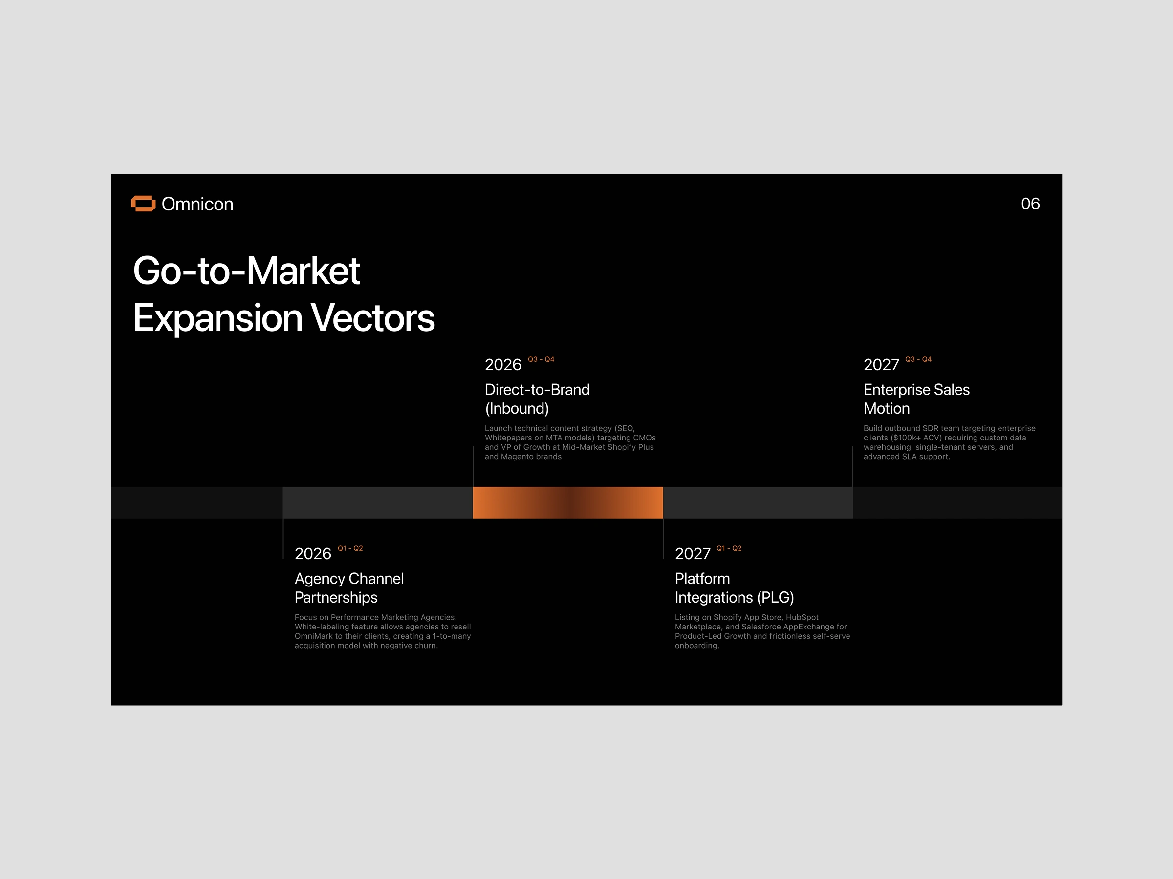
Light-dark rhythm — alternating white content slides with dramatic black data slides gives the deck pace, so a long read never feels monotonous and the big financial moments land with weight.
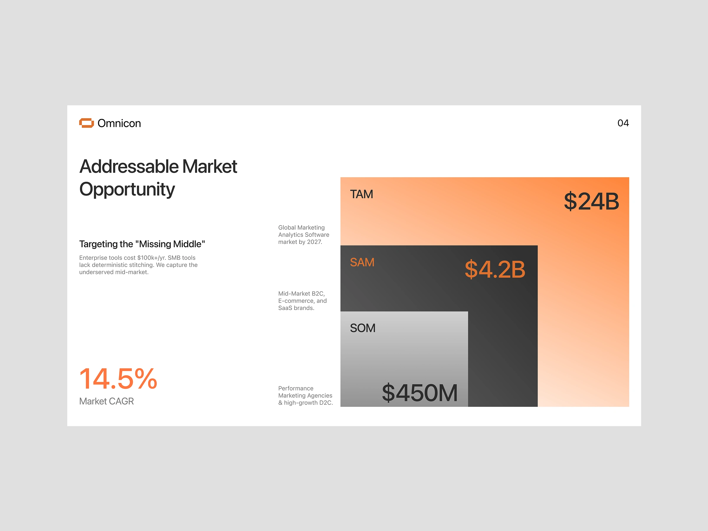
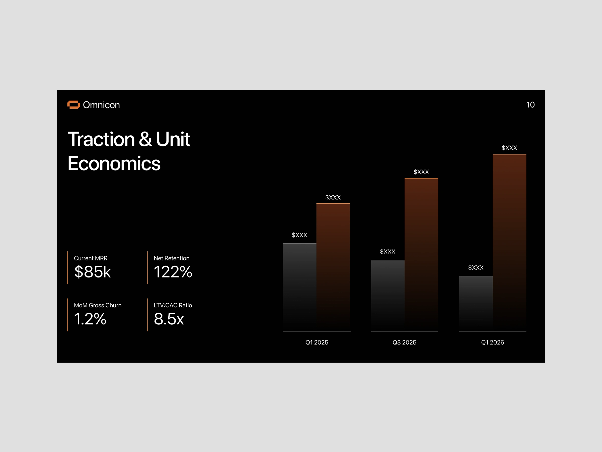
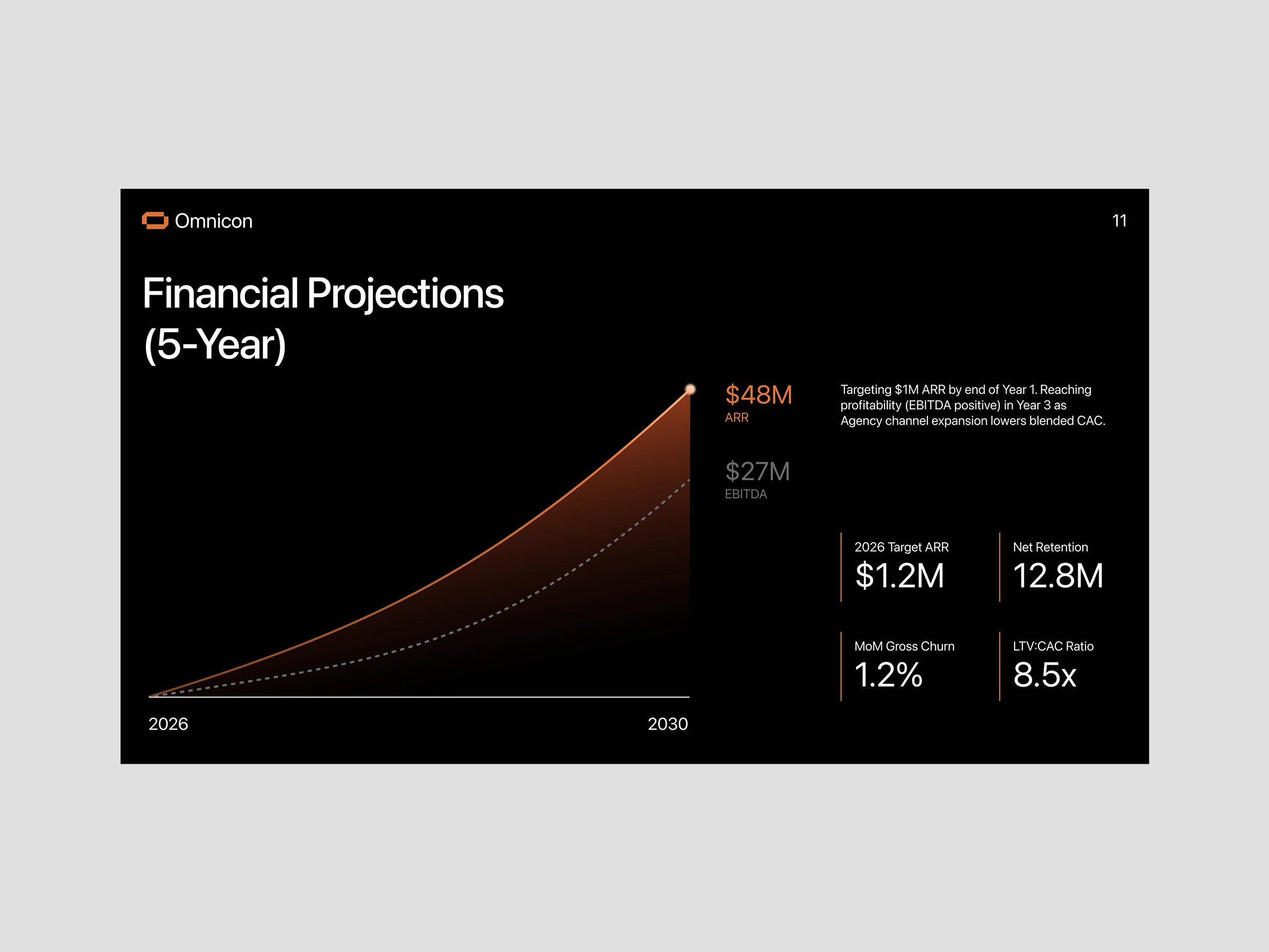
Numbers as the hero — headline metrics (TAM $24B, 14.5% CAGR, 8.5x LTV:CAC) are scaled up large and given room to breathe, so the story is legible even to someone only skimming the highlights.
Data made structural — the TAM/SAM/SOM nested squares and the glowing projection curve turn abstract figures into shapes you can grasp instantly, doing the explaining that paragraphs can't.
The Flow
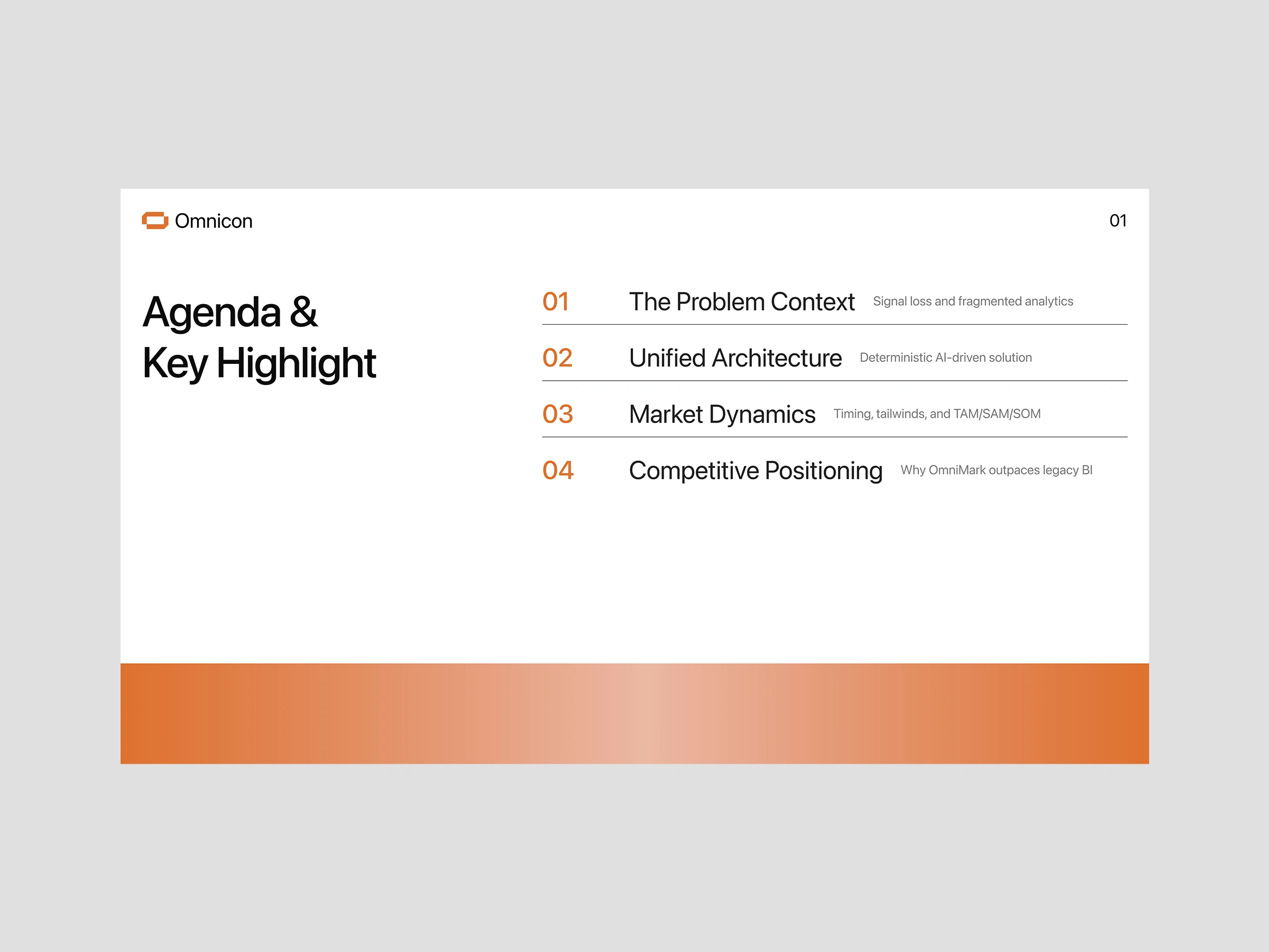
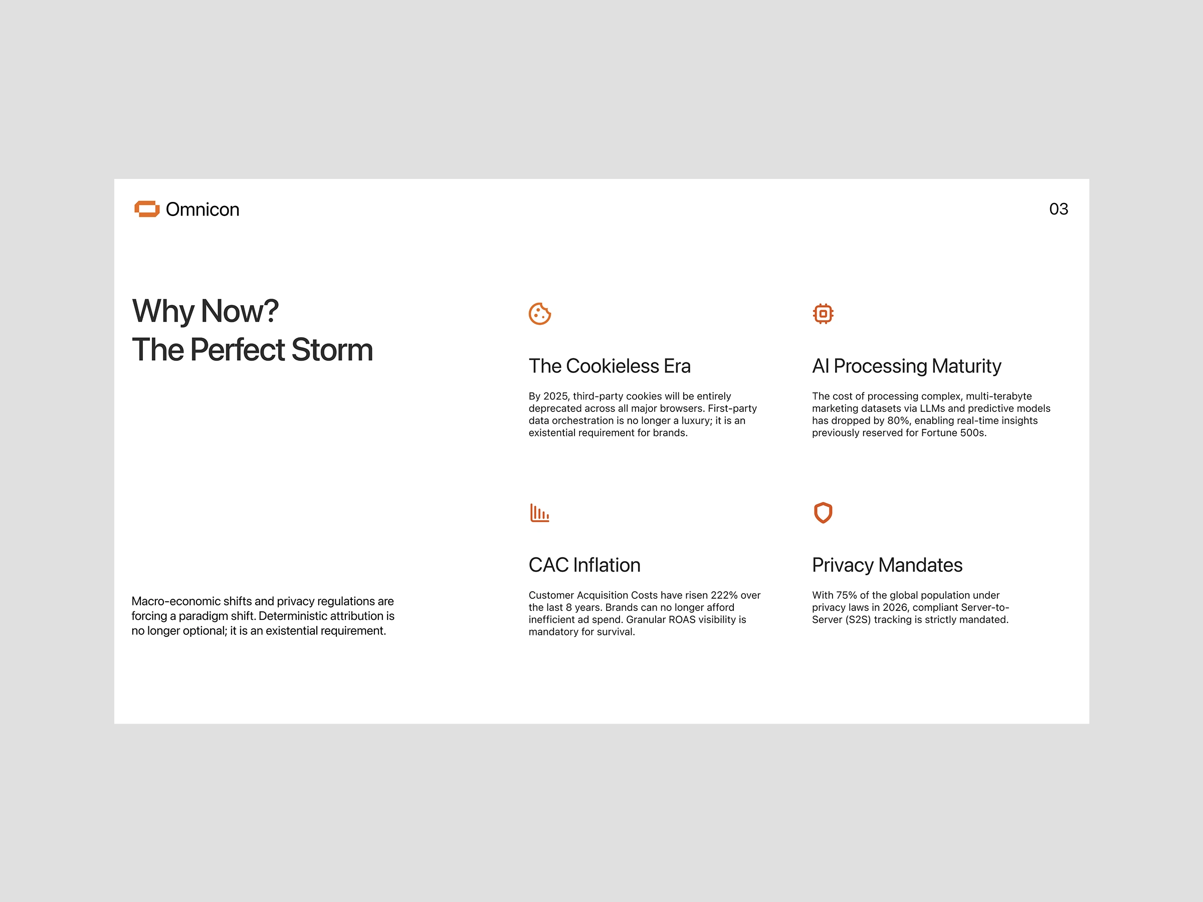
The deck is sequenced like an argument, not a document: Agenda → Problem ("Why Now") → Market Opportunity → Go-to-Market → Traction → Financial Projections. Each slide answers the exact question a skeptical investor asks next, building momentum from "why this matters" to "why this will win."
What I'd Explore Next
If this went live, priorities would be subtle build animations to reveal dense slides one layer at a time (so nothing overwhelms on first view), a print-friendly variant for leave-behinds, and tightening a few body-copy blocks that still run long for a skim-first audience.
Reflection
The hardest part of a pitch deck isn't making it look good — it's deciding what to leave out. Every slide is a fight between completeness and clarity, and clarity has to win, because a deck that isn't understood in one pass doesn't get a second. The goal here was a deck that feels effortless to read precisely because so much was cut.
Competitive Edge
What sets this deck apart isn't decoration — it's discipline. Many startup decks lean on stock gradients, busy icons, and inconsistent layouts that dilute the message. Omnicon does the opposite: one accent color, one type system, one clear grid repeated across every slide. That consistency is what makes the company feel already built, not still figuring itself out — a subtle signal investors read instantly.
Reflection
The hardest part of a pitch deck isn't making it look good — it's deciding what to leave out. Every slide is a fight between completeness and clarity, and clarity has to win, because a deck that isn't understood in one pass rarely earns a second. The real craft here was restraint: cutting enough that what remains lands with full force.
Like this project
Posted Aug 6, 2026
Designed an investor pitch deck for a marketing analytics startup.
Likes
1
Views
17