Metive - B2B Analytics SaaS Logo Branding

Sakma Studio


Overview
Metive is a B2B SaaS analytics platform that turns business data into meaningful insights, helping business leaders move from raw numbers to precise strategic decisions
Problem & Goals
Business leaders don't lack data, they lack meaning. Dashboards are full of numbers, but it's hard to tell which ones actually matter. Looking at the analytics space, we saw that most brands reflect the same problem: they look complex, cold, and built for analysts rather than decision-makers. Our goal was to create an identity that signals data precision while still feeling calm and trustworthy, and that stays consistent across every touchpoint, from the app to social media.
Process
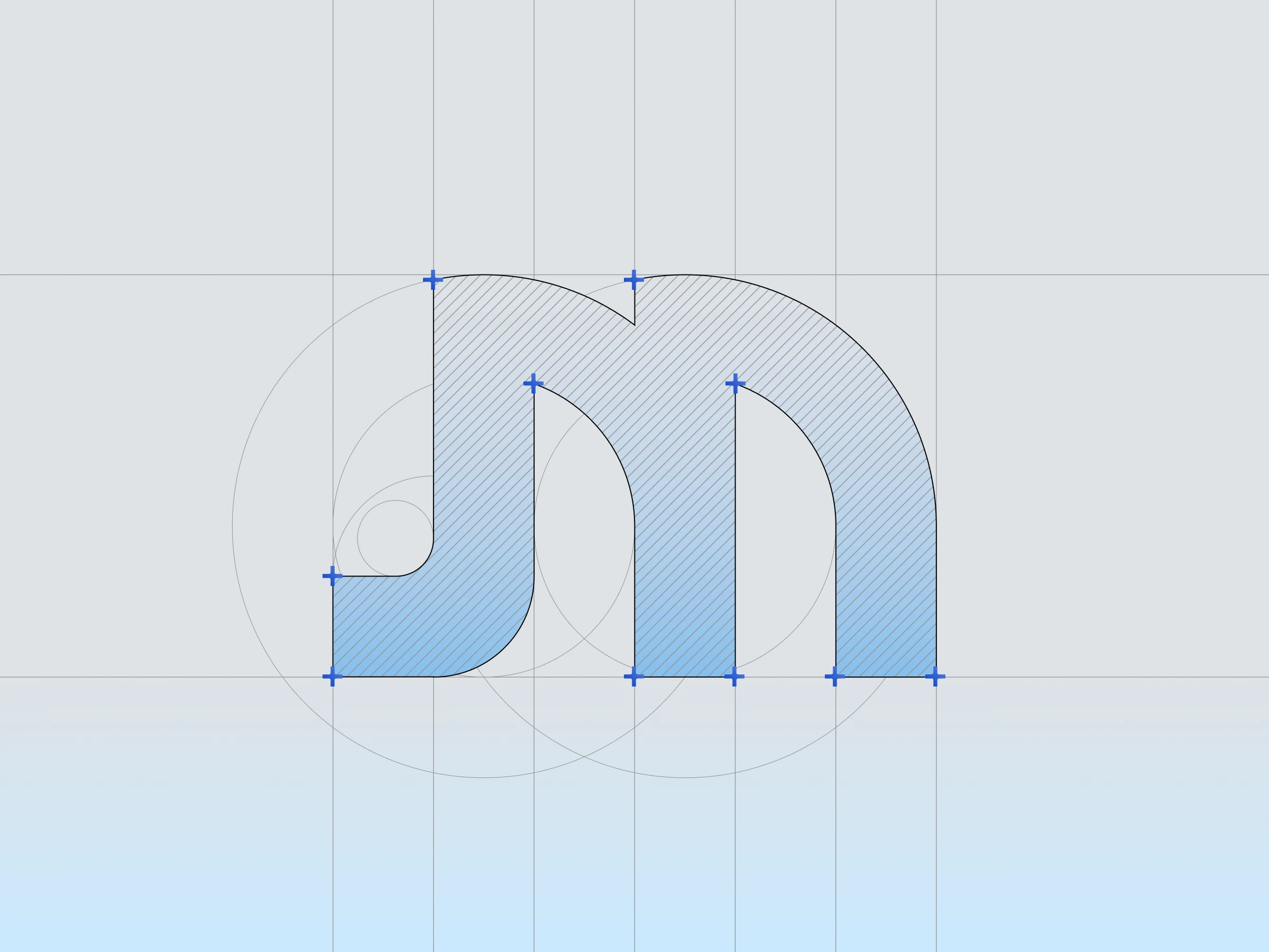
We started with the letter "m" and built it on a strict column grid, where every stroke shares the same width and every curve comes from the same circular construction. For an analytics product, trust comes from structure, so we wanted precision to be something people can see in the logo. We explored sharper geometric forms that are common in data brands, but they felt cold and intimidating, so we chose structured, rounded arches instead. That meant trading some technical edge for approachability, because Metive's users are business leaders, not data engineers. For color, we kept the palette within one hue family:
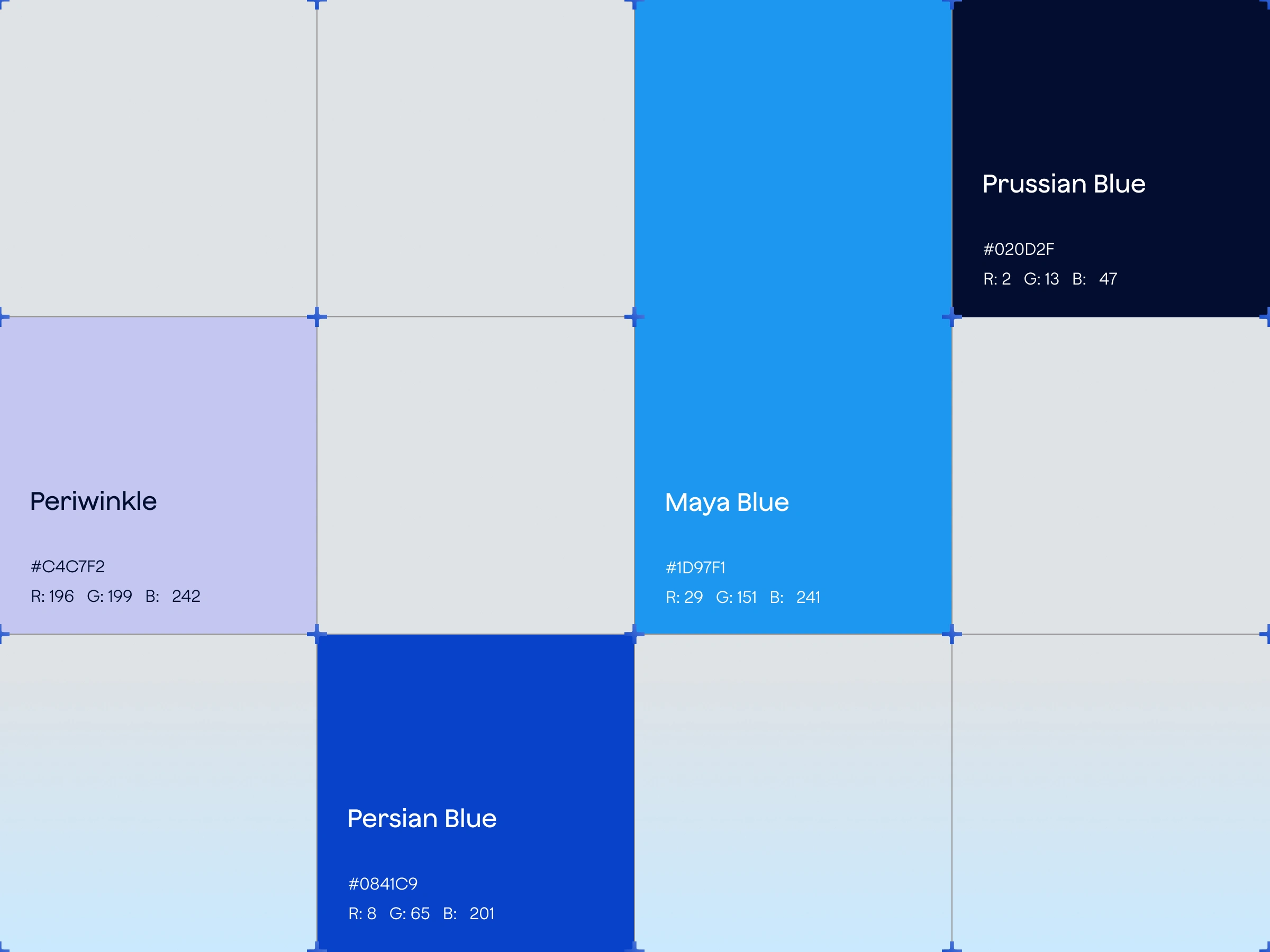
Maya Blue (#1D97F1) as the primary color
Persian Blue (#0841C9) for depth and actions
Prussian Blue (#020D2F) for text and dark surfaces
Periwinkle (#C4C7F2) as a soft accent
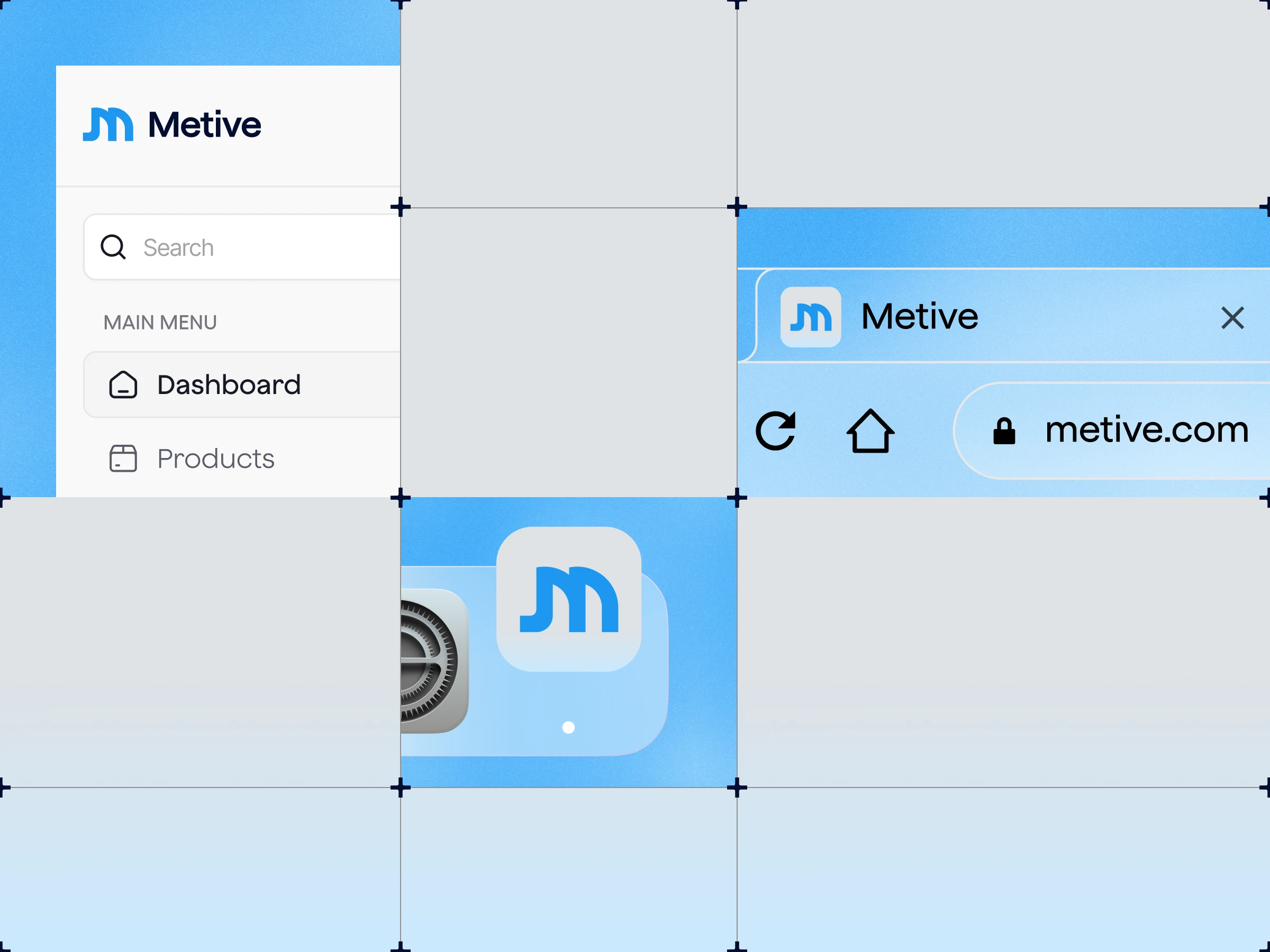
Finally, we tested the mark at every scale it would live in (browser tab, app icon, dashboard sidebar, and social profiles) to make sure it stays legible and balanced even at its smalles
Result
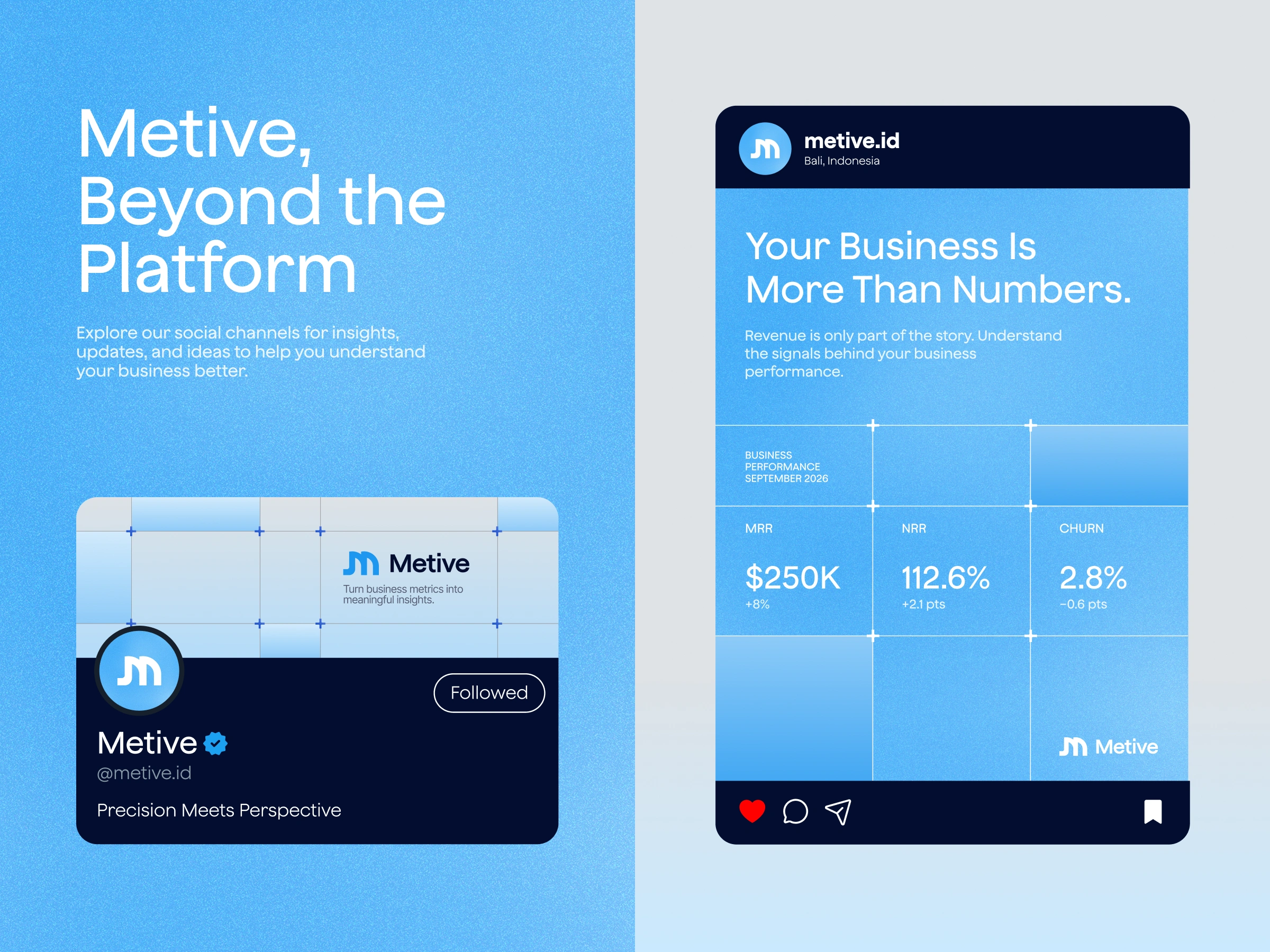
The final identity gives Metive one consistent visual system across product, web, and social. The brand now feels precise and professional without being cold.
Like this project
Posted Oct 25, 2026
Designed Metive's precision-driven logo for a modern B2B analytics SaaS platform.


