
Websites, Stores & Funnels | Framer, Shopify, Kajabi,Webflow


Websites, Stores & Funnels | Framer, Shopify, Kajabi,Webflow


Framer & Webflow Expert | High-Converting Custom Websites
- $1k+
- Earned
- 3x
- Hired
- 88
- Followers
Framer & Webflow Expert | High-Converting Custom Websites


Thank God It's Natural (tgin)
I developed a refined and purpose-driven website for Thank God It’s Natural (tgin) to elevate the brand’s premium, natural hair, skin, and body care line while honoring Chris-Tia’s inspiring wellness vision. The Website delivers a clean, responsive, and user-friendly experience.
tgin Foundation’s mission to support breast cancer fighters through early detection initiatives and health equity programs.
The website’s structure and navigation were engineered for clarity, speed, and mobile optimization, ensuring an effortless browsing and shopping experience across all devices. Overall, the platform reinforces tgin’s commitment to product quality, community upliftment, and holistic wellness.
24
673

Web Designer | Webflow and Wordpress Developer


Design & Development Made Easy


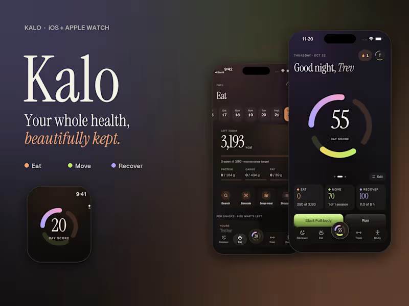

WordPress developer - I lead the strategy and build.

Forever Balboa Park - Garden Party Event Page
Forever Balboa Park needed a dedicated event page for their Garden Party, built to inform visitors, drive ticket interest, and reflect the organization's identity. I designed and developed a custom WordPress page that handled event details, imagery, and calls to action cleanly within their existing site.
0
363

Warm Heart Senior Living - New Website for a Licensed Senior Care Home
Warm Heart Senior Living provides 24-hour, family-style care for seniors in San Diego. As a newly launched facility, they had no online presence, and families searching for trusted senior care had no way to find or verify them.
For this audience, the website had one job: earn trust fast enough that a family picks up the phone.
What I did:
Designed a one-page site structured around the family decision journey, care philosophy, facility, services, proof, contact
Developed compassionate copy that emphasized safety, certified caregivers, and personalized care
Used warm brand tones and facility photography to create an immediate sense of home
Implemented local SEO and schema markup for LocalBusiness, FAQPage, and AboutPage to improve local search visibility
Added GEO optimization for AI search readiness, positioning the facility to appear in AI-generated overviews
Built a custom PHP plugin to automate global schema across the site
Result: Fully launched and search-optimized within one month. Increased family inquiries and phone calls, improved credibility for licensing and referrals, and a content flow that guides visitors directly to scheduling a tour.
Built on WordPress and Breakdance with ACF, Rank Math, and a custom PHP plugin for schema automation.
0
395

San Diego Emerging Museum Professionals - Redesign & Systems Rebuild
SDEMP connects and supports museum professionals across the San Diego region. Their website had recognizable branding the board wanted to keep, but the backend made routine updates slow and difficult, and visitors weren't finding what they needed.
The challenge wasn't starting over. It was making what existed actually work.
What I did:
Rebuilt the site architecture while preserving existing brand identity
Restructured event management so board members could post updates in minutes without touching code
Streamlined navigation around the three things visitors come for: events, resources, and getting involved
Built a custom board member section for easy, code-free updates
Upgraded accessibility to meet ADA standards
Improved SEO structure and optimized site speed across mobile and desktop
Result: Faster performance, more frequent event postings, and a backend the board actually uses, without losing the brand presence their audience already recognized.
Built on WordPress and Breakdance, optimized for speed with a lean plugin footprint.
0
383

Mo's Stucco is a third-generation, family-owned stucco company in San Diego County with over 30 years of craftsmanship, and no website to show for it. They had the reputation. They needed the presence to match it.
The goal wasn't just a website. It was a first impression they'd never had to make before, done right the first time.
What I did:
Built a complete WordPress site from the ground up using Breakdance
Designed for mobile-first with bold visuals that let the work speak
Wrote and structured service pages around how homeowners actually make hiring decisions
Built a before-and-after gallery to showcase project transformations
Added quote request forms and clear calls to action to convert visitors into inquiries
Optimized site architecture for local SEO from day one
Result: A professional online presence for the first time in three decades — built to generate leads, rank locally, and give Mo's Stucco full ownership and control going forward.
Built on WordPress and Breakdance, optimized for speed with a lean plugin footprint.
0
384

Creative Web & Logo Designer
Creative Web & Logo Designer


Website Designer | LMS, eCommerce & Digital Marketing
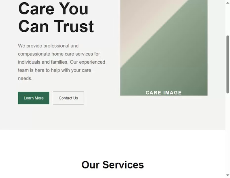
I built a complete care-service website for a fictional brand, HAVEN, to demonstrate a design principle I use in my real website-design workflow: the 5-second test.
When I review a website, I don't begin by asking whether it looks beautiful. I first ask whether a visitor can understand its purpose quickly. My test is built around three questions:
Who is this for? What do they get? What should they do next?
I started with a deliberately generic version of the HAVEN homepage. Although the structure was functional, the messaging was broad, the value wasn't immediately clear, and the page presented competing calls to action.
I then worked through the three questions before touching the visual polish.
First, I clarified who the website is for. Instead of a generic care statement, I positioned HAVEN around families looking for thoughtful support for someone they love.
Second, I clarified what the visitor gets. I replaced vague messaging with a more specific explanation of the in-home support HAVEN provides and the outcome it is designed to create.
Third, I clarified what the visitor should do next. I established a stronger primary call to action, “Explore care options,” and structured the rest of the page to support that decision.
Once the message and hierarchy were working, I moved into the visual design: typography, spacing, color, layout, responsive behavior, and subtle motion. These elements were used to reinforce the message rather than distract from it.
The final website is therefore not just a visual redesign. It demonstrates how I move from problem → decision → design, and how I use a simple test to decide what deserves attention before I spend time polishing a website.
The lesson I want another designer to take away is simple: before making a website more beautiful, make sure its purpose is obvious.
My 5-second test is:
Who is it for?
What do they get?
What should they do next?
If those three things aren't clear within a few seconds, I'm not finished designing
1
2
167
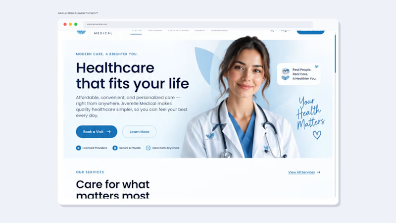
Healthcare Website Design That Builds Trust Before the First Appointment
A healthcare website needs to do more than look professional—it needs to build trust, explain the service clearly, and make the next step effortless.
I designed this Averelle Medical concept as a modern telehealth experience focused on clarity, credibility, and conversion.
The Goal
Create a healthcare website that feels:
Professional. Responsive. Clear. Easy to navigate.
The design uses a calm coastal blue + white palette, generous whitespace, rounded UI elements, and a clean visual hierarchy to create a trustworthy healthcare experience without feeling cold or overly clinical.
What I Designed
• High-impact healthcare hero section
• Clear service categories
• Simple 3-step “How It Works” journey
• Trust and credibility sections
• Patient testimonial section
• Mobile/app experience
• Strategic calls-to-action throughout the journey
• Responsive desktop-to-mobile design direction
• Complete footer and navigation system
The UX Thinking
Every section answers a question a potential patient may have:
What does this service offer?
Can I trust this provider?
How does it work?
What happens next?
The result is a website designed to move visitors from curiosity → confidence → action.
Design Philosophy
For healthcare and wellness brands, I believe great design sits at the intersection of:
Trust + Clarity + Experience + Conversion
That means beautiful visuals are only the starting point. The website also needs to communicate the right information, reduce friction, and guide users naturally toward taking action.
Looking for a healthcare website like this?
I help healthcare, telehealth, wellness, and service-based businesses create professional websites, landing pages, and digital experiences that are designed around both brand credibility and user experience.
Available for website design, redesigns, landing pages, and complete brand + website projects.
1
2
216
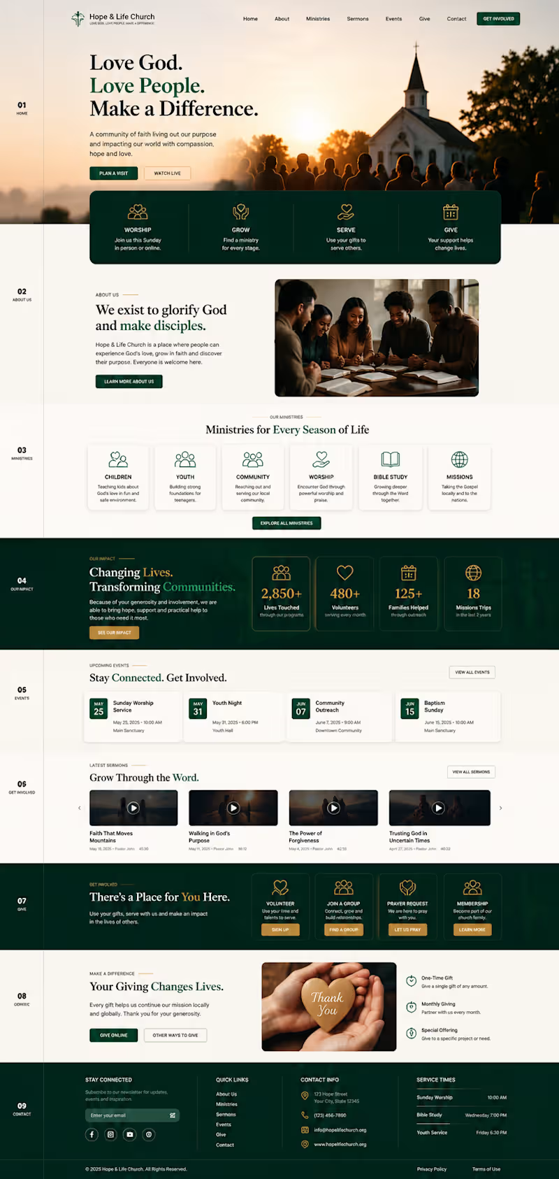
A church website concept created to show how thoughtful design can turn a ministry’s mission into a clear, welcoming digital experience. I structured the homepage around the real journey of a visitor from discovering the church and exploring ministries to watching sermons, finding events, volunteering, requesting prayer and giving online.
The design combines warm, faith-centered visuals with simple navigation, clear calls to action and dedicated sections for ministries, community impact, events, sermons, involvement and giving. Every section has a purpose: helping people understand the mission, find what matters to them and take the next step.
The result is a responsive, modern website concept that feels less like a generic organization template and more like a digital home for the church and its community.
1
121
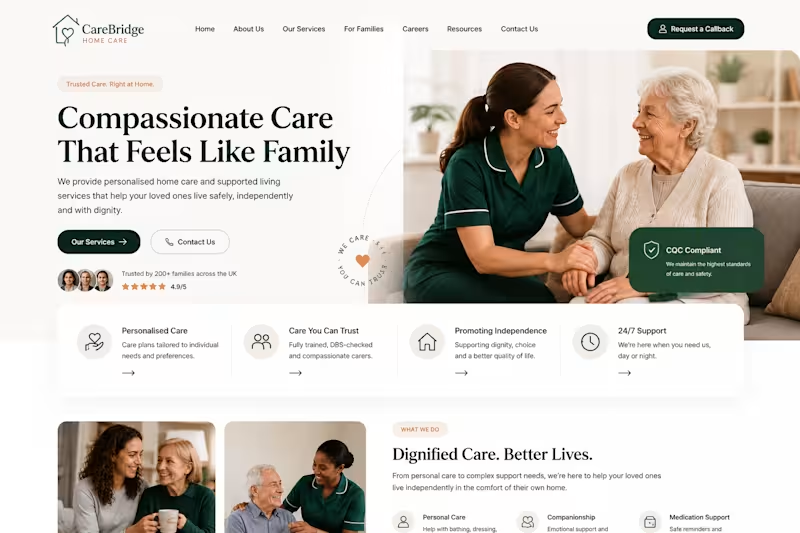
Designed and developed a modern home care website focused on building trust and making services easy to understand. The project included responsive page design, clear service sections, enquiry and callback pathways, careers navigation, local service information, and conversion-focused calls to action. The website was structured to provide a smooth experience for families, prospective clients, referral partners, and job applicants across desktop and mobile.
2
96


Straightforward Web and Branding Design
Straightforward Web and Branding Design


