
Framer Design partner for B2B brands and AI startups.

Framer Design partner for B2B brands and AI startups.

UX/UI & Framer Websites for SaaS and AI Startups
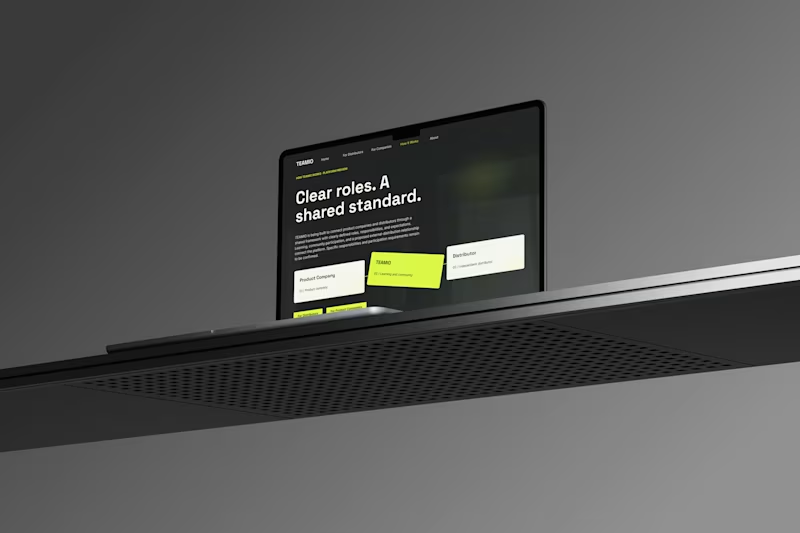
One produc Multiple experiences One cohesive design system
Meet TEAMIO a product I designed from the marketing website to the partner dashboard, bringing the entire experience together through thoughtful UX and consistent UI
Which screen is your favorite?
4
7
472
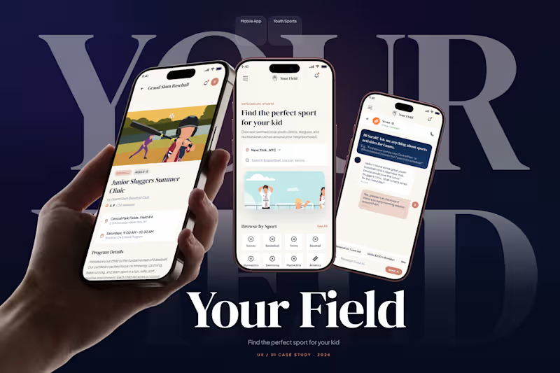
Your Field Helping Parents Find the Right Sport for Their Kid
Your Field is a mobile app that helps parents in NYC discover verified youth sports clinics, leagues, and camps near them. The core challenge wasn't just listing programs it was helping busy parents quickly find something trustworthy that actually fits their child's age, schedule, and interests, without endless scrolling through generic directories
2
2
213


Framer / WebFlow Web Developer and Designer.


Product Designer | 5M+ Users | Design Systems & Framer

Safi which means "Pure" in Arabic
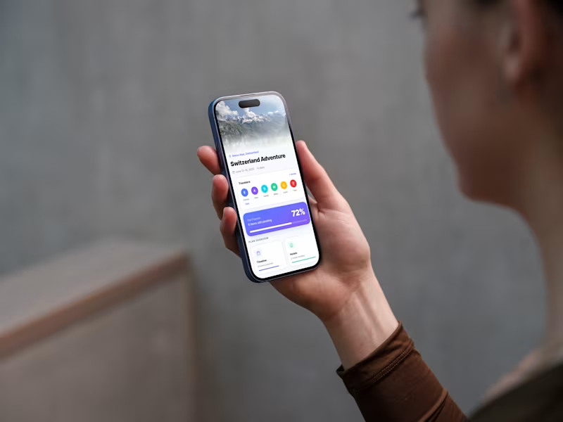
Concept: Safi is a car wash app. Users pick a package, drop a location, schedule a time, and a washer arrives wherever the car is parked
Problem: Traditional car washes mean driving, queuing, and waiting. Informal mobile washers (found via WhatsApp) lack quality control, fixed pricing, or scheduling:
Category: Lifestyle
Seasonal connection Spring in Cairo means khamaseen which is dusty winds that coat parked cars overnight. The "Spring Fresh" onboarding promo and bloom-themed confirmation screen lean into the season when your car needs Safi the most
Monetization: Pay-per-wash with 2 options from $10 to 20$ and telling the user that the taxes are free, plus selling other products that can be used in cars representing our brand like car air freshener
Safi is a new mobile-native build for this challenge
App name: Safi
Project Link
(https://bubble.io/page?id=mohamedliethy7&app_type=mobile&tab=Design&name=On-boarding)Preview Link
(https://mohamedliethy7.bubbleapps.io/version-test/api/1.1/mobile/preview?debug_mode=true&preview_view=On-boarding)"I’m having trouble sharing the app preview. I’d really appreciate it if someone could help me with this"
1
276


I turn rough ideas into polished, high-craft web products.
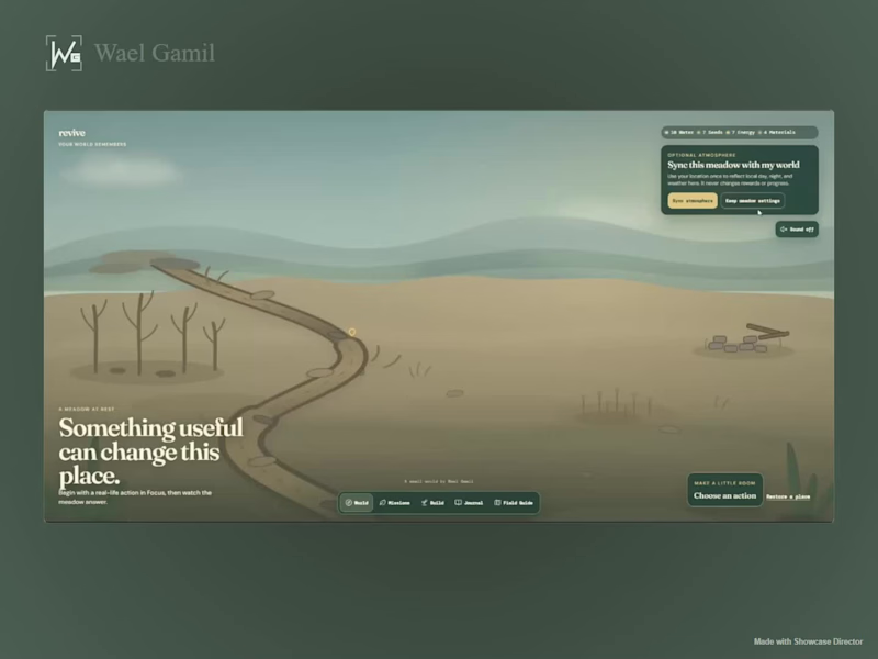
What if your progress wasn’t another streak, chart, or number? 🌱
I built Revive for the Replit Buildathon — a small living world that changes when you do something useful in real life.
Focus, move, or do something good for the planet → earn resources → restore the stream, grow wildflowers, bring back the grove, build a quiet reading nook, and slowly watch life return.
The world also remembers what you’ve done through a journal, unlockable wildlife, local weather/day-night syncing, and a calming soundscape that becomes richer as the meadow comes back to life.
The part I enjoyed most was making the environment itself the progress system instead of putting everything behind dashboards and stats.
Built with Replit
1
2
923
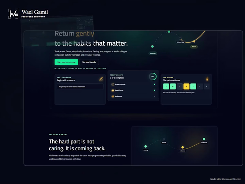
Hilal is a bilingual, local-first spiritual habit tracker I designed and built as a Progressive Web App. It helps users build consistent daily habits through streaks, calendars, customizable goals, rewards, and a calm motivational experience across Arabic and English.
I handled the product design and frontend development end-to-end using Next.js, React, and TypeScript, with responsive RTL/LTR interfaces, installable PWA behavior, local-first state, and motion designed to make progress feel rewarding without overwhelming the experience.
2
1
783
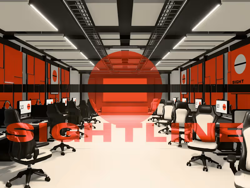
SIGHTLINE, an esports lounge I modeled in Blender and turned into a website.
Line up the crosshair from the one seat that sees it and the whole hall lights up. 12 seats, 4 playable games, all running in the browser. The Blender scene was 482 MB, the site loads 3 MB.
Modeling, Three.js and code, all me.
Try it: waelgamil.com/work/sightline
If you have a site, an interactive piece or a small game in mind, message me.
0
139
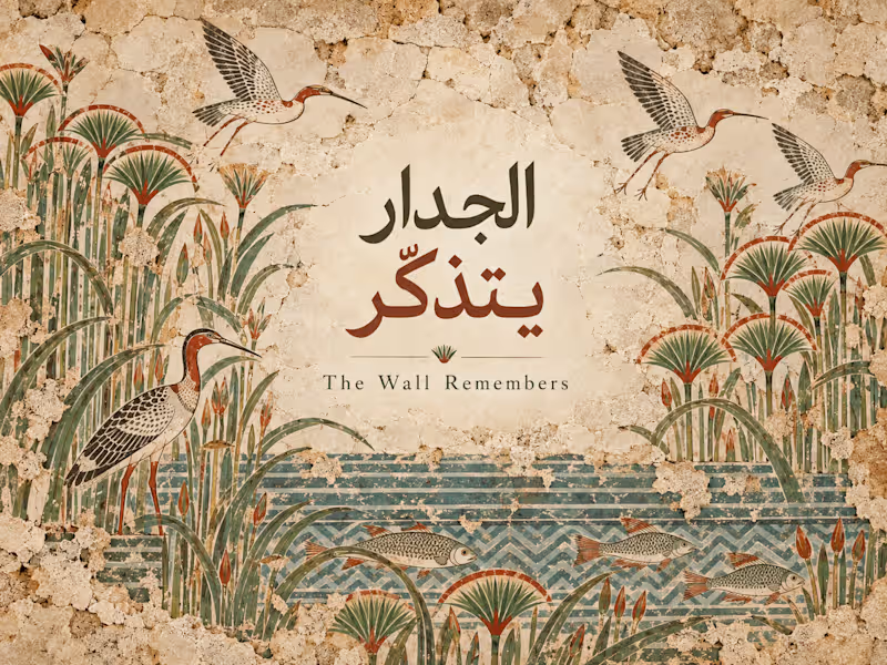
Turning an ancient wall painting into something you can move through.
The Wall Remembers is an interactive experiment inspired by the Tomb of Menna (TT69) in Luxor using light, movement, depth and scroll to bring parts of the painted world back to life.
Built with React + R3F.
I’ve been exploring more of this space lately: websites that feel less like pages and more like places you can enter.
0
141

UI/3D Designer & Frontend Engineer
UI/3D Designer & Frontend Engineer


Product Designer
Product Designer
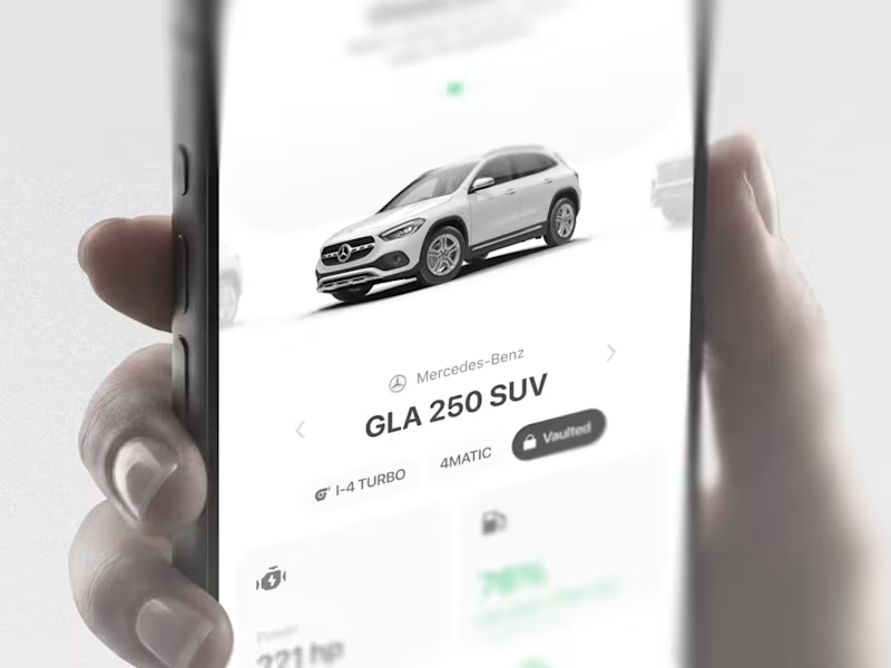
AutoVault: Automotive mobile app ui design
What it had to do: Hold everything a car generates: records, maintenance, documents. Tell the driver what needs attention. Legible for older drivers.
Decisions: clarity over decoration, for example in the fuel component i had fancier explorations but i went with the most clear and readable option.
1
148

UI/UX Designer | Building Web & Mobile Apps
UI/UX Designer | Building Web & Mobile Apps

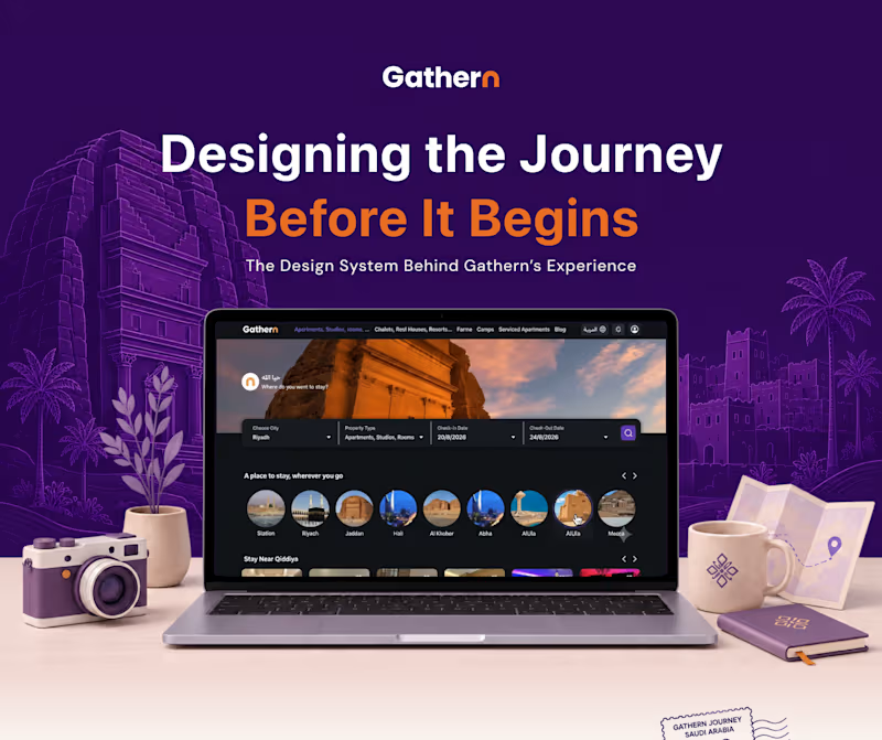
Case Study: Gathern — Vacation Rental & Accommodation Platform Redesign
Role: UI/UX Designer
Scope: Landing Page Design, Search & Discovery UX, Property Details Page (PDP) Redesign, Localized Booking Flows
Target Market: Saudi Arabia (Licensed by the Ministry of Tourism)
1. Executive Summary
Gathern is Saudi Arabia’s leading peer-to-peer accommodation platform, offering chalets, apartments, farms, and camps across major destinations like Riyadh, Al Ula, Jeddah, and Abha. This project focused on refining the web browsing experience—improving search clarity, visual hierarchy, property specifications, and sticky booking flows for seamless customer conversion.
2. The Challenge
Information Overload on Property Pages: Vacation rentals require extensive property disclosures (amenities, ministry licenses, host details, house rules, and specs), making details pages easily cluttered.
Complex Pricing Visibility: Users needed instant clarity on discounts, service fees, VAT, and localized pay-in-installment options (e.g., Tabby, Tamara).
Location-Based Discovery: Elevating seasonal curated collections (e.g., "Monthly Stays in Riyadh", "Stay Near Qiddiya") to drive conversion for high-demand tourist areas.
3. The Solution & Key Features
Streamlined Search & Hero Section: Redesigned the primary filter bar (City, Property Type, Check-in/out Dates) paired with circular category quick-links for fast regional browsing.
Curated Recommendation Carousels: Structured high-converting listings into themed sections like Stay Near Qiddiya with rating badges, location tags, and explicit pricing.
Modular Property Detail Layout: Organized listing data into scannable sub-navigation tabs (Specification, Guest Reviews, Locations & Maps, Terms & Policies).
Sticky High-Converting Booking Widget: Prominently featured pricing breakdowns, check-in/out pickers, checkout totals, and split-payment integration options (Tabby / Tamara).
4. Design & UX Highlights
Visual Hierarchy: Balanced rich photography (collages and gallery controls) with clean typography for property metadata (30m2 unit area, family/single specifications, etc.).
Trust & Compliance: Elevated safety indicators such as the Gathern Promise badge, host verification status, and official Ministry of Tourism license credentials in the footer.
Localization: Designed flexible UI components to handle Arabic and English text smoothly across all viewports.
0
63