
Designing user-centered interfaces with real impact


UI & Framer design for startups ready to scale

UI & Framer design for startups ready to scale
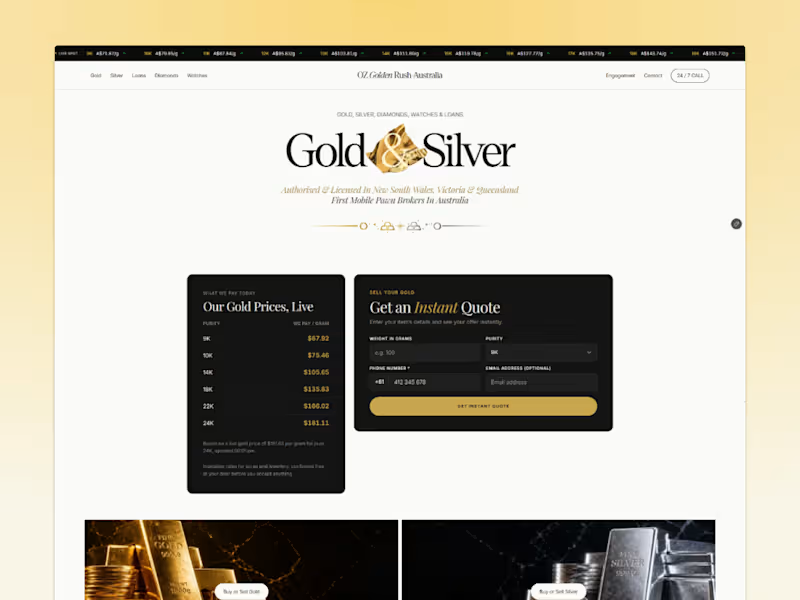


Really excited to see Contra launching its new Community section — feels like the perfect space for independents to connect, share their journey, and grow together 🚀
Love seeing how the platform keeps evolving to empower designers, creators, and freelancers like us.
Also, I just published my latest project Synko, a creative website concept I’ve been working on recently.
Would love to hear your thoughts or any feedback from the community 💬
2
40
2.3K

UX/UI & Visual Designer | AI Creative
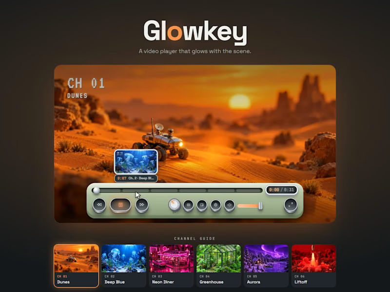
Glowkey treats a video player as an object you want to touch. It's a sage-green device with brushed-metal keys that sink when pressed, a speed dial and a mixing-desk fader. Its signature idea is light: the player reads the dominant colour of the scene, and the keys, progress bar and time glow in that hue, so every shot restyles the interface. I made a demo called Channel Surf, six single-colour miniature worlds with their own music, so the change is impossible to miss. It stays fully usable: complete keyboard control, visible focus, comfortable touch targets, a dedicated phone layout, and calm motion when reduced motion is on.
10
18
2.4K
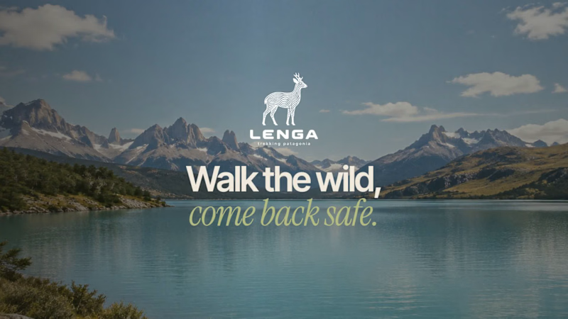
A short promo film for Lenga, a trekking app concept for Patagonia.
The idea: you're walking a lenga forest trail, eyes on your boots. A twig snaps, you look up, and the huemul from the Lenga logo steps out from the trees. It stops for a moment, then keeps walking. Then the brand fades in: Lenga, trekking app.
The logo becomes a character inside the real landscape, a quiet reminder of what the app is about: walking the wild and coming back safe.
Made with AI video and image generation plus manual compositing and editing: the line-art huemul is the real logo placed into the scene and animated, with film grain and natural forest sound.
Full case study and interactive prototype: chinnidesignstudio.com/case-lenga.html
1
114
Lenga Tecking App 🐐🏔️✨
Lenga is a concept app to discover, plan and walk Patagonian trails safely. In a region where weather turns in hours and signal disappears, most hiking apps still lock offline maps behind a paywall. Lenga starts from one idea: safety should never be premium.
What I did, end to end:
→ UX research: public surveys, app reviews and safety reports from the region
→ Proto-personas, journey map, user tasks and MoSCoW priorities
→ Information architecture: onboarding, 5 tabs, 6 flows and every state (offline, low battery, no results)
→ UI kit: earthy Patagonian palette, glass panels with grain, components and a huemul logo drawn with contour lines
→ AI imagery with a film look, plus mockups with the real app screens
→ A fully connected prototype built with AI and published on Vercel
Key features: safe return (if you don't check in, your contact gets your last location), hourly weather window, "Is it for me?" fit check, offline navigation with off-route alerts, "I'm lost" guide and hold-to-send SOS.
23 screens · 6 flows · try the live prototype:
https://www.chinnidesignstudio.com/lenga
2
11
419
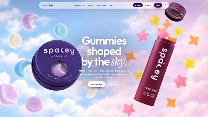
Spacey 🌙✨
A cannabis gummy brand where the shape is the dose. Moons for resting, stars for enjoying.
I designed the brand, the packaging, AI product photography and video, and a full interactive store: the whole site switches between Moon and Stars, and a dose selector morphs the moon phase as you choose.
Live: chinnidesignstudio.com/spacey
Would love to hear what you think 💜
1
88

Full-Stack Graphic Designer & Art Director


Senior UX/UI Designer | Mobile Apps, SaaS & High-Fidelity UI
- 46
- Followers
Senior UX/UI Designer | Mobile Apps, SaaS & High-Fidelity UI

🚀 New Case Study: Sportyeah Landing Experience
Over the past few weeks, I worked on reimagining the digital entry point for Sportyeah, an ecosystem designed to connect athletes, clubs, organizers, brands, facilities, and sports professionals.
The challenge wasn't creating another sports website.
It was transforming a feature-heavy platform into a clear and compelling story.
The goal was simple:
👉 Shift the perception from a sports management platform to the digital home of sports.
Through UX strategy, information architecture, visual storytelling, and UI design, I focused on creating an experience that communicates Sportyeah's vision before its features.
The result is a landing experience built around community, competition, events, broadcasting, and growth—everything connected within a single ecosystem.
🔗 View the full case study:
https://cristianzibecchi.myportfolio.com/sportyeah-landing-experience
#UXDesign #UIDesign #ProductDesign #WebDesign #LandingPage #SportsTech #Figma #DesignPortfolio #DigitalProductDesign
2
95
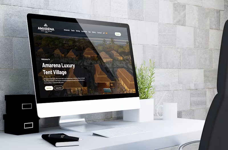
Redesigning Amarena’s digital experience ✨
We moved away from a long-scroll landing and restructured the experience into clearer, focused interfaces, improving navigation, readability, and overall flow.
The goal was simple: let the visuals breathe and make every section feel intentional.
Key improvements:
· Stronger visual hierarchy and spacing
· Full-width imagery for a more immersive feel
· Cleaner, more intuitive navigation
· Refined microcopy and section naming
· Better structured content across villas, spa, and experiences
A more editorial, elevated approach that aligns with the brand and enhances how users explore the space.
Design is not just how it looks. It’s how it guides you.
Portfolio: https://cristianzibecchi.myportfolio.com/
1
6
149
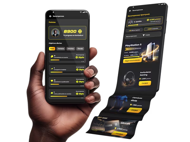
Built a full rewards system for a sports platform — from points → challenges → redemptions.
The goal wasn’t just UI, but creating a system that actually drives engagement:
• Earn points through real actions
• Track progress with clarity
• Redeem rewards with a sense of achievement
Everything is designed as a connected experience, not isolated screens.
Highlights:
Gamified challenges that guide user behavior
Wallet-style points tracking (inspired by fintech patterns)
Reward system with strong visual identity and motivation
Clear redemption flow with status and feedback
Curious how others approach gamification in product design —
what have you seen work (or fail) in reward systems?
0
118
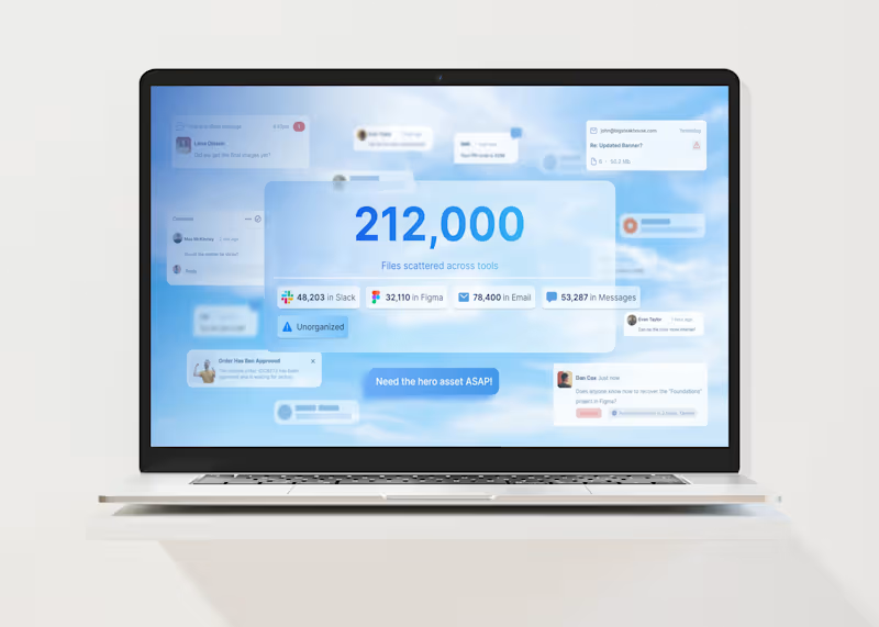
Visualizing Creative Chaos — Air.inc Style Frames
Motion style frames created for a campaign concept about creative operations.
The narrative visualizes a common problem inside creative teams: searching through thousands of files across tools like Figma, Slack, email, and messages.
The concept translates this chaos into a simple visual story:
Chaos → Cost → System.
The frames were designed to guide motion and storytelling, using annotations, directional cues, and structured UI elements that support animation and pacing.
2
1
139

Web Designer & Developer for businesses worldwide


UX/UI Product Designer ✦ Webflow Specialist ✦ Shopify Design
UX/UI Product Designer ✦ Webflow Specialist ✦ Shopify Design


Diseño Digital | Diseño UX/UI | UI Design | Web design
Diseño Digital | Diseño UX/UI | UI Design | Web design


