
Four-week digital transformation ⏳
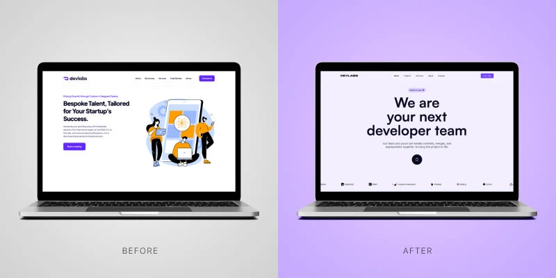
Hero section
👎 Before: Cluttered and outdated
The original hero section lacked clarity and engagement, burying the agency's value under an overwhelming layout.
✅ After: Clean, bold, and to the point
A sleek, modern hero section now showcases the agency's strengths with impactful messaging and streamlined design.
Project's section
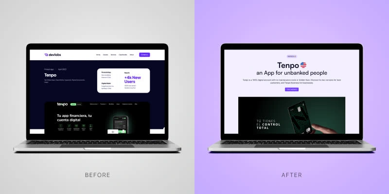
👎 Before: Hard to navigate, easy to miss
Disorganized project highlights made it difficult for visitors to understand the agency's full capabilities.
✅ After: Showcasing innovation with clarity
The new layout highlights each project clearly, allowing users to easily explore the agency's achievements and expertise.
Visit the new site👇
1 like · 14 views · Aug 29, 2024
I'm thrilled to share a sneak peek into the UI/UX redesign I've implemented for a developer's team.

