
Branding for design-lead brands in interiors & construction


Branding for design-lead brands in interiors & construction


I love a good before and after.
This project was a full transformation for the Pan-American Equestrian Federation, spanning both branding and landing page design. Their previous identity and website felt dated and lacked the clarity and presence the organization truly holds.
This wasn’t just a visual upgrade.
We approached the landing page with a clear objective: communicate a large amount of information with precision and ease. That meant restructuring content, prioritizing what matters most, and creating a strong foundation the brand can continue to build on.
The result is a system that feels more aligned, more intentional, and far more effective.
Take a look at the before and after, and let me know what you think.
Check out the live landing page here: https://www.paecequestrian.com/
1
28
1.5K


Beauty Focused Branding & Web Design Agency
Beauty Focused Branding & Web Design Agency


For RITUAL FORM, we developed a complete brand identity and custom packaging system for a contemporary luxury skincare brand rooted in ritual, tactility, and sculptural form.
The objective was to create a high-end skincare brand that moves away from visual excess and trend-driven aesthetics, and instead communicates through restraint, materiality, and proportion. RITUAL FORM is built on the philosophy of ritual over routine. Rather than positioning products around exaggerated claims, the brand reframes skincare as a daily, intentional act.
The bottle system was designed as a series of sculptural, stackable forms inspired by natural elements shaped by time, stones, shells, and softened mineral edges. The result is packaging that exists between functional design and art object.
22
62
6.7K


Quality Web & Product Design 🚀


Quality Web & Product Design 🚀


Strategy-led branding for wellness, beauty & lifestyle.

Strategy-led branding for wellness, beauty & lifestyle.
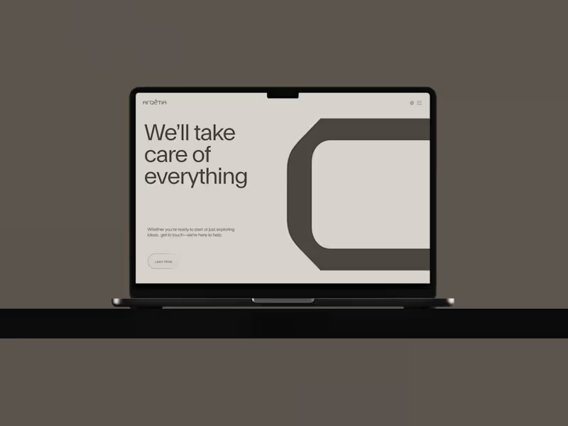
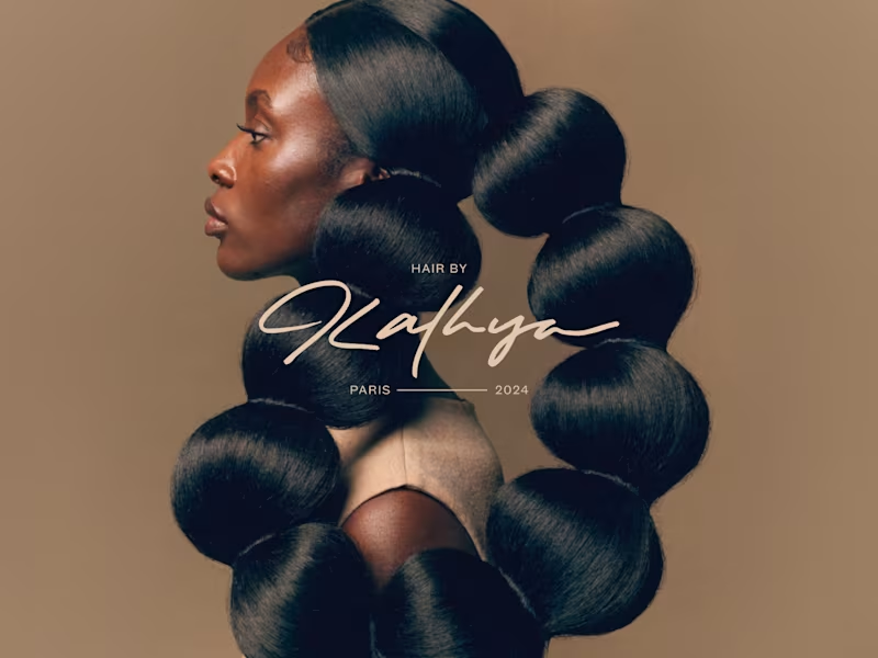
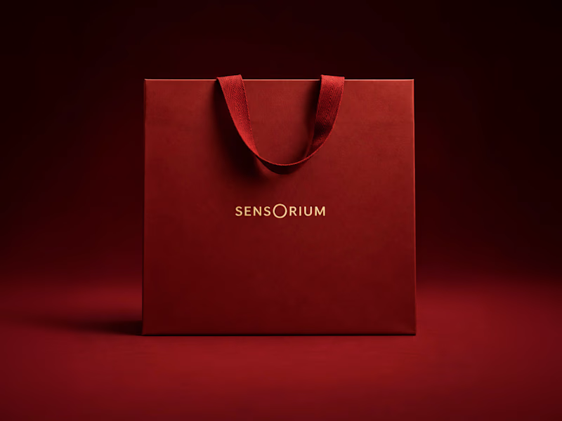
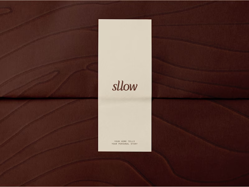

Rive Animator for Interactive Product Experiences

Rive Animator for Interactive Product Experiences


Brand & deck design getting founders leads, funds, & clients
- $25k+
- Earned
- 6x
- Hired
- 5.0
- Rating
- 157
- Followers
Brand & deck design getting founders leads, funds, & clients
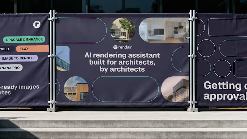
@Rendair Corporation just hit 1 MILLION users 🤯
I think we can safely say that we figured out how to scale the brand successfully!
Huge congratulations to Quim & Jose!
2
2
209
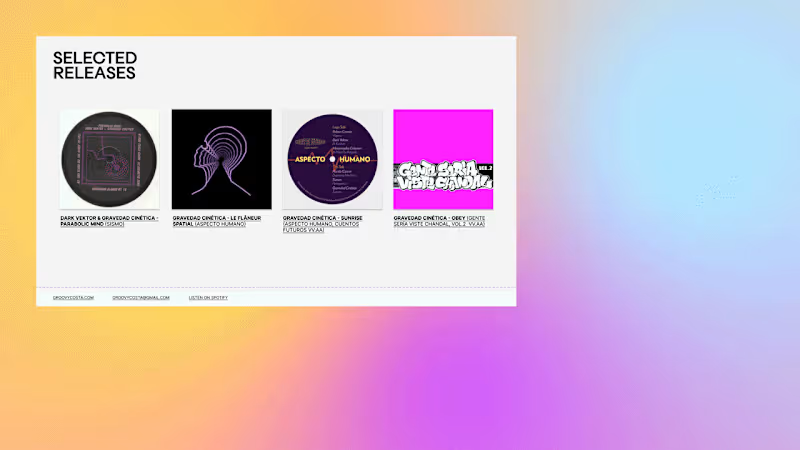
Been thinking a lot about presentations as if they were clothes lately:
They have the power to:
→ Create first impressions
→ Make a brilliant person look underprepared
→ Form assumptions really fast
→ Align you with your people
→ Convey confidence, status, personality, and belonging
→ Express your identity
→ Feel off: one size fits all doesn't usually work out
→ Look timeless, if well-designed
Above all, I think they need to be comfortable to use or you'll end up taking them off 😅
1
220



UX/UI designer creating thoughtful and scalable experiences.
- $5k+
- Earned
- 2x
- Hired
- 5.0
- Rating
- 32
- Followers
UX/UI designer creating thoughtful and scalable experiences.
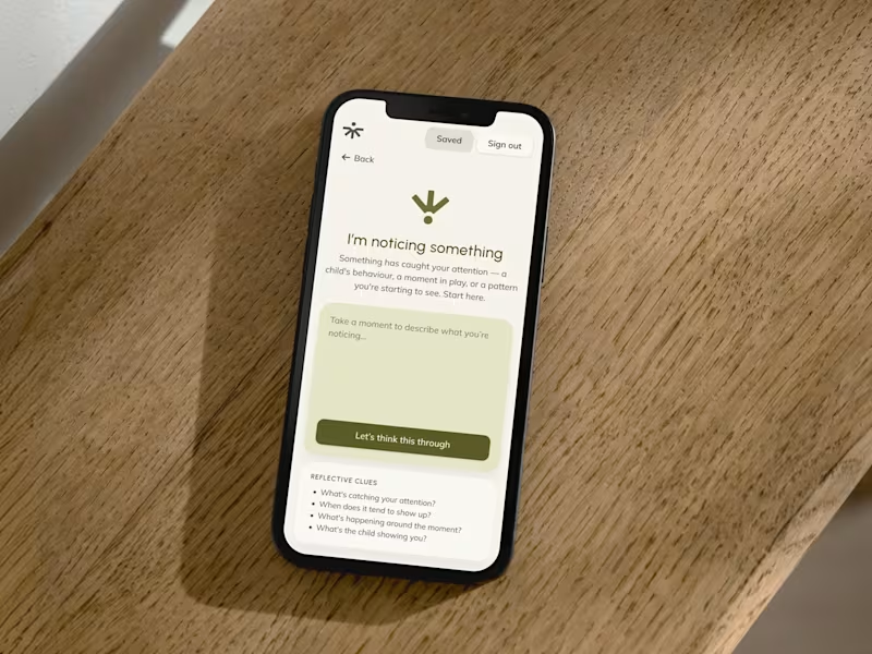



Framer Experts | Web Design & Development | UX/UI | Branding
Framer Experts | Web Design & Development | UX/UI | Branding

We recently helped Insynergy Labs, a UK-based supplement brand, rebuild its digital experience.
Their products were already exceptional. But their old website didn’t communicate that, as sections were not fully cohesive. So we redesigned it to turn it into a credible, converting, and aesthetic website.
Here’s what changed:
• A new landing experience optimized for user retention.
• A full PDP system that combines trust signals, ingredient transparency, and conversion flow.
• An About page to transform the brand story to increase customer confidence
• A structure that aligns science, clarity, and aspiration.
The result is a website that feels alive, focused, and true to what the brand stands for: quality for health.
You can explore the full case study here 👇🏼
https://www.charlyagency.com/case-study/insynergy-labs
19
689

At Charly Agency, we redesigned the website for Vyrill, an AI startup that helps brands analyze video reviews. The new layout, design system, and storytelling flow improved clarity, usability, and brand perception, helping their team communicate their value with confidence.
You can check the full case study here: https://www.charlyagency.com/case-study/vyrill
If you are considering a website or product redesign, send us a message or book a quick call here: https://calendly.com/charlyagency/25min
3
31
544

