

AI & SaaS launch sites + design systems in Framer & Webflow


AI & SaaS launch sites + design systems in Framer & Webflow
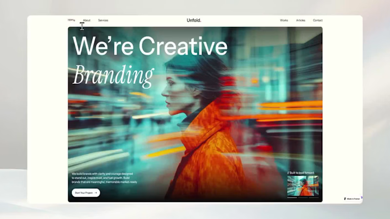
You list all of your projects on your portfolio.
But it never showed your strategy and thinking process.
That gap is where premium clients quietly disappear.
Unfold solves this gap.
Every section is built to align business strategy, brand positioning, and creative execution.
Case studies become decision breakdowns.
Services read like strategic engagements, not menu items.
By the time someone books a call, they already trust how you think.
Check the comment.
1
4
243

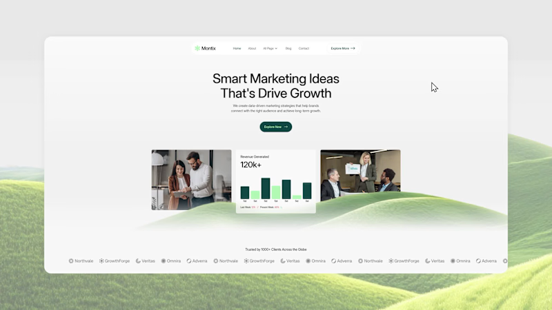
Most agency websites look impressive. But convert terribly.
Visitors land, scroll for 10 seconds, and still can't answer:
- What do you do?
- Who for?
- Why you?
That confusion is costing you clients.
Montix fixes this.
A Webflow template built for marketing agencies, where every section has one job: turn visitors into booked calls.
Real proof.
Clear positioning.
Strategic CTAs.
17 pages.
CMS-powered.
Your website should close clients.
This one does.
Check comment for the link.
6
13
978

You spent 3 years getting good at design.
But your portfolio still looks like it was made in an afternoon.
Hiring managers and clients decide in seconds.
If your site doesn't match your skill level, they're gone before they read a single case study.
You don't stack a project list on your portfolio.
You just need a site that works tonight.
Floyd Miles is a Framer template built specifically for product designers.
Clean, simple, faster; ready in hours, not weeks.
It comes with a Figma design file and a Framer Remix link.
Key features include light and dark mode, case studies, pricing, about, and even a 404 page.
No need to add another layer of tension when showcasing your work.
Start now with this premium portfolio template.
Link in the comment.
9
10
1K


No-Code Web Designer With Framer Expert & Webflow
No-Code Web Designer With Framer Expert & Webflow


Brand & Website Designer | AI Video | UI/UX


Brand & Website Designer | AI Video | UI/UX



Award-Winning UI & Framer Designer for Stunning Websites

Award-Winning UI & Framer Designer for Stunning Websites


Brand & Motion Designer | AI Video, Visual Identity, UI/UX

Brand & Motion Designer | AI Video, Visual Identity, UI/UX




Product Designer | SaaS, Fintech & AI
Product Designer | SaaS, Fintech & AI
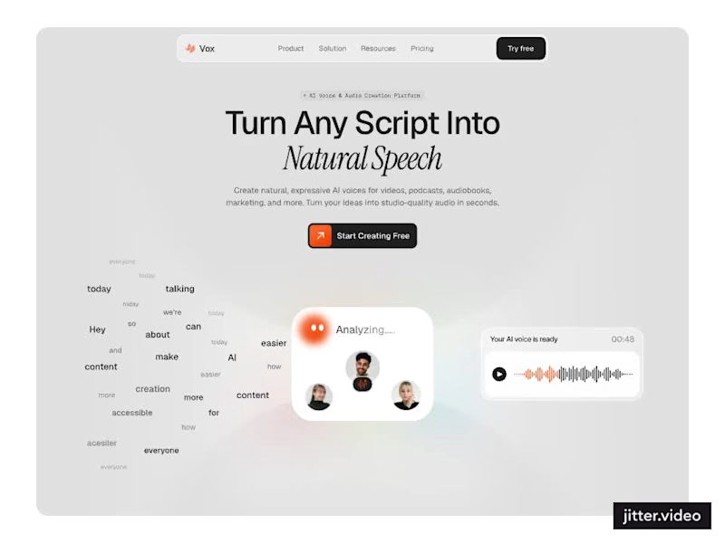
Designed a modern AI Voice SaaS Landing Page.
A soft light interface with gentle color glows, warm orange accents, and elegant italic serif headlines for a calm and creative first impression.
A floating word cloud turning into a voice wave, a language grid, a dark voice gallery with real faces, and use case cards for podcasts, audiobooks, video, and marketing make AI voice creation feel easy to understand. Clean spacing and soft cards keep the whole page light and easy to explore.
2
2
83

Designed a modern Finance Management Landing Page.
A sleek dark interface with an emerald green glow, mint accents, and a mix of clean sans and italic serif headlines for a premium and confident first impression.
Layered app and chart previews, bento style feature cards for analytics, budgeting, and reports, a growth score gauge, clear pricing plans, and a simple FAQ make managing money feel smart and easy. A bold glowing wordmark footer and consistent green highlights keep the whole page polished and easy to explore.
1
95
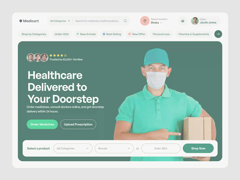
Designed a modern Online Pharmacy E-commerce Website.
A deep forest green hero with fresh mint accents, bold clean typography, and a friendly delivery photo for a caring and trusted first impression.
A smart search with location select, quick category pills, clear buttons to order medicines or upload a prescription, and a simple product finder by category, brand, or SKU make buying health products feel fast and easy. Rounded shapes, balanced spacing, and calm green tones keep the whole page clean and reassuring.
2
4
133
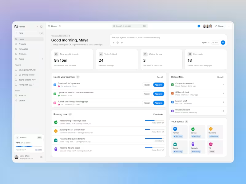

Brand & Web Designer

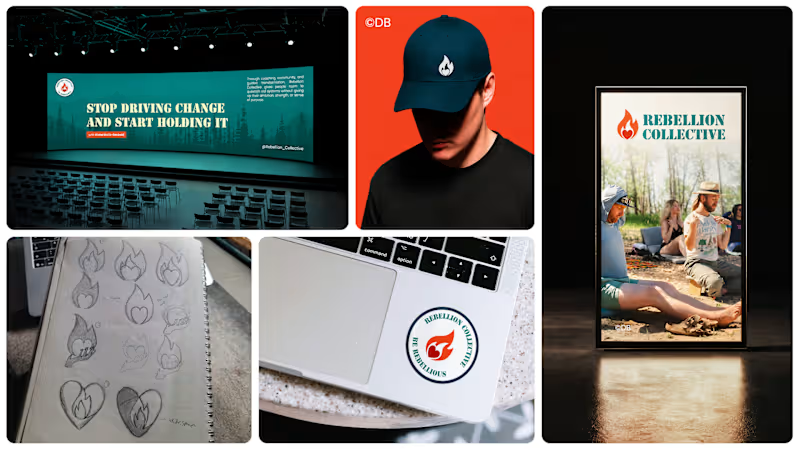

UX-led product design & dev agency for b2b saas and AI
UX-led product design & dev agency for b2b saas and AI
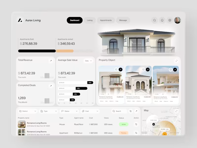
Real estate dashboards are usually built for data entry. Aurex Living was built for decision-making.
$873,42.39 total revenue. 1,269 completed deals this month. $276K sold, $346K rented. Property cards, agent tracking, map view, average sale value trending +10% - every number a real estate operator actually needs, on one clean white canvas.
Check it out (https://dribbble.com/shots/27350201-Aurex-Living-Real-Estate-Dashboard-Design)
12
17
1.9K
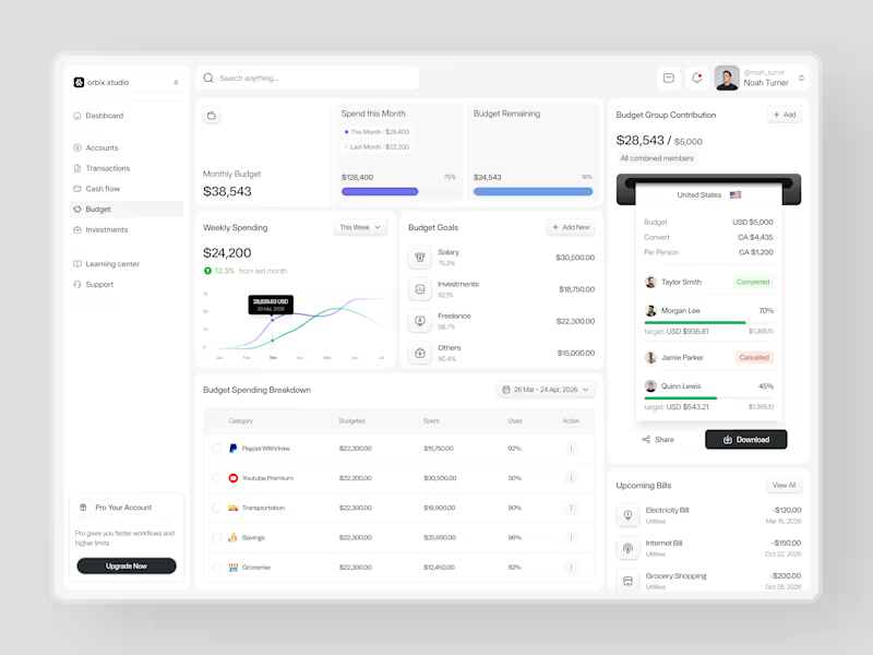
Most people set a budget once and forget it exists until it's too late.
This dashboard was designed to fix that. Weekly spending at $24,200, up 12.5% from last month. Monthly budget at $38,543 with 75% already allocated. Budget goals tracked by category salary, investments, freelance, and others each with a completion percentage and a dollar target that makes progress visible before the month ends.
The group contribution panel takes it further. Four members. One shared budget of $5,000. Taylor completed. Morgan at 70%. Quinn at 45%. Jamie cancelled. A collaborative finance tool that makes shared budgeting feel as clean as personal budgeting should.
Upcoming bills electricity, internet, grocery listed before they hit. A spending breakdown table that shows exactly what was budgeted, what was spent, and how much is left in every category.
This is what budget management looks like when the design treats users like they actually want to be in control of their money.
Does this feel like a dashboard that would change how a team manages their finances together? 👇
Designed by Orbix Studio
Tools: Figma
#DashboardDesign #FintechUI #BudgetApp #UIDesign #WebDesign #ContraFreelance #ProductDesign #SaaSUI
11
31
3.6K