Branding and packaging designer


Multidisciplinary Designer | Identity • Digital • Print
Multidisciplinary Designer | Identity • Digital • Print
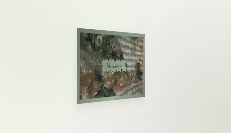
Fleuraison — Organic Minimalist Floristry
Artisanal Storytelling: Fleuraison Floral Studio
Translating the organic soul of a boutique flower studio into a minimalist visual identity. This design focuses on "perceived value"—making the brand feel as premium as its arrangements.
Key features:
★ Organic Palette: Earthy sage-green tones that project freshness and high-end artisanal quality.
★ Botanical Artistry: Halftone floral illustrations that bridge the gap between vintage charm and modern clean layouts.
★ Strategic Minimalism: A layout designed to let the brand’s professional authority speak for itself.
Business Goal: Elevating the brand's aesthetic to justify premium pricing for bespoke event curation. High-quality, technically precise layouts ready for professional printing to help a local business stand out in a saturated market.
0
149


Most nightlife branding tries to scream for your attention.
Nocturne is designed to whisper.
I’m thrilled to share that the brand identity for Nocturne — The Art of Sound & Shadow is officially live on Behance!
Nocturne is a premium visual identity developed for an exclusive, private bar sanctuary. The concept centers on the intersection of sensory experience, high-fidelity sound, and intimate hospitality.
The Client’s Challenge:
The objective was to avoid traditional, loud bar tropes. The client sought a sophisticated direction that would balance a sense of heritage with modern minimalism — creating an environment where the brand doesn't dominate, but quietly reveals itself through details.
The Design Strategy:
★ Light & Shadow: The identity plays with deep shadows and warm contrasts, mimicking the physical lighting of the venue.
★ Refined Typography: High-contrast serif typography establishes a confident, mysterious, and premium character.
★ Tactile Textures: A deep burgundy and gold palette paired with a signature floral lace pattern to create a cohesive, sensory journey for the guest across physical artifacts.
The result is a visual ecosystem where every touchpoint feels deliberate, premium, and quietly confident.
👉 Explore the full case study on Behance:
https://www.behance.net/gallery/255251611/NOCTURNE?platform=direct
I would love to hear your thoughts and get your support on this project!
3
12
144


Graphic Designer specializing in corporate brand identity.
Graphic Designer specializing in corporate brand identity.


Brand & Packaging Designer for Consumer Brands
- $10k+
- Earned
- 3x
- Hired
- 5.0
- Rating
- 30
- Followers
Brand & Packaging Designer for Consumer Brands


Brand Designer & Art Director

graphic designer & art director
graphic designer & art director



Experimental Architecture & Graphic Design
Experimental Architecture & Graphic Design


View more →

Motion Designer / 3D Artist
Motion Designer / 3D Artist