Built with Jitter
10KC - Networking & Mentorship - Branding

Margo Syniakova


Project Overview
A new identity built around the power of meaningful connections.
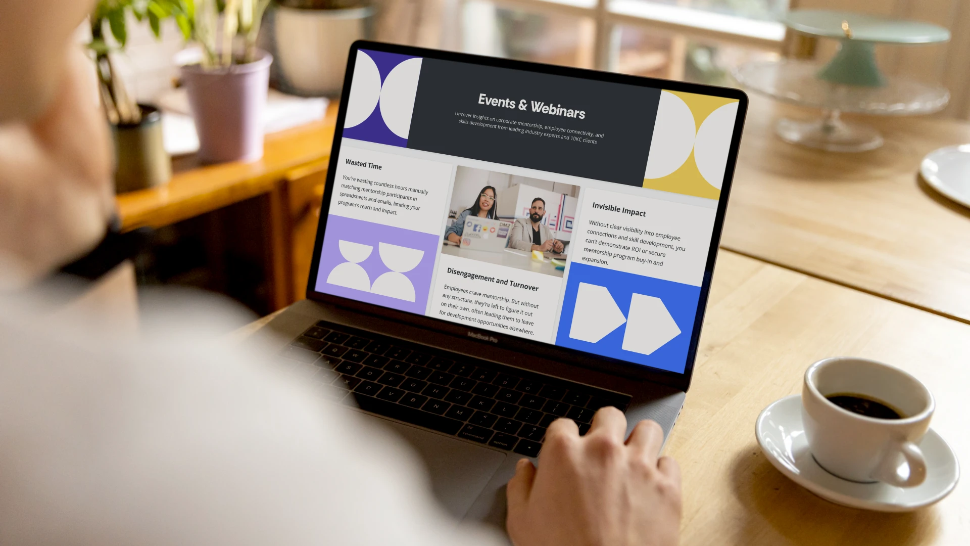
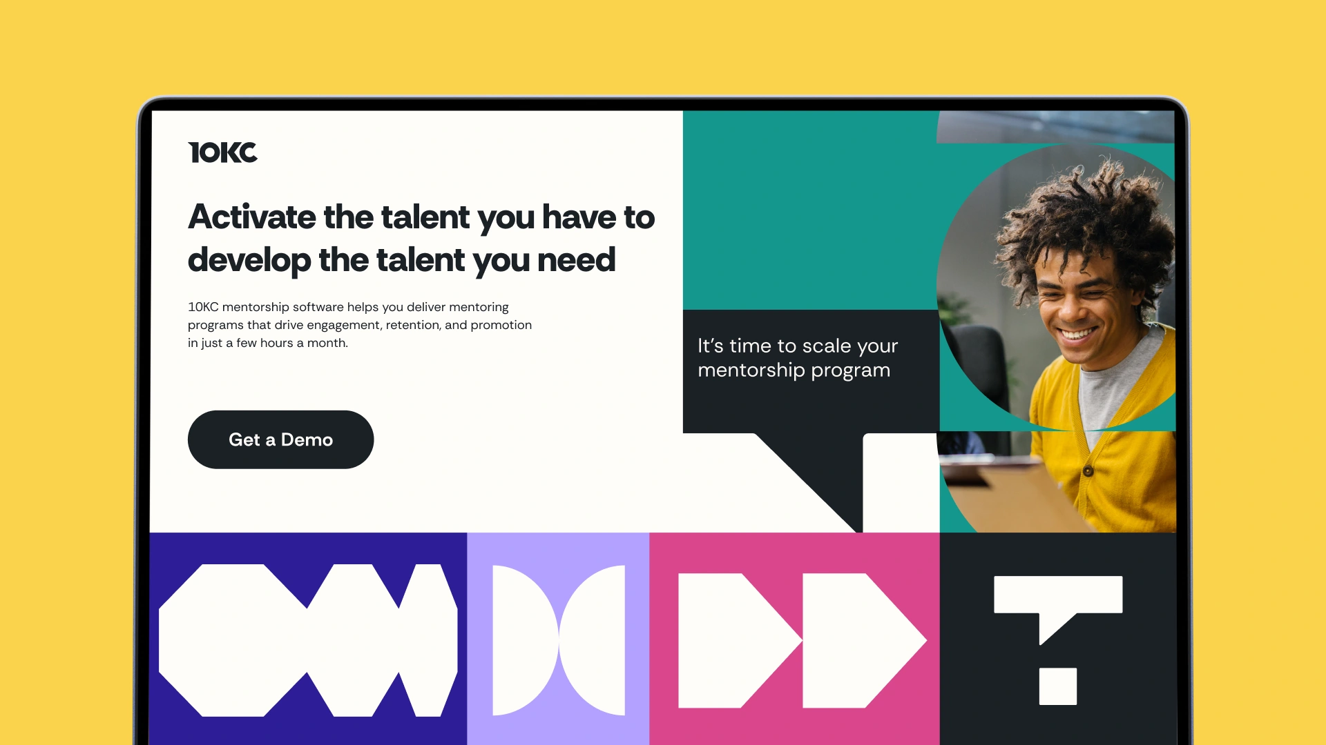
10KC is a platform designed to create stronger connections between people inside organizations. The challenge was to give the brand a clearer voice and a more contemporary visual presence while building a system flexible enough to grow with the platform. We developed a new identity around connection and progress, extending it from a responsive logo and modular graphic language into a complete digital experience.
Core Concept
Because the right connection can change what happens next.
At the heart of 10KC is a simple idea: progress rarely happens in isolation. Conversations lead to opportunities, introductions create new perspectives, and individual connections can influence an entire organization. This became the foundation of the identity — a brand language where separate elements continually meet, interact and create something larger together.
Responsive Logo
One logo, designed to behave differently wherever it appears.
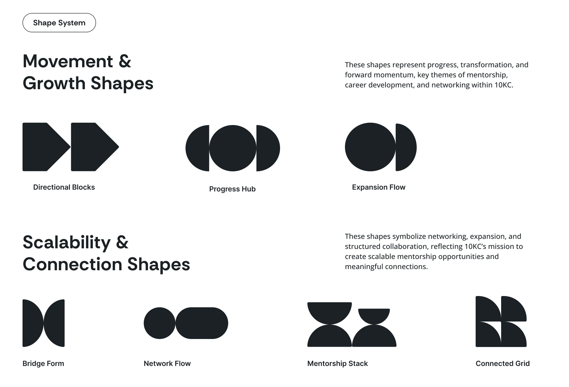
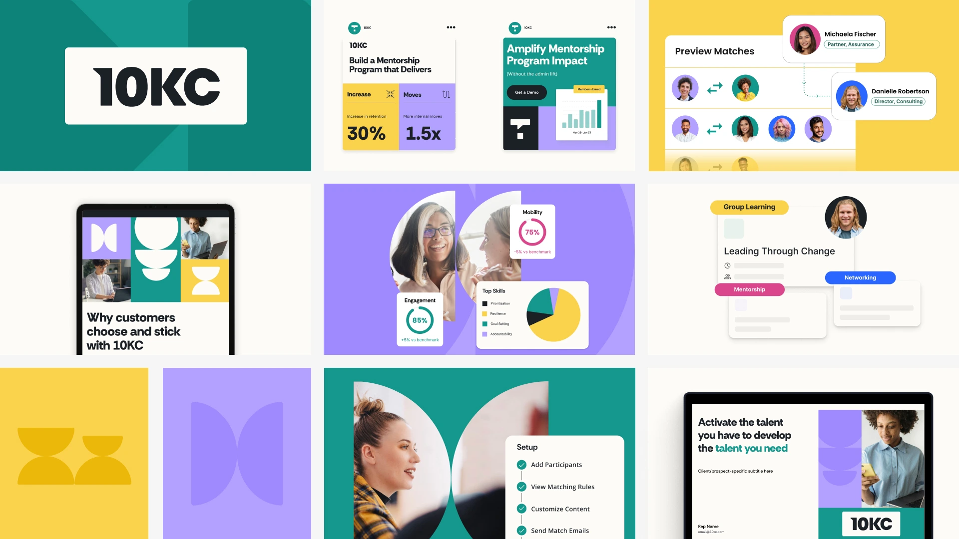
Rather than treating the logo as a fixed signature, we developed it as a responsive part of the wider identity. Its structure can adapt across different scales and contexts while maintaining the same recognizable character. This flexibility gives 10KC a more dynamic presence and reflects the behavior of the platform itself — constantly connecting people, ideas and opportunities.We also created a modular shape system that represents progress, transformation, and structured collaboration. This visual system reflects the platform’s mission to connect people through mentorship and knowledge sharing.
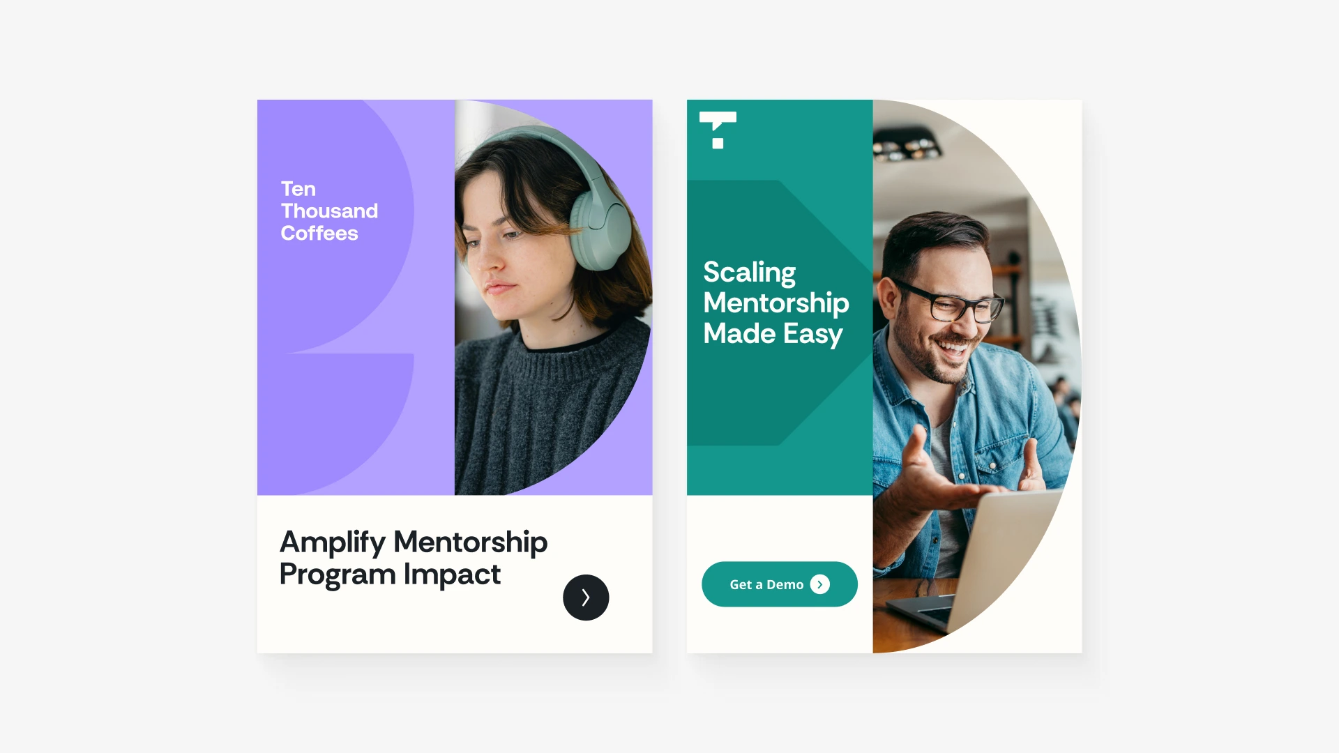
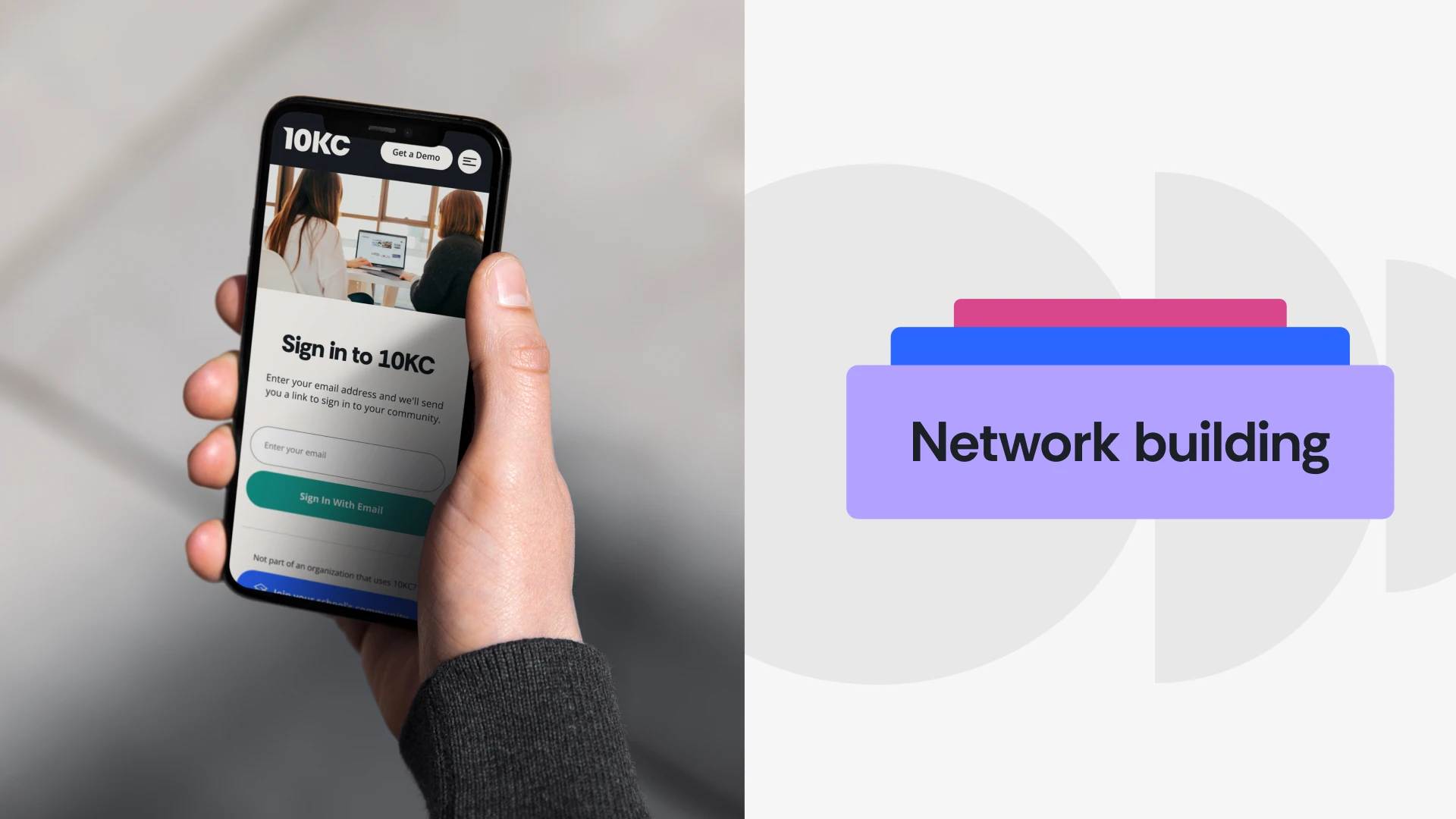
Alongside the visual language, we introduced a new brand voice, refreshed the photography direction, and designed and developed the platform’s website to bring the entire identity to life.
Graphic System
Simple shapes create an endless language of connection.
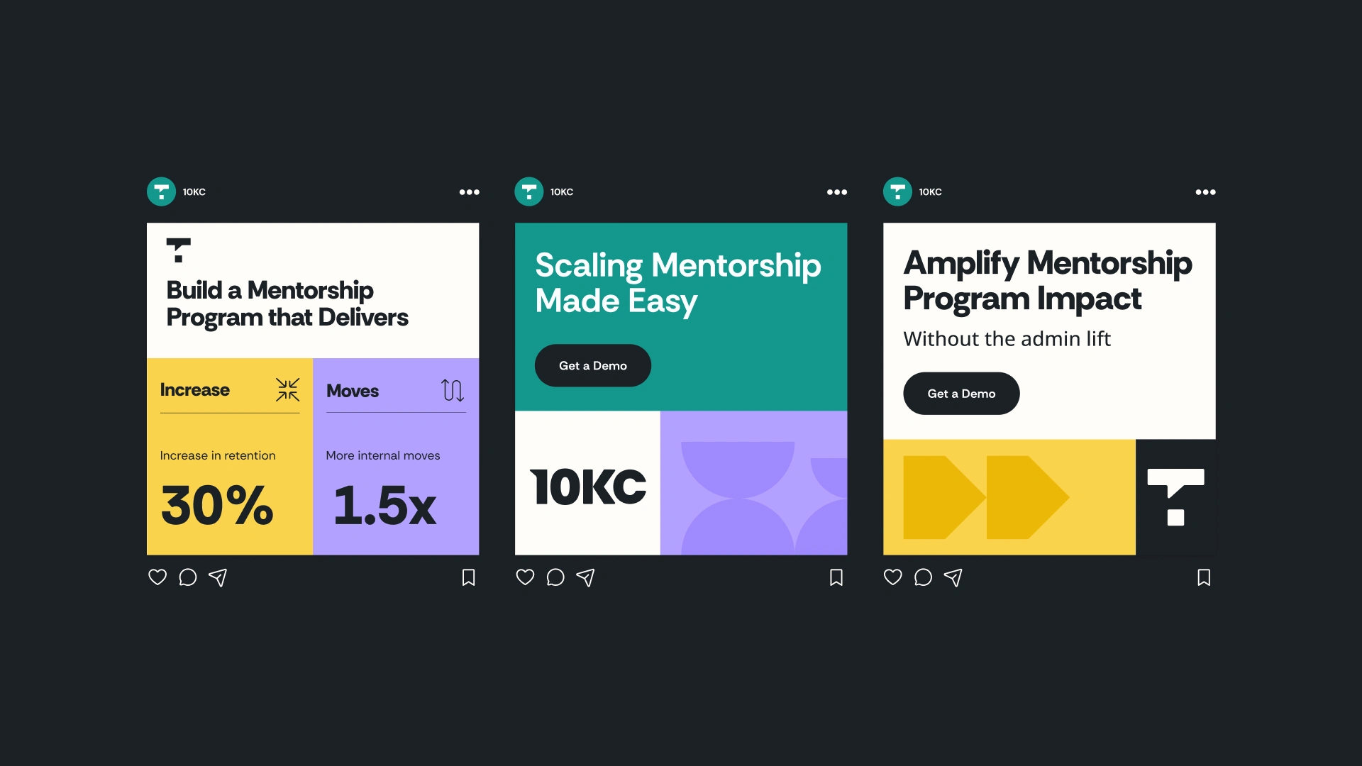
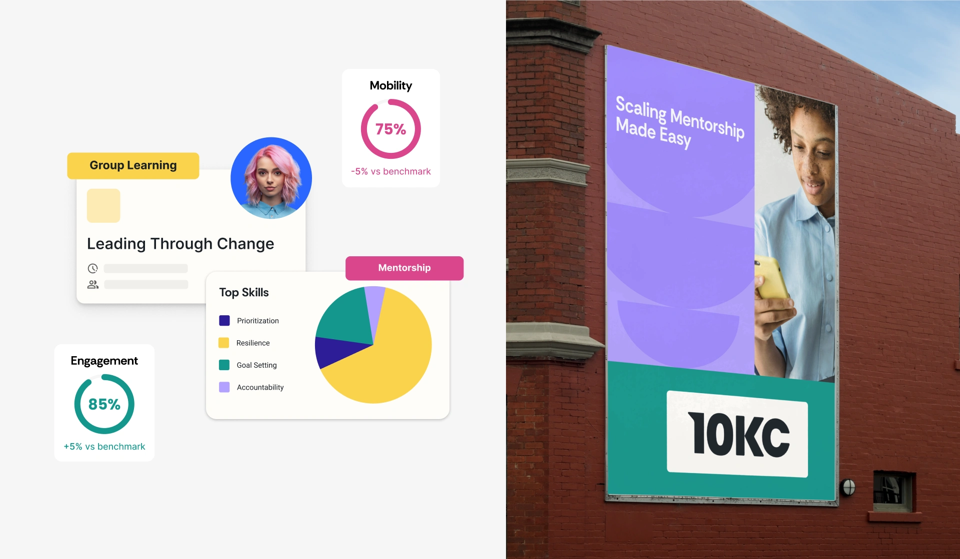
A modular family of shapes extends the logic of the identity beyond the logo. Elements can meet, overlap, separate and reorganize to create compositions that represent exchange, collaboration and movement. The system offers enough variation for campaigns, digital content and product communication without relying on a single repeated layout, giving the brand consistency through behavior rather than templates.Brand in Motion
Connection becomes a behavior, not just a graphic device.
The modular nature of the system naturally opens the identity to motion. Shapes can approach, connect, exchange positions and form new relationships, turning a static visual metaphor into recognizable brand behavior. This gives 10KC a distinctive way to communicate across digital touchpoints while reinforcing the central idea behind the platform.

Outcome
A system designed to grow through connection.
The new identity gives 10KC more than a refreshed visual presence. A responsive logo, modular shape language, clearer voice and redesigned website create a flexible foundation that can evolve alongside the platform. Different expressions can change in scale, energy and composition while remaining recognizably 10KC — giving the brand the consistency it needs without limiting how it can grow.
Like this project
Posted Sep 3, 2026
A dynamic identity for 10KC, transforming human connection into a flexible system of shapes, movement and digital experiences.
Likes
2
Views
3
Timeline
Aug 1, 2025 - Nov 21, 2025