Contemporary Sunscreen Range Design for UNIT

Margo Syniakova


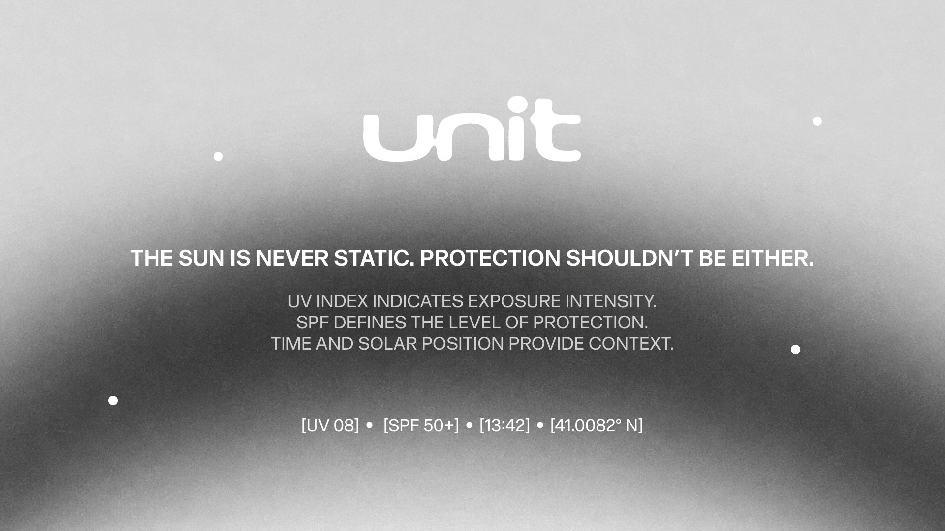
UNIT reframes everyday sun protection through a visual and tactile system shaped by exposure, materiality, and the physical experience of being in the sun.
Designed as a contemporary sunscreen range, UNIT moves away from conventional skincare aesthetics toward something more functional, sensory, and precise. Product architecture, packaging, and communication form one connected system, where technical information becomes part of the identity and every material choice reinforces the idea of protection.
Visual Identity
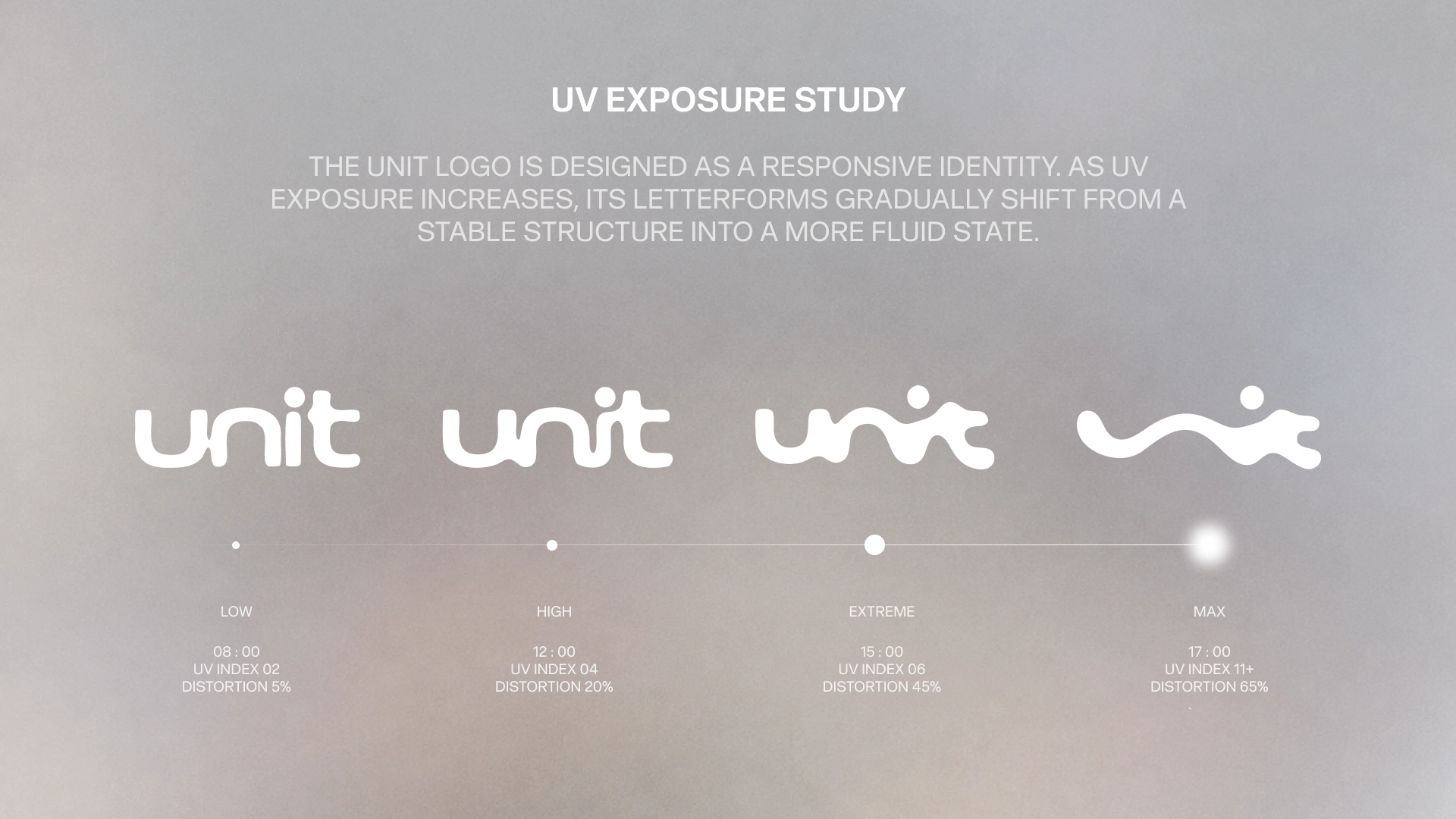
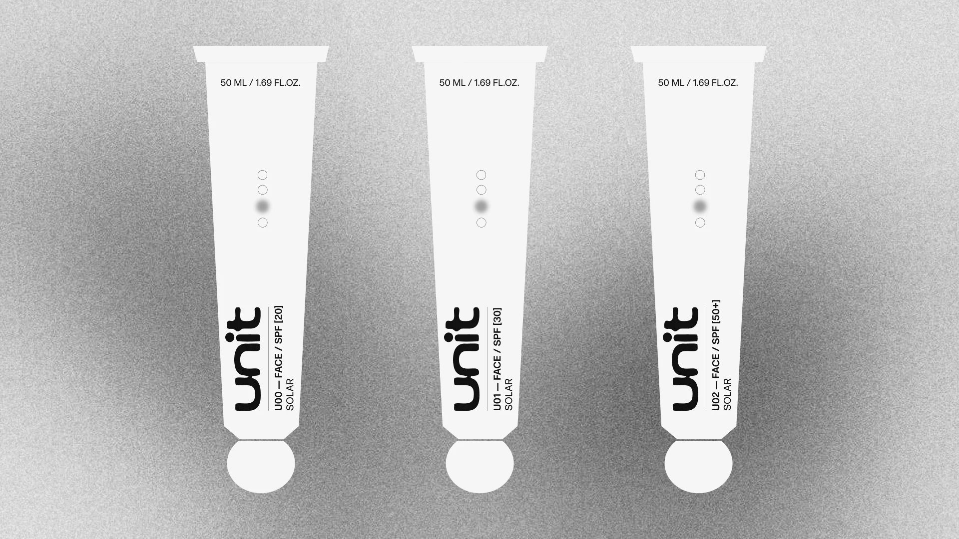
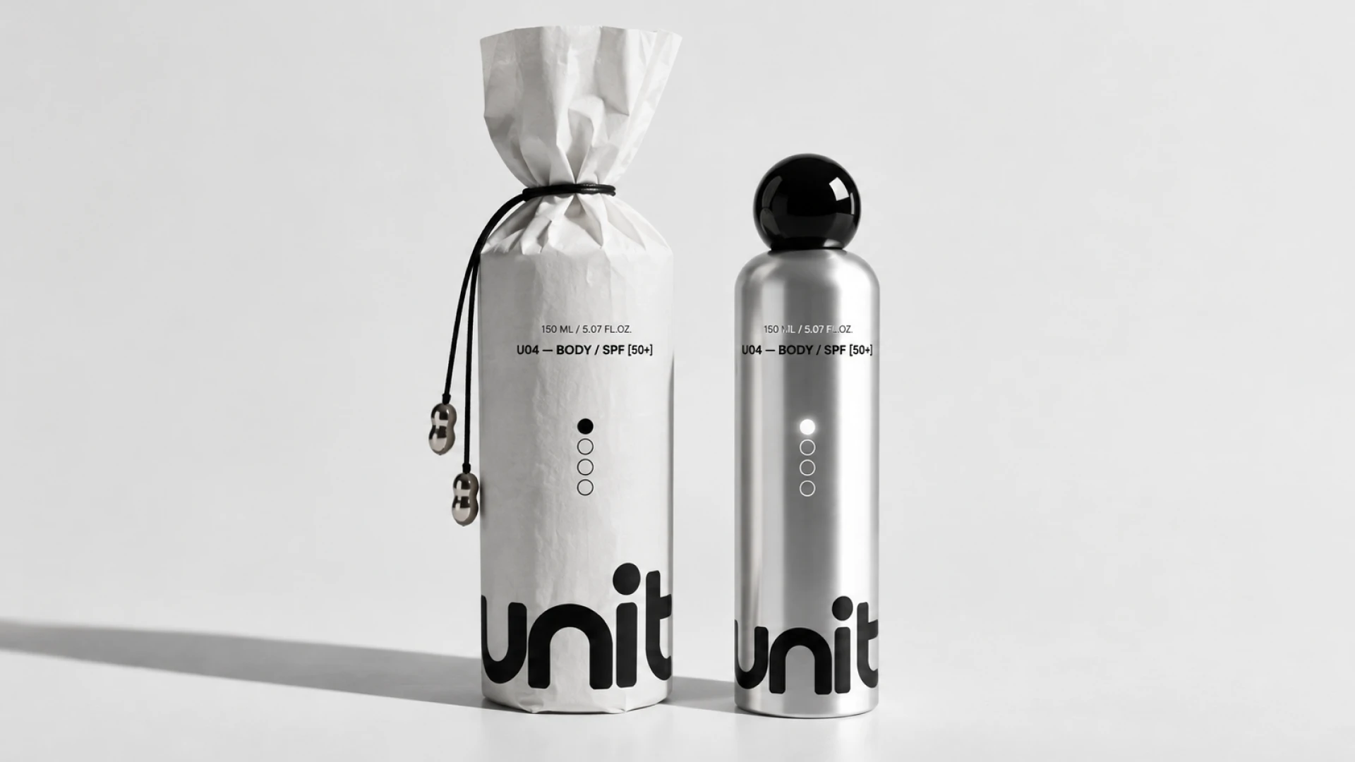
Rather than remaining fixed, the UNIT wordmark responds to intensity, shifting from controlled letterforms into increasingly fluid, heat-affected states.
The custom logo introduces a visual metaphor for exposure. As protection levels increase, the typography appears to soften, distort and melt under heat, with the SPF 50+ expression showing the strongest transformation. This creates a flexible identity system in which variation has meaning: each state belongs to the same brand while communicating a different degree of solar intensity.
Core Concept
The tension between solar heat and physical protection became the starting point for an identity that turns UV exposure into something visible, measurable and tangible.
UNIT is built around the behaviour of the sun rather than around traditional beauty codes. UV intensity, exposure levels and SPF values inform the way the identity changes across the range. What is normally treated as technical product information becomes an active design language, allowing protection itself to shape the brand.
Art Direction
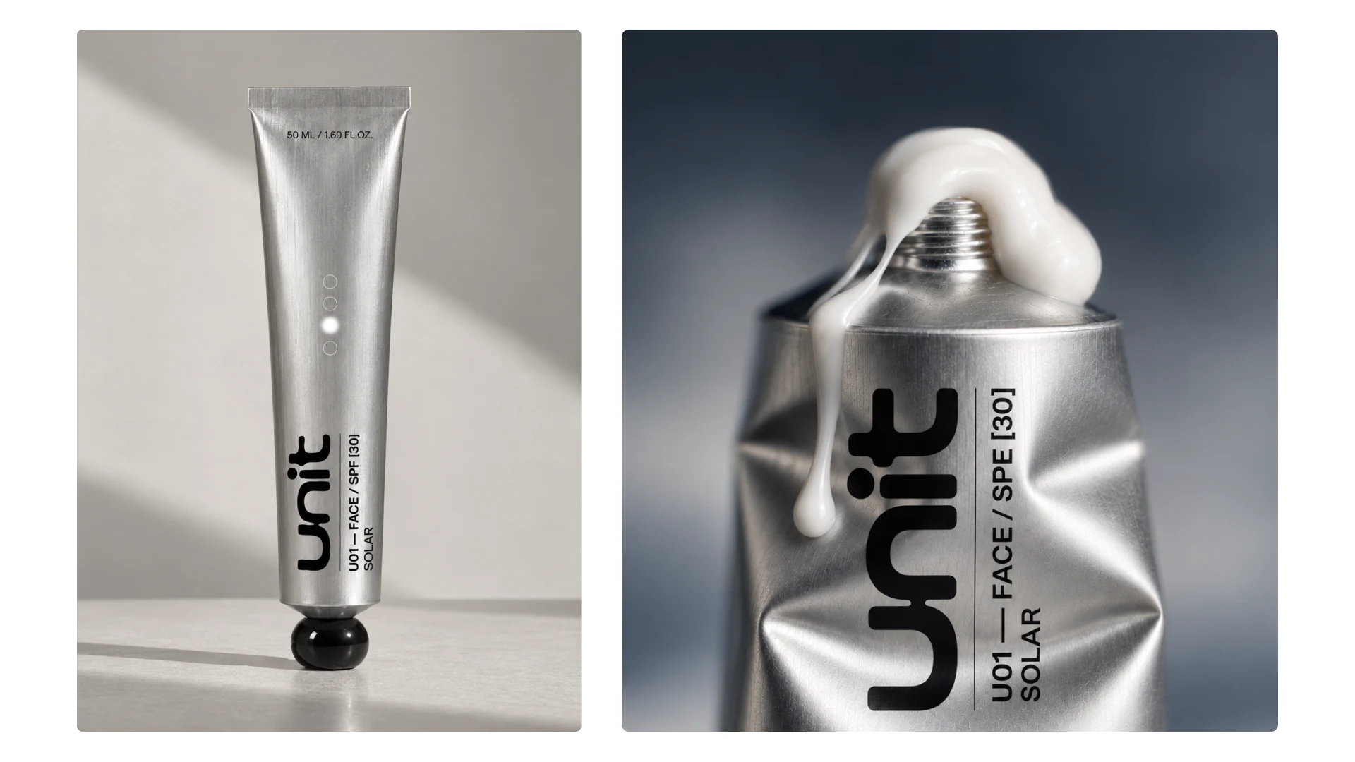
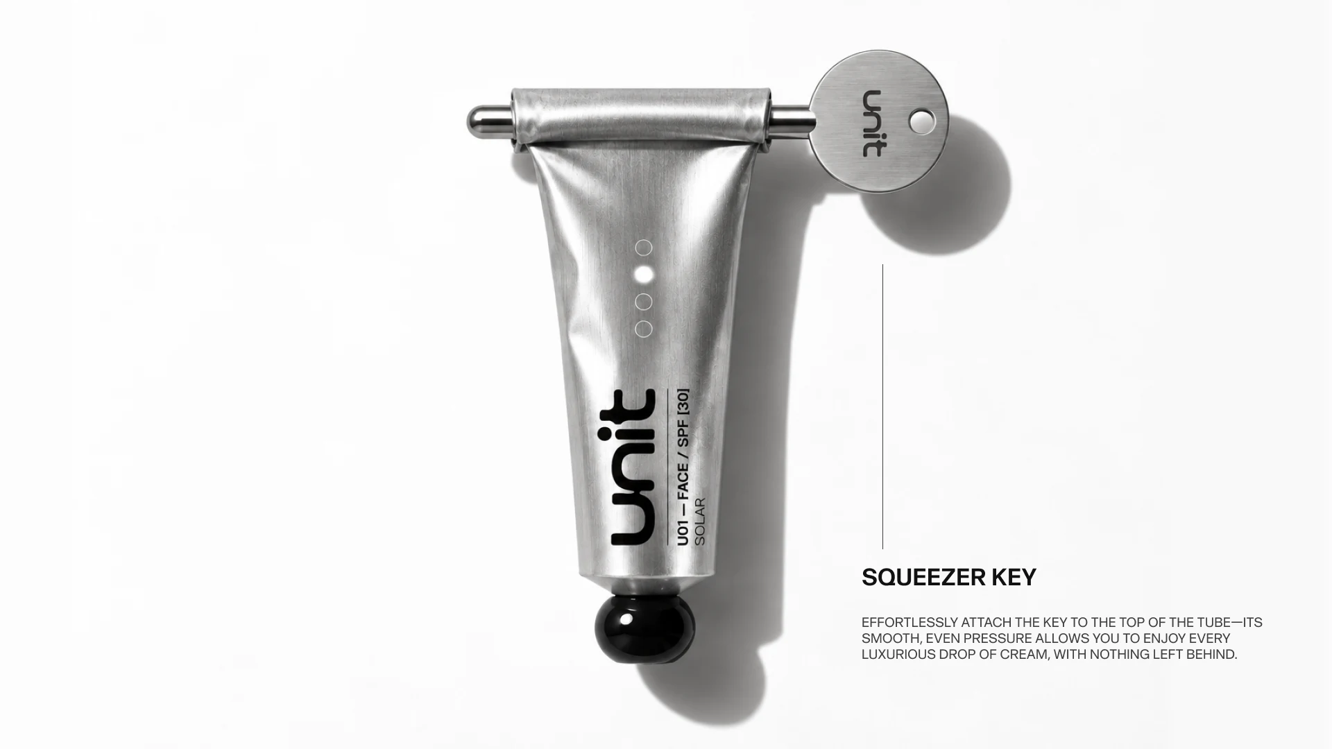
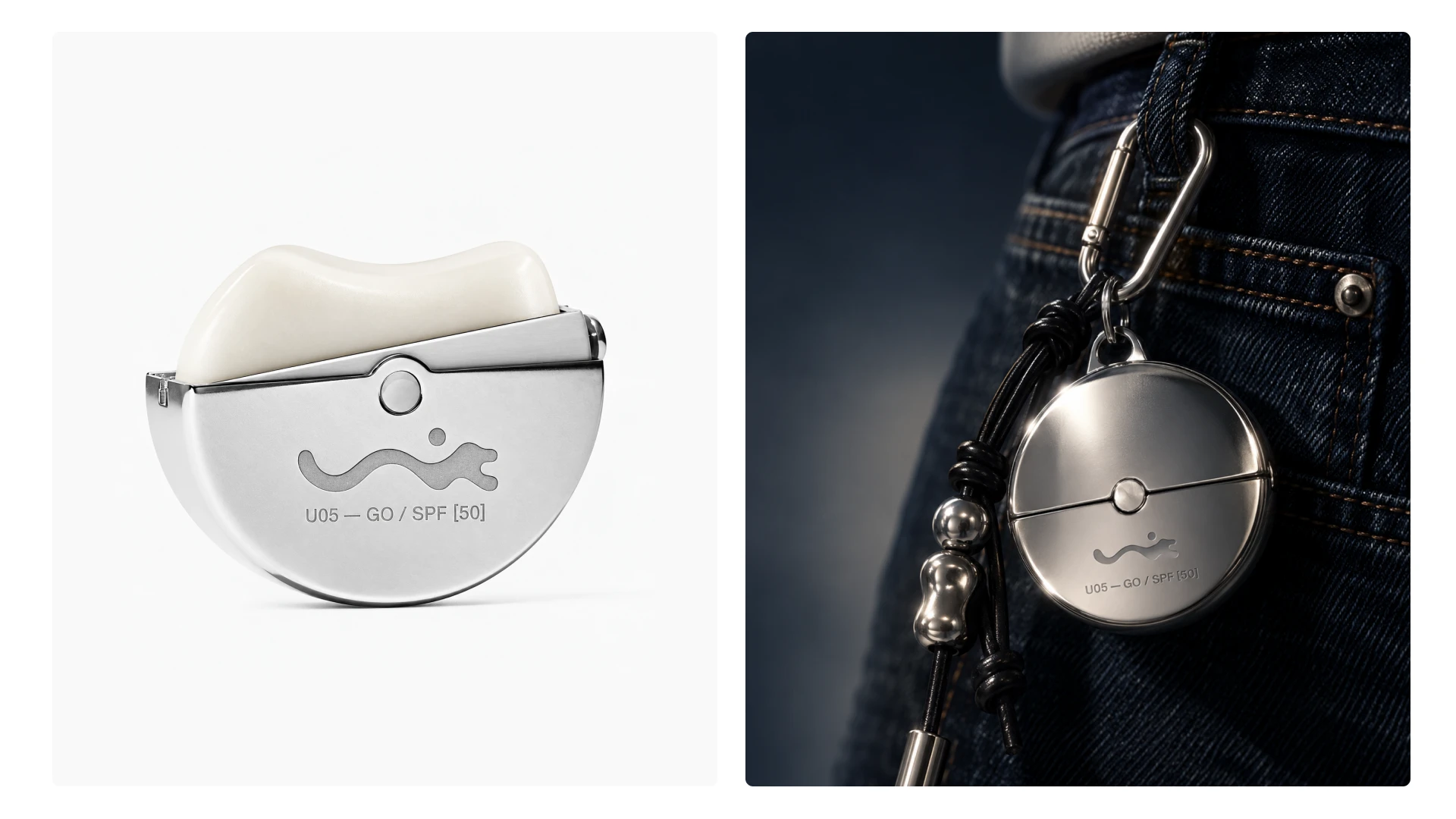
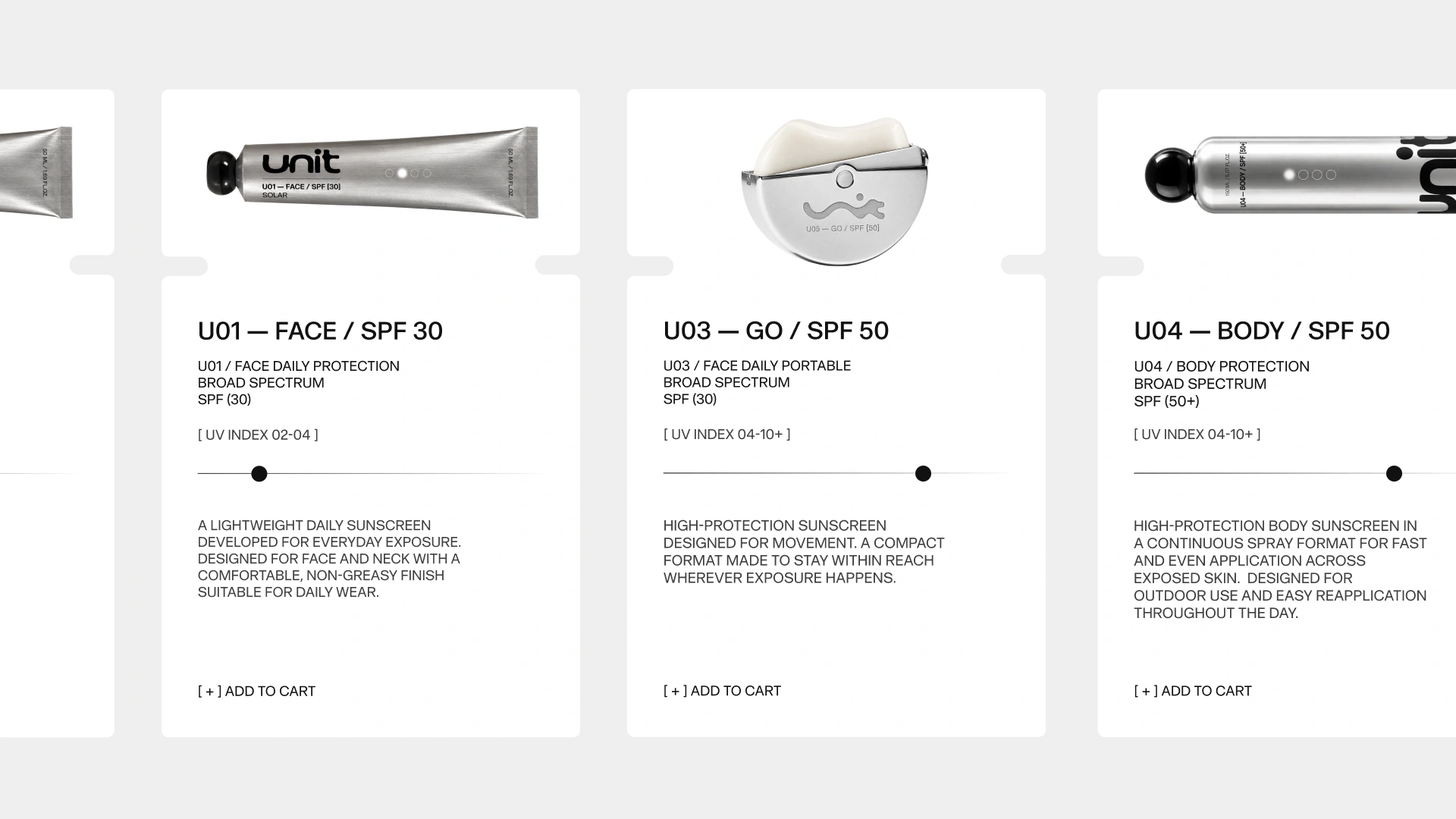
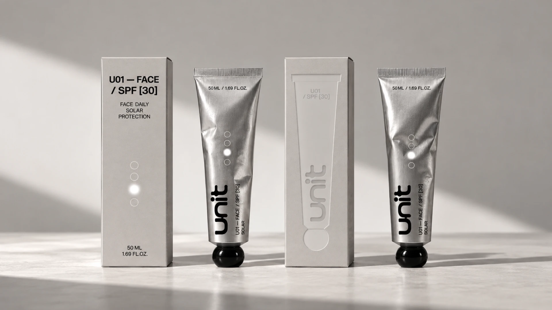
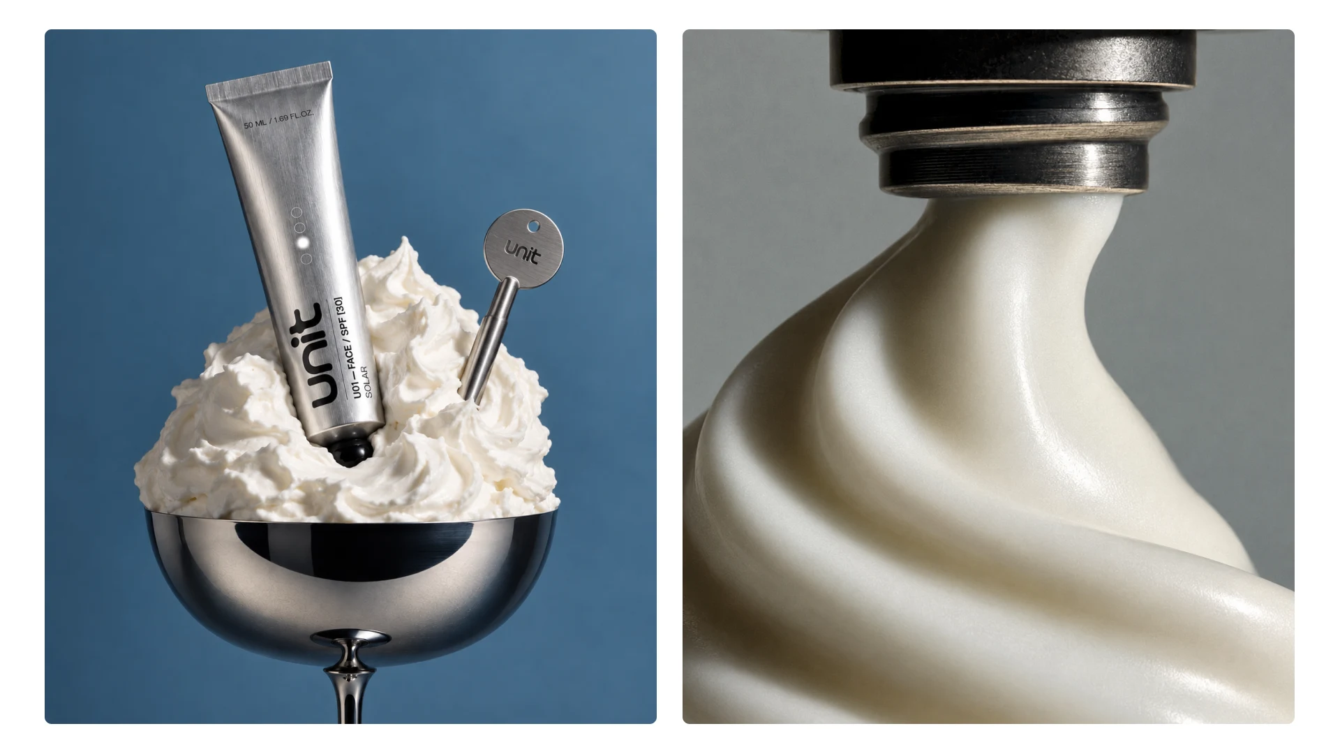
Cool aluminium, hard reflections and sun-cut shadows create a deliberate sensory contrast between the heat UNIT protects against and the object held in the hand.
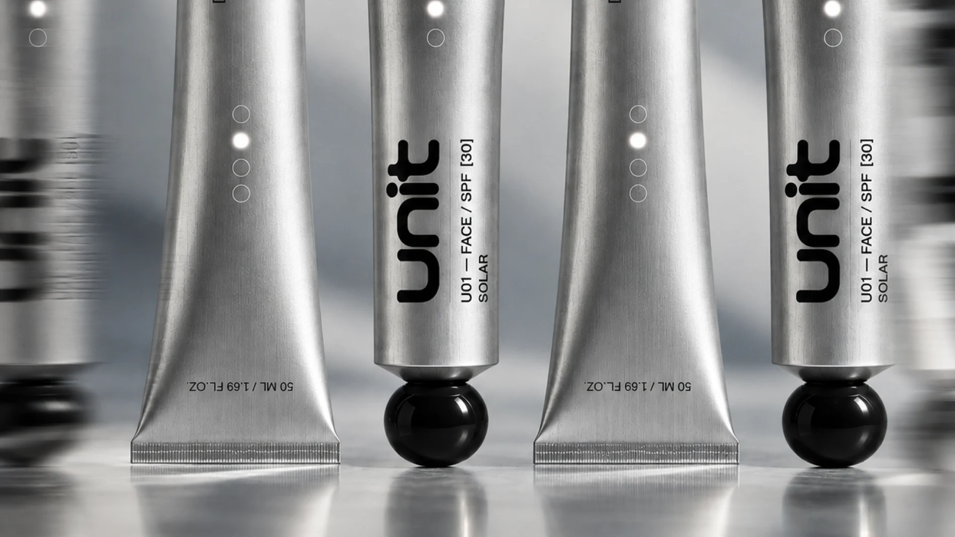
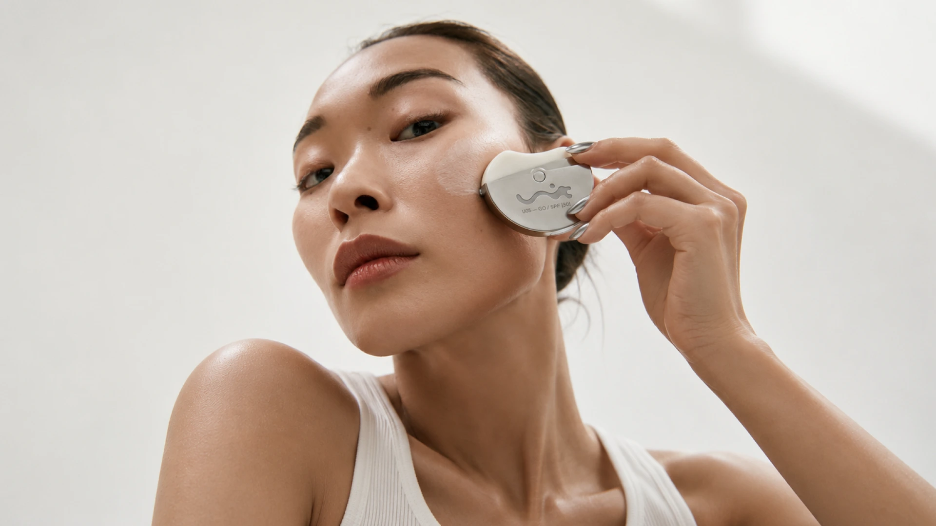
Materiality became central to the art direction. Brushed aluminium gives the primary packaging a cool, almost technical tactility a physical counterpoint to the warmth associated with sun exposure. Photography amplifies this relationship through directional light, reflective surfaces, sharp shadows and close material studies, positioning the product somewhere between skincare, industrial design and editorial object photography.
Connected Experience
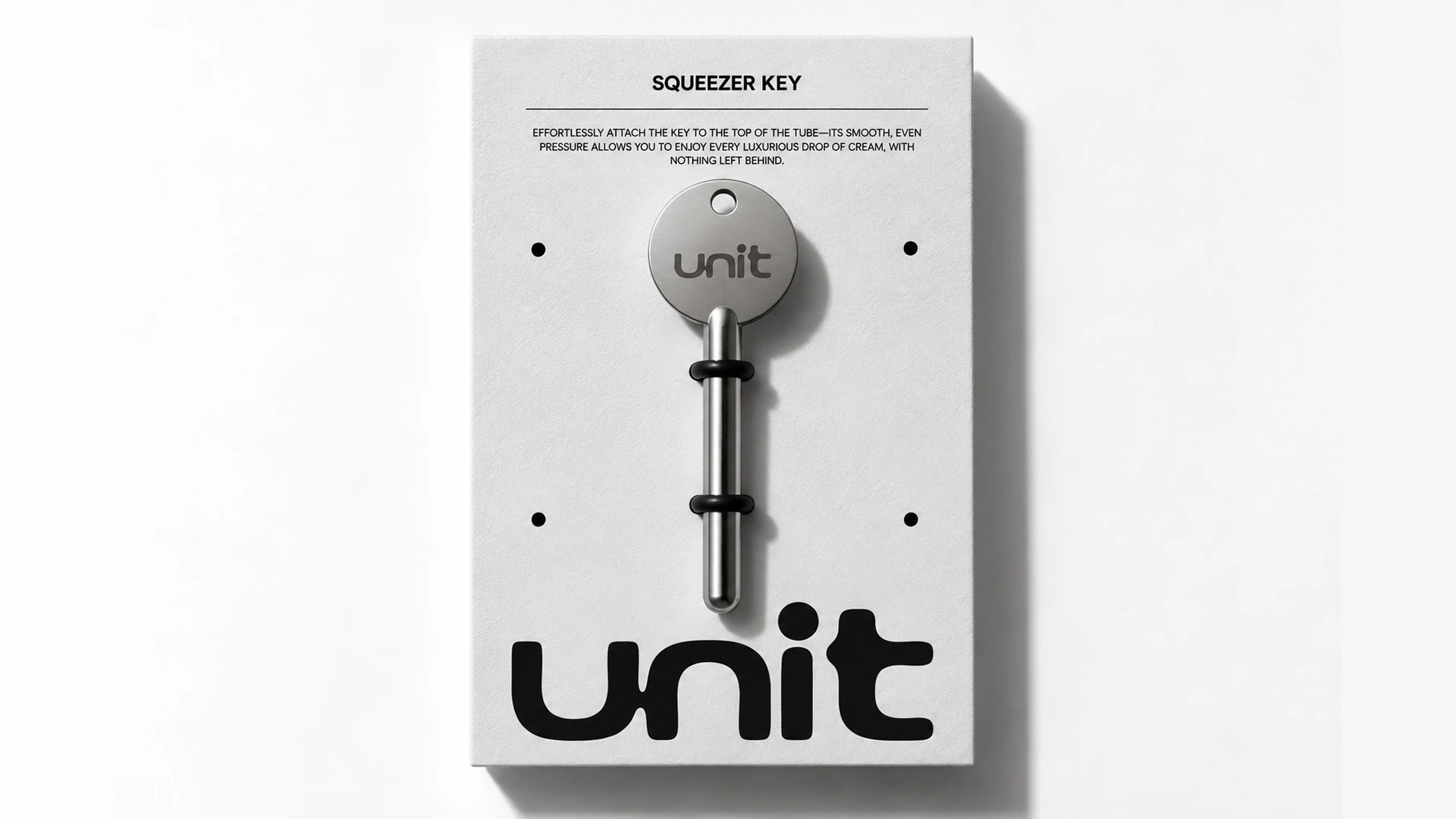
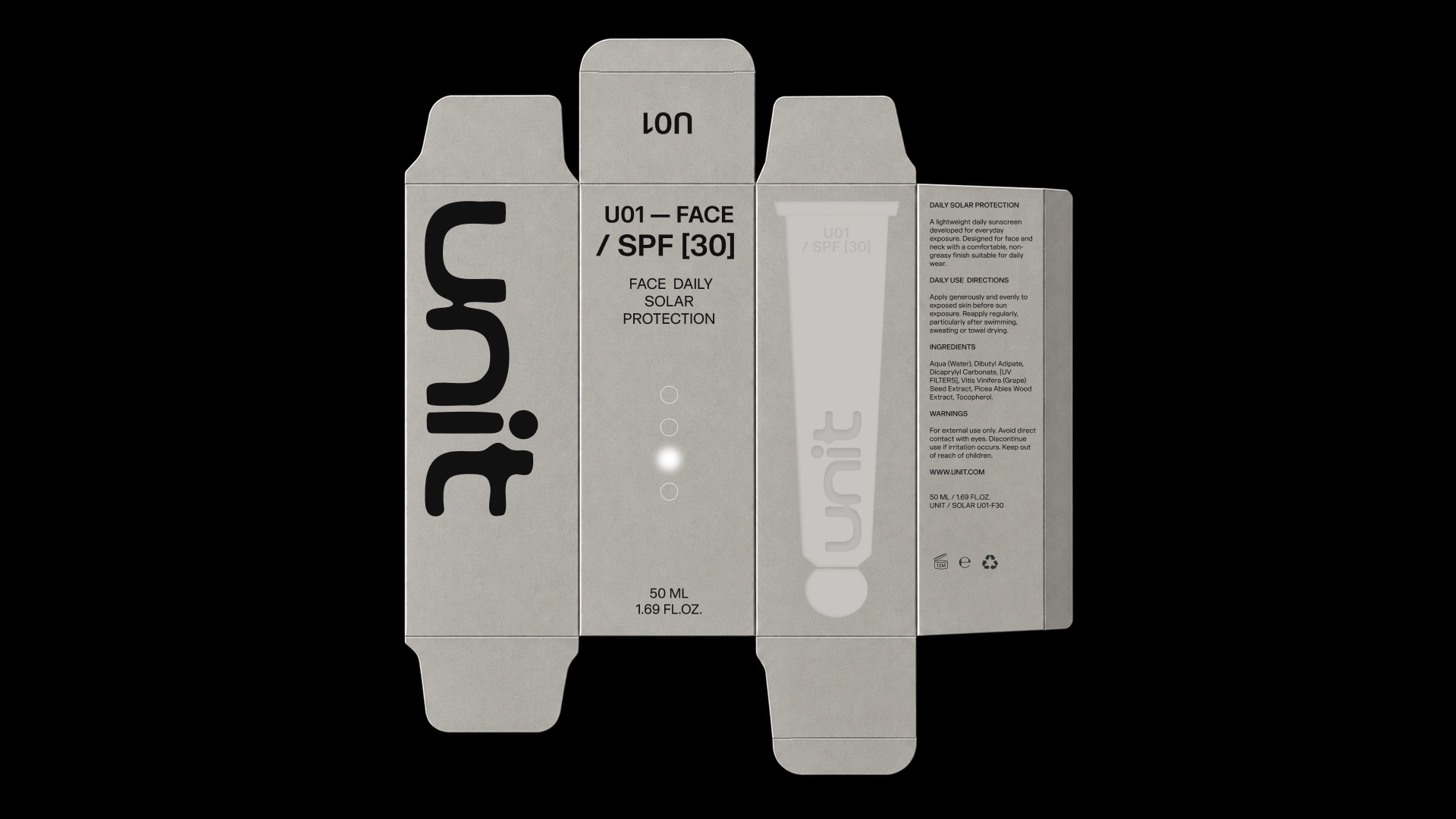
The secondary packaging doesn’t simply contain the product; it quietly reveals it through embossed silhouettes that echo the exact object waiting inside.
Instead of treating the carton as a separate branding surface, its graphics are derived directly from the primary packaging. Tonal reliefs reproduce the shapes, proportions and key details of the aluminium formats, creating recognition before the box is opened. The monochromatic paper stock keeps the experience restrained, allowing embossing, texture, light and shadow to communicate the product through touch as much as through print.
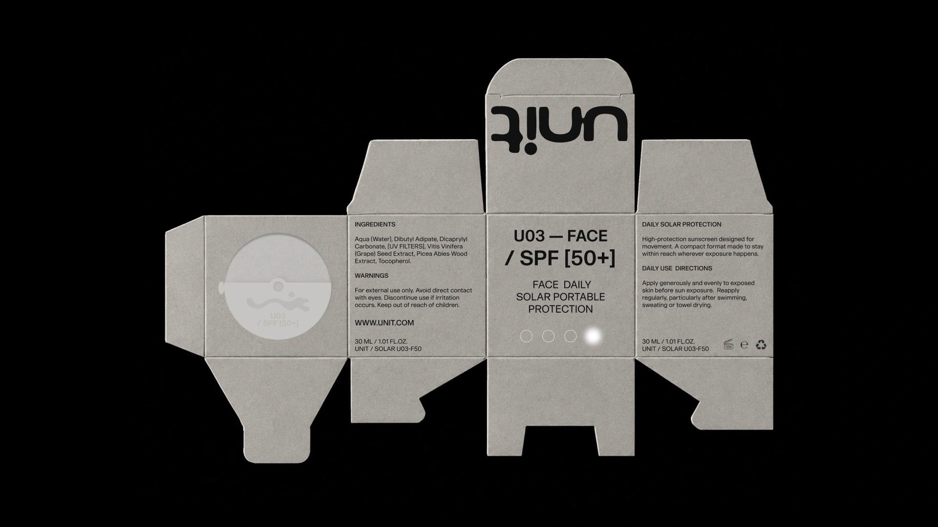
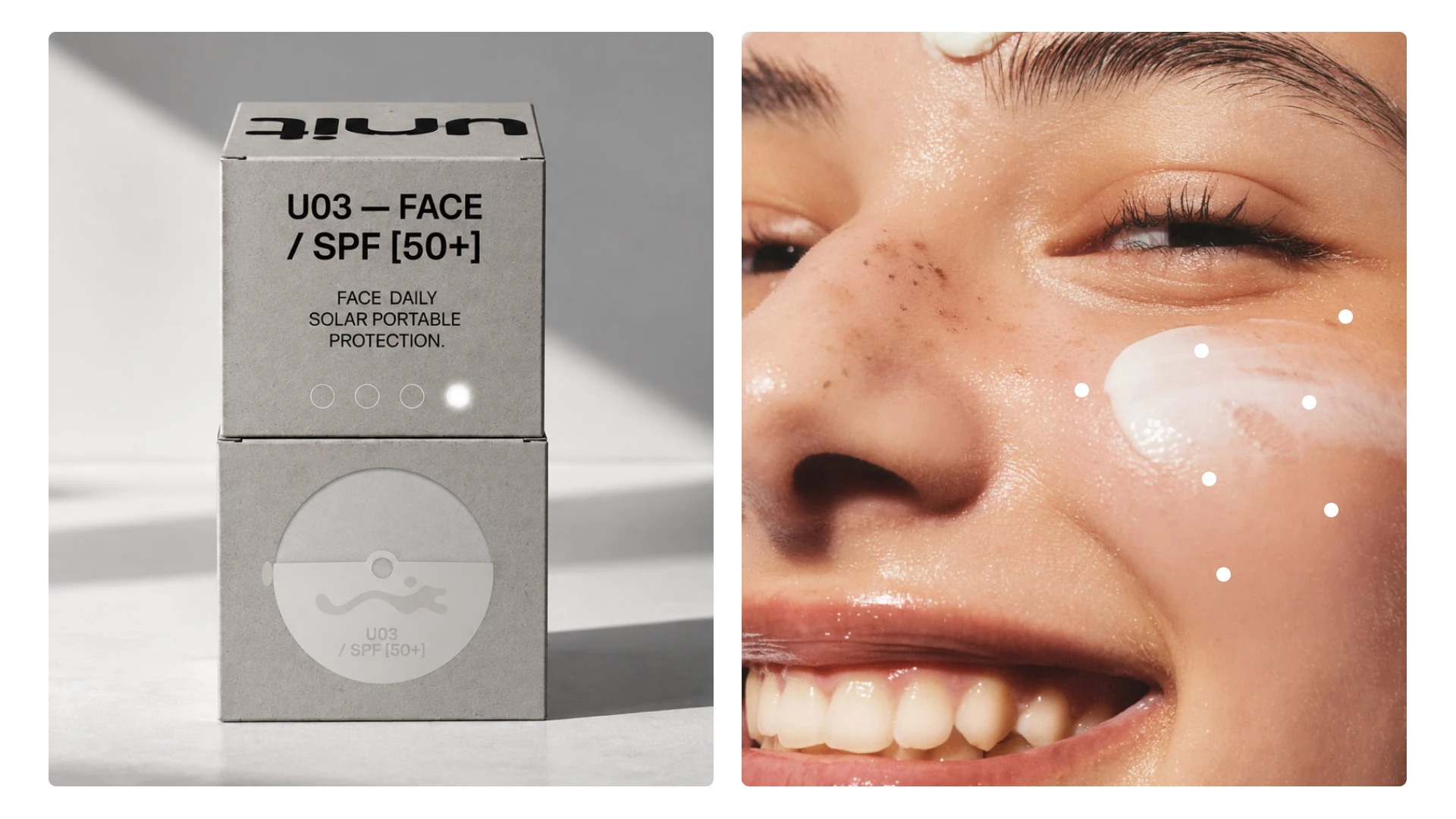
Across tubes, portable formats and cartons, product information becomes a consistent graphic language that helps the range communicate protection at a glance.
A recurring sequence of circles functions as UNIT’s UV and SPF indicator system, translating protection levels into a simple data-driven device. Individual markers activate according to intensity, distinguishing SPF 30 from SPF 50+ without introducing another conventional badge or label. Combined with product codes, structured typography, aluminium finishes and embossed secondary packaging, the device creates continuity across every format while leaving room for each product to behave differently.
Outcome
What begins as sunscreen becomes a connected product experience in which data informs the graphics, heat transforms the identity and material turns protection into something you can physically feel.
UNIT brings strategy, identity, packaging and art direction into a single system rather than treating them as separate layers. The melting wordmark visualises intensity, the UV markers organise protection levels, embossed cartons anticipate the products inside, and cold aluminium introduces a sensory response at the moment of use. Together, these elements give the brand a distinctive language that is functional enough to communicate performance and expressive enough to extend beyond a single sunscreen product.
Like this project
Posted Sep 22, 2026
A sun care identity shaped by UV intensity, tactile materials and a visual system that turns protection into something you can see, read and feel.
Likes
1
Views
1
Timeline
Sep 3, 2026 - Sep 22, 2026