Elena Kornilova
Multidisciplinary Designer | Identity • Digital • Print
New to Contra
Elena is ready for their next project!


Most nightlife branding tries to scream for your attention.
Nocturne is designed to whisper.
I’m thrilled to share that the brand identity for Nocturne — The Art of Sound & Shadow is officially live on Behance!
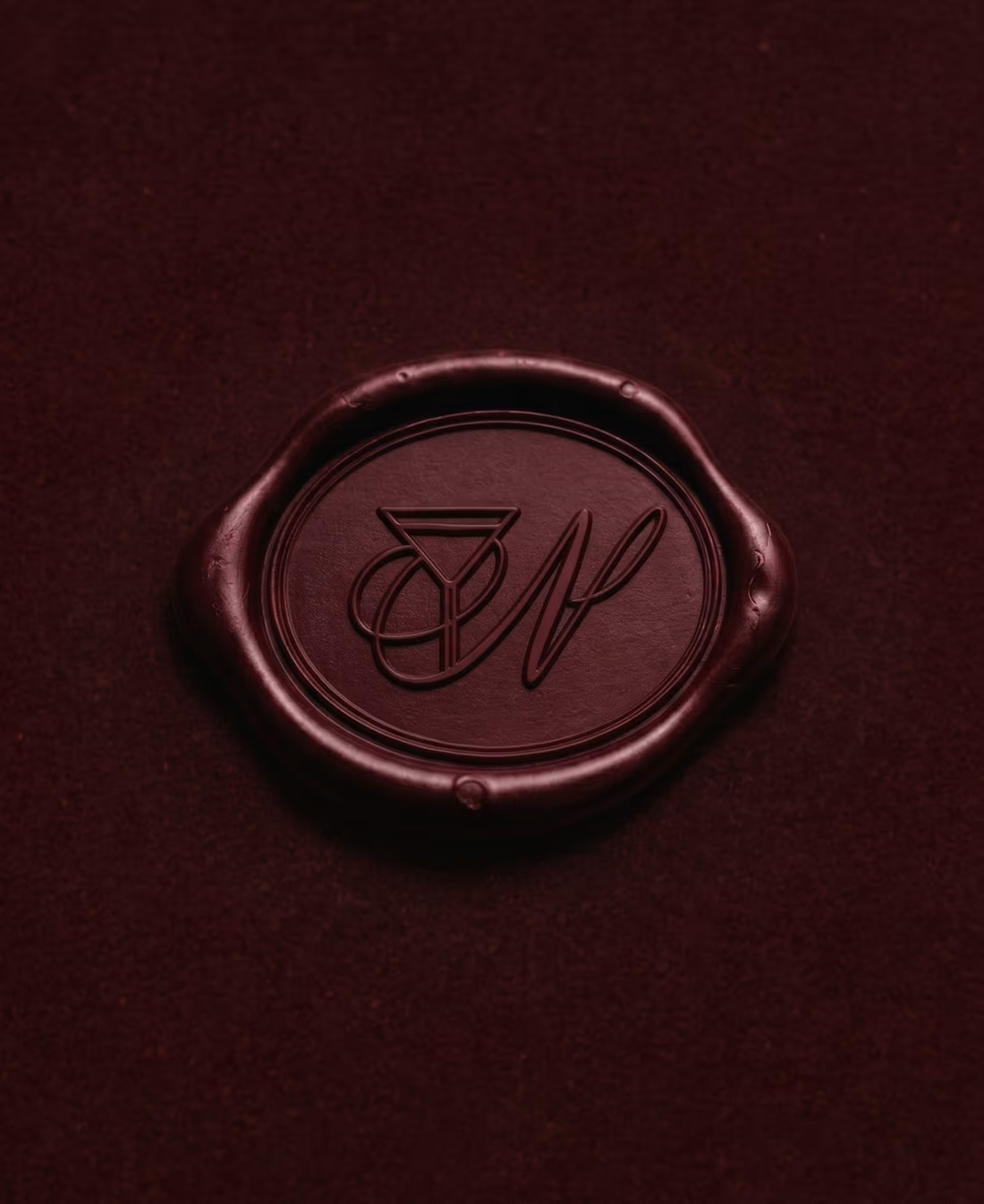
Nocturne is a premium visual identity developed for an exclusive, private bar sanctuary. The concept centers on the intersection of sensory experience, high-fidelity sound, and intimate hospitality.
The Client’s Challenge:
The objective was to avoid traditional, loud bar tropes. The client sought a sophisticated direction that would balance a sense of heritage with modern minimalism — creating an environment where the brand doesn't dominate, but quietly reveals itself through details.
The Design Strategy:
★ Light & Shadow: The identity plays with deep shadows and warm contrasts, mimicking the physical lighting of the venue.
★ Refined Typography: High-contrast serif typography establishes a confident, mysterious, and premium character.
★ Tactile Textures: A deep burgundy and gold palette paired with a signature floral lace pattern to create a cohesive, sensory journey for the guest across physical artifacts.
The result is a visual ecosystem where every touchpoint feels deliberate, premium, and quietly confident.
👉 Explore the full case study on Behance:
https://www.behance.net/gallery/255251611/NOCTURNE?platform=direct
I would love to hear your thoughts and get your support on this project!
3
12
121
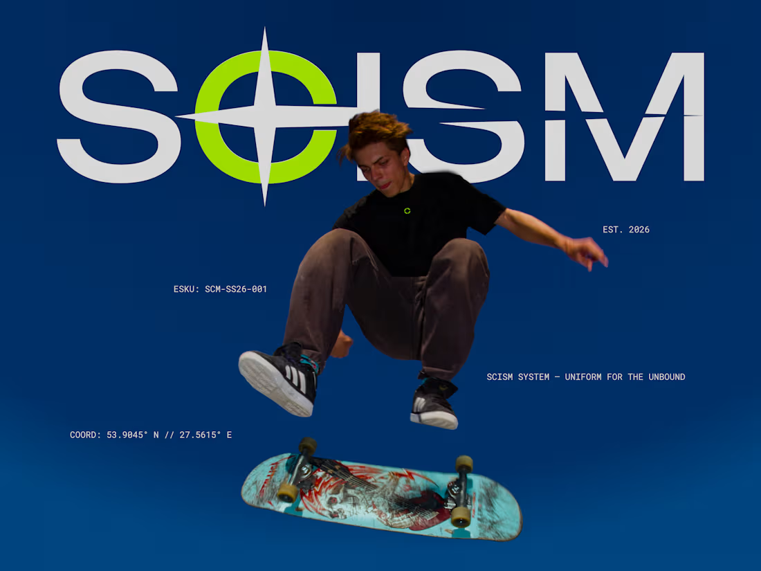
SCISM: Visual Identity for Urban Streetwear
1
10
VITA — Y2K & Retro-Futurism
A trendy brand card for a media studio that captures the high-energy, retro-future vibe. It’s more than a contact card—it’s a physical portal to a digital portfolio.
Key features:
★ Bespoke Logotype: A custom brand mark designed from the ground up to ensure 100% uniqueness.
★ Cultural Relevance: Y2K-inspired aesthetics and violet tones designed to attract a younger, design-forward demographic.
★ Frictionless Flow: Strategic QR placement on the back to instantly connect physical meetings with digital photobooks.
Business Goal: Establishing a bold, recognizable signature that turns a brief encounter into a long-term digital connection. All files are delivered production-ready (CMYK & bleeds) for a seamless transition from screen to print.
1
141
Fleuraison — Organic Minimalist Floristry
Artisanal Storytelling: Fleuraison Floral Studio
Translating the organic soul of a boutique flower studio into a minimalist visual identity. This design focuses on "perceived value"—making the brand feel as premium as its arrangements.
Key features:
★ Organic Palette: Earthy sage-green tones that project freshness and high-end artisanal quality.
★ Botanical Artistry: Halftone floral illustrations that bridge the gap between vintage charm and modern clean layouts.
★ Strategic Minimalism: A layout designed to let the brand’s professional authority speak for itself.
Business Goal: Elevating the brand's aesthetic to justify premium pricing for bespoke event curation. High-quality, technically precise layouts ready for professional printing to help a local business stand out in a saturated market.
0
132