The network for creativity
Join 1.25M professional creatives like you
Connect with clients, get discovered, and run your business 100% commission-free
Creatives on Contra have earned over $150M and we are just getting started
Back to feedPost

Most companies need a great website fast.
The problem is, "fast" usually means cutting corners.
I don't.
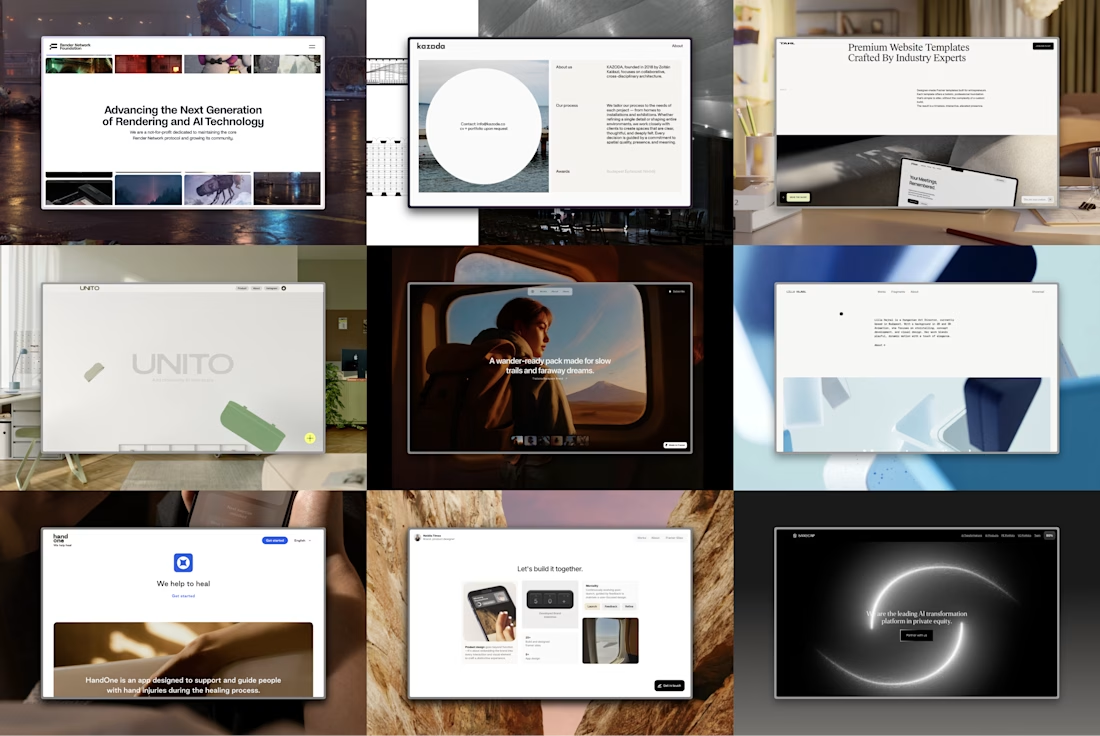
Here's how I build and launch a website in one week without sacrificing quality.
I only take on one project at a time. If it's your week, you have my full attention. That focus keeps everything moving.
Before I start building, I gather every asset, piece of copy, and reference I'll need. We align on the direction early with moodboards and inspiration, so there are no surprises halfway through.
I also build directly in Framer from day one. Clients actually really love seeing their live website immediately. They can click through it, experience it, and leave feedback on something that already feels real. It also removes the extra design to development handoff that often adds days or even weeks.
After launch, I stick around for another week to make sure everything runs smoothly and fix any small issues.
A clear process creates room for better design.
And that's where I spend my time. Crafting the details, polishing interactions, and making the website feel like a product, not just a collection of pages.


nice work

The one-project-at-a-time rule is probably the real secret weapon here. Most people try to parallelize and that's exactly where corners get cut. What's the first thing you say no to when a client wants it faster than a week?

Awesome

Having a clear process for sure makes room for better design. What you wrote really resonates with me Natália.
contra.com
Natália Tímea on Contra
View Natália Tímea’s Profile on Contra, the Independent-first, commission-free freelance marketplace shaping the future of work. Hire a freelancer today!

all work looks so cool.

perfect design

Building directly in Framer instead of handing off from a static design is the part most people skip. It sounds slower upfront but you're removing an entire round of interpretation errors between design and build.
Refining on the live site feels like a cheat code!

Dedicated focus and skipping traditional Figma to code handoffs by building directly in Framer is such a smart workflow. How do you handle it when a client wants extra changes or late text edits during that 1 week build?


Great work

Great philosophy. When companies hire for a quick fix it usually costs them in the long run with revisions and redesigns.


Impressive workflow. Keep it up.
Thank so much Danny!!
A pleasure

Taking one project at a time is such a good model💯
Agree!!💯

Amazing execution! ⭐️


Amazing project

great visuals!

Nice Job

This is damn good!

Process does make a lot of difference and impact, Love your work Natalia!

Focusing on one project at a time explains why this reads so clean.
I really like how you focus on quality while moving fast. The idea of using moodboards is smart and helps everyone understand the vision. It's great that you build in Framer from day one so clients can see their site live. I also appreciate your attention to details after launch. Nice job 🙌


Such a polished and premium design!


Minimal graphicss ❤

The one project at a time rule is the real engine here. Building live in Framer means feedback lands on something real instead of a flat mockup, so revisions get sharper and fewer. I protect polish time by batching late edits into one window near launch rather than reopening the build every day.

Good to see that

Dedicated focus is actually something we should def have.

Great Approach!

Great work

"100% spot on. Taking on one build at a time is the secret to fast turnaround without bloated code or sloppy responsiveness. Quality execution always beats speed alone."
"100% spot on. Taking on one build at a time is the secret to fast turnaround without bloated code or sloppy responsiveness. Quality execution always beats speed alone."
The network for creativity
Join 1.25M professional creatives like you
Connect with clients, get discovered, and run your business 100% commission-free
Creatives on Contra have earned over $150M and we are just getting started

Challenges
View all


Related posts

A SaaS website can explain every feature perfectly and still leave one question unanswered:
Why should I care?
That's why CORESPACE includes Stories.
Instead of only describing what the product does, Stories give those features context — showing how they're used and what they make possible.
Features explain the product.
Stories make it relatable.

The “why should I care?” framing is exactly the right antidote to feature tours. Turning real team stories into the connective tissue between the product and its impact makes the homepage feel human, not just informative.

A fresh take on file sharing & storage.
Designing a modern, simple, and user-friendly platform where users can upload, store, organize, and share files effortlessly. From secure storage to seamless file sharing, every interaction is designed to feel fast, intuitive, and reliable.
More details coming soon. Stay tuned!
#WebDesign #UXDesign #UIDesign #FileSharing #CloudStorage #Artificial Intelligence #InteractionDesign #ModernUI #ProductDesign #Figma #GeeksInDesign
The gradient blob doing double duty as both brand texture and a visual metaphor for data flow is a nice touch. Curious how Securitan differentiates on the security side once the full site lands.


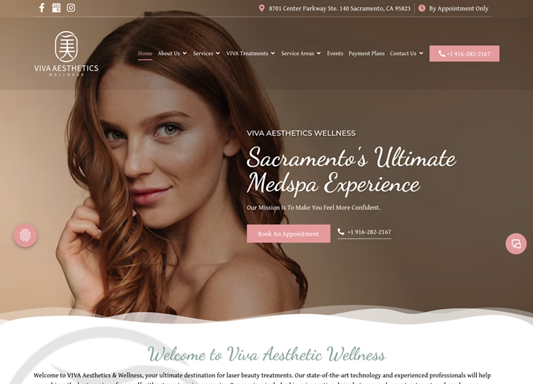
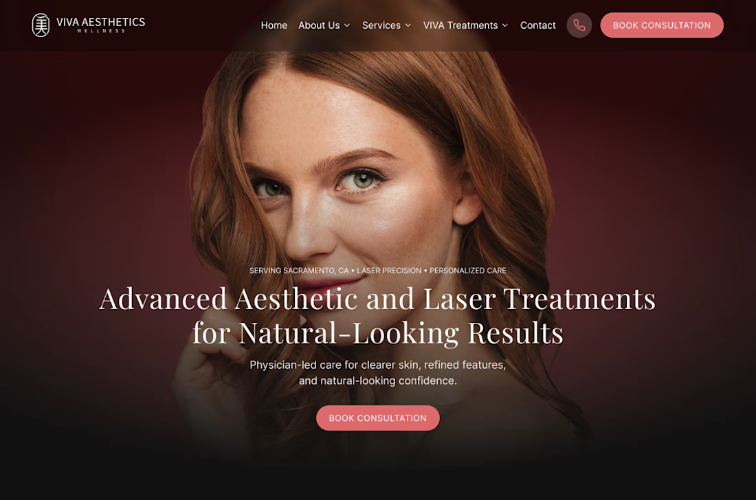
Viva Aesthetics Wellness — WordPress to Framer
A Sacramento medspa with real credentials, running on a site that asked too much of the person using it. Eight items in the navigation, treatments buried a few clicks down, and booking left to a phone number.
We moved them to Framer — not for the platform, but for what it let us do: rebuild the page structure instead of restyling it.
Eight nav items down to five. A hero that names the treatments and the physician-led care rather than promising an experience. Boulevard integrated as the booking platform, so there's one short, consistent path from landing on a page to holding an appointment. Sacramento named as the service area instead of spreading the menu thin.
The migration itself was the unglamorous half — a from/to redirect table built line by line before cutover so nothing already ranking got lost.
Full case study coming soon.