The network for creativity
Join 1.25M professional creatives like you
Connect with clients, get discovered, and run your business 100% commission-free
Creatives on Contra have earned over $150M and we are just getting started
Back to feedPost

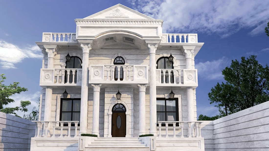
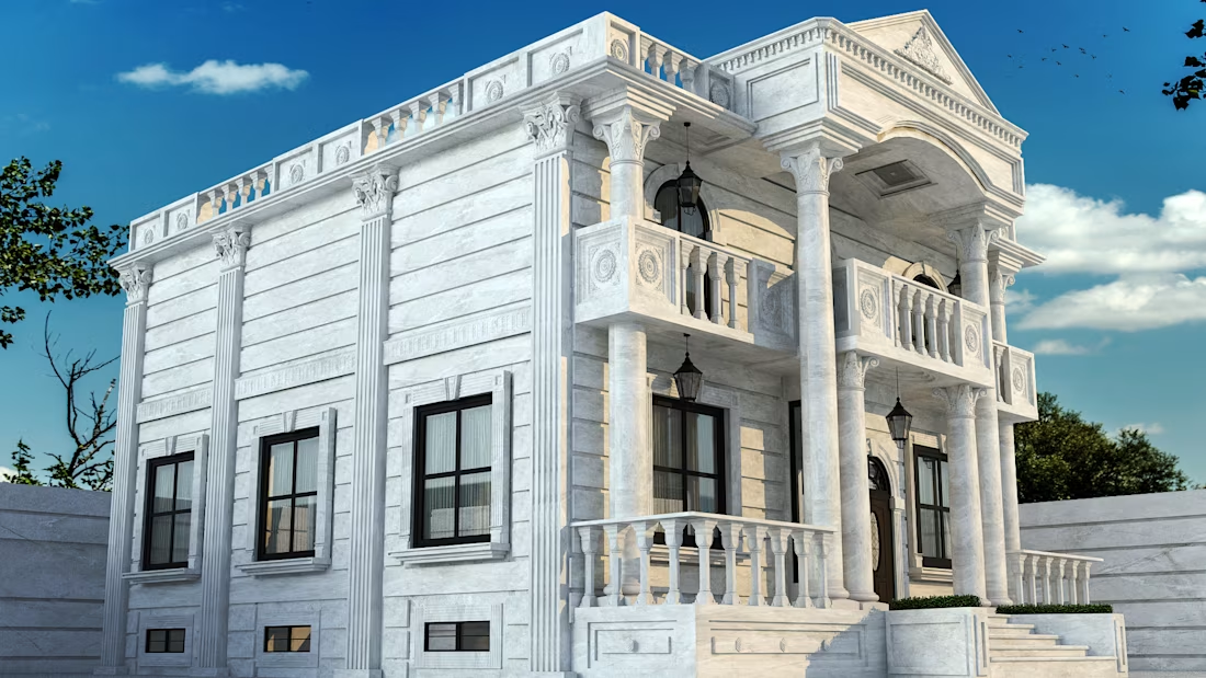
A classic exterior architectural visualization showcasing timeless elegance, refined details, and harmonious proportions. This project highlights traditional architectural elements, sophisticated materials, and realistic lighting to create a luxurious and inviting villa design.



Great work!
The network for creativity
Join 1.25M professional creatives like you
Connect with clients, get discovered, and run your business 100% commission-free
Creatives on Contra have earned over $150M and we are just getting started




Related posts

3d music icons I created for a music festival.





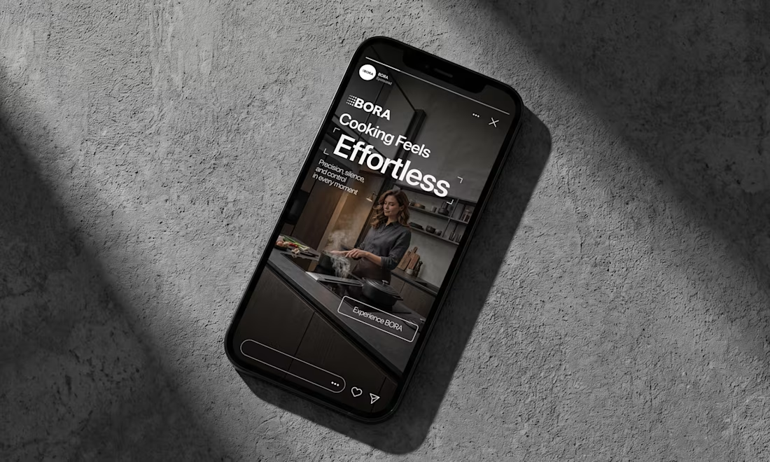
BORA – Ad Creative Concept
Most kitchen appliance ads sell you the warm family dinner. I wanted to try the opposite.
Built this BORA concept as a portfolio piece, treating the product like architecture instead of tech – dark marble, concrete, no hands, no food styling. Just a pot, steam, and silence.
The steam does all the movement in the motion piece. Typography stays out of the way – one line, low CTA, nothing fighting the composition. Turns out when you strip out the lifestyle, the price point sells itself.




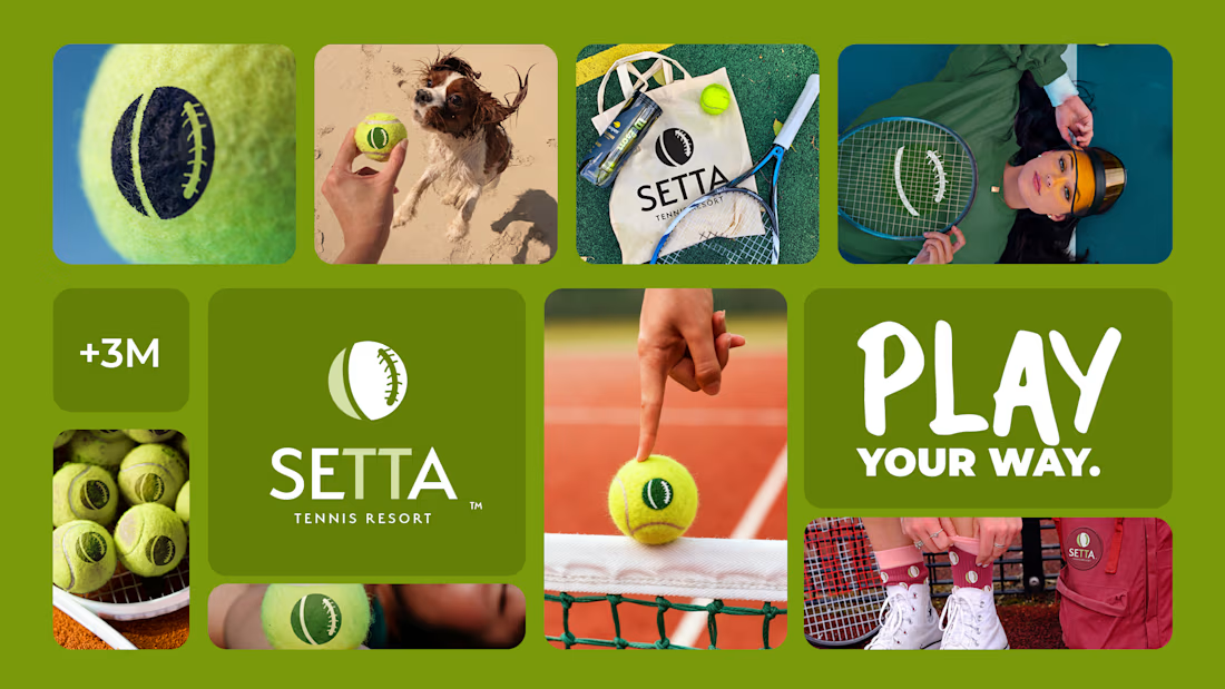
Where the ball meets the game 🎾
Spent the past week building this one — a full brand identity for SETTA, a tennis resort that didn't want to look like every other sportswear label chasing this season's trend.
The mark lives right on the seam of the ball itself — heritage green, quiet typography, nothing borrowed from anyone else's court. Built to hold up whether it's on a sweatshirt or thirty feet tall on the side of a building. 🌿
Some brands are designed to be loud. This one was designed to last.