The network for creativity
Join 1.25M professional creatives like you
Connect with clients, get discovered, and run your business 100% commission-free
Creatives on Contra have earned over $150M and we are just getting started
Back to feedPost

Where the ball meets the game 🎾
Spent the past week building this one — a full brand identity for SETTA, a tennis resort that didn't want to look like every other sportswear label chasing this season's trend.
The mark lives right on the seam of the ball itself — heritage green, quiet typography, nothing borrowed from anyone else's court. Built to hold up whether it's on a sweatshirt or thirty feet tall on the side of a building. 🌿
Some brands are designed to be loud. This one was designed to last.


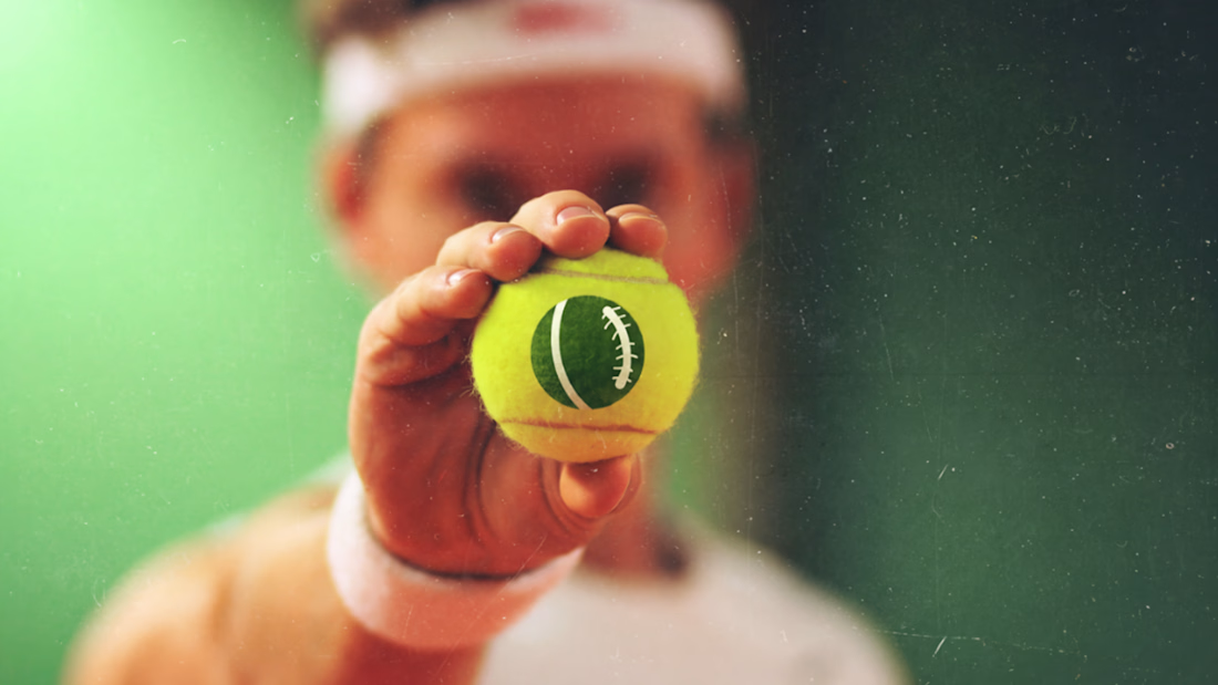
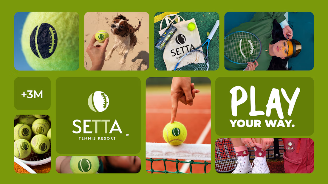


Thirty feet up is the easy end for a seam mark — it's the other extreme that usually kills them, a booking-app icon or a favicon where that curve collapses into a smudge. Did it survive down there intact, or is there a reduced mark doing the small sizes?

Creative and professional
The network for creativity
Join 1.25M professional creatives like you
Connect with clients, get discovered, and run your business 100% commission-free
Creatives on Contra have earned over $150M and we are just getting started
Challenges
View all


Related posts

Logo design for StocksWithJosh, a prominent online trading mentor with 195K YouTube subscribers.
The concept was simple: blend the initials SWJ with a subtle nod to his status as the "GOAT" (Greatest Of All Time), a moniker earned from his community.
The result is a bold, recognizable brand mark that fits his business perfectly.
What do you think of the end result?


The mark reads instantly at thumbnail size, and the framed SWJ lockup gives it a strong YouTube-avatar presence. The subtle crown/GOAT cue is a nice detail without overpowering the initials.


Color palette exploration for an Australian company, rooted in calmness, warmth, mental health and professionalism
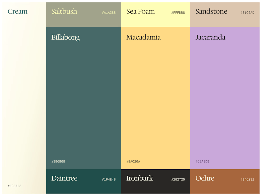

These tones are stunning. I can instantly picture this color system translating beautifully into soft, flowing motion graphics for a brand reveal video. Great exploration!

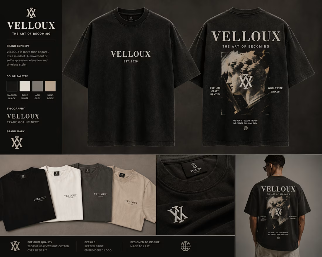
Apparel Brand — Brand Identity Design
A distinctive brand identity created for an apparel brand focused on building a strong and recognizable presence through fashion.
The identity combines bold typography, a refined visual system, and versatile graphic elements to create a look that feels modern, confident, and fashion-forward. The design system was developed to maintain consistency across clothing, packaging, labels, social media, and other brand touchpoints.
The goal was to create an identity that feels memorable on its own while remaining flexible across different apparel collections and products.
Focus: Brand Identity • Logo Design • Apparel Branding • Typography • Visual Identity • Art Direction
Style: Modern • Bold • Minimal • Fashion-Forward
Tools: Adobe Illustrator • Adobe Photoshop • Figma
#BrandIdentity #ApparelBranding #FashionBrand #LogoDesign #Branding #VisualIdentity #GraphicDesign #FashionDesign #ContraPortfolio