The network for creativity
Join 1.25M professional creatives like you
Connect with clients, get discovered, and run your business 100% commission-free
Creatives on Contra have earned over $150M and we are just getting started
Back to feedPost


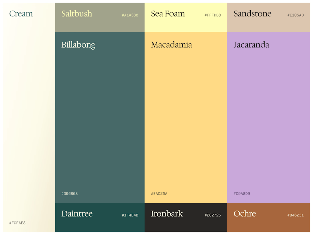
Color palette exploration for an Australian company, rooted in calmness, warmth, mental health and professionalism

Lovely, Aryna

This palette balances softness with enough grounded contrast to stay professional—the Billabong and Sea Foam pairing feels especially distinctive. The restrained purple accent gives the system a useful moment of warmth without losing calm.

These tones are stunning. I can instantly picture this color system translating beautifully into soft, flowing motion graphics for a brand reveal video. Great exploration!

Really fits into the company description

These Australian native names are such a nice touch. Saltbush and Ironbark alongside a palette that genuinely feels grounded and warm. Strong direction.

Ahh I loove a good palette. I can already see the brand in motion. I'm so curious how this will turn out!!
The network for creativity
Join 1.25M professional creatives like you
Connect with clients, get discovered, and run your business 100% commission-free
Creatives on Contra have earned over $150M and we are just getting started

Challenges
View all


Related posts

Brand Identity for Propane
Propane is an experience-led platform firm that helps organizations sell and scale complex offerings. We operate between traditional agencies and large
consultancies: strategic, but accountable to what actually gets built.
The brand identity for Propane is built as a disciplined, scalable system that
reflects its role as an experience-led platform firm operating between agencies and consultancies. Positioned at the intersection of human-centered thinking and industrial-grade complexity, the identity resolves this tension with calm confidence—balancing precision, systems logic, and usability without leaning into coldness or superficial warmth.
View full project and more structured context on the link above or my profile.
Feel free to share your constructive feedback ⚡

Yooo this visual language is great🔥

TechMax brand identity, more coming soon.
.
.
This is the kind of thing I share daily while building follow on x.com/rightnextstep


Amazing work!

Toadrinks - Brand Identity
Excited to share TOADRINKS, a conceptual gut-friendly soda brand made for a lighter, more enjoyable way to sip. Built around playful personality, bold flavours, and a character-led visual world, the brand aims to make better-for-you choices feel fun rather than functional.
I'd love to hear your thoughts in comments!

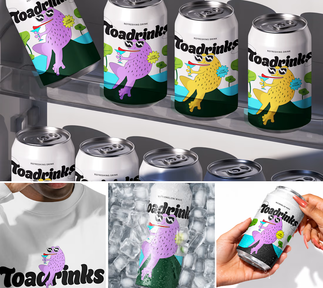

The character-led route is exactly right for a gut-friendly soda: a playful mascot makes better-for-you feel like a treat instead of a health lecture, which is the whole positioning. Giving each can its own toad pose turns the mascot into a cast you can stretch across flavours and social, not just a logo.


