The network for creativity
Join 1.25M professional creatives like you
Connect with clients, get discovered, and run your business 100% commission-free
Creatives on Contra have earned over $150M and we are just getting started
Back to feedPost
Strong brands aren’t complex - they’re structured.
Rankenik is built around one core idea: clear structure creates better growth.
This bento-style branding system brings SEO, websites, and ads into one clean, connected layout - where every block has a purpose and every message feels easy to understand.
Instead of overwhelming users, the design organizes everything into simple, visual sections.
Because great branding isn’t about adding more, it’s about arranging things better.
👉 Want a clean, structured brand that people instantly understand and trust? DM us now to build your bento-branding


Thanks for the feedback.

Good job
Thanks for the compliment.

absolutely stunning 👌
Thanks for your valuable comment.


This looks clean and well thought out. How long did it take you to bring everything together?
Thanks! Took about 2 days - mostly spent refining the structure and visual hierarchy.

Looks great
The network for creativity
Join 1.25M professional creatives like you
Connect with clients, get discovered, and run your business 100% commission-free
Creatives on Contra have earned over $150M and we are just getting started


Related posts

Interior Design Website
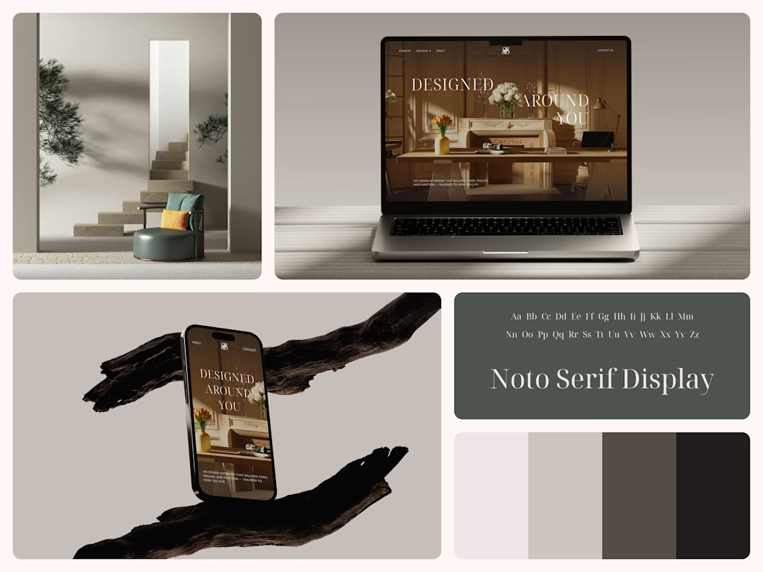
The white flowers on the mantel overlap the headline.
Thin Noto Serif Display capitals step down across one warm photo of a paneled room, so the space stays in view between the words. On the phone, the three words stack in a centered column, with Menu and Contact on either side of the monogram.
The palette runs from soft white to near black, which leaves the color to the photo: orange tulips and warm light on the walls.
The headline reads "Designed Around You", and the hero takes it literally, with the wall behind the type and the flowers in front of it.
Designed by the Hue & Machine team.
#InteriorDesign #InteriorStudio #WebsiteDesign #HomepageDesign #WebDesign #ResponsiveDesign #Typography #EditorialDesign #UIDesign #FigmaDesign


Nice!


When you forget that it's not 2005 and you don't work for 2Advanced... 😅
Designed and animated in Figma.
(it's about time to finally discover these new animation features).

That looks like an underwater design😊 Great Work!


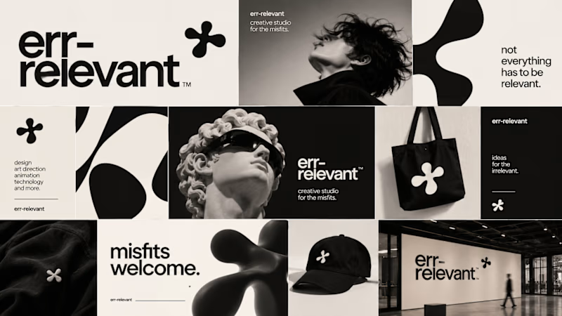
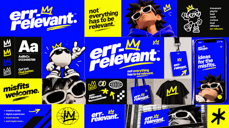
Before we begin working on any branding project, we use Curative Intelligence to explore ideas, challenge conventional thinking, and establish the creative direction.
Err-relevant is something particularly fun that we're developing at The RLVNT Studios.
Now, I'd love your inputs. Which visual direction do you think we should take forward into the main production stage?
8 voted
67%
4 voted
33%
12 votes
Closed