The network for creativity
Join 1.25M professional creatives like you
Connect with clients, get discovered, and run your business 100% commission-free
Creatives on Contra have earned over $150M and we are just getting started
Back to feedPost
Taste Test


Before we begin working on any branding project, we use Curative Intelligence to explore ideas, challenge conventional thinking, and establish the creative direction.
Err-relevant is something particularly fun that we're developing at The RLVNT Studios.
Now, I'd love your inputs. Which visual direction do you think we should take forward into the main production stage?
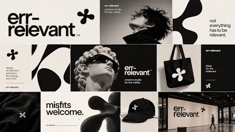
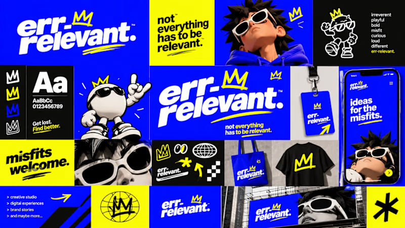
6 votes
Ends in 1d


Nice 👍
The network for creativity
Join 1.25M professional creatives like you
Connect with clients, get discovered, and run your business 100% commission-free
Creatives on Contra have earned over $150M and we are just getting started



Related posts

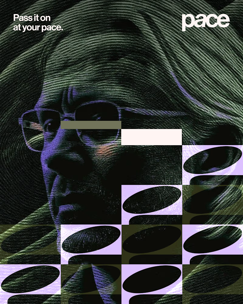
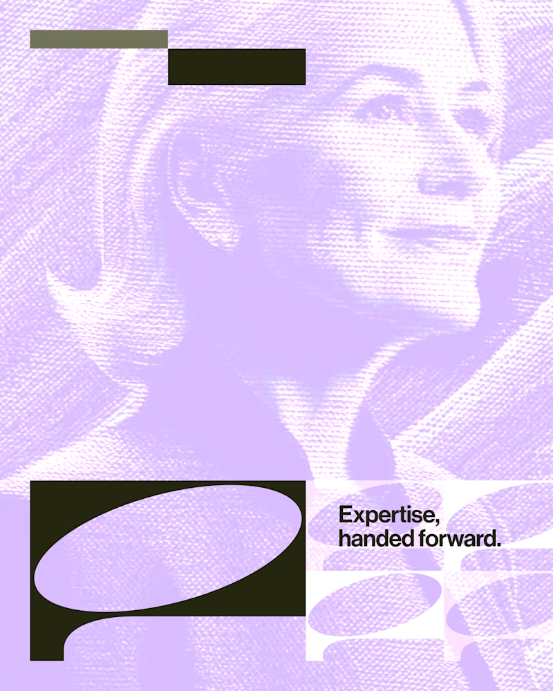
Experimental layouts for Pace. Which one do you like?
23 voted
52%
21 voted
48%
44 votes
Closed

Looks cool.


Which homepage would make you more likely to explore the platform?
HackStack features bold typography, teal gradients, and a centered layout focused on AI tools and automation. DataVistaHQ uses purple accents, a split layout, and a prominent dashboard preview to introduce its business intelligence platform.
I would like your perspective on the visual design, clarity, and first impression. Which approach communicates its value more effectively and makes you want to take the next step?
Vote for your preferred design and share what influenced your choice: the colors, headline, layout, dashboard preview, or overall presentation.
#WebDesign #AIWebsites #UIUXDesign #SaaSDesign #TransformedDesign


2 voted
17%

10 voted
83%

12 votes
Closed

Visually, I lean toward DataVistaHQ, but the cognitive load is really high. The value proposition and the stats feel like they're competing for attention.
On the other hand, HackStack has a much better visual hierarchy. The value proposition and CTA group immediately give me a...

A little look at how Nazariya Living stands apart from its category.
On one side, familiar visual conventions. On the other, an identity with its own character, rooted in stories worth keeping.
We chose not to blend in. :)
Which side catches your eye?


3 voted
30%
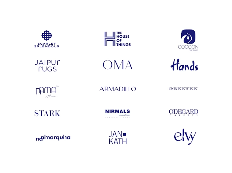
7 voted
70%
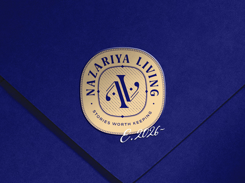
10 votes
Closed

That side with all the competitor logos in one grid is the slide I'd steal for a client presentation. Nothing explains "why this direction" faster than showing the sea of sameness first. The navy seal wins easily after that.