The network for creativity
Join 1.25M professional creatives like you
Connect with clients, get discovered, and run your business 100% commission-free
Creatives on Contra have earned over $150M and we are just getting started
Back to feedPost


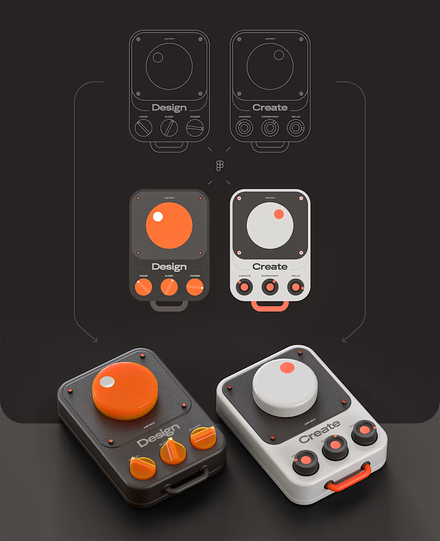


adds a whole new perspective to a design.

Brilliant work! ⚡

Nice💯

Looks great


Stunning!

Love that the flat Figma icons and the rendered devices read as the exact same object, nothing gets lost in translation. Was matching those proportions across 2D and 3D the tricky part, or was most of the challenge in the Blender lighting and materials?

Great concept!👏🏼
I love the one on the left because It’s similar to my portfolio “theme”.🔥

This is so pretty! Love the materials on the knobs.

awesome work


Good work🔥👏👏

Quality work🔥

Superb 🔥


Hey this is cool!! i am curious what device u think this would be 🤔

Amazing!

woah, this is amazing

Great work.

Weldone Mik


The color coding between the orange "Design" unit and the white "Create" one makes the pairing read instantly, even before you clock the labels. Getting that soft shadow and knob bevel to feel physical is usually the hardest part of the Figma to Blender jump. How much of the...

amazing!


Awesome

From concept to reality. Personal brand well executed.

astonishing

These visuals are sexy dude!

Giving Design and Create matching layouts but swapping the dominant knob color (orange vs. white) is a clean way to brand two modes without changing the interaction model users have to relearn.

Very impressive, can you share the name of the product?
The network for creativity
Join 1.25M professional creatives like you
Connect with clients, get discovered, and run your business 100% commission-free
Creatives on Contra have earned over $150M and we are just getting started











Related posts

Built this in Framer as a concept project. Goal was to make it feel run by ex-journalists. Choices: editorial serif (Libre Baskerville), a dark photo with one color accent, and copy that positions against blast-style PR.
Where I’m unsure: text legibility over the photo and whether the two CTAs compete. What would you change?



That's great design it feels professional I like how the background mixed with interface ❤️❤️
Great job Cheree🎉🎉

Same design. Which palette? 👀
You picked your favorite preview last time. This time, I’m putting the colors to the vote.
One body-care packaging concept, with the same typography and composition:
A · Rose Cream, Strawberry Sorbet + Plum Jelly
B · Lime Mousse, Coconut Cream + Plum Jelly
Which would you choose and what does it make you feel about the brand?
Both palettes use colors and matching ingredient textures from DCS 654, my library of 654 dessert-inspired colors.
Take a closer look: dcs.mariya.design
7 voted
44%
9 voted
56%
16 votes
Closed
B is absolutely stunning 🎉🎉🎉🎉
Great job Mariya❤️

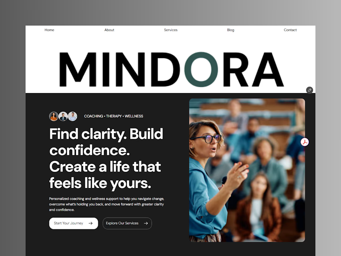
Introducing Mindora — a Life Coaching & Wellness Framer Template.
I designed Mindora for life coaches, wellness professionals, and personal growth brands looking for a calm, modern, and welcoming online presence.
Inspired by clarity, confidence, and meaningful growth, Mindora features a thoughtful layout, dedicated service sections, a blog for sharing valuable insights, and a clean visual style designed to help brands connect with their audience.
Built with Framer, it's a customizable starting point for creating a professional coaching or wellness website.
Explore Mindora and bring your next website idea to life.
Kindly check it out the template: https://www.framer.com/marketplace/templates/mindora-life-coach/


Great work