The network for creativity
Join 1.25M professional creatives like you
Connect with clients, get discovered, and run your business 100% commission-free
Creatives on Contra have earned over $150M and we are just getting started
Back to feedPost

Kinetic typography for
Future Forward: The Climate Pledge
on Amazon Prime.


kinetic type for an amazon piece is a big get. was the climate pledge copy locked before you started animating?
Thank you @Benjamin C - yes the copy was locked. We did this for MTCO studio who's project owner.


Love how the bold white caps swing between weights and orientations over that aerial city shot, the vertical "building a new" line really anchors the whole frame.
Thank you @Arek Dvornechuck means a lot.
The network for creativity
Join 1.25M professional creatives like you
Connect with clients, get discovered, and run your business 100% commission-free
Creatives on Contra have earned over $150M and we are just getting started



Related posts

What do you do with a brand that’s 80% done and nobody asked for it?
I have a whole folder of them.
A name here, a palette there, a few campaigns that never saw daylight.
One of them finally got the full treatment. The Iridia case study drops soon.
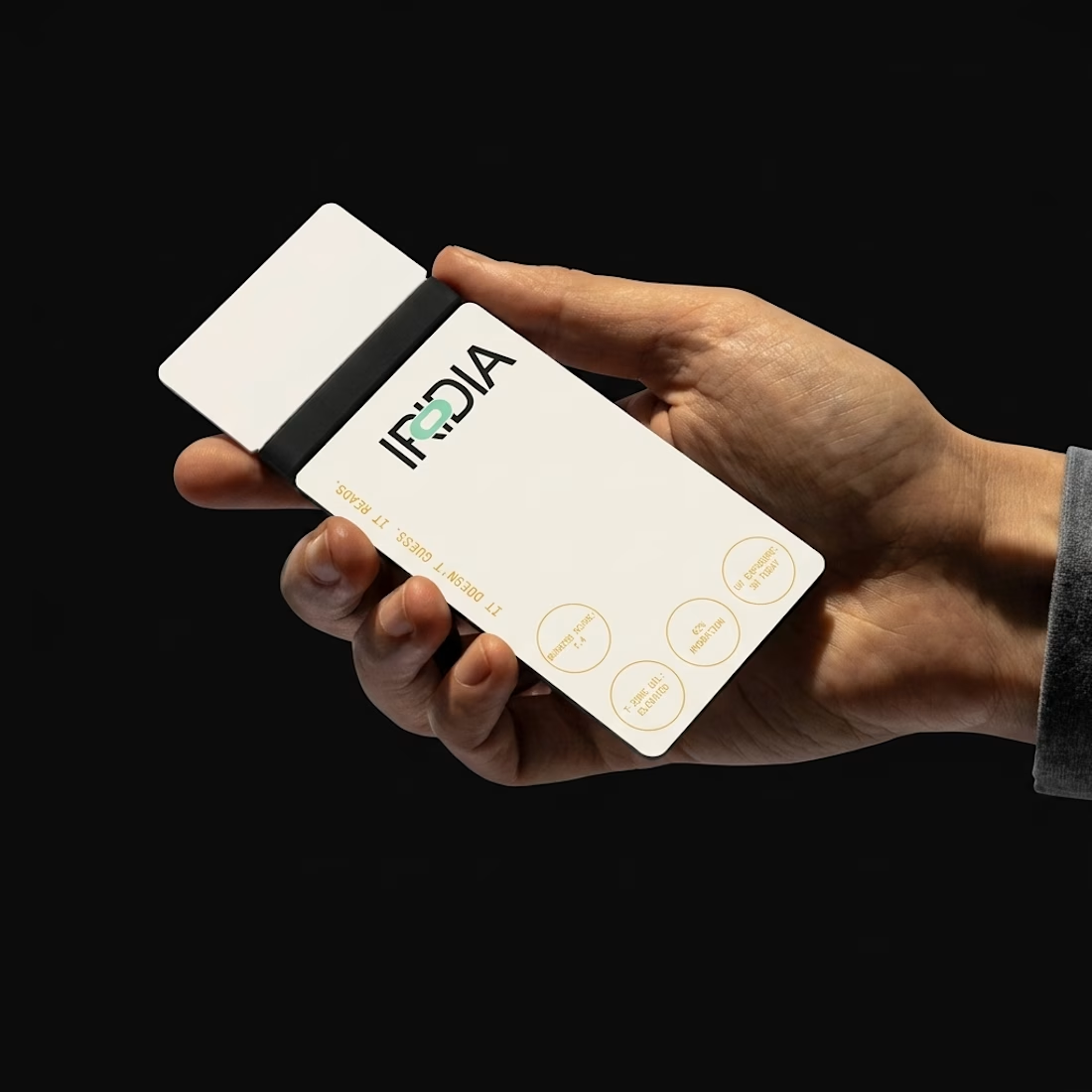
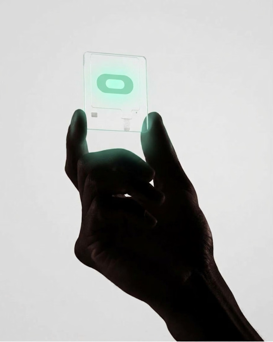
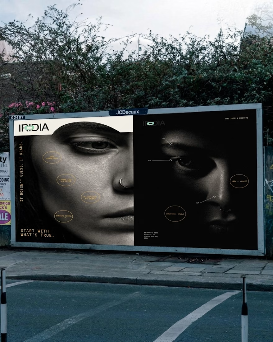
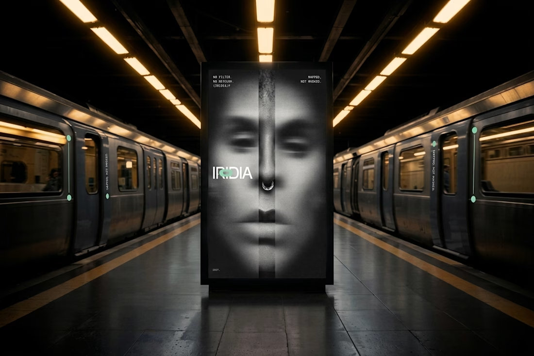


Amazing design!

Ovéa — care with character.
One skincare identity across bottles, jars and tubes. I designed the wordmark, pink-and-cobalt packaging system, campaign applications and digital mockups, then brought the collection into motion.
A consistent visual language, with room for each product to feel individual.
View the full case study. Building a skincare brand? Let’s talk about your identity and packaging.

Love the colour direction and the visual language. Everything feels so well thought out. The overall look is beautiful.