The network for creativity
Join 1.25M professional creatives like you
Connect with clients, get discovered, and run your business 100% commission-free
Creatives on Contra have earned over $150M and we are just getting started
Back to feedPost
Taste Test
Currently working on a brand Identity project for an Architecture studio named Hexa, and I am experimenting with multiple directions, Direction 1 uses a pattern that is inspired from the logo design, and Option 2 does not. Curious to see which one would you choose and why! :)
16 voted
76%
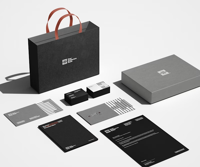
5 voted
24%
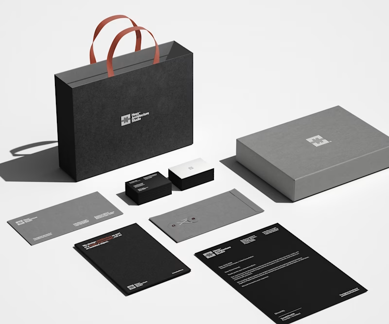
21 votes
Closed
Nice work
Clean as always!
Thank you Alec, I've felt that you're gonna vote for the clear one!! 😂
I like this minimalist approach!
Thank you, much appreciated! :)
I'm really loving the pattern in option 1. Makes it stand out way more!
I completely agree with you, it's definitely more appealing! :)
The pattern gives a character to the touch points. It makes it stand out from every other brand going for minimalism. Too much cleaning can strip the character ig. I'd go with Patterns.
Thank you, you are completely right with this one, and that's my opinion also! :)
Great Work.
Thanks, much appreciated!
The pattern in Option 1 adds sophisticated depth
Thank you, I agree with you! :)
Definitely option 1! the pattern reminds me of a pattern for wooden doors that looks very nice.
Thank you Heba, that's a really interesting interpretation, honestly I did not saw it like that, main idea was to reflect the brutalism architecture since that's Hexa's biggest inspiration 😃
Something new to learn! I didn't know about brutalism architecture. But it even felt familiar and visually appealing to me. Here're a few images of the pattern, I found out what it's called "Slanted Wood".
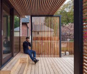
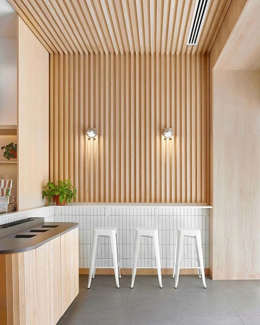
Ohhhh I completely understand what you mean, yess this perfectly aligns with the shape and geometry of the logo, I included some shots in the Identity of a building with this type of architecture! :)
Glad you got familiarised with brutalism, Hexa is heavily inspired by their...
I’d go with Option 1. The pattern adds a subtle layer of identity and makes the brand feel more distinctive without being overwhelming. It gives the system more personality while still keeping it clean.
The network for creativity
Join 1.25M professional creatives like you
Connect with clients, get discovered, and run your business 100% commission-free
Creatives on Contra have earned over $150M and we are just getting started
Related posts
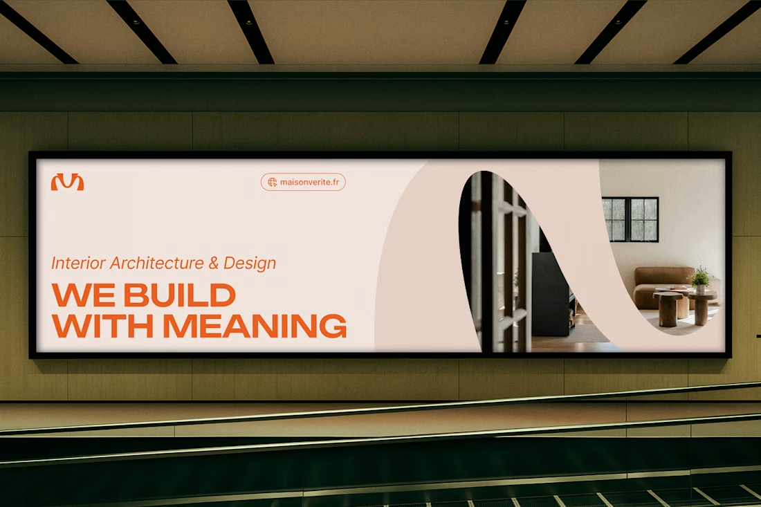
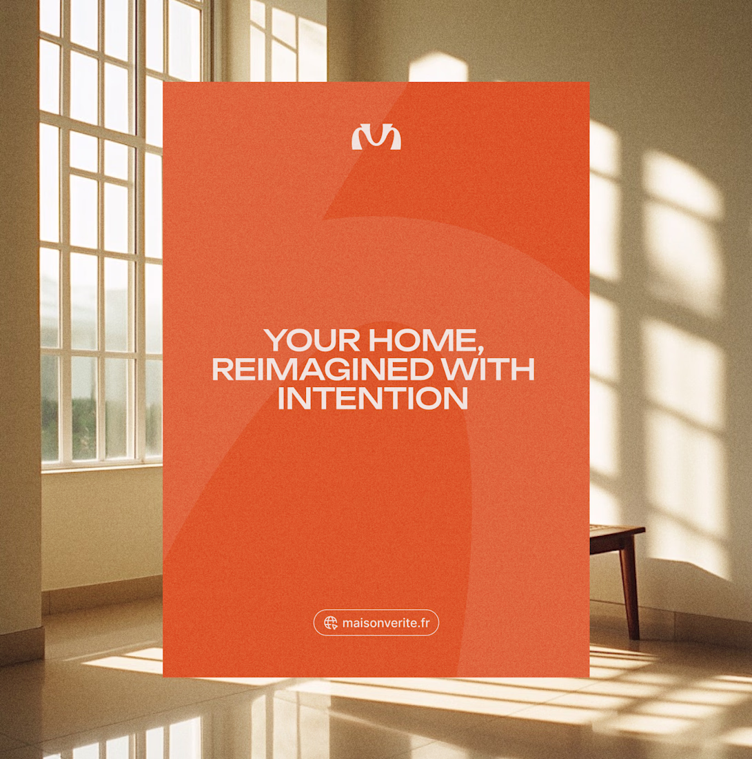
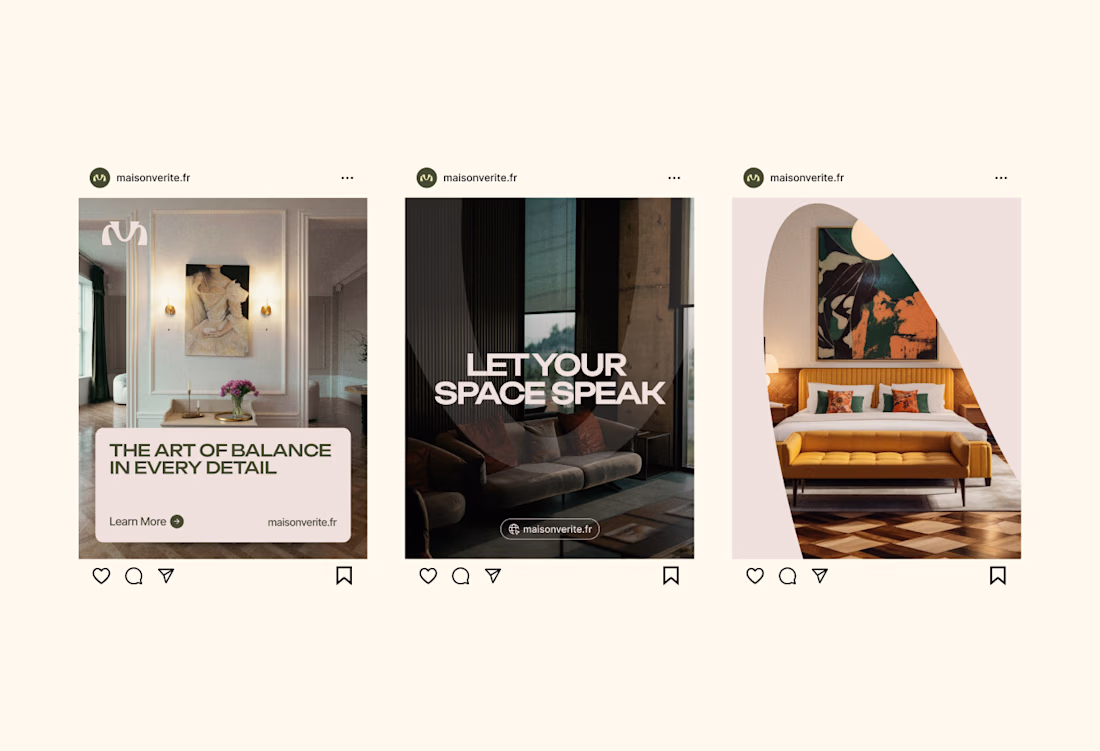
A brief preview of the visual identity for an interior design agency that I've been working on recently.
When Maison Vérité approached me, they wanted a visual system that felt just like their interiors (architectural and deeply intentional)
The concept was inspired by the keystone, the central stone of an architectural arch that holds the entire structure together. Just as the keystone gives purpose and stability to the arch, Maison Vérité gives meaning to the spaces they shape.
If you look closely, the symbol also subtly intertwines the initials “M” and “V,” merging Maison and Vérité into a harmonious form.
Fellow designers and strategists, what do you think of this visual direction?
Cool
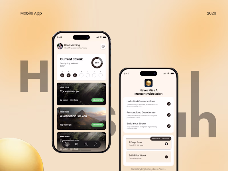
Made a couple of mockup covers for my upcoming religious mobile app case study, but can't decide which direction feels stronger.
Which one are you picking?
24 voted
59%
17 voted
41%
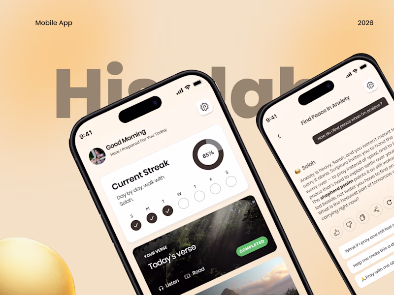
41 votes
Closed
amazing work
Some branding we did for a prediction market platform on Solana. Will share web + product designs soon!
Nice, Everything looks so aligned 🙌
Trending
Claude
Claude has entered the design space. How are you using Claude Design?
Contra University
Learn from expert creatives how to earn more using next-gen AI tools.
MagicPath
The canvas is infinite, and exploration is becoming the workflow. How are you using MagicPath?
creativeaiflow
Creative AI workflows are evolving. What tools do you use, and what are their strengths and weaknesses?
freelancerlife
Freelancer life is wins, pivots, and everything in between. What’s yours right now?