The network for creativity
Join 1.25M professional creatives like you
Connect with clients, get discovered, and run your business 100% commission-free
Creatives on Contra have earned over $150M and we are just getting started
Back to feedPost
Taste Test

Currently working on a brand Identity project for an Architecture studio named Hexa, and I am experimenting with multiple directions, Direction 1 uses a pattern that is inspired from the logo design, and Option 2 does not. Curious to see which one would you choose and why! :)
16 voted
76%
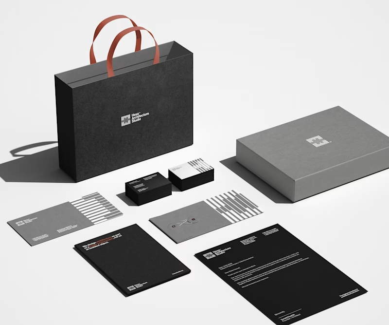
5 voted
24%
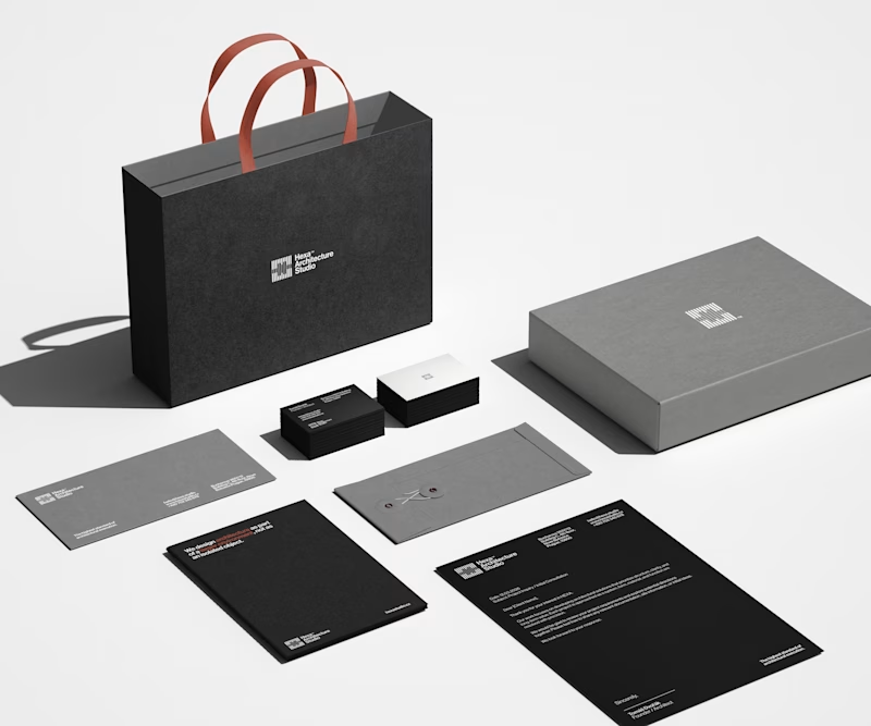
21 votes
Closed

Clean as always!
Thank you Alec, I've felt that you're gonna vote for the clear one!! 😂

I like this minimalist approach!
Thank you, much appreciated! :)

I'm really loving the pattern in option 1. Makes it stand out way more!
I completely agree with you, it's definitely more appealing! :)

The pattern gives a character to the touch points. It makes it stand out from every other brand going for minimalism. Too much cleaning can strip the character ig. I'd go with Patterns.
Thank you, you are completely right with this one, and that's my opinion also! :)

Great Work.
Thanks, much appreciated!

The pattern in Option 1 adds sophisticated depth
Thank you, I agree with you! :)

Definitely option 1! the pattern reminds me of a pattern for wooden doors that looks very nice.
Thank you Heba, that's a really interesting interpretation, honestly I did not saw it like that, main idea was to reflect the brutalism architecture since that's Hexa's biggest inspiration 😃
Something new to learn! I didn't know about brutalism architecture. But it even felt familiar and visually appealing to me. Here're a few images of the pattern, I found out what it's called "Slanted Wood".
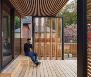
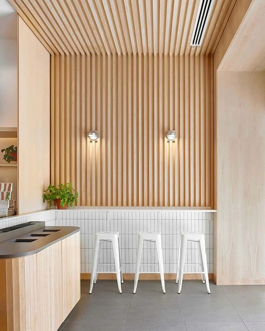
Ohhhh I completely understand what you mean, yess this perfectly aligns with the shape and geometry of the logo, I included some shots in the Identity of a building with this type of architecture! :)
Glad you got familiarised with brutalism, Hexa is heavily inspired by their...

I’d go with Option 1. The pattern adds a subtle layer of identity and makes the brand feel more distinctive without being overwhelming. It gives the system more personality while still keeping it clean.
The network for creativity
Join 1.25M professional creatives like you
Connect with clients, get discovered, and run your business 100% commission-free
Creatives on Contra have earned over $150M and we are just getting started





Related posts


Collage

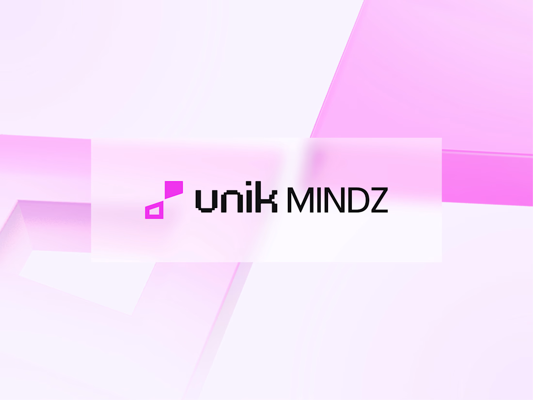
I'm excited to share the full case study from our collaboration on the Unik Mindz logo design and branding, completed in August 2026.
Unik Mindz is a creative design studio born from the legacy of the Unik family brand. Founded on the belief that every idea begins with a unique mind, the studio needed an identity that could carry that message and become the face of the brand.
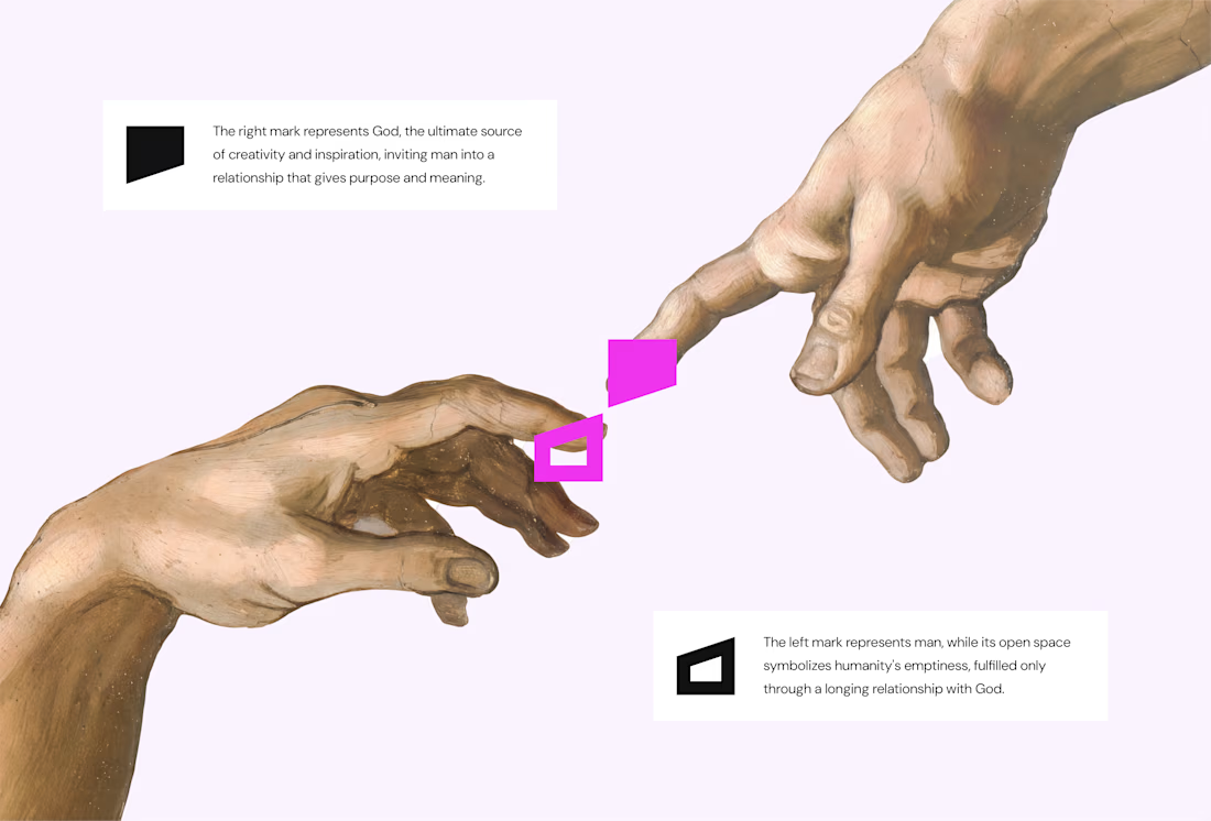
The logo draws inspiration from Michelangelo’s The Creation of Adam, focusing on the idea of connection. It captures the moment two minds meet to create something greater, reflecting the brand’s conviction that meaningful creativity starts with connection.
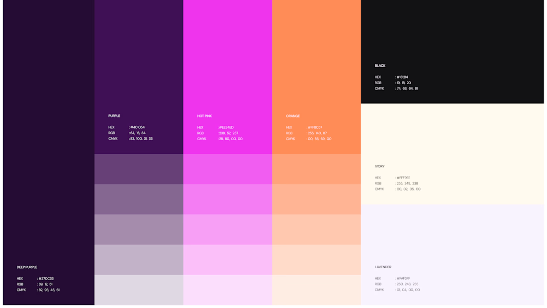
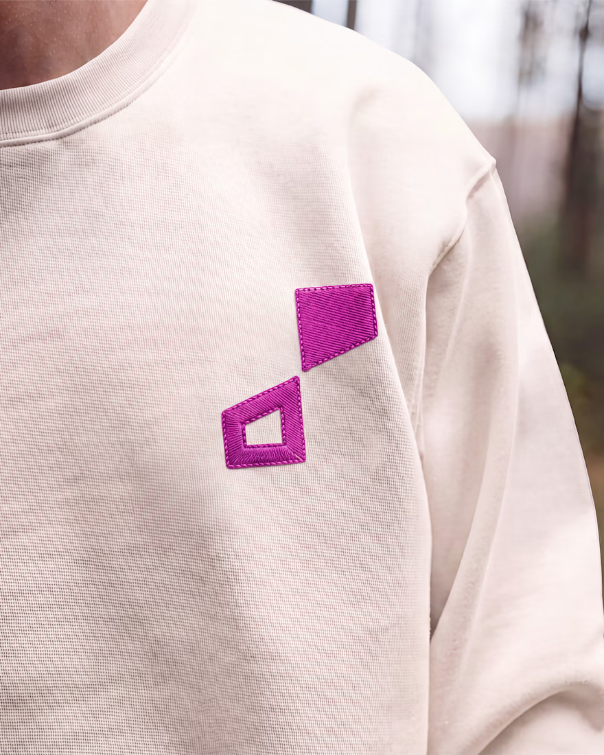
We wrapped the project with a clear system and guide for how the brand assets should be used going forward.
Want to work with us? Send a DM or email to info@donatus.agency



Honestly I never see something like this before I love the uniqueness of the design and it's vibrant color palette great job 🎉🎉


I've helped 100+ founders make brand decisions. The most expensive one is always naming a second product separately.
Intuit paid $12B for Mailchimp, spent years keeping it visually apart from TurboTax, and is now paying again with a global rebrand to reconnect them.
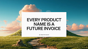
Every separate product name is a brand you'll eventually have to pay to reunite. The bill arrives when you try to cross-sell and your customers can't see the connection.
Before you name product two: write one sentence on how it makes product one more valuable to the same buyer. If you can, it's a capability, not a brand.
thebrightmethod.substack.com
Every Product Name Is a Future Invoice
The second logo always costs more
Great job Daniel congratulations 🎉🎉❤️❤️