The network for creativity
Join 1.25M professional creatives like you
Connect with clients, get discovered, and run your business 100% commission-free
Creatives on Contra have earned over $150M and we are just getting started
Back to feedPost
Most books are designed around paper costs.
This one — around the reader.
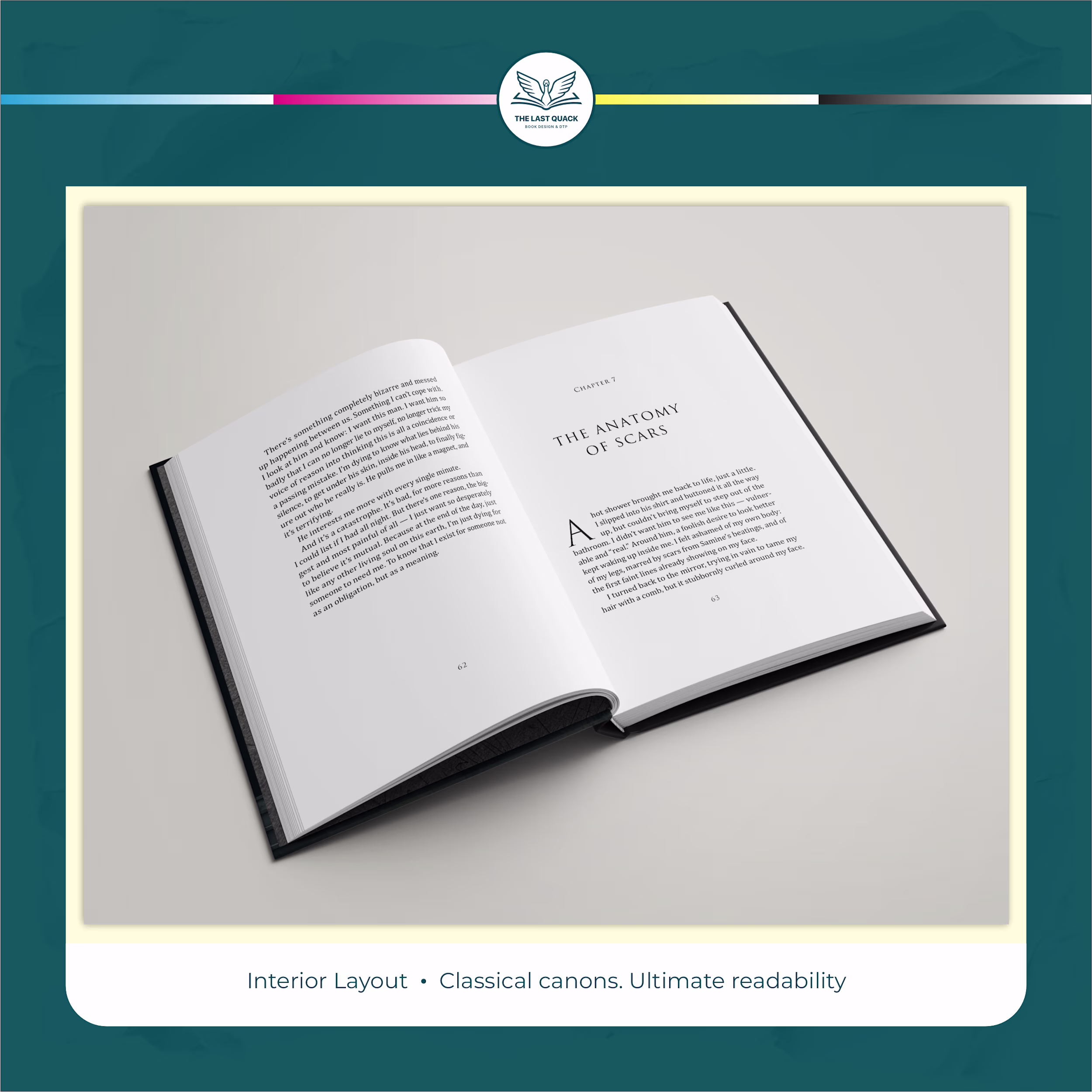
Classic typographic canons — generous outer margins, optimal line length, proportional leading — were developed over centuries for a single purpose: to make reading effortless. Not for beauty (though it's here too). But to disappear — and give full space to the story.
Today these principles are rarely found in commercial printing. More margins = less text per page = more paper = higher cost. And so they were set aside.
This project brought them back to life.
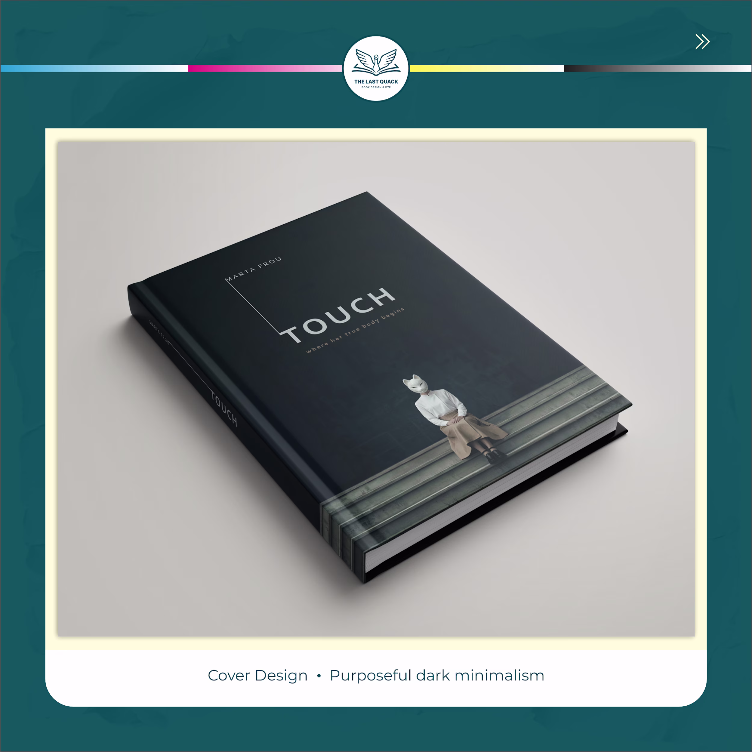
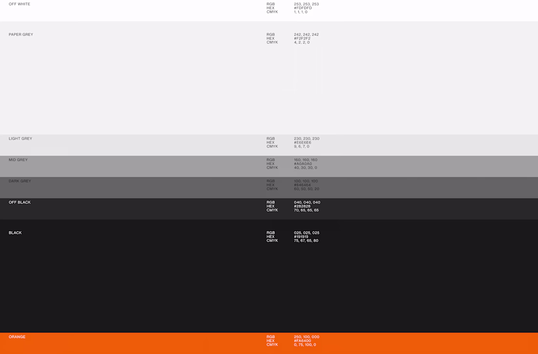
Cover ⮕ dark minimalist palette — refined, with zero visual noise.
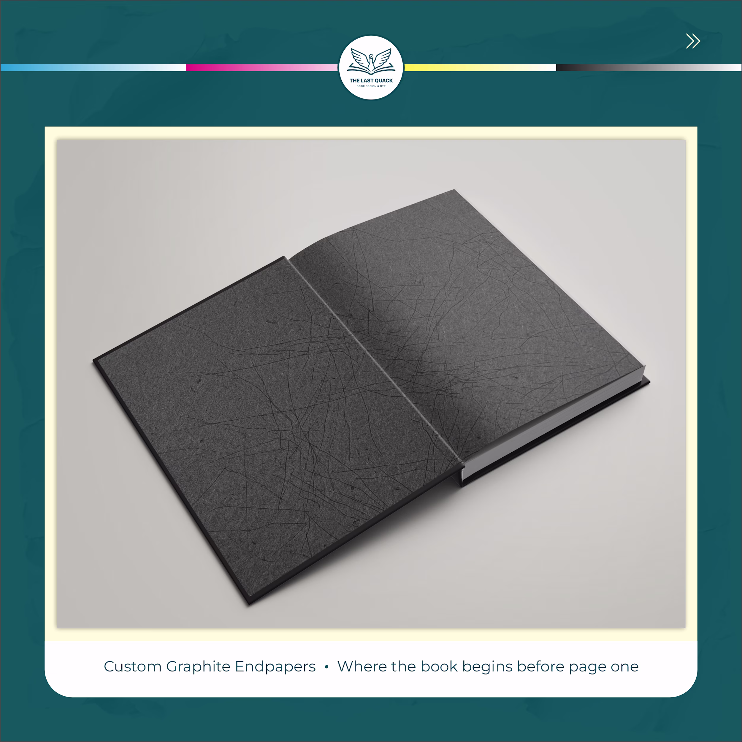
Endpapers ⮕ custom graphite pattern — the book begins before page one.
Interior ⮕ classic canon grid with proportional spacing throughout the entire edition.
Every element ⮕ from cover to last page — one cohesive object.
The result of this project is a book that reads itself. When typography does its job flawlessly, you don't notice it. You just reach the last page — and wonder where the time went! : )
The network for creativity
Join 1.25M professional creatives like you
Connect with clients, get discovered, and run your business 100% commission-free
Creatives on Contra have earned over $150M and we are just getting started
Related posts
The Future in Black was built for Joy Fennell to hold a story that needed more than a standard portfolio site. Our goal from the start was to make the site feel archival and alive at once, part digital exhibit, part living brand presence, so every design decision was made to support that feeling rather than just present information.
We started with structure: how should a visitor move through this content, and what pace should that movement have? That question shaped our use of Finish Layer's block animations. Text reveals on scroll, so the story unfolds in beats instead of arriving all at once, closer to reading a book than scrolling a website. Images use hover interactions to invite a second look without pulling focus from the words around them.
From there we layered in movement. Shapes transform and shift position as the visitor scrolls, adding depth and a sense of motion that a static layout couldn't carry. This was the piece that took the most iteration, getting the timing and scale of these transforms to feel intentional rather than gimmicky meant testing several versions before landing on the current pacing.
Typography carried a lot of the brand's identity, so we uploaded Million and Inter Tight rather than relying on Squarespace's native font library. Million gives the site its editorial voice in headlines, and Inter Tight keeps body copy clean and legible against it.
The result is a site built on Squarespace's foundation, using Finish Layer's native tools alongside custom CSS and JS, pushed toward something that reads as custom, editorial, and specific to one person's story rather than a repeatable formula.
FigmasquarespacedesignsquarespacewebsitesSquarespace Website DesignWebsite CSSSquarespacesquarespacechallenge
Hey @Golden Launch this is awesome but it looks like the link you included in the comments isn't working. make sure the link is active in order for your submission to be judged 😃
Just like that... 𝘁𝗲𝗻 𝘆𝗲𝗮𝗿𝘀 𝗳𝗿𝗲𝗲𝗹𝗮𝗻𝗰𝗶𝗻𝗴, 𝗮 𝗱𝗲𝗰𝗮𝗱𝗲.
I'm officially old, cough, experienced now...
Three cities, four laptops, countless projects, married, house, baby, same cat. 🐅
Deepest thanks to all the incredible clients and agencies that I've worked with.
I count myself very lucky to have a job working with such a varied client base, from solving deep UX problems and building systems, to pushing creative boundaries and everything in between. It's a wild ride.
I’m immensely grateful to the brilliant teams and individuals I’ve worked with over the years. Thank you.
To everyone else who has liked, followed, recommended, or reposted along the way, you're awesome. 🔥
10 whole years.. thats awesome and that animation is great too!
I've shared some 375ai work this week already, but there's one part of this project I keep coming back to: watching the same logomark hold up everywhere.
When I was designing it, I was mostly worried about the small stuff, whether the mark would still read as an app icon or a favicon. Then a few months later it's 20 meters wide behind a speaker at an investors conference, and somehow it still feels like the same brand.
The video shows how the mark is built, next to the actual lidar scans the product makes. That's where the dot pattern came from in the first place, so it never felt like decoration to me.
Curious how other designers approach this: do you start from the smallest size a logo has to survive at, or design the big version first and scale down?
Saw this on behance few days ago and can't help but comment here again... You did a great job
Trending
Claude
Claude has entered the design space. How are you using Claude Design?
Contra University
Learn from expert creatives how to earn more using next-gen AI tools.
creativeaiflow
Creative AI workflows are evolving. What tools do you use, and what are their strengths and weaknesses?
freelancerlife
Freelancer life is wins, pivots, and everything in between. What’s yours right now?