
Viktoriia Rubanenko
Professional Book Interior | Pre-press Expert


Most books are designed around paper costs.
This one — around the reader.
Classic typographic canons — generous outer margins, optimal line length, proportional leading — were developed over centuries for a single purpose: to make reading effortless. Not for beauty (though it's here too). But to disappear — and give full space to the story.
Today these principles are rarely found in commercial printing. More margins = less text per page = more paper = higher cost. And so they were set aside.
This project brought them back to life.
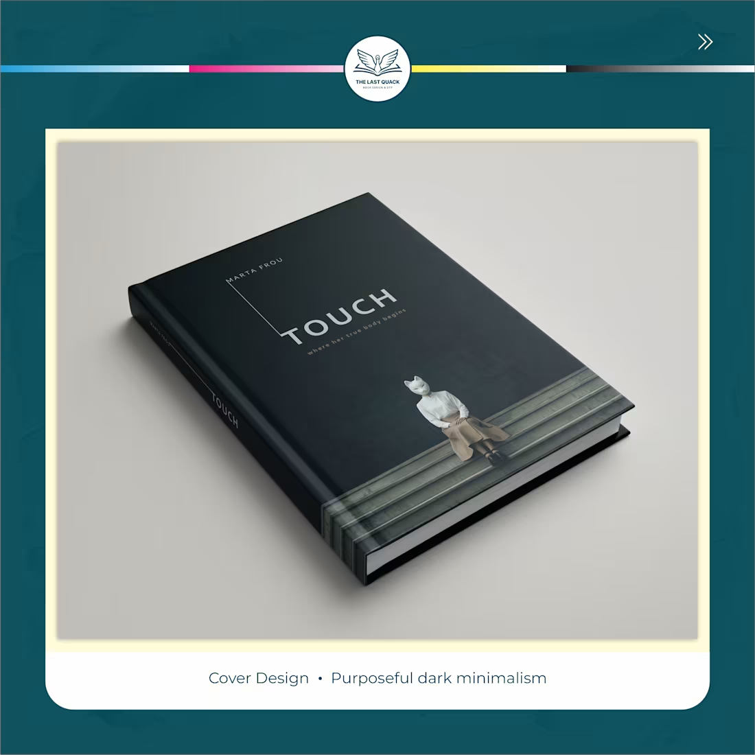
Cover ⮕ dark minimalist palette — refined, with zero visual noise.
Endpapers ⮕ custom graphite pattern — the book begins before page one.
Interior ⮕ classic canon grid with proportional spacing throughout the entire edition.
Every element ⮕ from cover to last page — one cohesive object.
The result of this project is a book that reads itself. When typography does its job flawlessly, you don't notice it. You just reach the last page — and wonder where the time went! : )
2
98
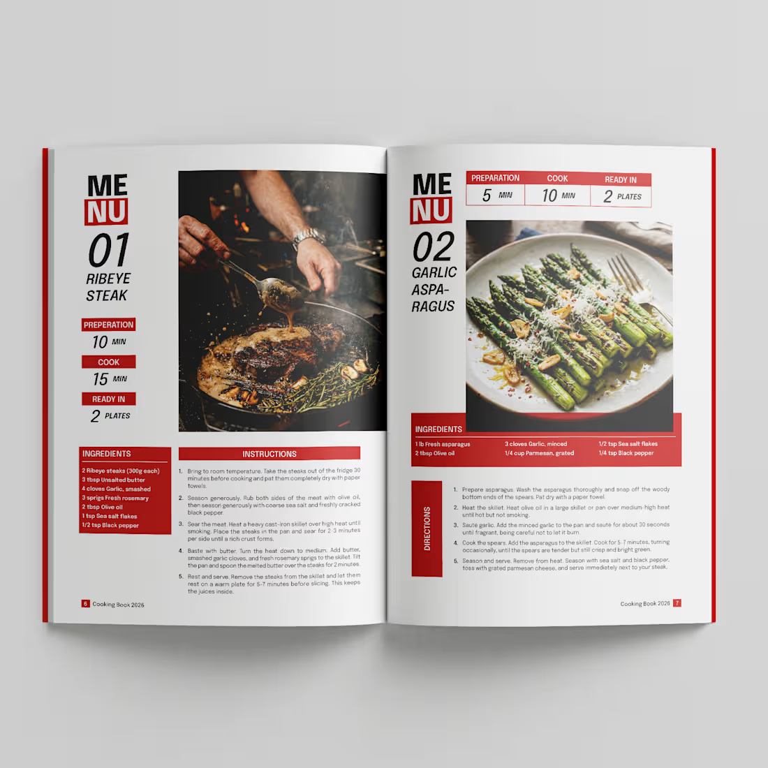
Cookbook Amazon KDP
1
105
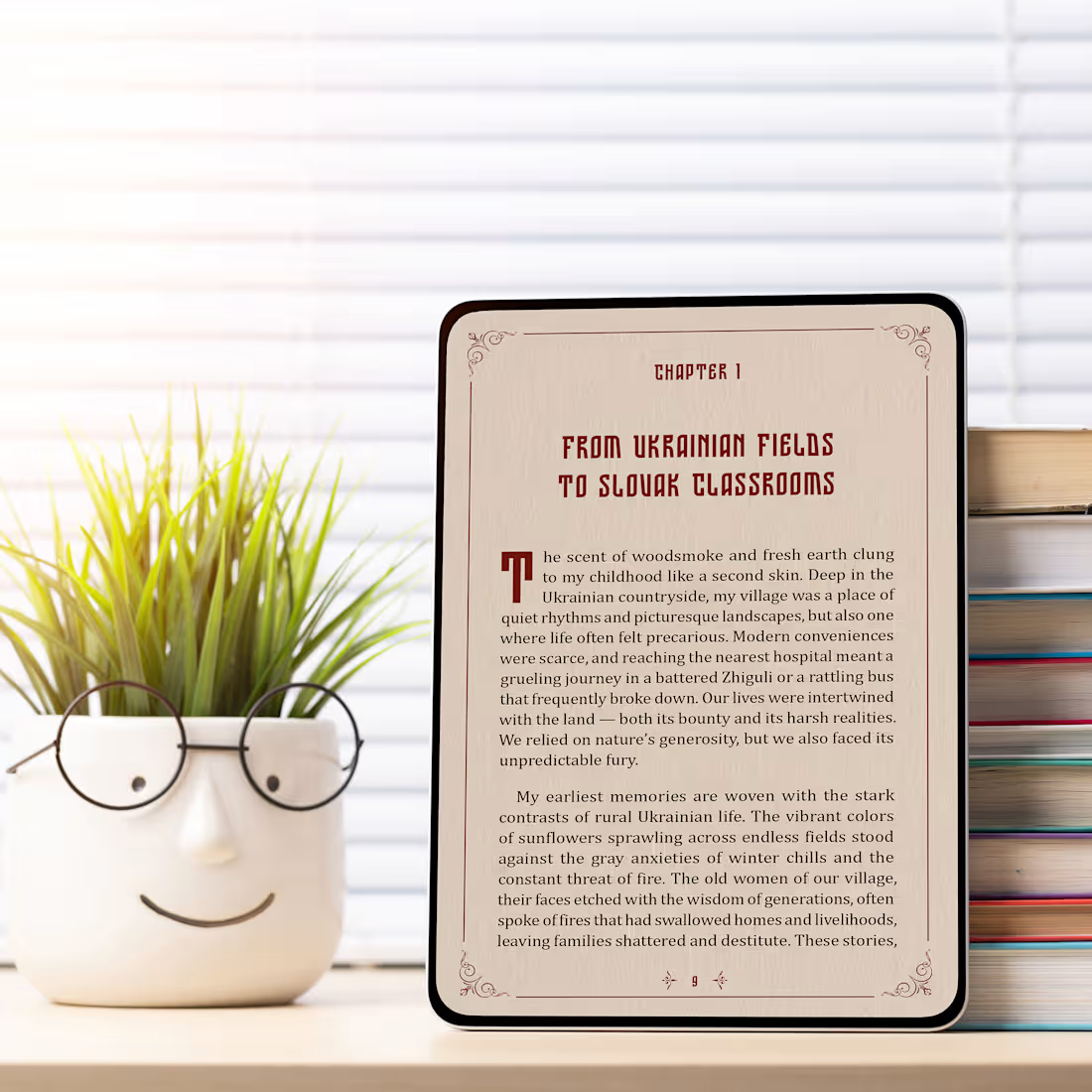
Premium PDF eBook Design & Typography Layout
1
1
152
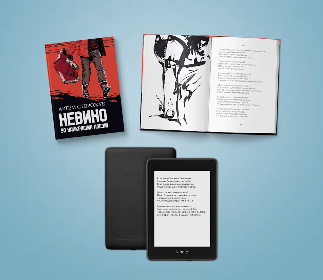
book layout and prepress
3
237