Viktoriia Rubanenko
Professional Book Interior | Pre-press Expert




Most books are designed around paper costs.
This one — around the reader.
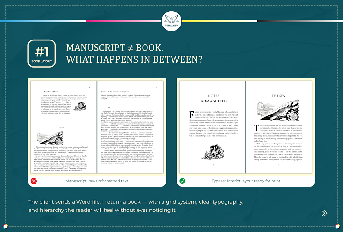
Classic typographic canons — generous outer margins, optimal line length, proportional leading — were developed over centuries for a single purpose: to make reading effortless. Not for beauty (though it's...


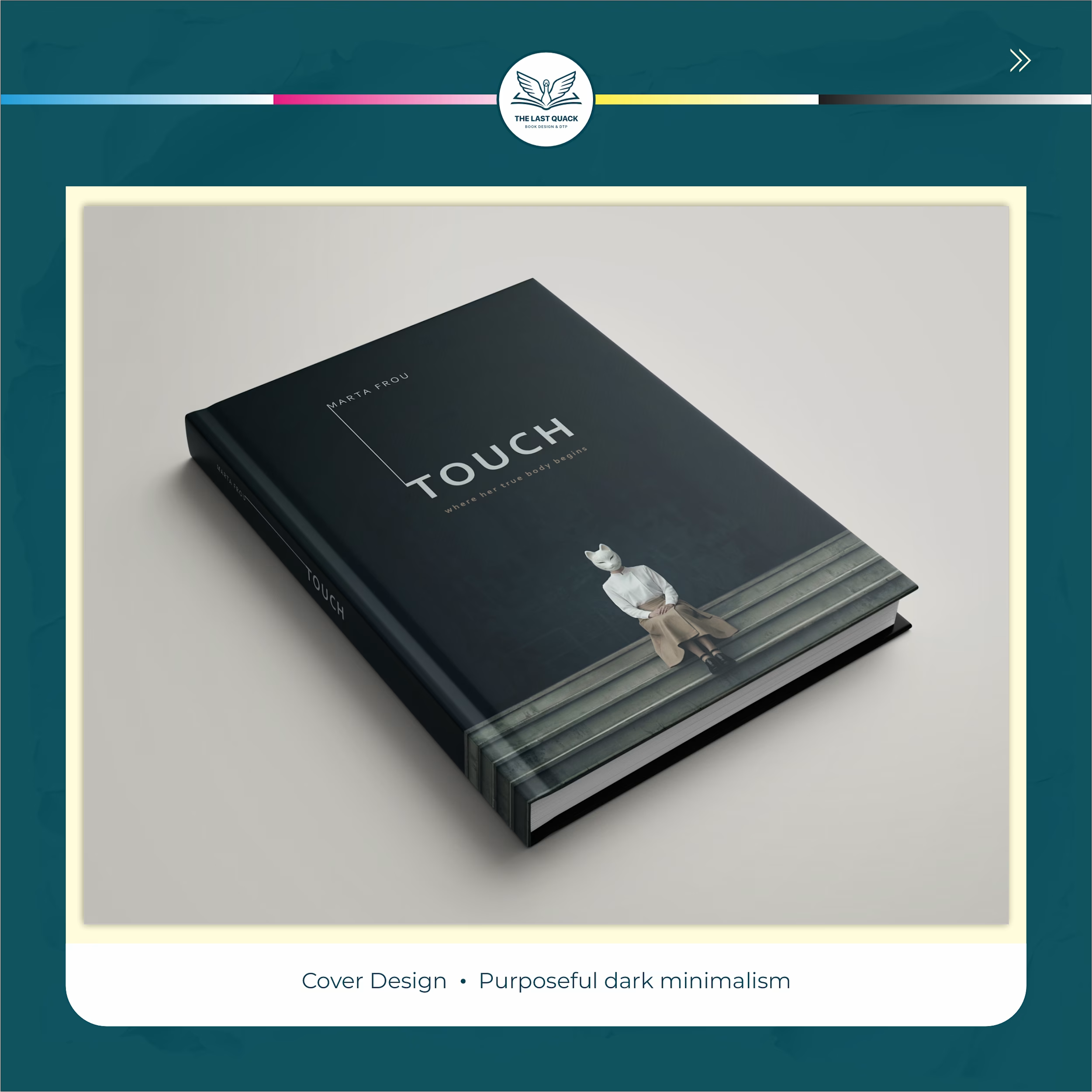
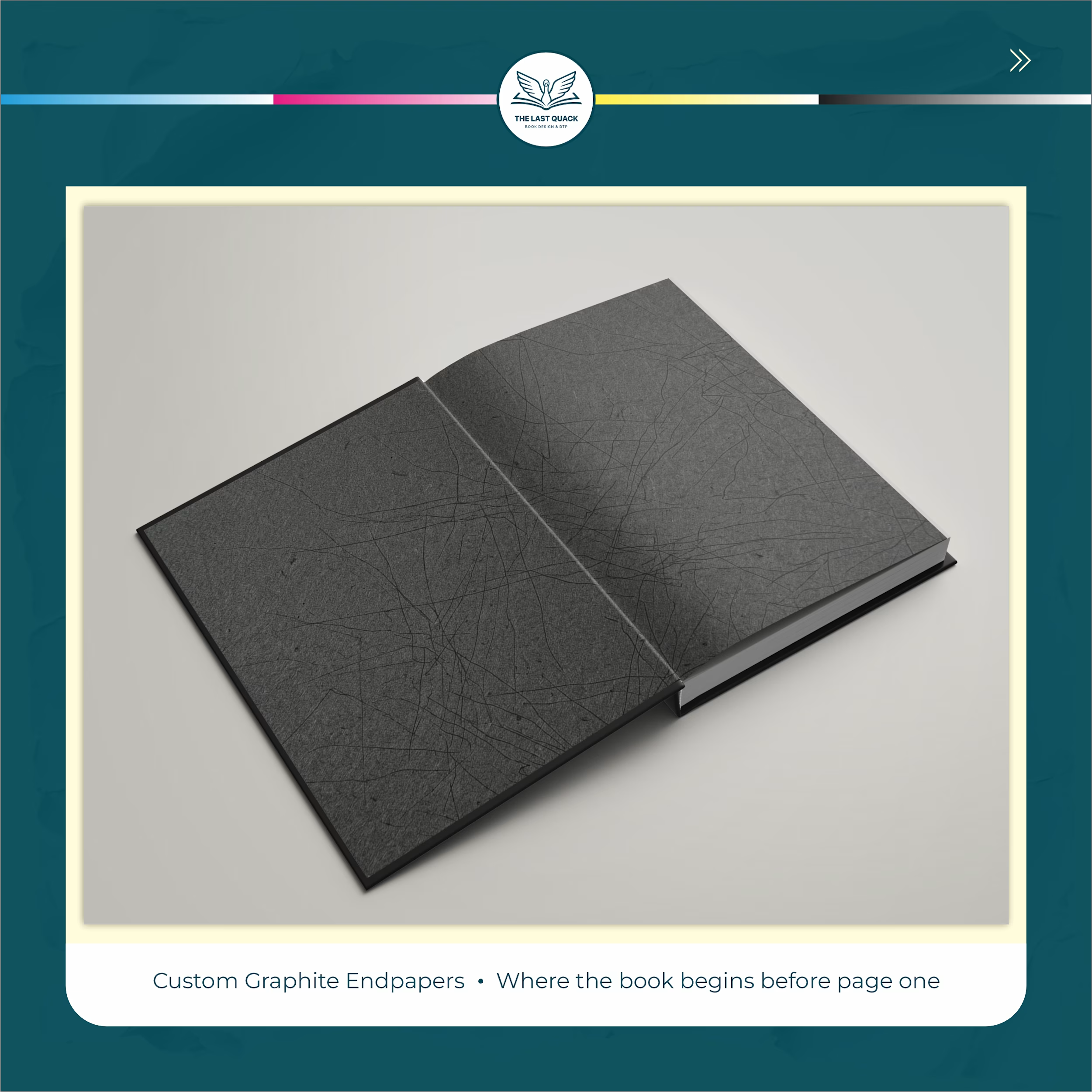
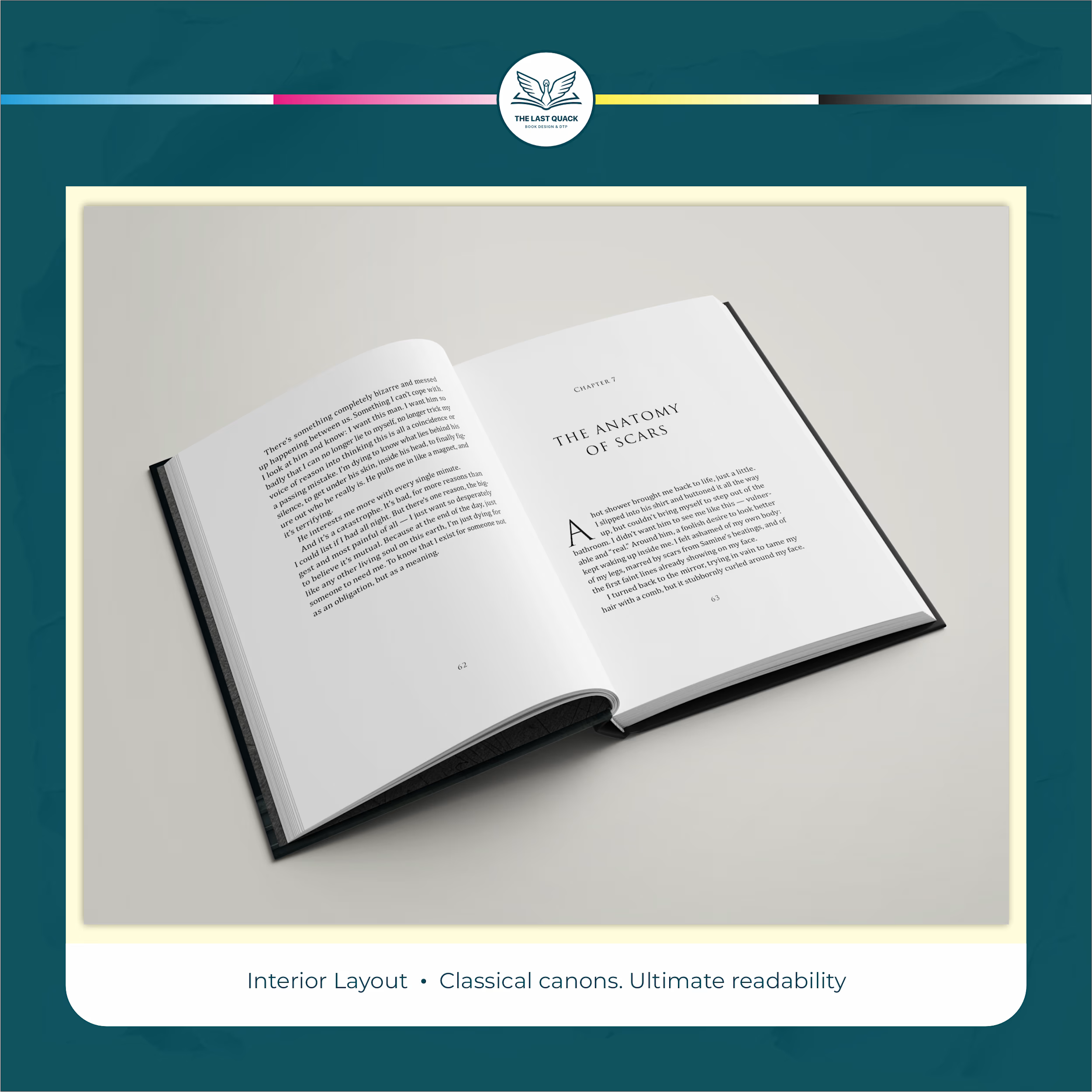

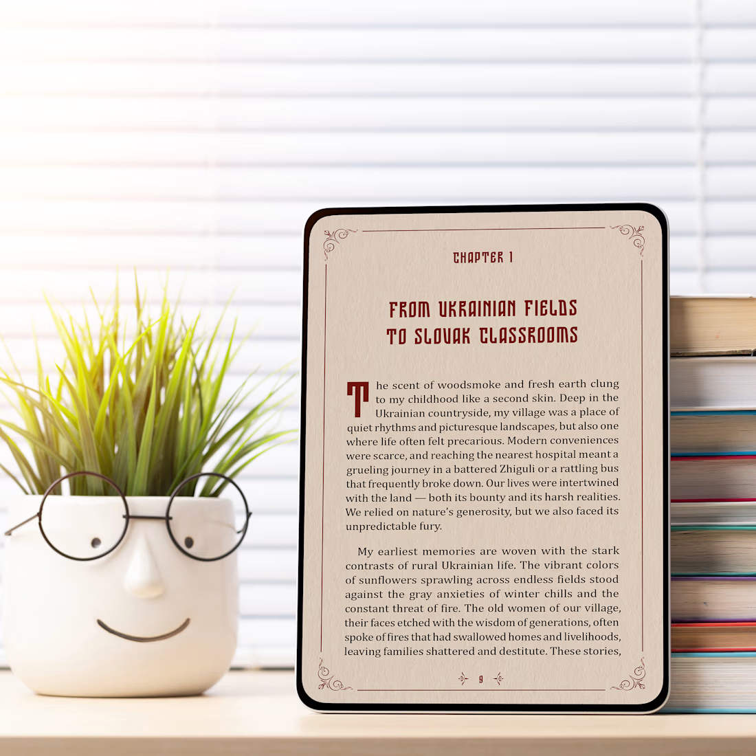
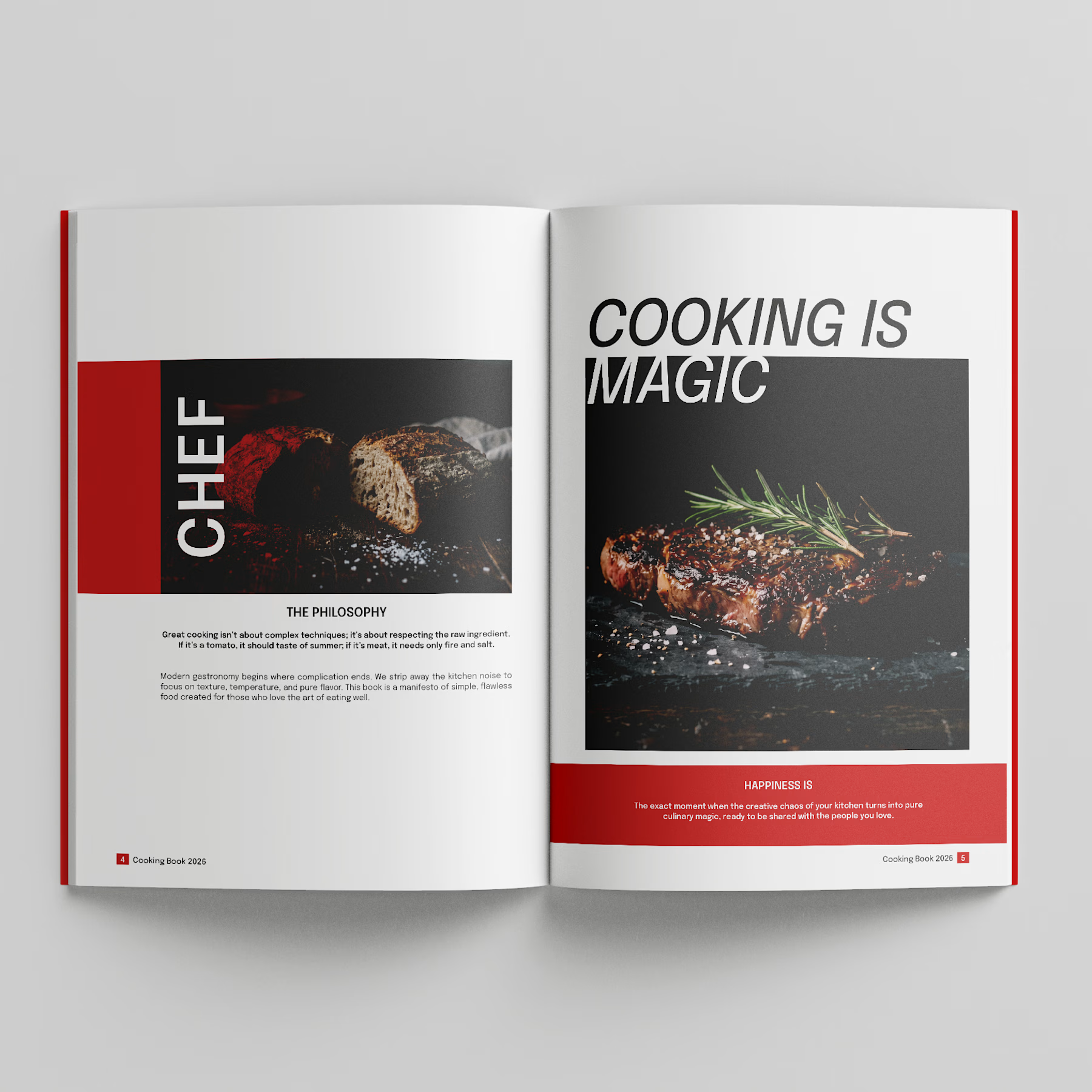
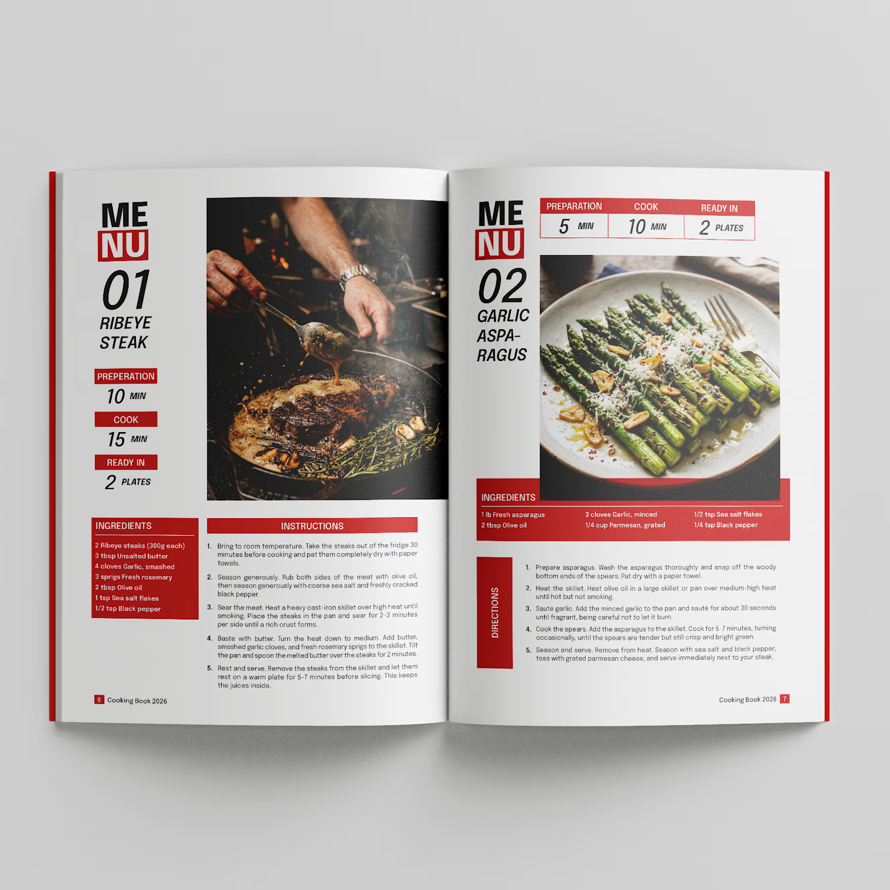
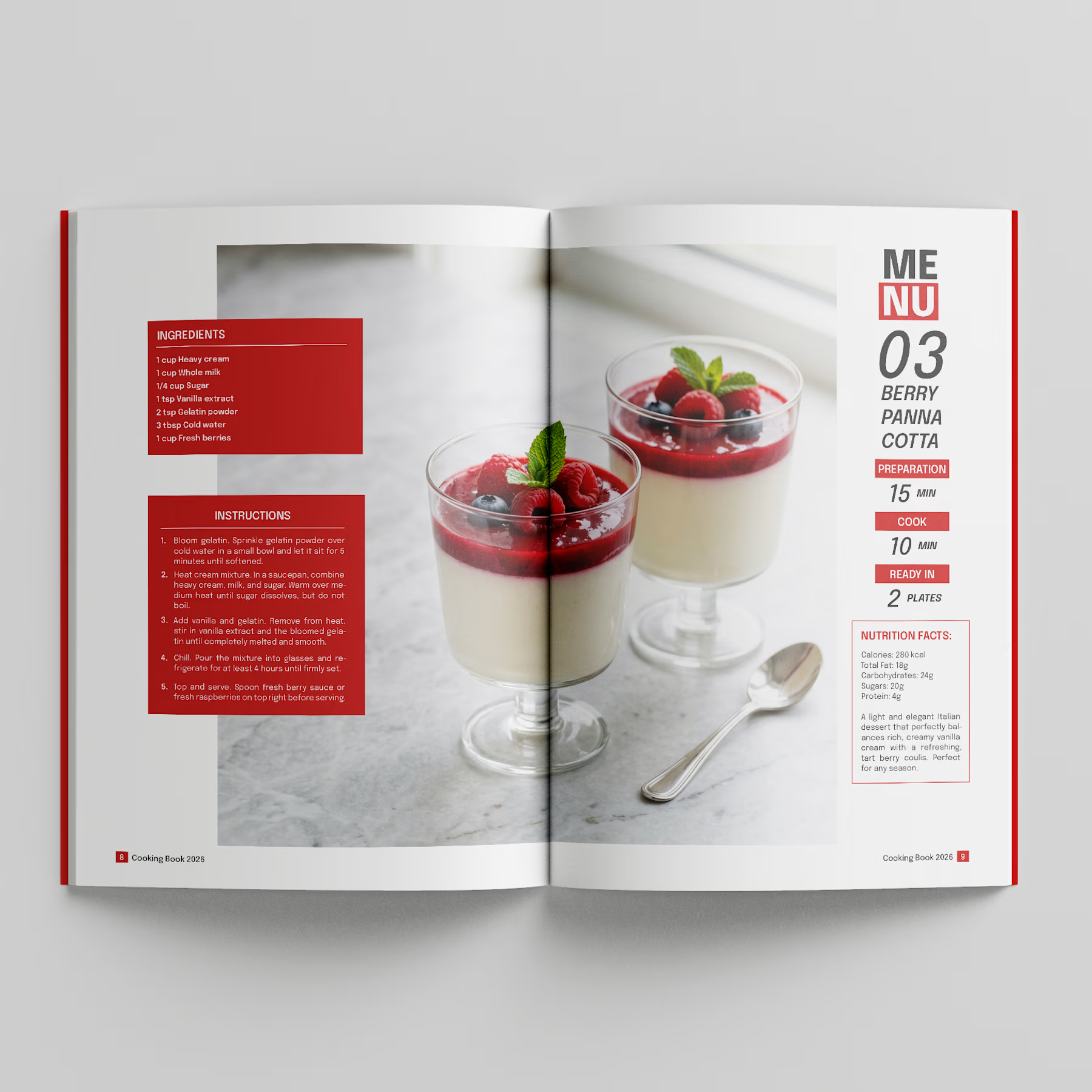
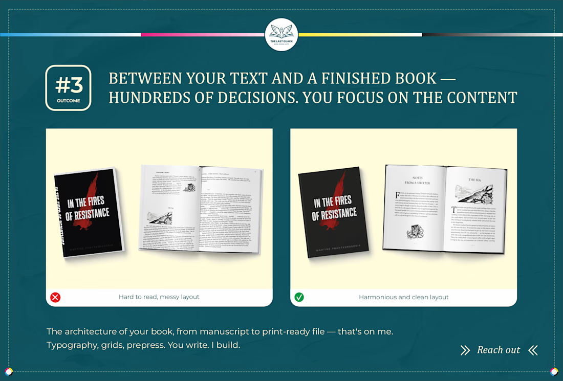
500+ books in — and not one of them made itself.
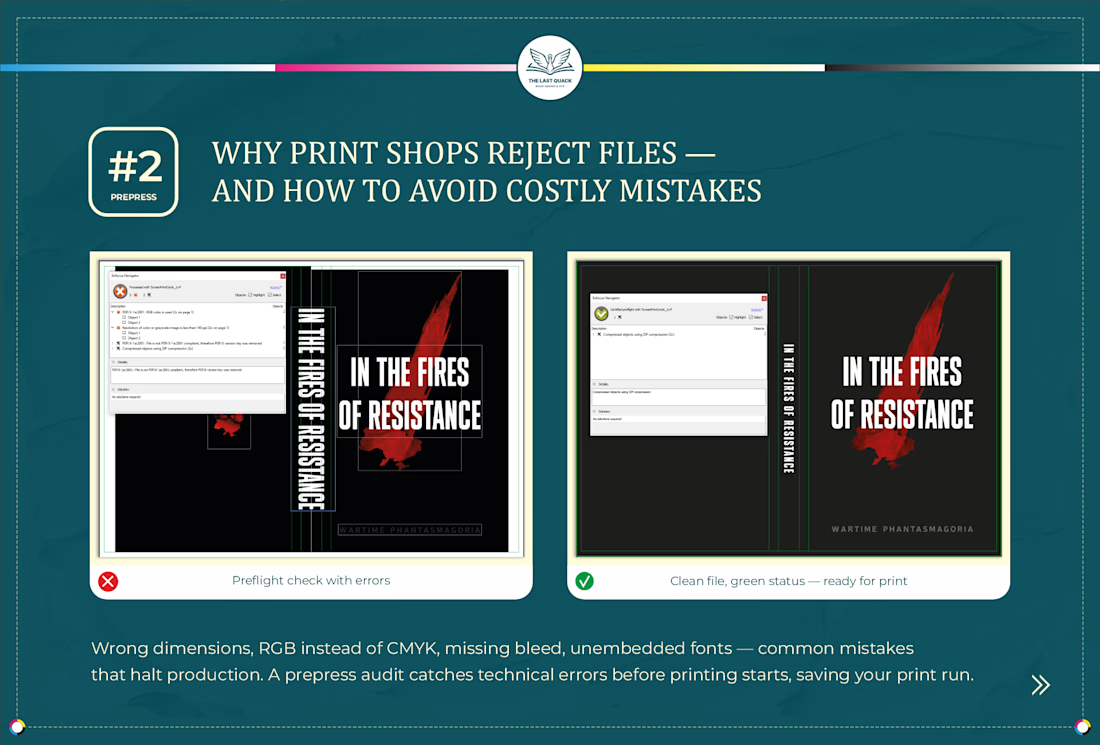
I'm Viktoria, a book layout and prepress specialist with 10+ years of experience. I handle the part of publishing that readers never see — but always feel when it's done wrong.
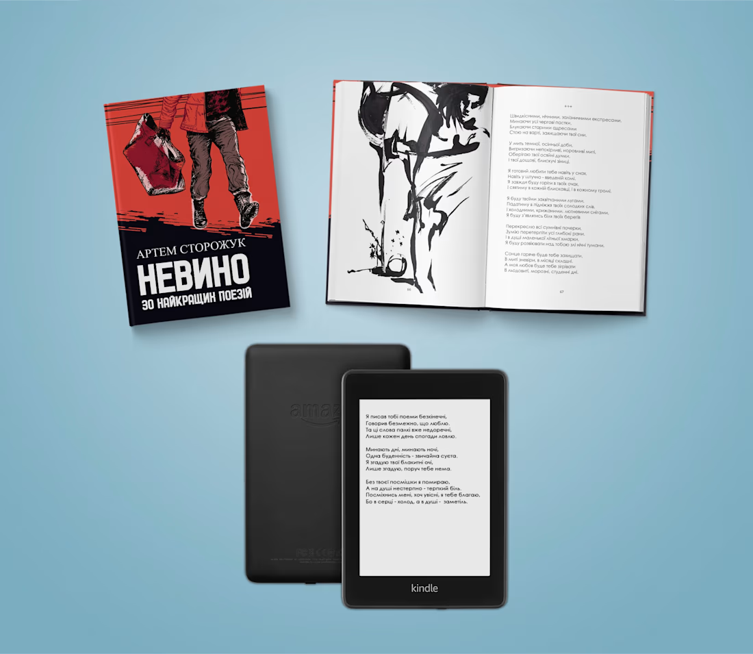
Adobe InDesign, GREP automation, prepress for print and...