The network for creativity
Join 1.25M professional creatives like you
Connect with clients, get discovered, and run your business 100% commission-free
Creatives on Contra have earned over $150M and we are just getting started
Back to feedPost
Sagelet is an AI communication platform that routes each prompt to the language model best suited to handle it.
The challenge was making that complexity feel simple and approachable. We built a visual identity around clarity, accessibility, and a more human way of introducing AI to everyday users.
The system combines a vivid visual language, accessible iconography, and Sova, a friendly owl mascot that became part of the brand's personality.
What we did
→ Brand Identity
→ Art Direction
→ Visual System
→ UX / UI
→ Iconography
→ Mascot Design


So goooood!

Great work and presentation, Catalina

Giving a model-routing engine an owl mascot instead of leaning on "smart AI" iconography is the right call — Sova gives users something to trust before they understand what's happening under the hood, which matters more here than explaining the routing logic.

Definitely. We were honestly a bit tired of seeing the same “smart AI” visual language everywhere, and the founder was also looking for a way to make Sagelet stand out in a sea of tech products.
Sova was actually her idea. Owls have been associated with wisdom for centuries, so...

The routing is invisible to the user by definition, which leaves Sova carrying the whole promise that something is choosing well on their behalf. Did you try visualising the routing itself before landing on the mascot, or was the literal route ruled out early?
The owl was actually the starting point. The founder came in with a pretty clear idea of going in that direction, so we didn't really explore visualizing the routing itself.
Our challenge was more about figuring out how to build a visual system around Sova without losing the...

Looks cool, would love to see a case study out of it!
Absolutely! I'd love to turn this one into a proper case study. There's a bit more context over on Behance in the meantime:
Sagelet — Branding on Behance
And if you were reading a case study about it, what would you want to see?
Thanks a lot for sharing Catalina!

Love the gradients on this!


Great work👏🔥🔥


The owl mascot is a nice touch. It makes the AI side feel a lot more approachable without taking away from the clean visual system.

🔥 🔥

Waiting on the case study, great job!! 🔥

Love this!

Can't stop looking at this! 🤗

The owl is a great touch. It makes the AI product feel much more friendly and easy to understand.

This is such a fresh and innovative take. So inspiring! 😍

Love the owl logo concept and the presentation stands out.

Great work

amazing

Top notch

amazing 🤩

Awesome!

i need to step up my project presentation to this kind of level

This is such a clean execution! Love how you made a complex AI routing concept feel so human and approachable. The green palette and soft UI is perfect for clarity. Amazing work Catalina!

Looks lovely


Damn 🔥

Flawless 🧡

Awesome

clean!

wow how fantastic it is
The network for creativity
Join 1.25M professional creatives like you
Connect with clients, get discovered, and run your business 100% commission-free
Creatives on Contra have earned over $150M and we are just getting started











Related posts

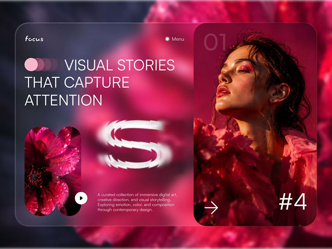
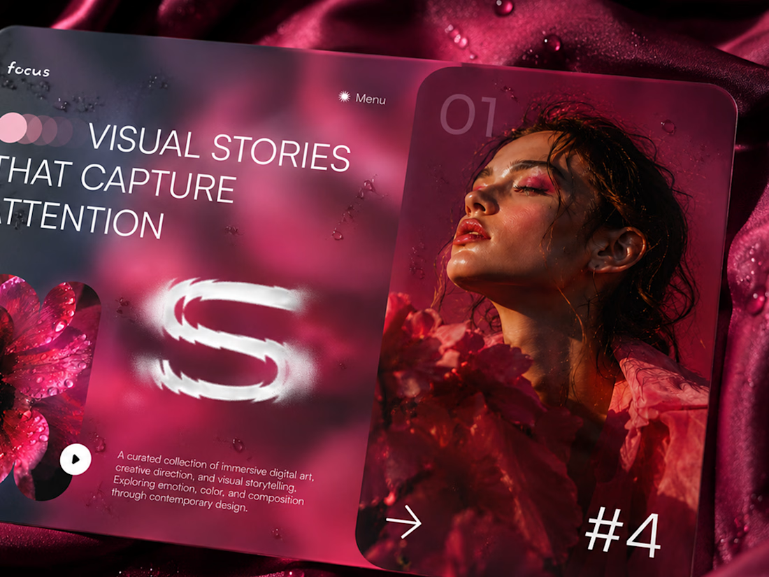
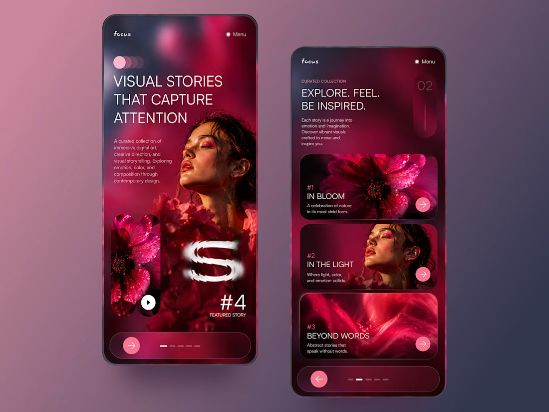
FOCUS — Creative Portfolio & Digital Art Website 🌸✨
A visually expressive website concept for a creative portfolio, built around digital art, bold imagery, and visual storytelling
The design combines vibrant pink tones, soft gradients, experimental typography, and immersive photography to create a distinctive editorial experience
Special attention was given to:
• Bold editorial hero composition
• Vibrant pink and dark color palette
• Experimental typography and visual details
• Immersive photography and digital artwork
• Creative project gallery and navigation
• Responsive mobile experience
• Clean layouts with a strong visual identity
The result is an expressive digital experience that puts creativity, emotion, and visual storytelling at the center of every screen 💗
Looking to create a standout portfolio or website for a creative brand? Let’s connect 🚀



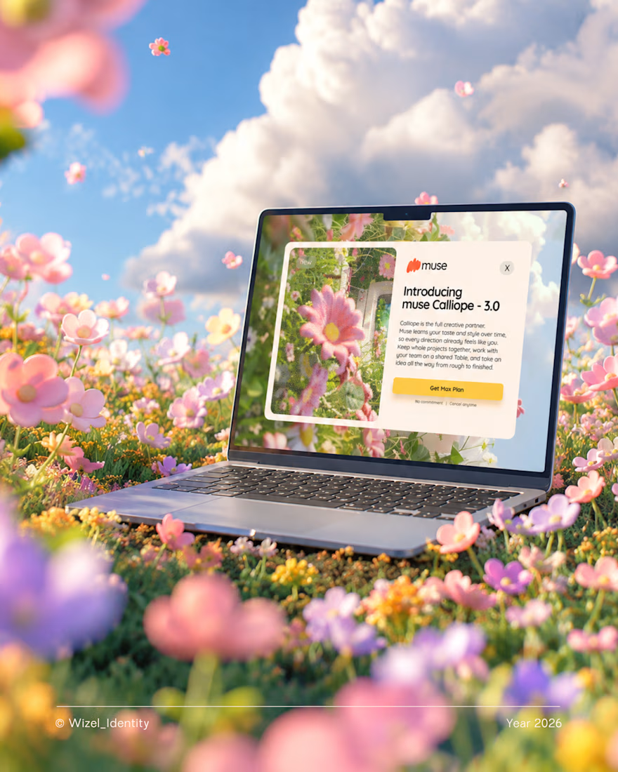
What if creating felt more natural? 🌼
Meet Muse, an AI creative companion that helps turn rough ideas into clear concepts.
The thought you can't quite explain. The idea that's still taking shape. The concept you're trying to bring to life.
Muse meets you right there.
For this identity, I explored a visual direction that feels playful, expressive, and full of possibility, a reflection of what creativity can feel like when you have room to explore.
Brand identity design for Muse.
Designed by Wizel_Identity. © 2026
#BrandIdentity #VisualIdentity #BrandDesign #CreativeTechnology #AI


T O P!

The presentation on top. The process below. ⚡
A behind-the-scenes look at my Tesla Cybertruck presentation, with the finished animation playing alongside a sped-up view of how I built it in PowerPoint.
From arranging each slide to fine-tuning the Morph transitions, here’s the work behind the final result.
