The network for creativity
Join 1.25M professional creatives like you
Connect with clients, get discovered, and run your business 100% commission-free
Creatives on Contra have earned over $150M and we are just getting started
Back to feedPost

Type Has a Voice. 🔤
A quick typography study: one word, one orange "O" as the focal point, in two moods.
V1 is dark and dramatic. V2 is light and editorial.
Which version hits harder? Vote below, and tell me which typeface you'd pair with it 👇
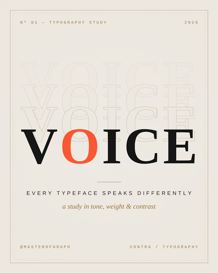
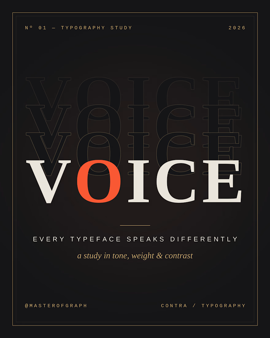

The high-contrast serif already gives V2 its editorial voice, so I'd test a quiet grotesk like Neue Montreal for the small caption lines. It would keep the orange O as the only loud element. Did you try the same serif in a lighter weight for V1?
The network for creativity
Join 1.25M professional creatives like you
Connect with clients, get discovered, and run your business 100% commission-free
Creatives on Contra have earned over $150M and we are just getting started





Related posts

Bringing MONETA to life through a series of brand applications that extend the identity across digital banking, business materials, and marketing touchpoints. A refined combination of typography, color, and structured layouts creates a modern and cohesive financial brand experience.
Have a project in mind?
Get in touch and let’s create something together.

Goatt!!


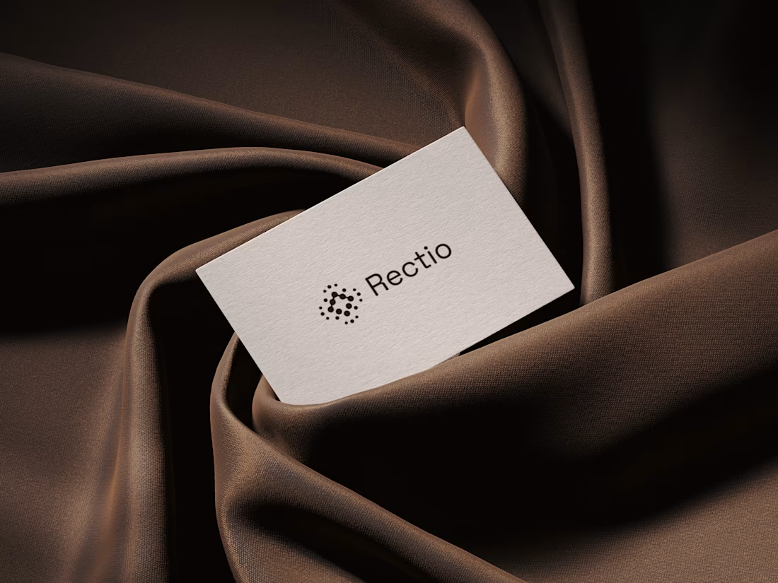
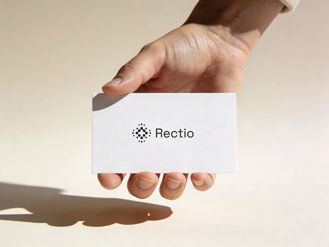
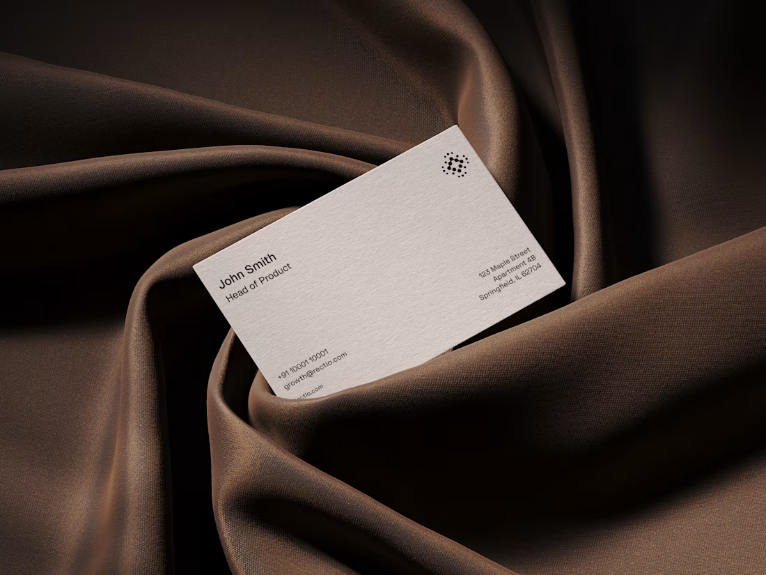
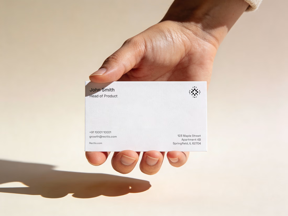
Rectio — Brand Identity
Brand Identity • Visual Direction • Business Cards • Mockups
A modern and minimal branding direction for Rectio, from visual identity to business card applications.
Created by Artonest Design Studio — artonest.design




If you had to guess the final pick, would you go with A or B?
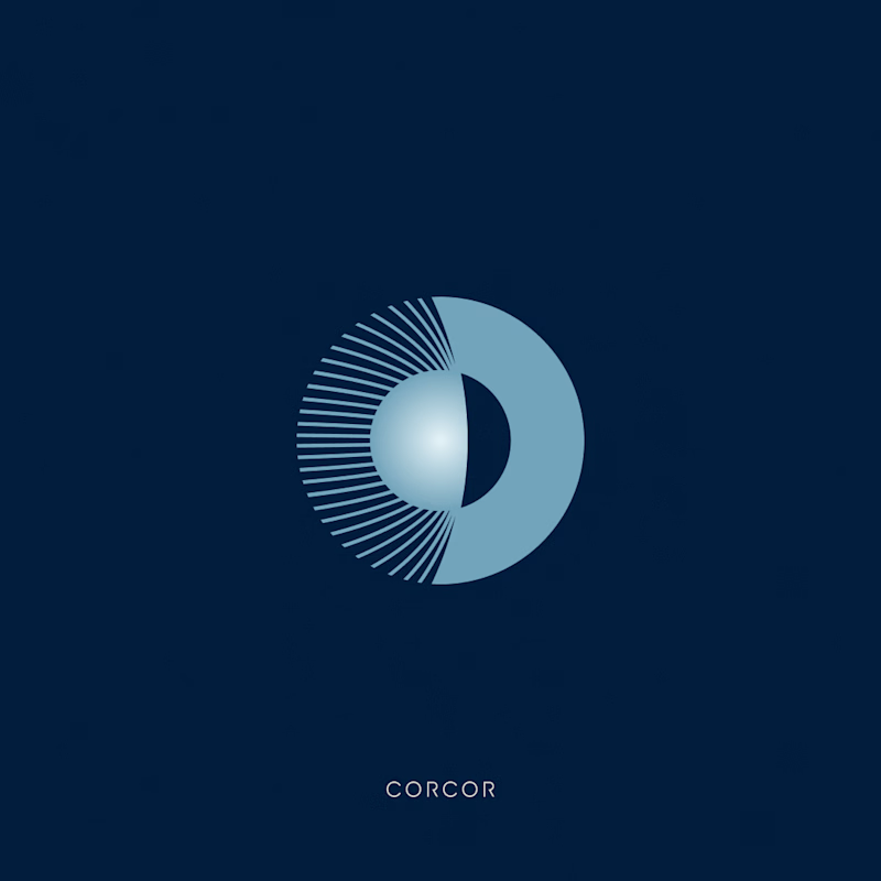
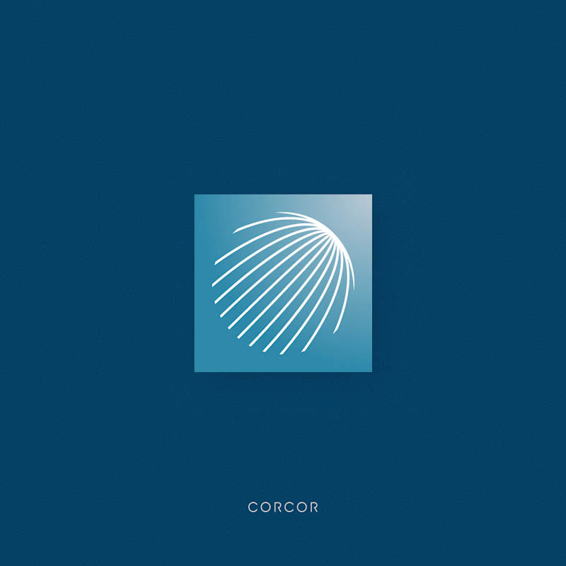
I explored two different visual identities for an eye clinic. Both have their own personality, but only one made it to the final round. Can you guess which logo made the cut?
A or B?
#logo #pool #eyeclinic #eyelogo #cliniclogo
14 voted
70%
6 voted
30%
20 votes
Closed

Logo A is more attractive I like it