The network for creativity
Join 1.25M professional creatives like you
Connect with clients, get discovered, and run your business 100% commission-free
Creatives on Contra have earned over $150M and we are just getting started
Back to feedPost
Taste Test
If you had to guess the final pick, would you go with A or B?
I explored two different visual identities for an eye clinic. Both have their own personality, but only one made it to the final round. Can you guess which logo made the cut?
A or B?
#logo #pool #eyeclinic #eyelogo #cliniclogo
14 voted
70%
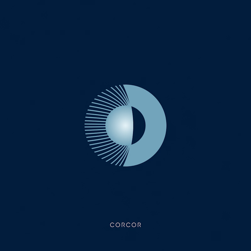
6 voted
30%
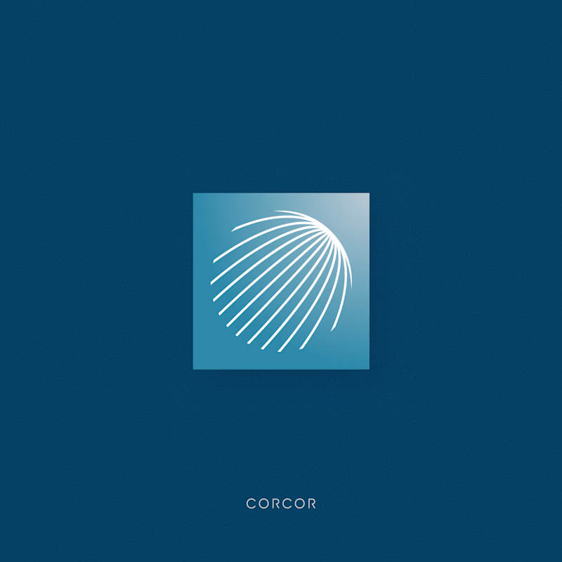
20 votes
Closed

Great work man

Thank you, Rahman

I loooove option B. It says eye clinic loudly in such an elegant way.
Thank you Chantal! Actually, the idea behind option B was to give it a more elegant feel compared to option A, while keeping it clearly connected to the eye clinic.

Logo A is more attractive I like it
Thanks Mostafa 🙌

Logo A for me. The crescent iris reads instantly as an eye and works down to a tiny favicon, which is exactly what a clinic needs across signage and app. B is elegant but more abstract, people might not clock the eye. My guess is A made the cut.

logo A is simple but stylish. logo B is simple and kind of generic

logo A
The network for creativity
Join 1.25M professional creatives like you
Connect with clients, get discovered, and run your business 100% commission-free
Creatives on Contra have earned over $150M and we are just getting started





Related posts

Somewhere between Japan, surf culture, and a very unnecessary amount of matcha. 🍵🌊
This passion project was created for @designerbriefs , but the direction became a little personal.
I visited Kamakura earlier this year, and fell in love with the whole vibe. It’s Japan, but with a slower, more relaxed energy. Surf culture, cozy streets, friendly people, and that easygoing coastal feeling where nobody seems to be in too much of a rush. Basically, my kind of place. 🫶
So when I saw the brief for a Japanese matcha brand, I knew I wanted to take it in that direction. Not just traditional Japanese tea culture, but the meeting point between ritual and relaxation, structure and spontaneity, matcha and surfboards.
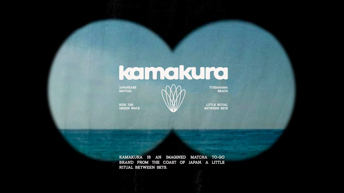
And that’s how KAMAKURA came to life.
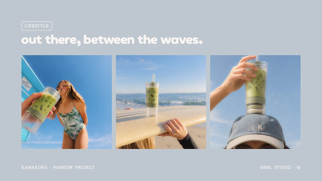
A Matcha To-Go Kit designed for your post-surf pause, with ceremonial matcha, oat milk, a bamboo whisk, a reusable cup, and packaging you can plant after use. 🌱
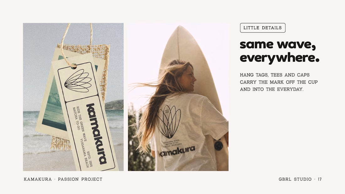
The icon brings both worlds together, with surfboards arranged into the shape of a matcha whisk. Because, naturally, even the logo had to catch a wave.
Ride the green wave. 🌊
#Kamakura #MatchaBranding #BrandIdentity #PassionProject #dbckamakura



Love this Gabriela! 🤍
I you don't mind sharing, what's the display font?

Design Direction Poll!
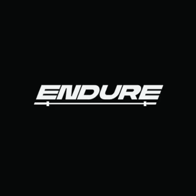
Two versions of the same Endure logo concept; same aggressive italic letterforms, same racing DNA. One detail changes the entire read.
Which version hits harder? 👇
14 voted
78%

4 voted
22%
18 votes
Closed

Meriot personal portfolio Website Homepage showcase
A portfolio website designed to turn personal expertise into a strong digital presence.
The goal was to create a website that communicates experience, personality, expertise, and credibility within the first few seconds.
I focused on:
Clear positioning and personal branding
Strong visual hierarchy
Editorial-style typography
Project-focused storytelling
UX/Product Design service presentation
Testimonials and social proof
Clear CTA for potential clients
Responsive, conversion-focused layouts
The visual direction combines minimal typography, bold imagery, dark/light sections, and subtle interactions to give the portfolio a distinctive personality without making it difficult to navigate.


Top notch execution