The network for creativity
Join 1.25M professional creatives like you
Connect with clients, get discovered, and run your business 100% commission-free
Creatives on Contra have earned over $150M and we are just getting started
Back to feedPost
Taste Test

Design Direction Poll!
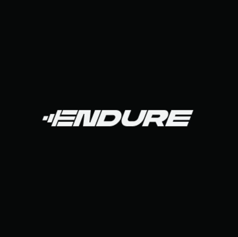
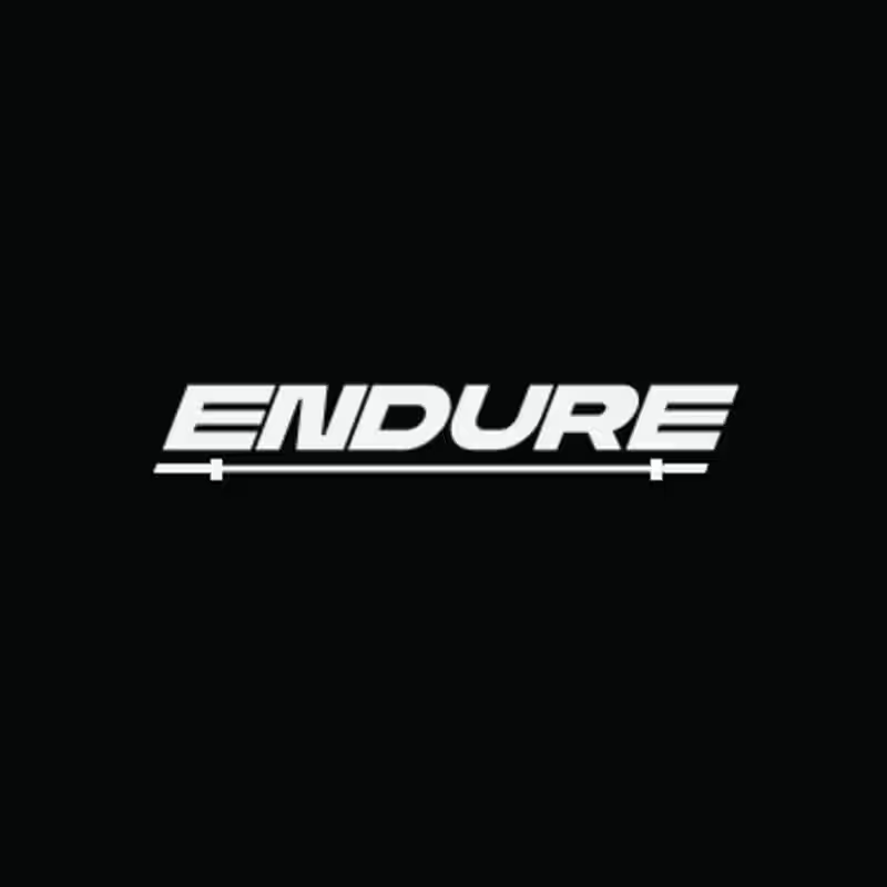
Two versions of the same Endure logo concept; same aggressive italic letterforms, same racing DNA. One detail changes the entire read.
Which version hits harder? 👇

14 voted
78%
4 voted
22%
18 votes
Closed


creative work

V1 looks more dynamic and sticks more to the brand in my opinion where V2 seems to be very static.

The network for creativity
Join 1.25M professional creatives like you
Connect with clients, get discovered, and run your business 100% commission-free
Creatives on Contra have earned over $150M and we are just getting started




Related posts


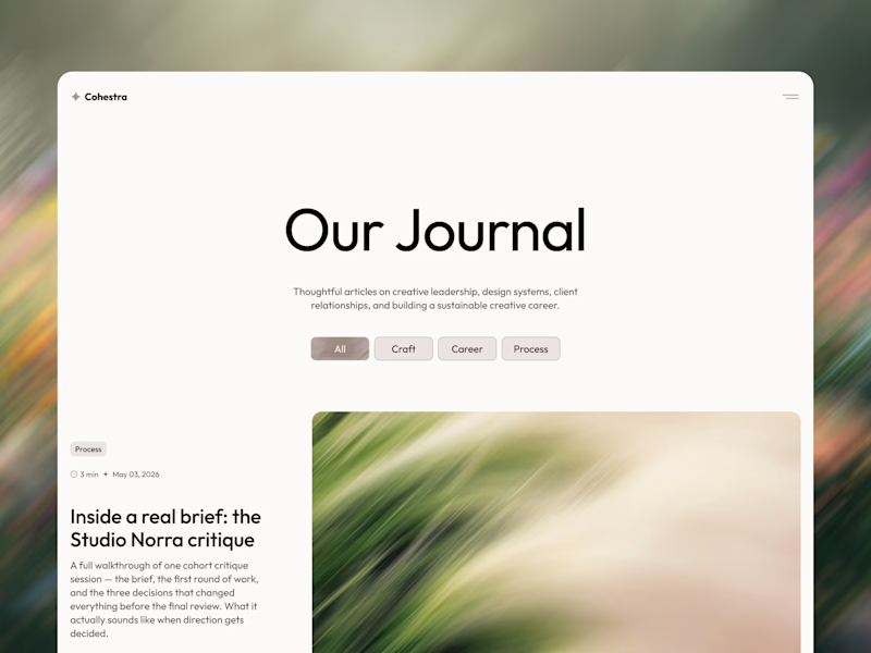
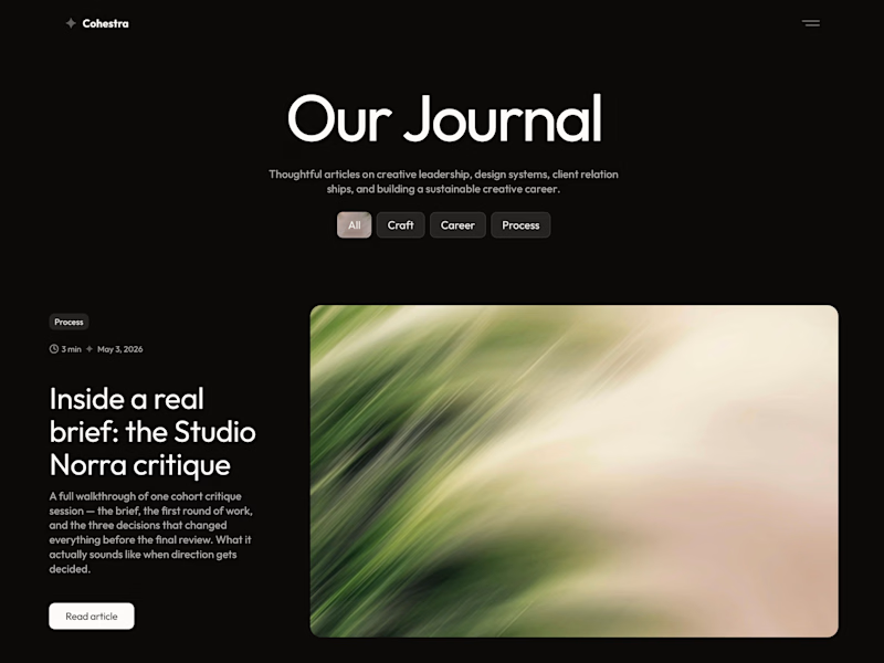
cohestra’s journal in light and dark. which would you keep?

26 voted
41%
37 voted
59%
63 votes
Closed


light: more clear for me 🎉

Brand exploration. Which one speaks to you?
12 voted
50%
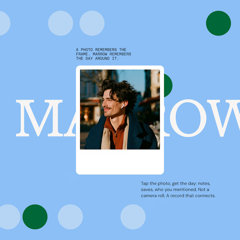
12 voted
50%
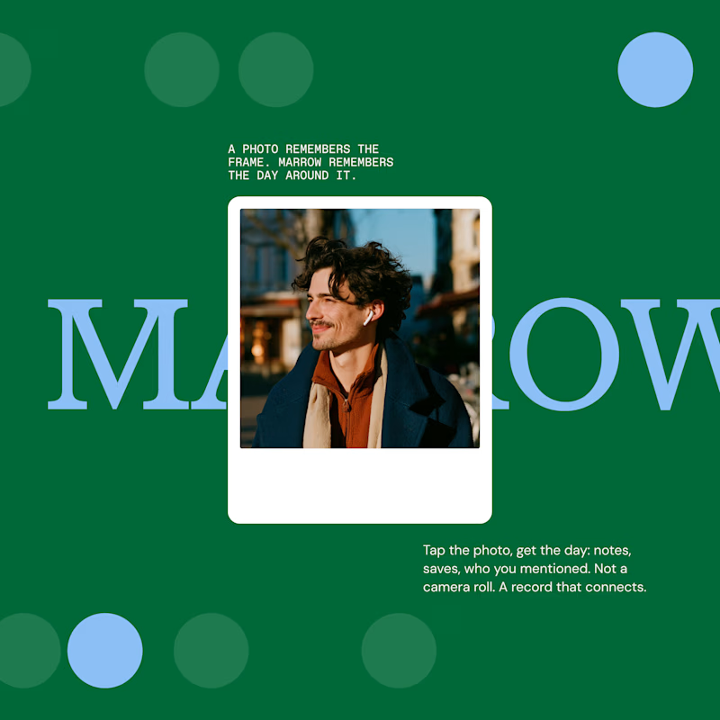
24 votes
Closed


Left or Right?
Yesterday I showed you two directions for my new portfolio, A, B and asked you to vote.
Truth is, I already knew which one would win.
Massimo Vignelli, one of the greatest designers ever, gave clients a single option. Not three, one. And if they pushed, the story goes, he offered to write a book explaining why.
I ran every direction for this site, but they all pointed to the same answer, the one that actually fit.
Let me know what you think now.

42 voted
61%
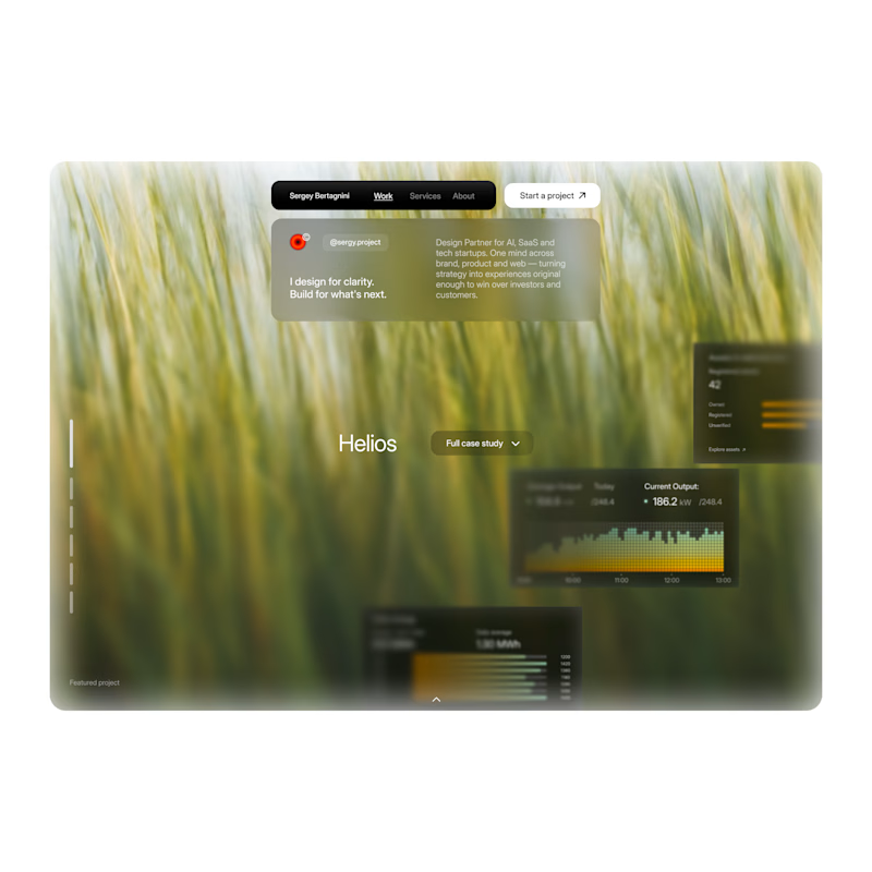
27 voted
39%
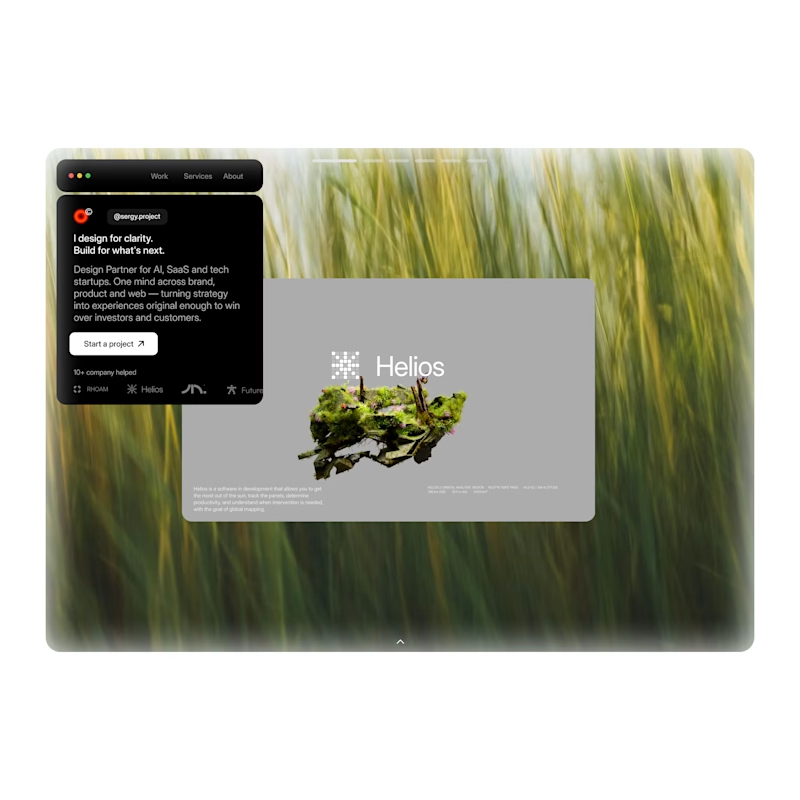
69 votes
Closed
