The network for creativity
Join 1.25M professional creatives like you
Connect with clients, get discovered, and run your business 100% commission-free
Creatives on Contra have earned over $150M and we are just getting started
Back to feedPost
Taste Test


cohestra’s journal in light and dark. which would you keep?

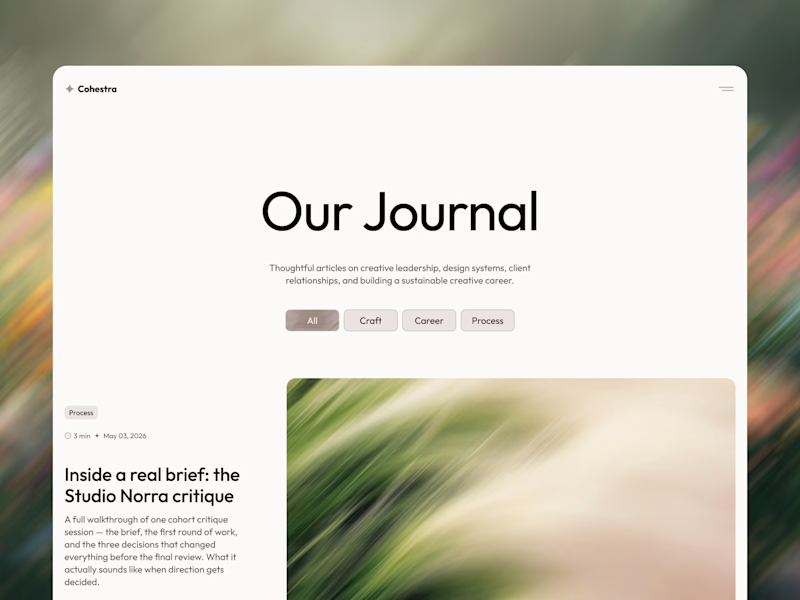
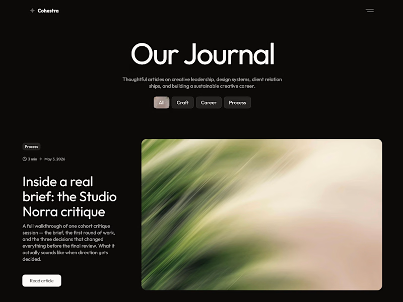
25 votes
Ends in 1d

yeah, can't decide either 😅

So cool. Love the white version more 🔥
🙌

dark
🌚

For some reasons, the light version catches the eye

The content both the text and image show well on the dark background.


light: more clear for me 🎉
🙌

• 7h
White

Both look extremely clean, but Dark mode takes the win for visual depth. Ideally, auto-switching based on system preferences would be the sweet spot. Great work on the spatial hierarchy in Framer!
The network for creativity
Join 1.25M professional creatives like you
Connect with clients, get discovered, and run your business 100% commission-free
Creatives on Contra have earned over $150M and we are just getting started

Challenges
View all


Related posts

Which layout is better?
.
.
Curious which one wins? Follow along for more tests like this x.com/rightnextstep
20 voted
67%

10 voted
33%

30 votes
Closed

Hero 1 shows the hero text very well but you might need to work on the Hero CTA for "join the masterclass", I will probable miss it as a key action if I was a regular user
another week another @framer template dropping soon 👀

this is so heart eyes
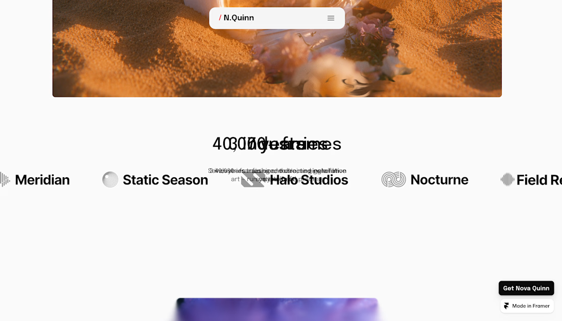
Nova Quinn is live, a Framer portfolio template for visual artists and small studios. Lots of motion on the landing page, best seen on desktop.
$99, or $129 with the Figma file.

I guess there is a problem with the sticky text.