The network for creativity
Join 1.25M professional creatives like you
Connect with clients, get discovered, and run your business 100% commission-free
Creatives on Contra have earned over $150M and we are just getting started
Back to feedPost
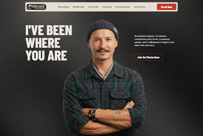
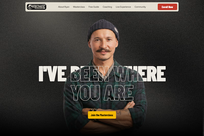
Taste Test

Which layout is better?
.
.
Curious which one wins? Follow along for more tests like this x.com/rightnextstep

8 votes
Ends in 1d

First. Readability over aesthetic applications. Always.


hero 2

The side-by-side test is a smart way to isolate hierarchy—Hero 2 gives the headline more presence, while Hero 1 feels a touch calmer. I’d keep testing the CTA against the image contrast.
The network for creativity
Join 1.25M professional creatives like you
Connect with clients, get discovered, and run your business 100% commission-free
Creatives on Contra have earned over $150M and we are just getting started

Challenges
View all


Related posts

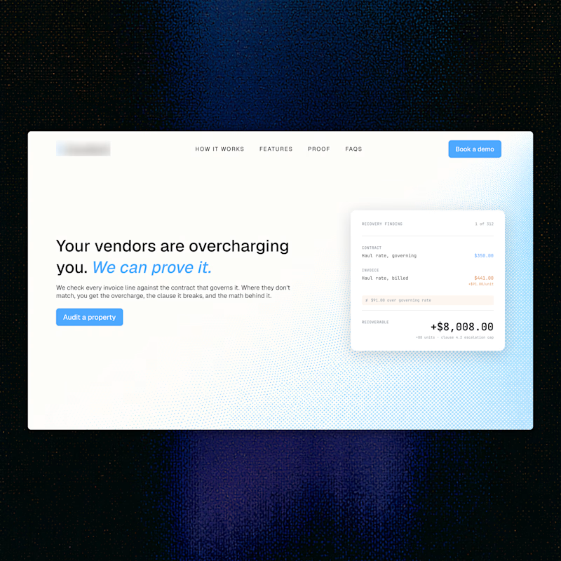
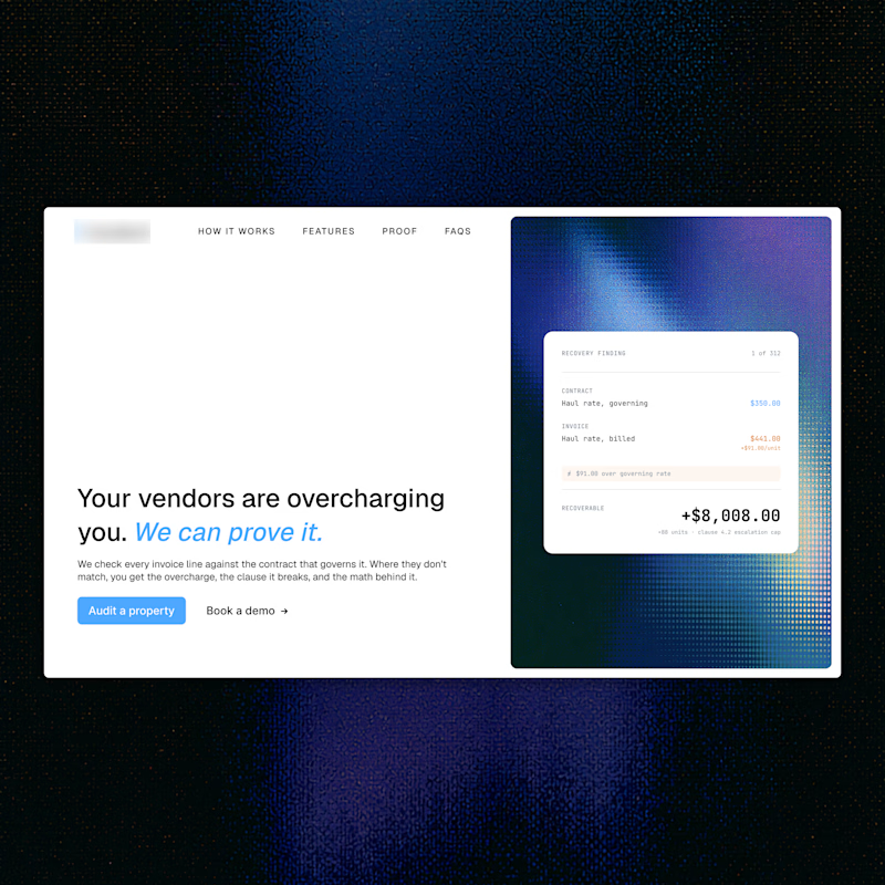
Full bleed or split layout. Which structure works better?
2 voted
40%
3 voted
60%
5 votes
Closed

Full bleed. Way more modern. The split layout creates an unnecessary hard divide right down the middle.

SaaS interfaces need clarity.
But clarity doesn't have to mean sterile.
With CORESPACE, the gooey effect is a small moment where the visual system gets to be more expressive.
It doesn't explain the product.
It doesn't add functionality.
It simply gives the experience some character.
Sometimes that's enough to make a product feel memorable.

The win here is placement. A gooey moment on the hero adds character, the same effect on a data table or form would just tax the task. Putting it where the eye is already resting is what makes it read as personality instead of noise.

If your dashboard has to be beautiful OR instantly understandable, which one wins?
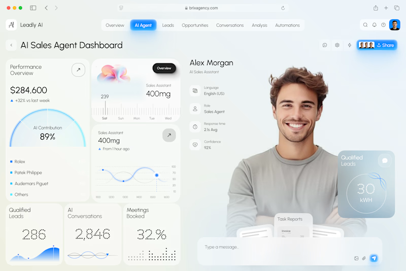
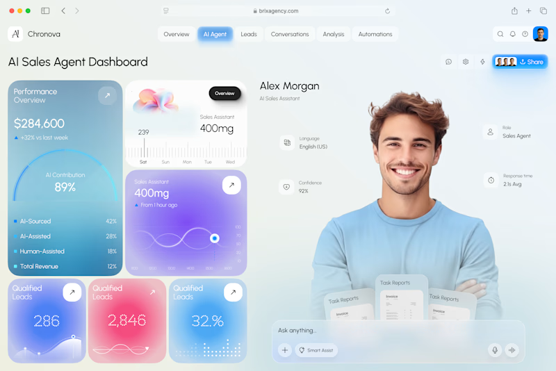
I designed two visual directions for the same AI Sales Agent dashboard.
Same product. Same data. Same core UX.
Only the visual language changed.
Poll options:
A — Clarity First
B — Energy First


30 voted
53%
27 voted
47%
57 votes
Closed

A clarity outstanding