The network for creativity
Join 1.25M professional creatives like you
Connect with clients, get discovered, and run your business 100% commission-free
Creatives on Contra have earned over $150M and we are just getting started
Back to feedPost
SaaS interfaces need clarity.
But clarity doesn't have to mean sterile.
With CORESPACE, the gooey effect is a small moment where the visual system gets to be more expressive.
It doesn't explain the product.
It doesn't add functionality.
It simply gives the experience some character.
Sometimes that's enough to make a product feel memorable.


Clean work!

Thanks! Really appreciate it 🙌


Great saying and great execution. Loving the fluid like motion, looks good and you can feel its different, carrying an identity and seperating itself apart from sterile identities. Great work!
Thank you! That was exactly the goal — using motion to create identity without turning it into noise. Really appreciate it 🙌

Outstanding work
Thanks! Really appreciate it 🙌
Thanks! Really appreciate it 🙌

Keep up the great work! ❤️🔥
Thanks! Really appreciate it 🙌

Love this. The interaction is subtle enough to not get in the way, but memorable enough to make the UI feel unique.
Exactly — memorable without demanding attention. That's the sweet spot 🙌

Exactly. Not every design decision needs to solve a functional problem. Sometimes a small visual detail simply makes the experience feel more human and gives the product a personality people remember.
Absolutely. That emotional layer is often what turns a good interface into something people actually remember 🙌
I think that’s the sweet spot, functionality creates clarity, but personality creates connection. A small detail doesn’t have to improve a workflow to add value. Sometimes making the experience more memorable is the value.
Exactly. Not every detail needs to improve the workflow — sometimes creating a moment people remember is enough value on its own. 🙌
The network for creativity
Join 1.25M professional creatives like you
Connect with clients, get discovered, and run your business 100% commission-free
Creatives on Contra have earned over $150M and we are just getting started











Related posts

A hungry customer decides in about 3 seconds.
Is your website making them hungrier, or sending them to the competitor down the street?
Marco's restaurant had great food, and empty tables every Friday night.
Not because the pasta was bad. Because the website was.
Last month, a couple searched "Italian restaurant near me" and found Marco's page. Blurry photos. A menu as a PDF that never loaded on the phone. No way to book a table. They closed the tab in 5 seconds and walked into the place next door.
Marco never knew. That's the dangerous part. You don't see the customers your website loses.
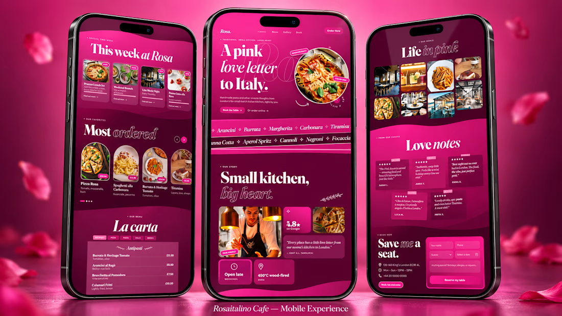
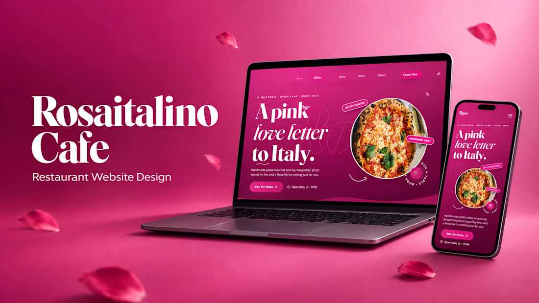
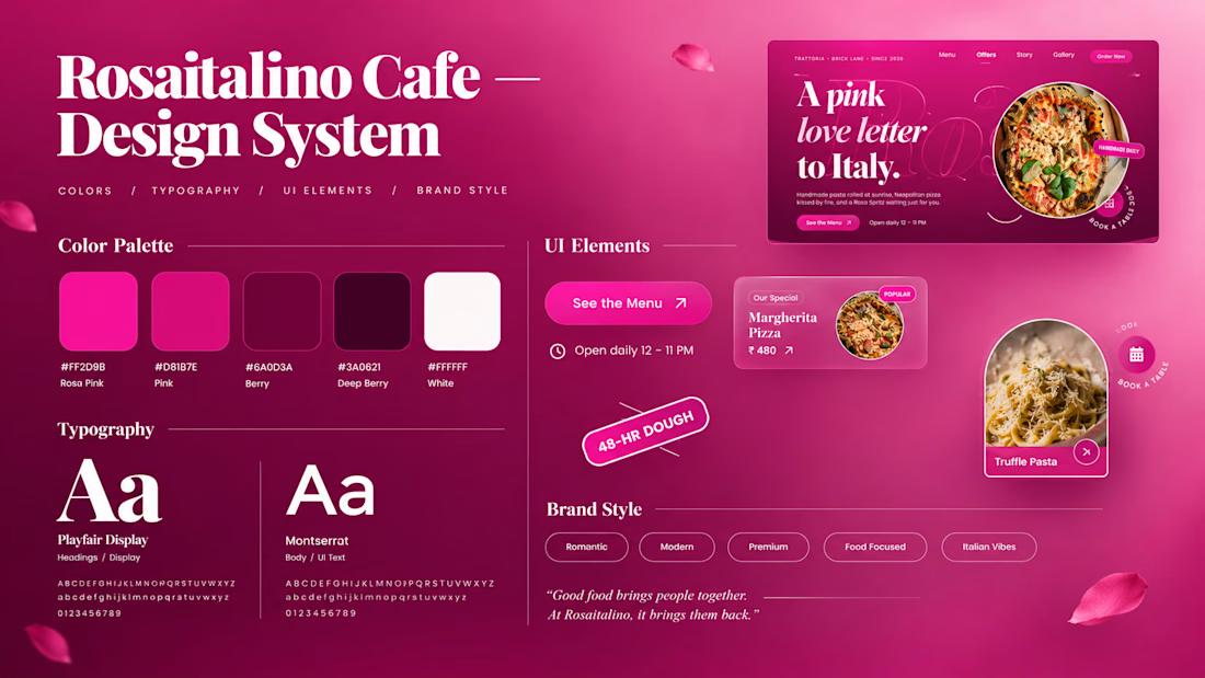
So I built a concept to show what that same restaurant could look like: Rosa italino Cafe, a rose-pink Italian restaurant website for London.
Here's what a website like this gives the owner:
🌹 A first impression that sells
People judge a restaurant in 3 seconds. A bold, beautiful design makes them hungry before they read a single word.
🍝 A menu that works like your best waiter
Dishes with photos, descriptions and prices, easy to scroll on a phone. Your signature dishes get the spotlight, so people order more of what you want to sell.
📱 Bookings from thumbs
Most people find a restaurant on their phone. A simple booking section means they reserve a table in a few taps instead of giving up.
⭐ Trust at a glance
Reviews, photos and your story in one place, so a stranger feels safe choosing you over the place next door.
📣 A place for your offers
Lunch sets, weekend specials, live music nights: update them and your regulars see them first.
🕛 A sales person that never sleeps
Your website is open at 2 AM, on Sundays and on holidays, showing your food to everyone who searches.
None of this needs a bigger budget. It needs a website designed like it cares about your food as much as you do.
That's what I do. I'm Swayam. I design and build websites for restaurants and small businesses, made to look stunning and turn visitors into customers.
Run a restaurant, cafe, salon or any small business?
Message me your business name and I'll send you a quick concept idea for your brand. No pressure, no boring sales pitch.
(Rosa italino Cafe is a concept project. Marco is a fictional character, but the problem is very real.)


Thats real intuitive post!

Absolute positioning can be really useful in Framer.
For example, when an element needs to overlap another element or sit on top of other stack. (1st clip)
It's also useful when an element needs to stay in a specific position instead of following the normal layout. (2nd clip)
These are just a few cases where absolute positioning makes sense.

Great breakdown! Absolute positioning is so underrated in Framer for those overlap cases. Love how you explained the 2 use-cases - stacking and fixed position vs normal flow. Super helpful tip!


A Recent Framer-Based Brand Experience for a Real Estate Company


Super clean brand system! 🤌 Love the mint on dark contrast and how the mark works across touchpoints - that ID card mockup is chef's kiss. Great Framer execution for real estate!


