The network for creativity
Join 1.25M professional creatives like you
Connect with clients, get discovered, and run your business 100% commission-free
Creatives on Contra have earned over $150M and we are just getting started
Back to feedPost
Taste Test

Brand exploration. Which one speaks to you?
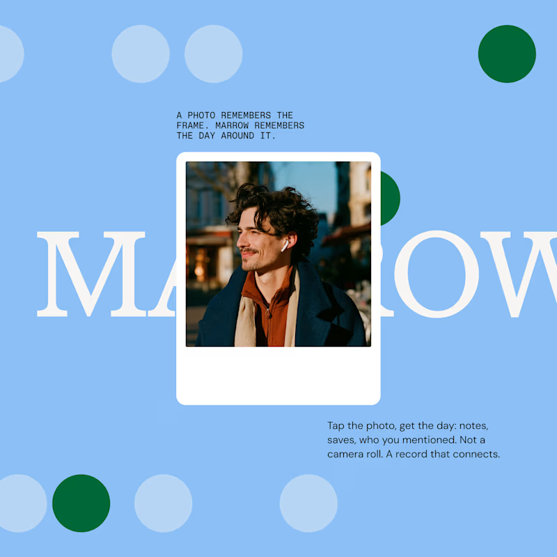
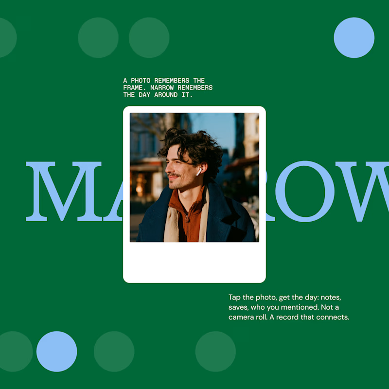
2 votes
Ends in 1d

The network for creativity
Join 1.25M professional creatives like you
Connect with clients, get discovered, and run your business 100% commission-free
Creatives on Contra have earned over $150M and we are just getting started

Challenges
View all


Related posts

What do yoyu think about the design structure?
3 voted
100%
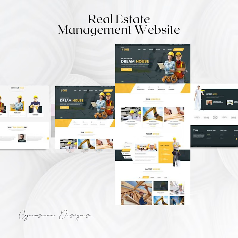
0 voted
0%
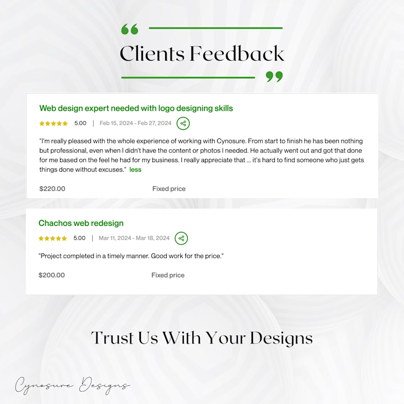
3 votes
Closed

The content hierarchy feels clear, and the restrained green-and-yellow palette gives the real-estate pages a confident, practical tone. The testimonial treatment is a nice trust-building detail.


I like 2 more

I’m testing two different creative directions and would love your honest opinion.
Version A focuses on a bright, minimal gallery experience with circular visual experiments.
Version B explores a darker, more cinematic product direction for Montairé with hardware-focused visuals.
Which one feels cooler, more premium, and more memorable — A or B?
I’d also love feedback on the typography, layout, animation, and overall art direction.
10 voted
53%
9 voted
47%
19 votes
Closed

I’d lean toward Version B. The darker direction gives the hardware more presence and makes the whole experience feel more intentional and engineered. Version A is visually interesting, but B gives Montairé a much clearer identity at first glance.