The network for creativity
Join 1.25M professional creatives like you
Connect with clients, get discovered, and run your business 100% commission-free
Creatives on Contra have earned over $150M and we are just getting started
Back to feedPost
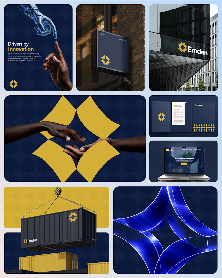
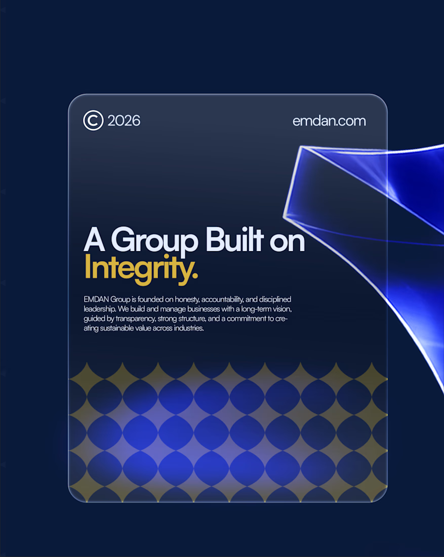
Emdan Identity is a brand built on integrity, structure, and long-term vision. The goal was to create an identity that reflects a strong parent brand capable of unifying multiple businesses under one trusted name.
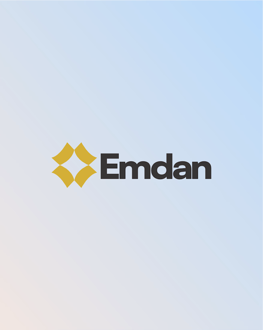
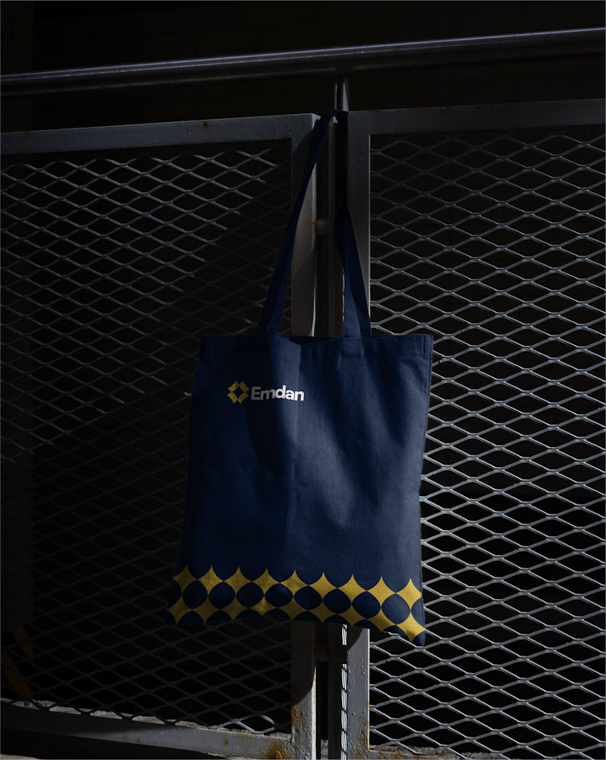
From strategy and logo development to the complete visual identity system, every element was carefully designed to communicate connection, leadership, and sustainable growth while ensuring consistency across every touchpoint.
This identity was designed to unify the Emdan under one strong and recognizable brand one that reflects its values, supports its diverse businesses, and is built to grow with its vision for the future.
Brand DesignGraphic DesignLogo DesignAdobe IllustratorAdobe PhotoshopCorelDrawbrandingbrandidentitylogodesigner




Thank you
Thank you
The network for creativity
Join 1.25M professional creatives like you
Connect with clients, get discovered, and run your business 100% commission-free
Creatives on Contra have earned over $150M and we are just getting started




Related posts

Sipzy – Fresh Fruit Juice Can Design


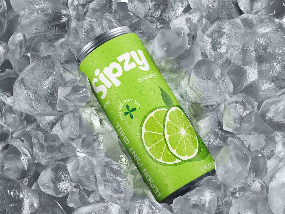

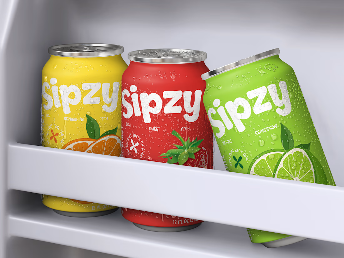

Love the visuals!


Tash rendered in a custom holographic alphabet, built from patterned letterforms in Figma.

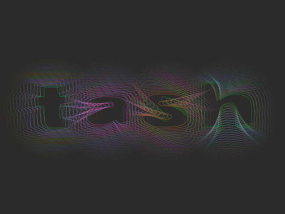

The holographic effect makes it really stand out.

Meriot Netherlands-based product designer portfolio
I explored a portfolio website for Meriot, a product designer based in the Netherlands who wanted a digital presence that felt more personal, editorial, and design-focused.
The challenge was to avoid the typical portfolio formula and create something that communicates personality within the first few seconds.
The direction
→ Bold editorial typography
→ Strong personal photography
→ Minimal black-and-white foundation
→ Warm orange accent for CTAs
→ Simple, structured navigation
→ Clear positioning as a product designer
→ A portfolio experience that feels like a personal brand
The idea was to make the website feel confident without being complicated.
Rather than leading with a long introduction, the hero immediately communicates who Meriot is, what he does, and where the visitor should go next.

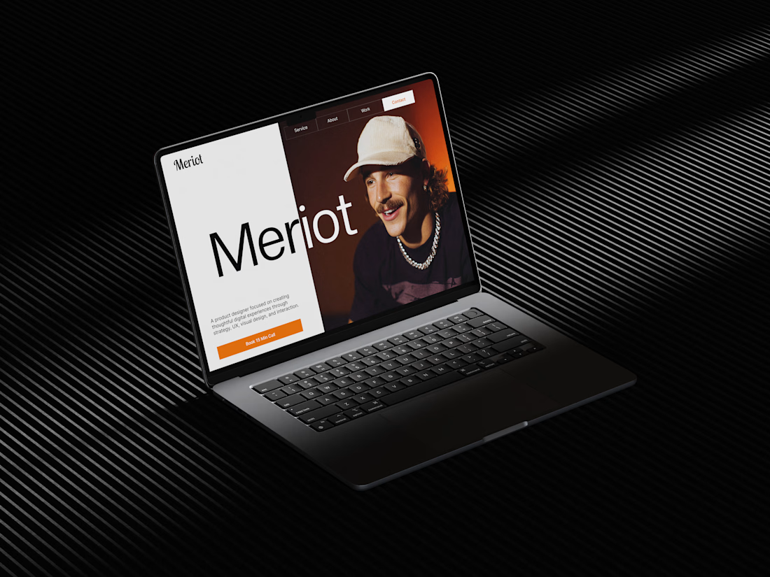

Nice design broooo